21 Fall Vignette Styling Ideas for Shelves and Tables That Look Curated
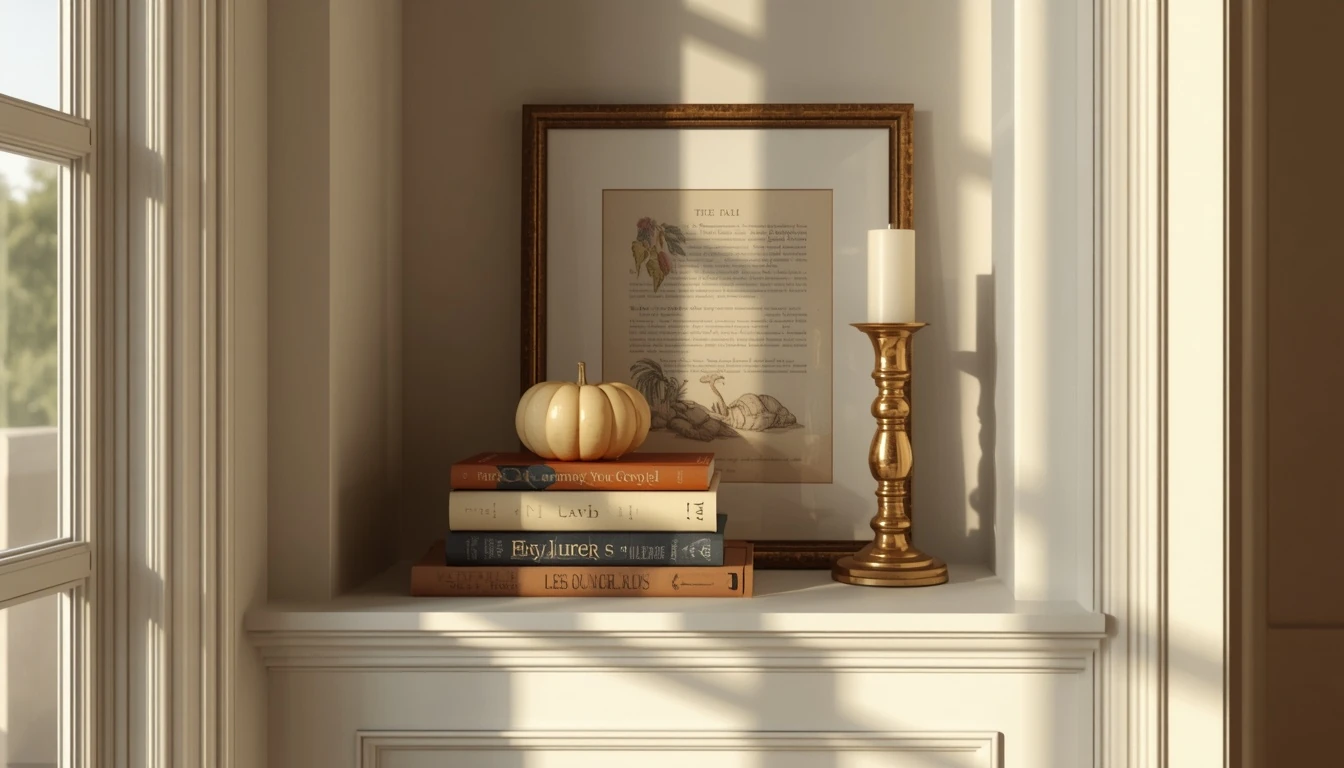
There’s a specific kind of shelf that stops you mid-scroll: a few books, a candle, maybe a small pumpkin, arranged in a way that looks effortless but somehow isn’t easy to recreate. That’s not an accident. It’s a vignette, and it follows a handful of quiet rules that most people never learn because nobody explains them, they just show the finished photo.
A vignette is really just a small, intentional grouping of objects on a shelf, table, or console that tells a little story about the season. The difference between one that looks curated and one that looks cluttered almost never comes down to how much money was spent. It comes down to height, texture, odd numbers, and how much empty space you’re brave enough to leave alone. These 21 ideas cover both: the actual technique behind a great vignette, and specific fall-ready looks you can build with it, on everything from a floating shelf to a bathroom counter.
Table of Contents
1. Start With One Anchor Piece
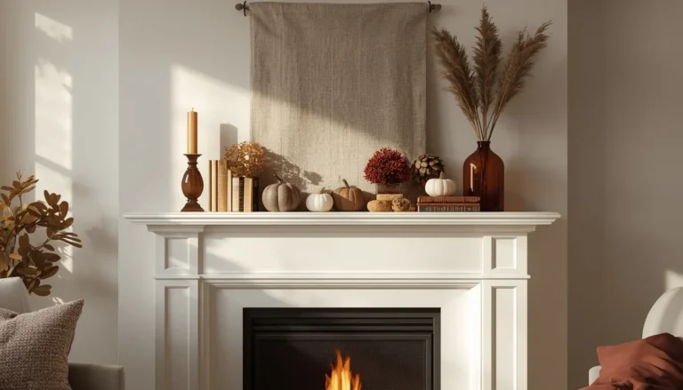
Every strong vignette starts with a single anchor, one object substantial enough to ground the whole grouping before anything else gets added. On a shelf, this might be a tall vase filled with dried florals or a piece of framed art leaned against the wall; on a table, it could be a lamp, a large ceramic pumpkin, or a small sculpture. The anchor should be noticeably larger or taller than everything else you plan to add, since its job is to give the eye a clear starting point rather than compete with the smaller pieces around it. Choosing the anchor first, before shopping for anything else, prevents the common mistake of ending up with several same-sized objects and no clear focal point. Once the anchor is in place, everything else in the vignette exists to support it, not to rival it.
2. Use the Rule of Odds for Your Pumpkin Cluster
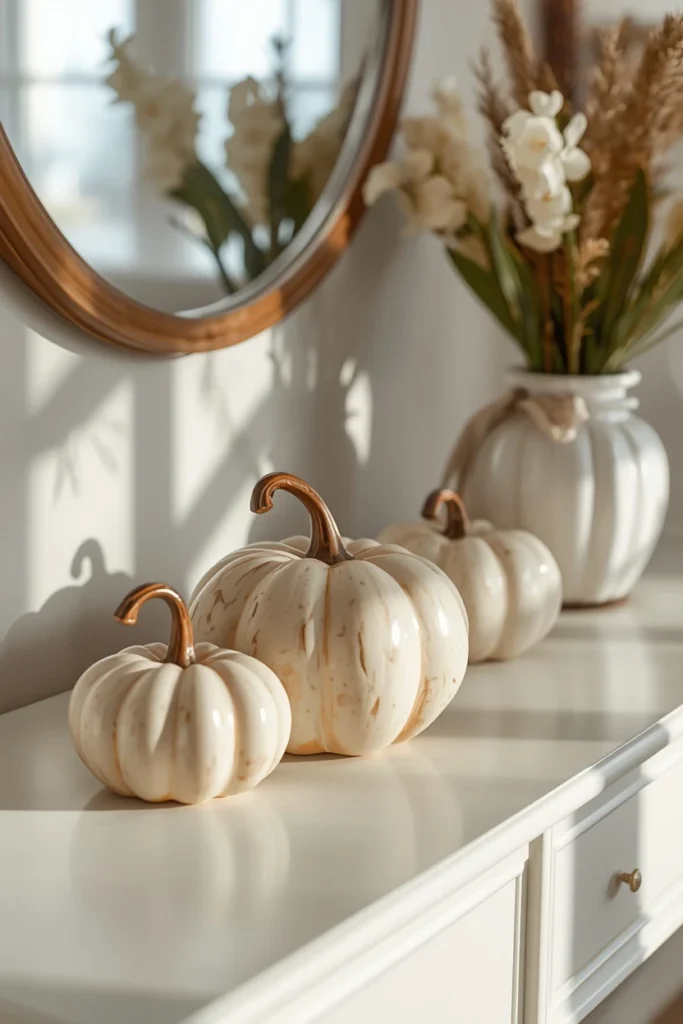
Grouping pumpkins, candles, or small objects in odd numbers, three, five, or seven, consistently looks more natural and balanced than grouping them in pairs or even numbers. This isn’t just decorating folklore; odd-numbered groupings avoid the rigid, symmetrical feel that even numbers tend to create, since the eye can’t split the group evenly and instead reads it as one cohesive shape. A simple three-pumpkin cluster in varying sizes, small, medium, and large, applies this rule in its most basic form and works on almost any shelf or table. As you get more comfortable, expanding to five or seven objects follows the same logic, just at a slightly larger scale. This is one of the easiest rules to apply immediately to any vignette you’re currently working on.
3. Build a Cream and Wheat Palette Shelf
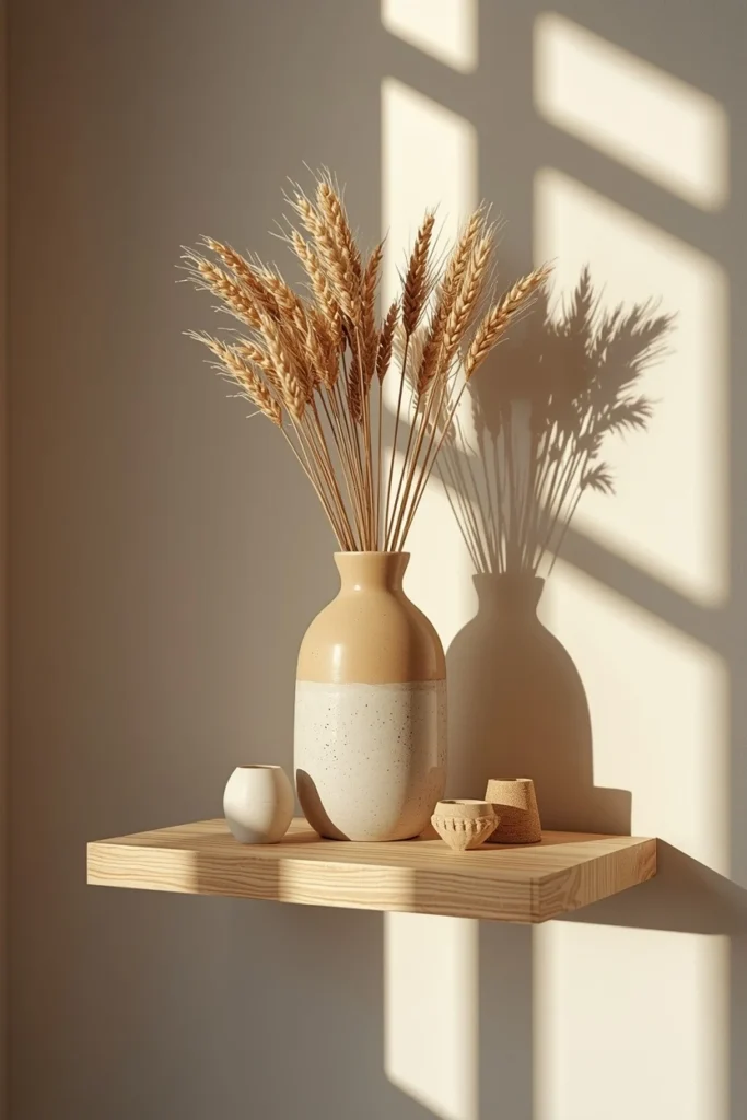
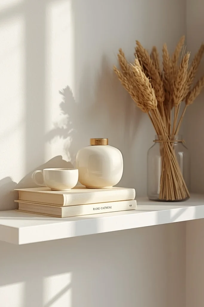
Instead of reaching for orange, style a shelf entirely in cream, oatmeal, and warm wheat tones: a piece of creamy pottery, a couple of books with pale covers, and a bundle of dried wheat or grass tucked beside them. This palette reads as warm and seasonal without relying on the expected fall colors, which makes it a strong choice for modern, coastal, or Scandinavian-style homes. Because everything sits in such a tight tonal range, texture becomes the main source of visual interest, so mixing a smooth ceramic piece with the wheat’s natural texture matters more here than it would in a more colorful vignette. This look also transitions easily into winter with only minor swaps, since cream and wheat tones aren’t tied specifically to Halloween or harvest imagery. It’s one of the more sophisticated-looking ideas on this list for the amount of effort it actually requires.
4. Choose a Muted Base Color With One Orange Accent
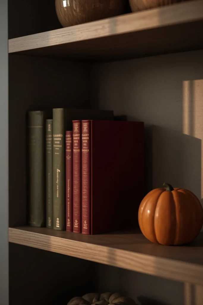
Rather than defaulting to all-orange fall decor, build your vignette’s foundation in a deeper, less expected tone, olive, plum, navy, burgundy, or ochre, and then add just one small orange element, a pumpkin, a terracotta pot, or a single book spine, as an accent. Limiting orange to a single touch makes it read as more intentional and noticeable than if it were spread across the entire display. This approach works especially well for anyone who wants their fall styling to feel sophisticated rather than costume-like, since the base colors carry more visual weight than the seasonal accent color. Olive and burgundy in particular pair beautifully with brass, wood, and dried florals, which are common materials in most fall vignettes anyway. This is a small shift in thinking that consistently produces a more elevated result than an all-orange approach.
5. Use a Thrifted Tray or Mirror as Your Base
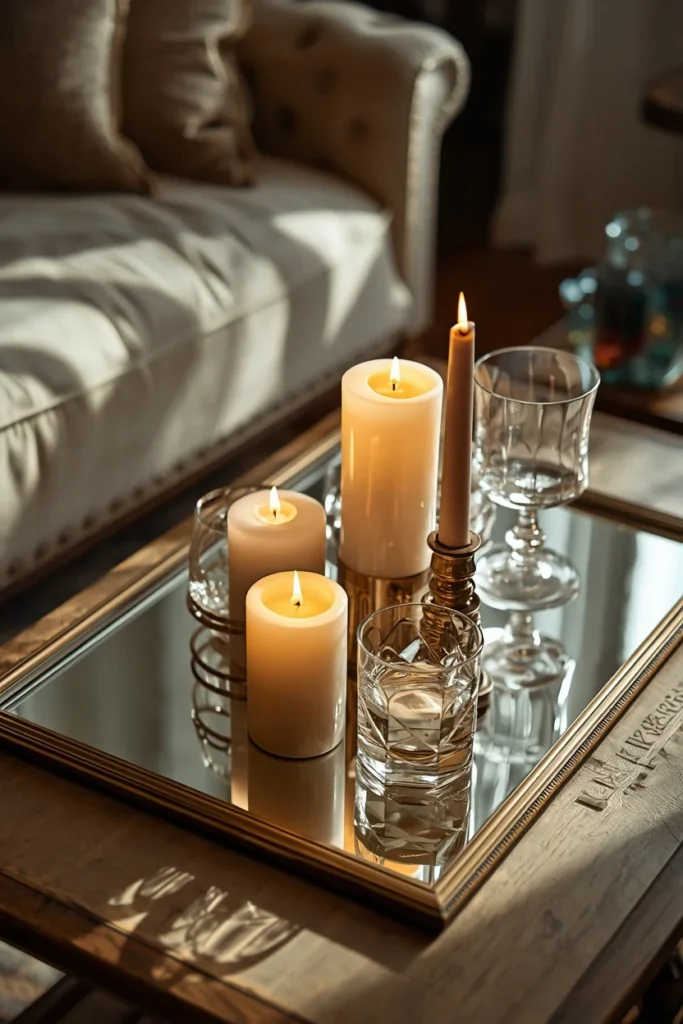
Defining the boundaries of a vignette with a base, a tray, a mirror, or even a wood cutting board, immediately makes a grouping of objects look more intentional than the same items scattered loose across a surface. A vintage thrift store mirror laid flat under a cluster of candles and glassware reflects light back up into the display, drawing extra attention to a shelf or table that might otherwise get overlooked. A large round basket tray, meanwhile, suits a more rustic, harvest-themed grouping of apples, nuts, and pears. Choosing a base with some age or character, rather than a brand-new one, tends to add more visual interest than a plain, unworn surface would. This is one of the simplest structural changes you can make to instantly elevate an existing vignette.
6. Use Books as Hidden Height Risers
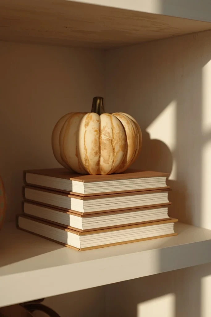
When two objects in a vignette are frustratingly close in height, a stack of books tucked underneath one of them is the fastest fix, and it doesn’t need to be visible to work. Professional stylists regularly hide risers, folded fabric, an overturned bowl, even a rolled-up sock, under a tablecloth or behind an object specifically to create height variation without it reading as an obvious trick. On an open shelf, a visible stack of two or three books can double as both the riser and a styling element itself, especially if a small pumpkin or candle sits on top. This technique solves one of the most common vignette problems: everything ending up at roughly the same height and reading as visually flat. Once you start looking for uneven height in a display, it becomes one of the easiest things to adjust.
7. Arrange Your Pieces in a Triangle
Thinking of your vignette as a triangle, with your tallest piece at one point and two shorter pieces filling out the base, is one of the most reliable composition tricks in visual design, and it works whether you’re arranging three objects or twelve. Working from the back of the display forward, tallest to shortest, naturally creates this triangular shape and gives the eye a clear path to follow across the grouping. On a larger surface, you can even build multiple overlapping triangles rather than one single shape, which adds complexity without losing the underlying structure. This technique is especially useful when you’re staring at a pile of fall decor items and aren’t sure where to start, since it gives you an actual method rather than relying purely on instinct. Once you see the triangle in a well-styled vignette, you’ll notice it in almost every professionally styled shelf or table.
8. Style a Ceramic Autumn Village on a Shelf
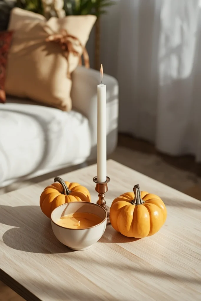
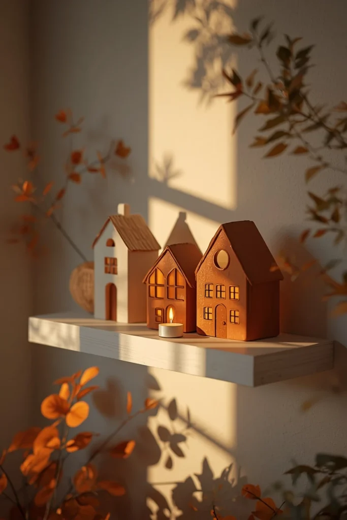
A small grouping of simple ceramic houses in cream, brown, charcoal, or terracotta, styled together on a shelf, creates a quiet, whimsical autumn village without relying on any traditional Halloween or harvest imagery. Keeping the group to three houses at most, varied in height, lets each one stand out rather than blending into a crowded row. Tucking a battery-operated tea light inside one or two of the houses creates a warm, glowing window effect once it’s dark, which adds a genuinely magical touch to an otherwise simple display. A light scattering of moss, a few tiny pinecones, or a single bare twig beside the houses suggests a landscape without turning the whole shelf into an elaborate miniature scene. This idea works particularly well in family rooms or kids’ spaces, since it feels playful without leaning on spookier Halloween motifs.
9. Load a Three-Tier Stand With a Harvest Display
A three-tier enamel or metal stand, filled generously with pumpkins, gourds, and small seasonal figures across each level, creates a naturally tiered vignette without requiring any additional risers or books to build height. This idea works especially well as a whimsical, slightly maximalist statement piece for an entryway table or a large console, somewhere it can be the clear centerpiece of the room. Layering different sizes of pumpkins and gourds across the three tiers, rather than grouping same-sized ones together on each level, keeps the eye moving up and down the whole structure. A small hanging sign or banner draped over the edge of the top tier adds a finishing detail that ties the whole display together. Because the stand itself does most of the structural work, this is a relatively low-effort way to create a genuinely full, abundant-looking vignette.
10. Fill a Vintage Milk Can With Dried Hydrangeas
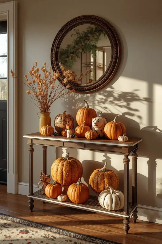
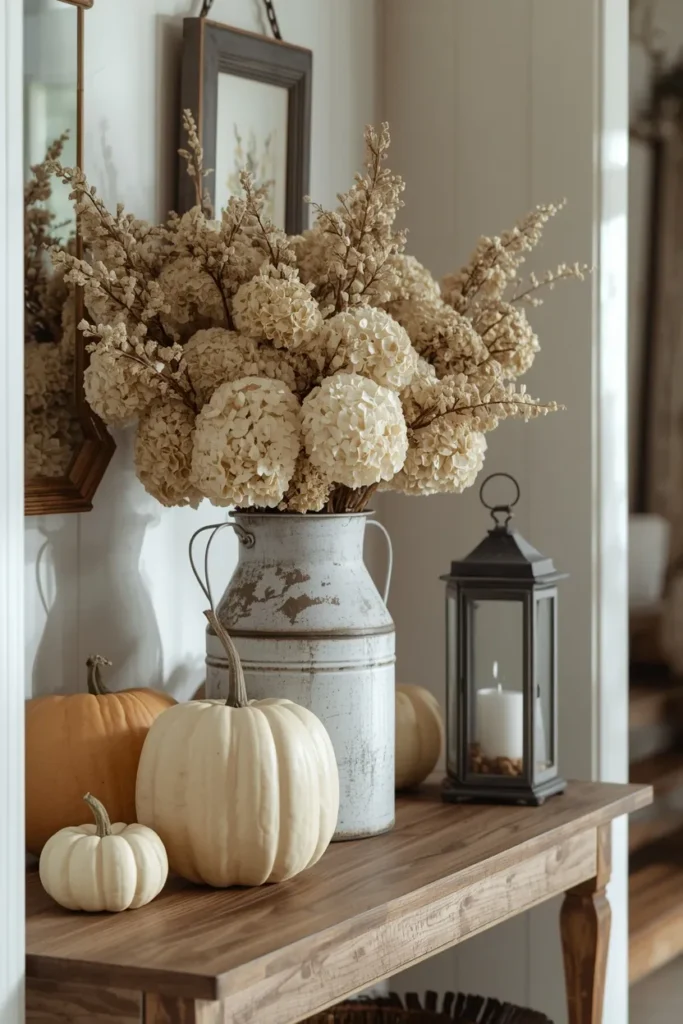
A tall vintage milk can filled with a generous bundle of dried hydrangeas instantly becomes the anchor piece for an entryway or guest room vignette, adding both height and soft, faded color without needing fresh flowers. The muted, slightly dusty tones of dried hydrangea heads pair beautifully with the aged metal finish of a vintage can, creating a cohesive, collected look rather than a mismatched one. Adding a couple of small pumpkins and a vintage candle holder at the base of the can fills out the display without competing with the height of the florals above. This idea is a favorite for anyone who already collects vintage or farmhouse pieces, since a milk can is a common thrift store find that can be repurposed for multiple seasons. The soft, romantic quality of dried hydrangeas also makes this one of the gentler, less overtly “Halloween” ideas on the entire list.
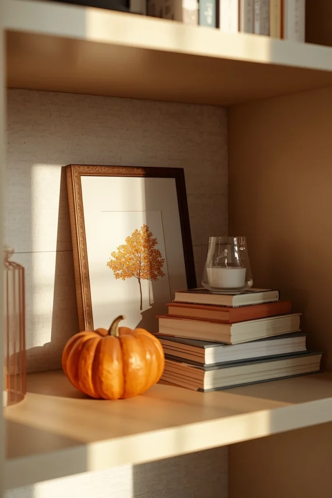
11. Layer a Frame or Mirror Behind Your Books
On an open shelf, leaning a small framed print or mirror behind a stack of books, rather than placing it flat against the wall on its own, adds depth and makes the whole grouping feel like one cohesive layer instead of two separate decorations. Choosing artwork or a mirror frame in warm tones ties it visually to the fall styling in front of it, even if the piece itself isn’t seasonal at all. This technique is especially useful on shelves where the background wall would otherwise feel empty or unfinished behind the main display. A mirror specifically adds the bonus of reflecting light back into the room, which can make a shelf displayed against a darker wall feel brighter and more dimensional. This is a simple layering trick that instantly makes a flat, single-layer shelf display look more considered.
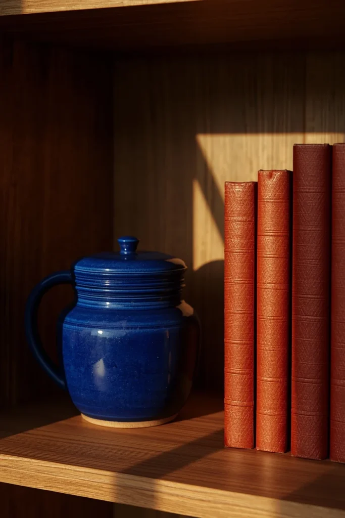
12. Mix Cobalt Blue Pottery With Rust-Toned Books
Blue doesn’t usually make the list of expected fall colors, but a piece of cobalt pottery placed beside a stack of rust-colored books creates a genuinely rich contrast that feels more layered than an arrangement made entirely of warm tones. This pairing works because blue and rust sit almost opposite each other, which means even a small amount of blue reads as a deliberate, sophisticated choice rather than an accident. Dusty or muted blue tones pair just as well with cream pumpkins and pale wheat if a bolder cobalt feels like too much of a departure. This idea is a good option for anyone who already has blue accents elsewhere in their home and wants their fall styling to feel connected to the existing room rather than introducing an entirely new, temporary palette. It also proves that a genuinely well-styled fall vignette doesn’t have to stay within the expected orange-brown-cream range.
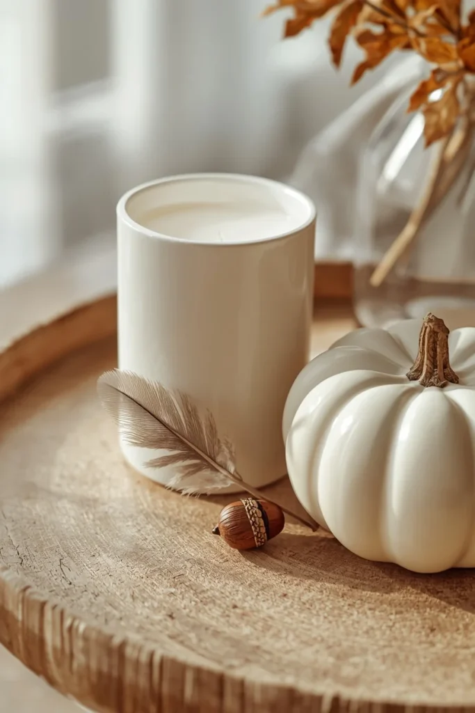
13. Add One Small Piece of Real Nature
When a vignette feels almost right but something still seems slightly off, adding one small natural element, a feather, a rock, a sprig of greenery, a single acorn, often solves the problem more effectively than adding another manufactured decor item. Natural elements introduce organic imperfection into an otherwise curated display, which keeps the whole grouping from feeling too stiff or overly styled. This doesn’t need to be a large gesture; even a single small twig tucked beside a candle can shift a vignette from “arranged” to “gathered.” This trick works on virtually any style of vignette, from a minimalist neutral display to a maximalist tiered stand, since nature reads as universally grounding regardless of the surrounding aesthetic. It’s a small, nearly free addition that experienced stylists return to again and again.
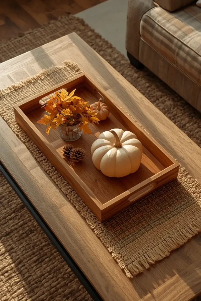
14. Ground a Coffee Table Tray With a Runner or Placemat
Before styling a coffee table tray with candles and seasonal decor, place a placemat or narrow table runner underneath it, letting a few inches show along the edges rather than fully hiding it under the tray. This creates a visible layer beneath the tray itself, adding texture and a sense of intentional grounding that a tray placed directly on a bare table surface doesn’t achieve. A plaid or woven runner in a warm tone works especially well for a farmhouse or cozy aesthetic, while a simple linen runner suits a more minimal, neutral vignette. This technique echoes the same layering principle used on shelves, background first, main display second, just applied horizontally on a table instead of vertically against a wall. It’s a small addition that consistently gets noticed even though it takes only a few seconds to add.
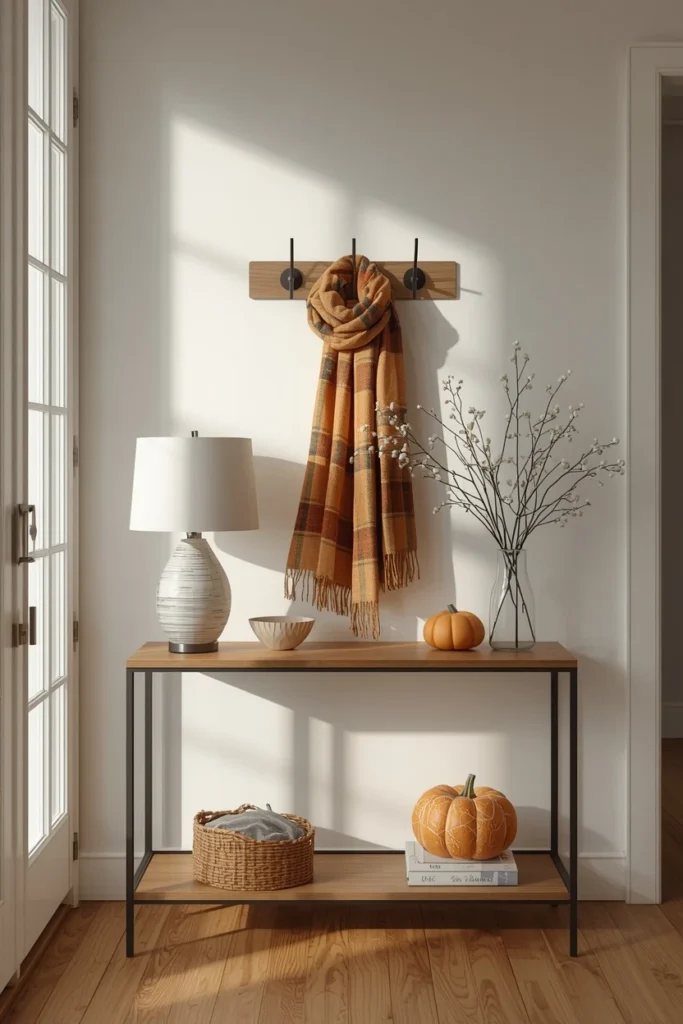
15. Build an Entryway Console Vignette With Hooks
For an entryway with wall-mounted hooks above a console table or bench, extend the vignette vertically by hanging a small fall sign or a scarf from one hook, then styling the surface below with a lamp, a small bowl for keys, and a seasonal accent like a pumpkin or a few faux stems. This combination of hanging and surface-level styling makes the most of an entryway’s limited footprint while still creating a layered, full display. Choosing one anchor for the wall, like a sign or a piece of art, and one anchor for the table surface keeps the two levels from competing with each other for attention. Adding a scattering of leaves or a small basket beneath the console fills out the lower portion of the space if it would otherwise look empty. This is one of the more functional ideas on the list, since an entryway vignette typically also needs to accommodate mail, keys, or bags.
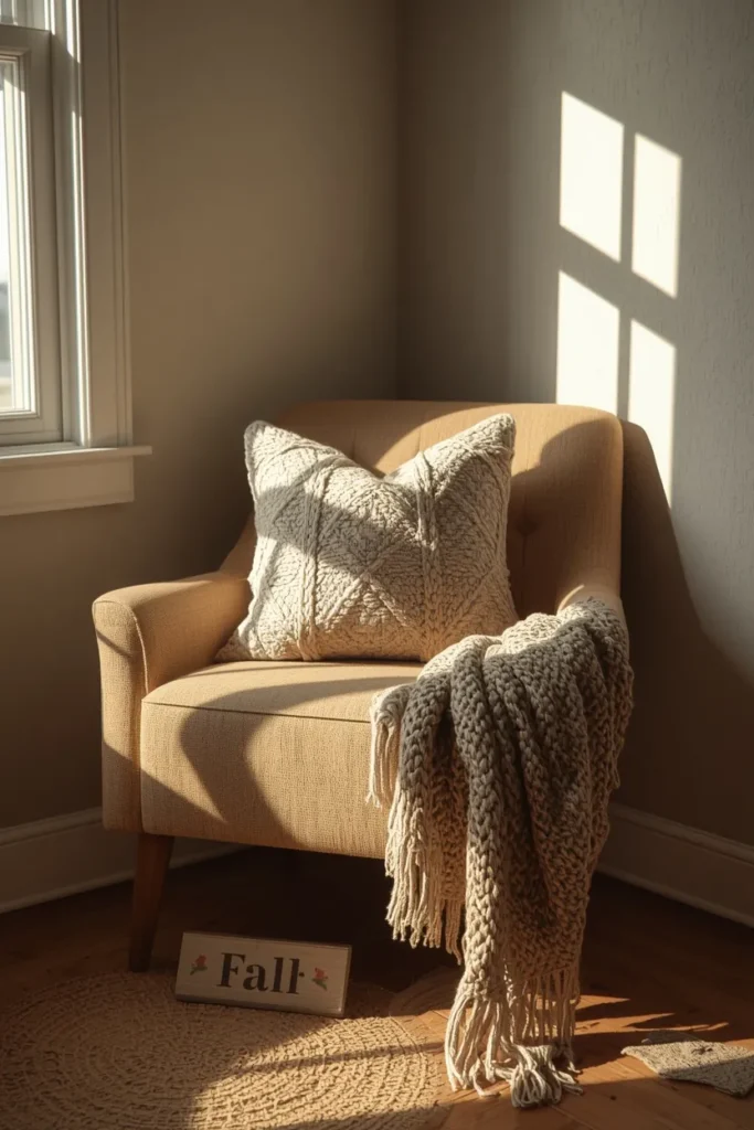
16. Style a Cozy Corner Vignette With Pillows and Throws
A reading corner or unused seating nook becomes a vignette in its own right when styled with a couple of textured pillows, a folded throw blanket, and a small fall sign or piece of decor nearby. Unlike a shelf or table vignette, this version relies more on soft materials than hard objects, which makes texture and color coordination the primary tools rather than height and odd numbers. Choosing pillows and a throw in a shared color family, rather than exactly matching, keeps the corner feeling collected rather than like a matched furniture set. This idea works especially well for pulling together a corner of the room that might otherwise feel forgotten or under-decorated compared to the rest of the space. It also happens to be one of the more functional vignettes on this list, since the whole point is for someone to actually sit there and use it.
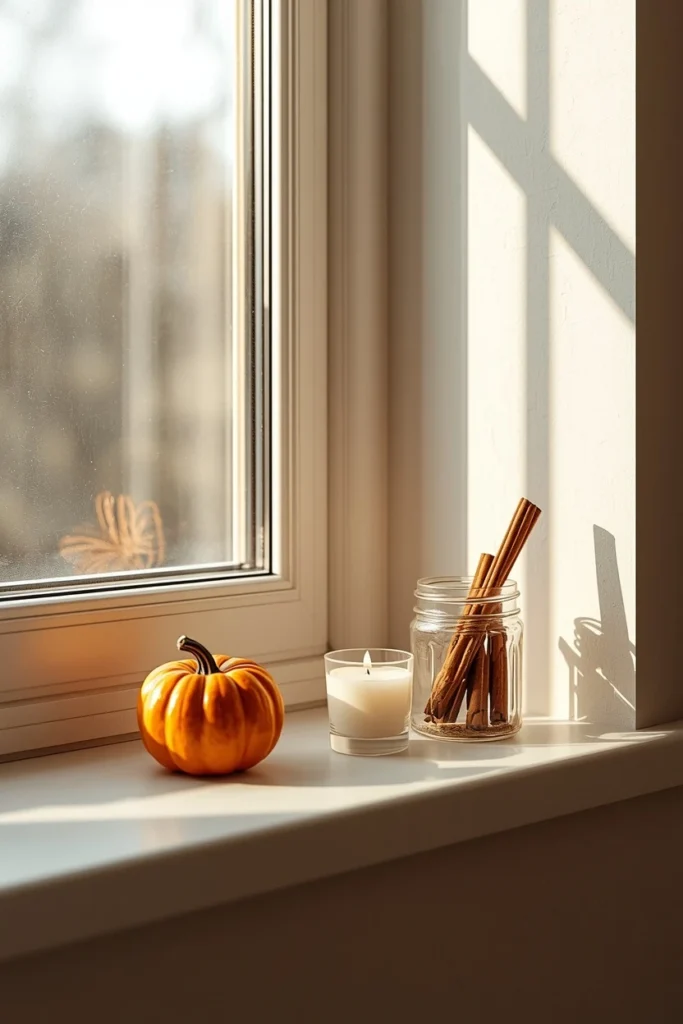
17. Create a Tiny Vignette on a Kitchen Ledge
A kitchen window ledge, the top of a cabinet, or a narrow open shelf above the stove is often the most overlooked spot for seasonal styling, yet a small grouping of two or three items, a mini pumpkin, a short candle, a small jar of cinnamon sticks, fills it perfectly without interfering with actual kitchen function. Because these spots are typically narrow and shallow, this is a strong test case for the rule of using fewer, smaller items rather than trying to recreate a larger vignette at a reduced scale. Choosing items that can handle a bit of kitchen humidity and heat, like ceramic or wood rather than delicate paper or fabric, keeps the display looking good longer in this particular spot. This idea proves that vignette styling doesn’t require a dedicated shelf or table; almost any flat surface with a few inches of depth can hold a small seasonal moment. It’s also one of the fastest ideas on this entire list to put together and take down.
18. Add a Small Seasonal Vignette to a Bathroom Shelf
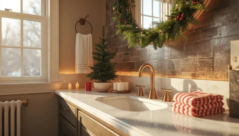
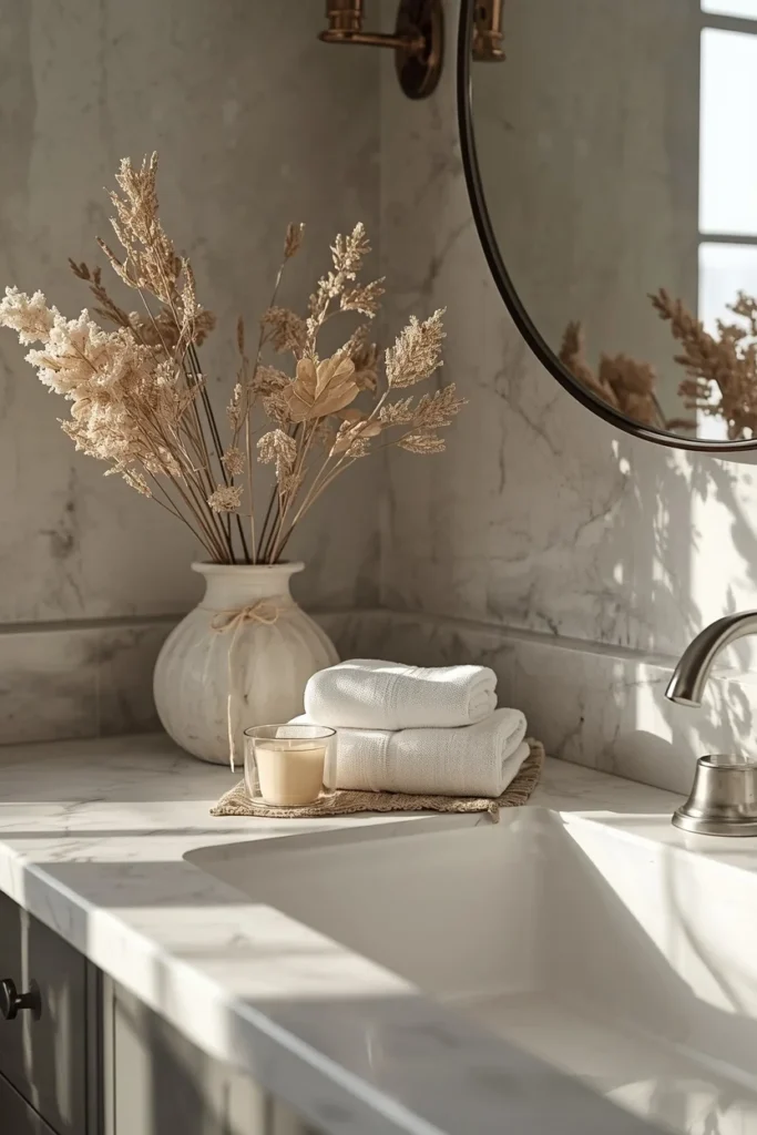
A bathroom counter or narrow floating shelf can hold a surprisingly effective mini vignette: a small vase of dried florals, a stack of two folded hand towels, and a single votive candle in a warm scent. Because bathroom surfaces tend to be small and already functional, this vignette benefits from the same restraint used in the kitchen ledge idea, just two or three items, chosen carefully, rather than a full multi-piece display. Choosing a candle scent that complements rather than overwhelms a small, enclosed room matters more here than almost anywhere else on this list. This idea is an easy way to extend fall styling into a room that most seasonal decorating guides skip entirely. It also makes a genuine difference for guests using the bathroom during a fall gathering or dinner party.
19. Style a Black-Framed Shelf With a Sculptural Gourd
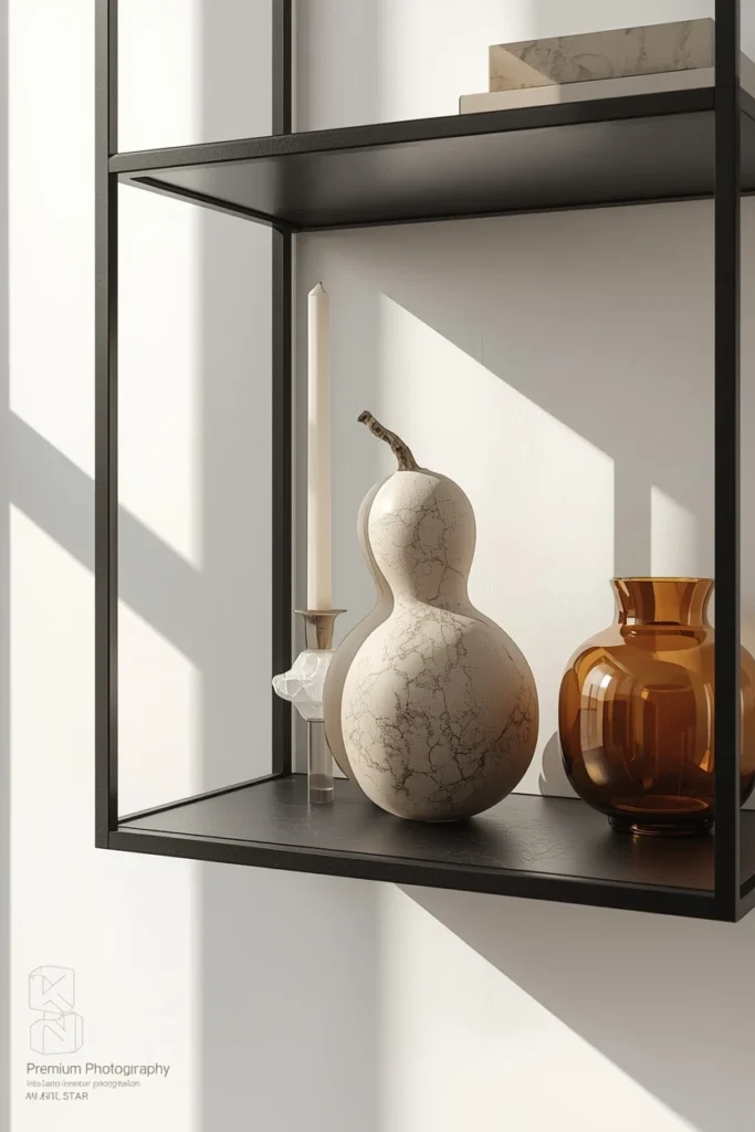
Black-framed floating shelves provide natural contrast for a fall vignette built around a single sculptural gourd, a pair of pale candlesticks, and a small amber glass vessel. The dark frame grounds the display and makes lighter, warmer materials stand out more clearly against it than they would on a plain white shelf. Following the “swap your art and add one warm piece” approach, changing out whatever print or photo normally lives on that shelf for something with a moodier, autumnal palette, then adding just one seasonal object, keeps the update feeling intentional rather than like a total overhaul. This idea suits modern or transitional homes especially well, where a full farmhouse-style pumpkin display might feel out of place against sleeker architectural details. It’s proof that a fall vignette doesn’t need multiple pumpkins to read as seasonal; one well-chosen sculptural piece is often enough.
20. Add a Simple Sign or Greeting as the Focal Point
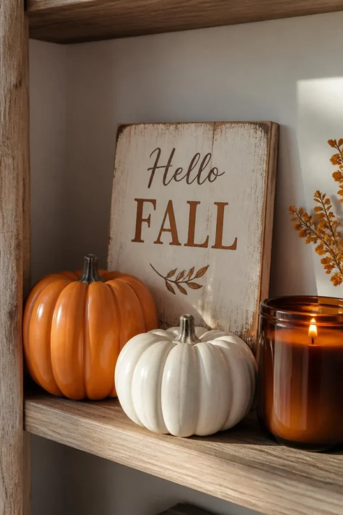
A small wood or metal sign reading something simple, “Hello Autumn” or a similar short greeting, propped against the back of a shelf or table, gives an otherwise object-based vignette a clear textual focal point to build around. Surrounding the sign with just a couple of pumpkins, a small pinecone cluster, and a lightly scented candle keeps the whole display quick to assemble and easy to understand at a glance. This idea works particularly well for beginners, since the sign itself does much of the storytelling work that would otherwise require several coordinated objects to achieve. Choosing a sign in a finish that matches the rest of the vignette’s materials, like a distressed wood sign alongside other natural textures, keeps it from looking like an isolated add-on. This is one of the fastest, most beginner-friendly ideas on the entire list.
21. Let It Sit for 24 Hours, Then Edit
The final and most overlooked step in styling any vignette is walking away from it and looking again the next day with fresh eyes, since a display that felt right in the moment often reveals one thing that needs to be removed, shifted, or added once you’ve stopped staring directly at it. Professional stylists routinely build a display, step back, adjust, and repeat several times before considering it finished, and a full day’s distance accomplishes the same thing even more effectively. Common edits at this stage include removing one item that’s crowding the composition, swapping something for better height variation, or simply shifting a piece a few inches to break up a too-straight line. This step costs nothing and takes only a moment, but it’s often the difference between a vignette that looks fine and one that actually looks curated. Treating the first pass as a draft, rather than the final version, is the habit that separates a styled shelf from a truly great one.
Styling Tips
- Choose one anchor piece before adding anything else, and let every other object support it rather than compete with it.
- Group like items in odd numbers, three, five, or seven, for a more natural, balanced look than pairs or even groupings.
- Vary height using risers, books, or naturally tall and short objects so the vignette doesn’t read as flat.
- Mix at least two textures, smooth and rough, matte and glossy, hard and soft, in every grouping.
- Leave visible negative space around the display rather than filling every inch of the surface, since empty space is part of the composition.
Practical Implementation Ideas
- Start by gathering everything you might use before placing anything, so you can see your full range of options at once.
- Build from the back forward: tallest pieces first, then medium height, then the smallest accents closest to the viewer.
- Use hidden risers, books, an overturned bowl, folded fabric, to solve height problems without buying new furniture or decor.
- Photograph your finished vignette and view it from your main sightline in the room, not just standing directly over it.
- Walk away and revisit the display after a day before considering it finished, since distance almost always reveals one useful edit.
Common Mistakes to Avoid
- Skipping an anchor piece and ending up with several same-sized objects competing for attention.
- Using even numbers, especially pairs, which tend to look more rigid and less natural than odd-numbered groupings.
- Keeping every object at the same height, which makes even a well-chosen set of items look flat and uninteresting.
- Filling every inch of the surface with no negative space, which reads as cluttered regardless of how nice the individual pieces are.
- Sticking exclusively to orange and brown, when a muted base with a single seasonal accent often looks more sophisticated.
Small-Space Alternatives
Small shelves, ledges, and narrow surfaces benefit from applying the same principles at a reduced scale rather than skipping them altogether: one small anchor, two or three supporting pieces in odd numbers, and a bit of visible empty space. Kitchen ledges, bathroom shelves, and narrow entryway tables are all strong candidates for a two-to-three-item vignette that still follows the height and texture rules used in larger displays. Wall-mounted single shelves are especially well suited to leaning a small frame behind one or two objects, borrowing the same layering trick used on larger bookshelves. In the tightest spaces, resist the urge to add more items to compensate for the small footprint; fewer, better-chosen pieces will always look more intentional than a crowded miniature version of a larger vignette.
Budget-Friendly Alternatives
Thrifted trays, mirrors, and vessels almost always cost less than new ones and typically bring more character and age to a vignette than freshly purchased pieces. Foraged pinecones, acorns, feathers, and branches are free and add the exact kind of natural texture that elevates a vignette from staged to gathered. Repurposing books, bowls, and objects you already own as functional risers avoids buying dedicated stands or pedestals. Faux pumpkins and dried florals, while a slightly higher upfront cost than fresh, real materials, are reusable for years, making them a stronger long-term value for anyone planning to style vignettes every fall.
Pro Styling Recommendations
Treat every vignette as a small design exercise with an actual method: anchor first, odd numbers for supporting objects, height variation from back to front, and at least one natural or textured element to keep things from feeling too polished. Build in layers the way a stylist would for a photoshoot, background first, then structural pieces, then small finishing accents, so nothing gets covered accidentally or added out of order. Don’t be afraid to use invisible tricks, hidden risers, a slightly shifted object, a subtracted piece, since the goal is how the vignette looks, not how it was built. And always give yourself permission to edit; the best vignettes are rarely the first version you put together.
FAQs
Conclusion
A vignette that looks effortlessly curated almost never actually is. It’s built on a handful of quiet decisions: one clear anchor, odd numbers, varied height, a little texture, and the discipline to leave some space empty. Once you understand that framework, it applies to literally any surface in your home, a floating shelf, a coffee table, a bathroom counter, using whatever fall decor you already have. Pick one idea from this list, apply the technique, and give it a day before deciding it’s finished. That’s really the whole method.