21 Luxury Living Room Ideas That Look Designer Without the Designer Price
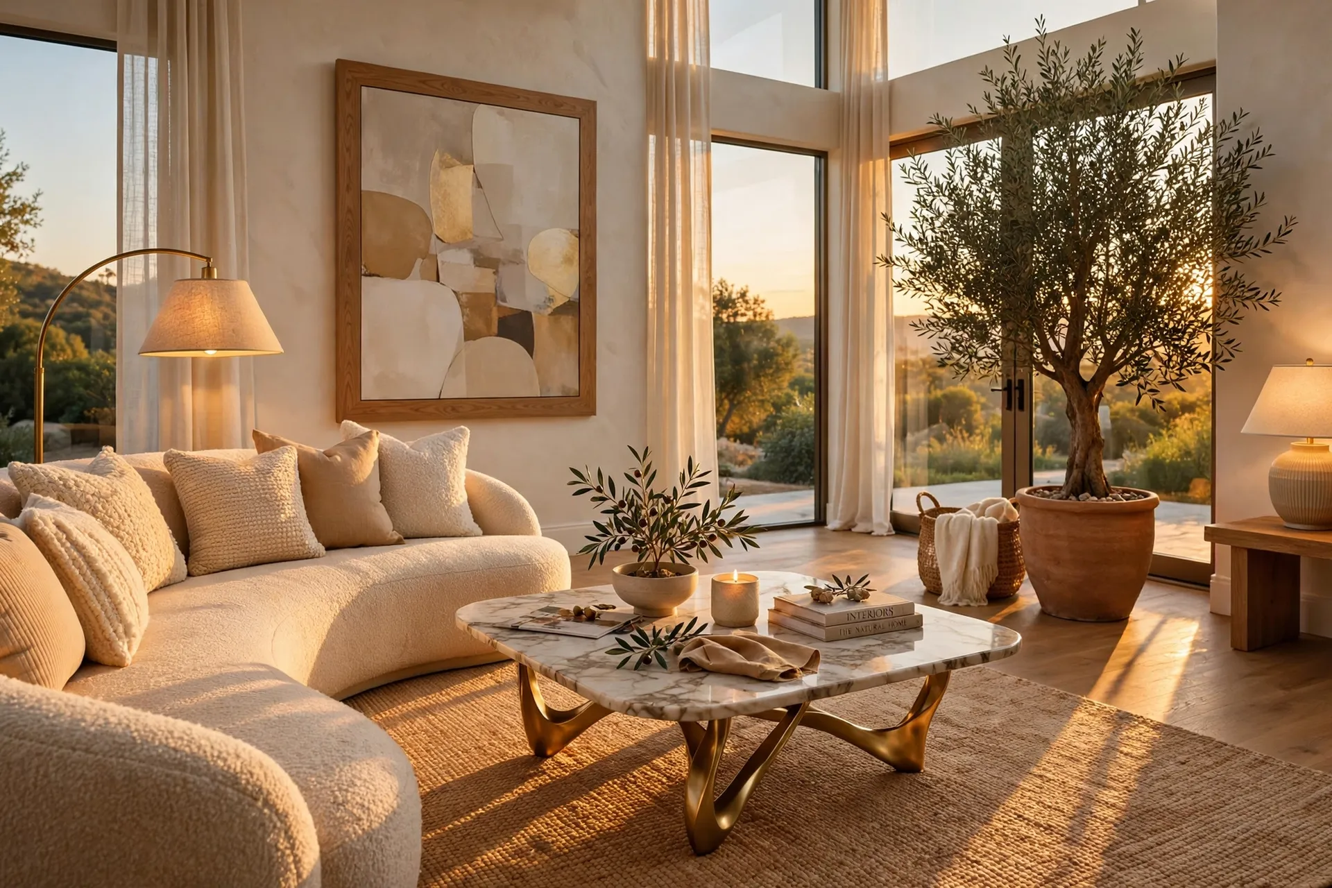
There’s a specific feeling a well-designed living room gives off, and it has almost nothing to do with how much the furniture cost. It’s in the way the light layers across the room in the evening, the way one oversized piece of art anchors the whole wall, the way nothing looks like it was bought in a single rushed trip to one store.
That feeling is learnable. Designers don’t reach for luxury by defaulting to the most expensive version of everything — they reach for intention. A sculptural table leg instead of a plain one. A rug sized correctly instead of one that floats in the middle of the room. A single big gesture, like an oversized plant or a floor-to-ceiling curtain, instead of a dozen small purchases that don’t add up to anything.
This guide breaks down 21 of those exact moves — the kind that shift a living room from “fine” to “did you hire someone for this?” without requiring a renovation budget to get there.
- 21 Luxury Living Room Ideas
- Styling Tips
- Practical Implementation Ideas
- Common Mistakes to Avoid
- Small-Space Alternatives
- Budget-Friendly Alternatives
- Pro Styling Recommendations
- FAQs
- Conclusion
21 Luxury Living Room Ideas
1. Upgrade the Furniture Legs
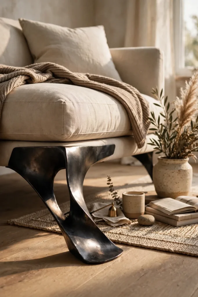
One of the fastest ways to make budget furniture look custom is swapping out the legs. Standard plastic or thin wooden legs are usually what gives a piece away as mass-produced, and replacing them with sculptural, tapered wood or metal legs in a consistent finish instantly changes how the whole piece reads. Gold or blackened steel legs in particular photograph as more expensive because they catch light differently than the original hardware. This works especially well on sofas, media consoles, and coffee tables, and it’s one of the few upgrades on this list that takes under an hour per piece. Keep the finish consistent across every leg swap in the room so the change feels intentional rather than piecemeal.
2. Go Big With One Statement Plant
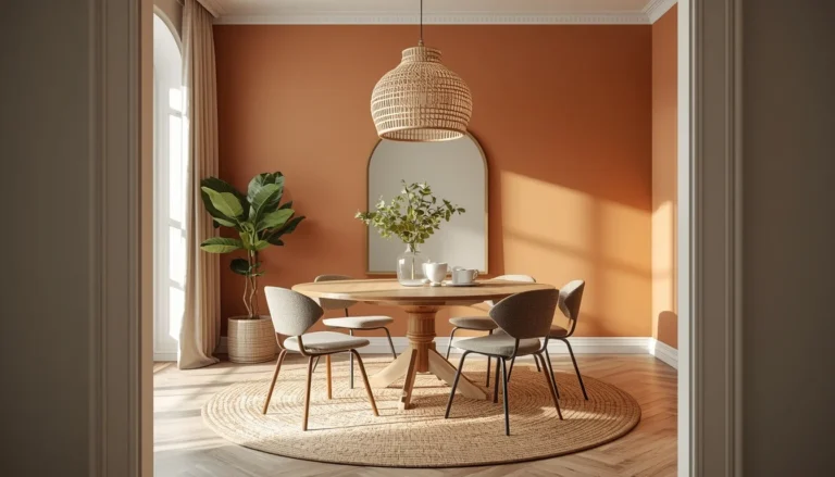
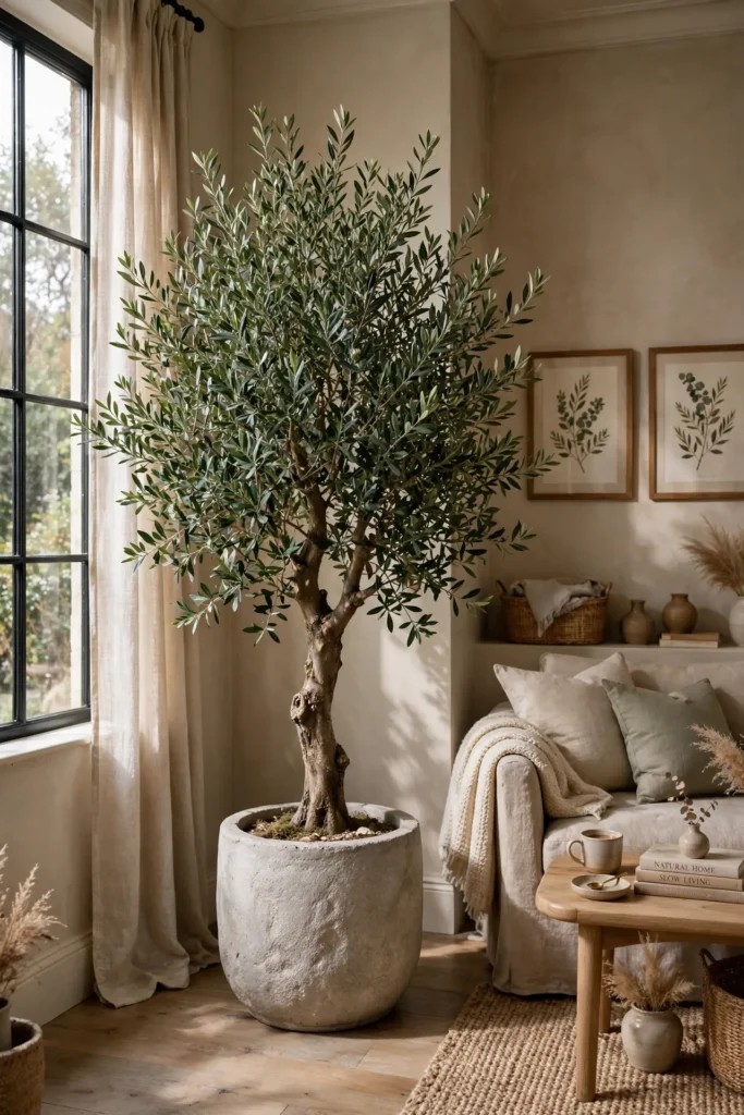
Nearly every designer living room tour features one oversized potted plant or tree, and it’s rarely a coincidence. A large fiddle leaf fig, olive tree, or bird of paradise in a substantial pot fills vertical space in a way small decor accessories never can, giving the room a sense of scale that reads as considered rather than sparse. Placing it in an empty corner solves two problems at once: it adds life to a dead zone in the room and gives the eye a natural resting point. Choose a simple, weighty pot in stone, concrete, or matte ceramic so the plant reads as a design feature rather than an afterthought purchase.
3. Size the Rug Correctly
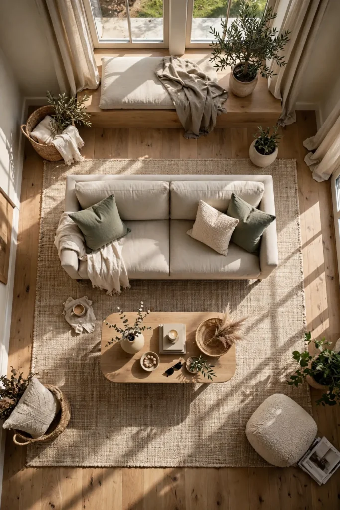
A rug that’s too small is one of the fastest ways to make a living room look unfinished, no matter how nice the furniture is. The front legs of every major piece — sofa, chairs, coffee table — should sit on the rug, which visually unifies the seating area instead of letting it float in the middle of the floor. This is a sizing fix more than a spending fix; a properly sized rug in a simple neutral tone often reads more expensive than a smaller, busier one. If a full room-sized rug isn’t in the budget yet, sizing up to the next largest option you can afford still makes a noticeable difference.
4. Layer Lighting Instead of Relying on One Overhead Fixture
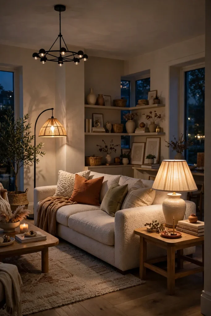
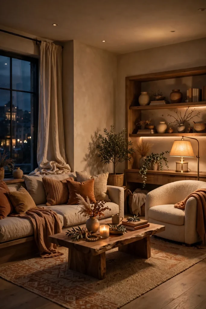
A single overhead light source is one of the clearest signals of an undecorated room. Designers layer light at three levels — a floor lamp in one corner, a table lamp near the seating, and a dimmable overhead or wall fixture — so the room has warmth and depth once the sun goes down. This layering also lets you control mood, since a room lit entirely by soft lamp light in the evening feels dramatically more expensive than one lit by a single bright bulb overhead. Warm-toned bulbs across every fixture keep the layered light cohesive instead of mismatched.
5. Bring in One Curved Furniture Piece
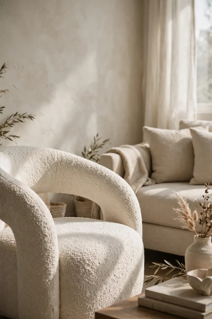
Curved silhouettes are everywhere in luxury interiors right now, and a single curved piece — a rounded sofa, an arched mirror, or an organically shaped coffee table — softens a room’s hard lines without requiring you to replace everything else. Curves tend to make a space feel more sculptural and considered, since a room with only straight edges can start to feel flat or generic. This doesn’t have to mean a full curved sectional; even a curved accent chair or a round-edged side table introduces the same softening effect on a smaller budget.
Related: 21 Pool House Ideas That Make Your Backyard Feel Like a Luxury Resort
6. Add DIY Picture Frame Molding
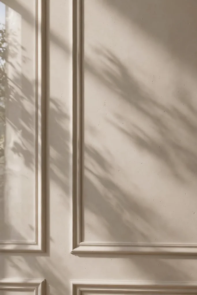
Picture frame molding along the walls gives a plain room the kind of architectural detail usually found in higher-end builds, and it’s a project most people can tackle in a weekend with basic trim and a miter saw. Painting the molding the same color as the wall keeps the look subtle and modern rather than overly traditional, which fits the current move toward quieter, more refined detailing. This upgrade works especially well behind a sofa or on the main wall you see when entering the room, since it adds texture and shadow lines that plain drywall can’t offer. Renters can often achieve a similar effect with peel-and-stick or lightweight applied molding designed to remove cleanly.
7. Mix in Vintage or Thrifted Accent Pieces
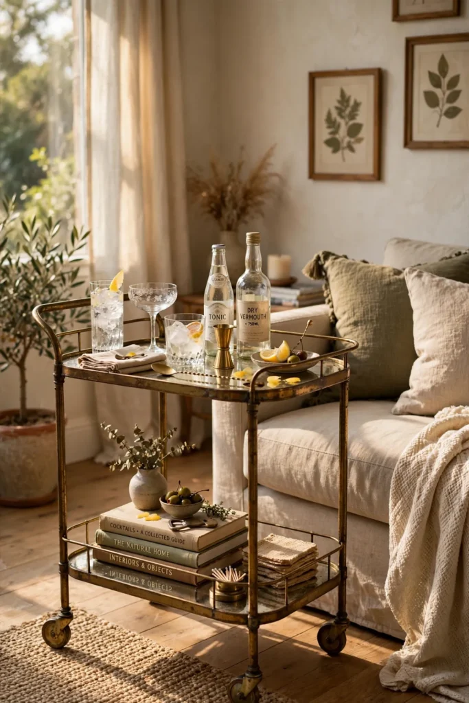
A single vintage find — a bar cart, a brass tray, an antique side table — gives a room a sense of history that new furniture can’t replicate on its own. Thrifted pieces often cost a fraction of their new equivalents, and the slight imperfection or patina reads as collected rather than mass-produced, which is a hallmark of higher-end interiors. Estate sales, flea markets, and online marketplaces are reliable sources for this kind of piece, and building a small collection over time avoids the impulse-buy look that comes from furnishing a whole room in one trip. One or two well-chosen vintage accents are usually enough to shift the feel of an entire seating area.
8. Fake Marble With Budget-Friendly Alternatives
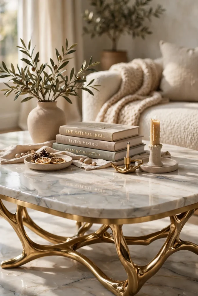
Real marble is one of the clearest luxury signals in interior design, but it’s also one of the most expensive materials to install. Faux marble contact paper, stick-on panels, or a marble-look laminate coffee table can replicate the look convincingly, especially on smaller surfaces like a side table, fireplace surround, or tabletop where the material doesn’t need to withstand heavy daily wear. Choosing a subtle veining pattern rather than a dramatic one keeps the faux material from reading as obviously artificial. This is one of the highest-impact, lowest-cost swaps on this entire list.
9. Choose One Oversized Statement Art Piece
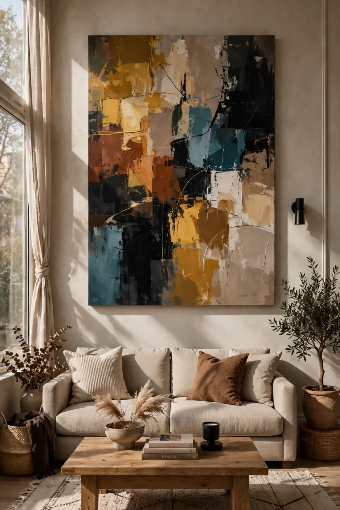
A single large piece of art does more for a room than a cluster of small mismatched frames. Designers often anchor a main wall with one oversized painting or print in a bold but cohesive color, letting it act as the room’s focal point instead of competing with several smaller pieces. This approach also simplifies decorating decisions, since the rest of the room’s palette can simply pull from tones already present in the artwork. Large-format prints from independent artists or print shops are often far more affordable than an equivalent-sized piece from a gallery, without sacrificing visual impact.
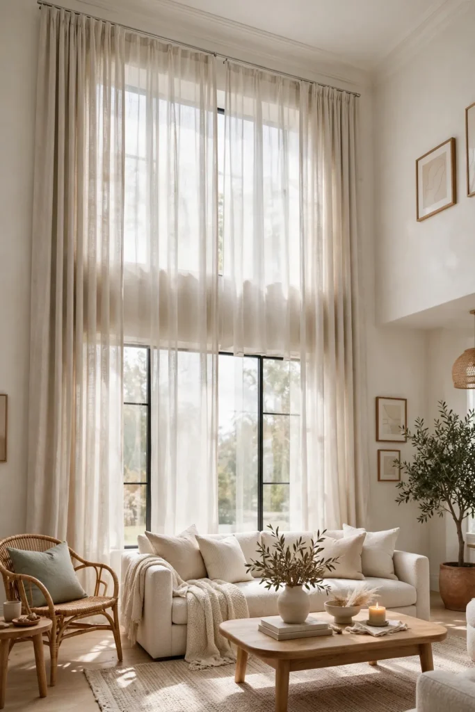
10. Raise the Curtain Rods and Go Floor Length
Hanging curtain rods a few inches above the window frame, and choosing curtains that graze or slightly pool at the floor, tricks the eye into reading the ceiling as taller and the window as larger than it actually is. This is one of the most repeated designer tricks for a reason: it costs the same as a correctly sized curtain but changes the entire proportion of the room. Choosing curtains in a color close to the wall keeps the look seamless rather than choppy, letting the height do the visual work instead of a bold pattern.
11. Edit Down Before Adding Anything New
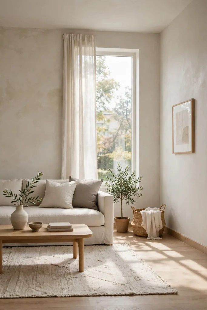
Decluttering is free, and it’s often the single biggest lever for making a room feel more expensive. Removing mismatched throw pillows, excess small decor objects, and anything that doesn’t serve a clear purpose gives the pieces that remain more visual weight and room to be noticed. Quiet, restrained rooms tend to photograph and feel more high-end than busy ones, since luxury design leans on a few intentional objects rather than many small ones. Before buying anything new for a living room refresh, removing ten items first usually does more for the room than adding five new ones.
12. Narrow Down to a Restrained Color Palette
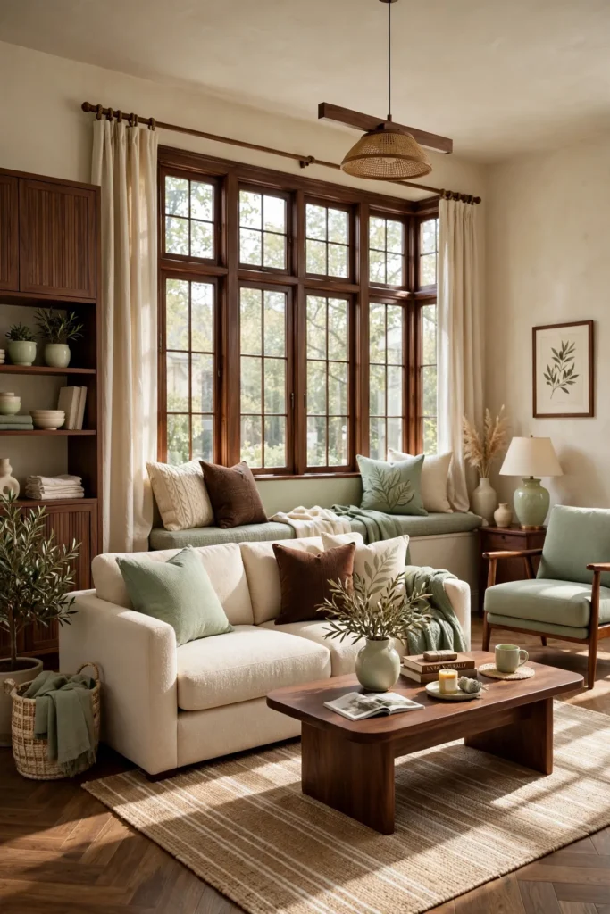
Luxury interiors rarely use more than three or four core colors in a single room. Picking a tight palette — a warm neutral base, one deeper anchoring tone, and one accent color — keeps the space feeling cohesive instead of scattered. This restraint is part of what separates a room that feels curated from one that feels randomly assembled over time, even if both contain similarly priced furniture. Once the palette is set, it becomes much easier to evaluate future purchases, since anything that doesn’t fit the three or four core tones can be skipped.
13. Mix Metals With Intention
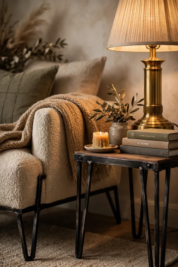
Mixing warm and cool metals — brass with blackened steel, or gold with matte black — adds visual interest without looking mismatched, as long as it’s done consistently across the room. Pick two metal finishes maximum and repeat them across lighting, hardware, and furniture legs so the mix reads as a deliberate choice rather than a collection of whatever was on sale. This detail is subtle, but it’s one that designers use constantly, since an all-matching metal finish throughout a room can start to feel flat and builder-grade.
Related: 16 Cool Blue Living Room Ideas That Feel Fresh, Not Cold
14. Layer in Chunky Knit and Faux Fur Textures
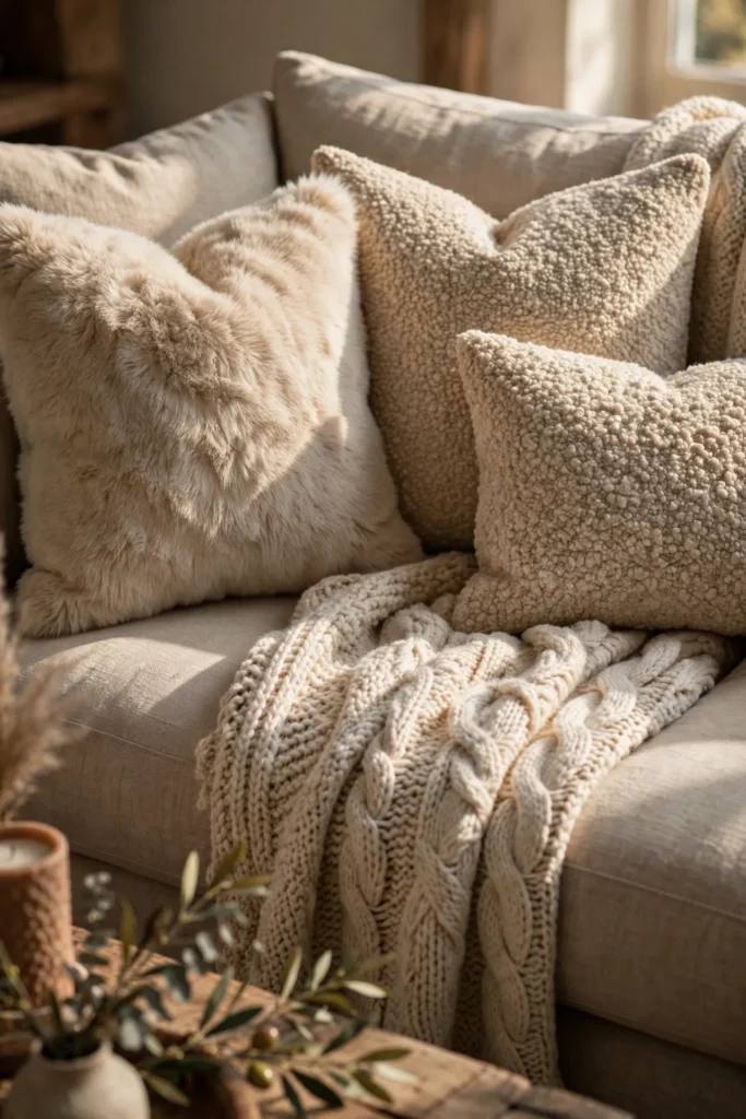
Tactile textiles — a chunky knit throw, a faux fur pillow, a heavier bouclé cushion — add warmth and visual richness to a seating area without requiring new furniture. These textures photograph beautifully because of the way they catch light and shadow, and they immediately make a sofa look more inviting and layered than one styled with flat, thin pillow covers. Two or three textured pieces per sofa is usually enough; too many competing textures can start to look cluttered rather than intentional.
15. Style Open Shelving Like a Design Vignette
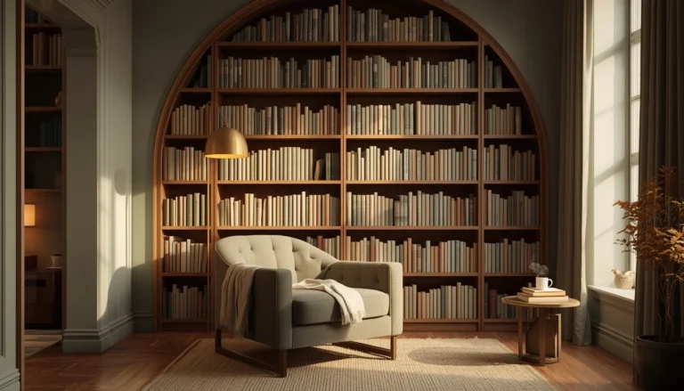
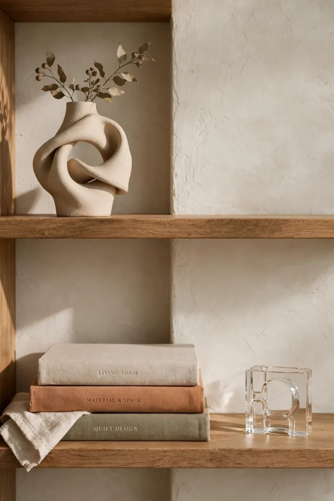
Bookcases and open shelves read as luxury when they’re styled with intention rather than filled edge to edge. Group objects in odd numbers, vary the heights with a few stacked books, and leave visible negative space between groupings so each object has room to be noticed. Adding one or two larger pieces — a sculptural vase, a small bust, or a piece of glass decor — gives the shelving more visual weight than a shelf full of small, same-sized items. This kind of styling takes almost no budget, just a willingness to edit and rearrange what you already own.
16. Choose a Faux Marble or Stone-Look Coffee Table
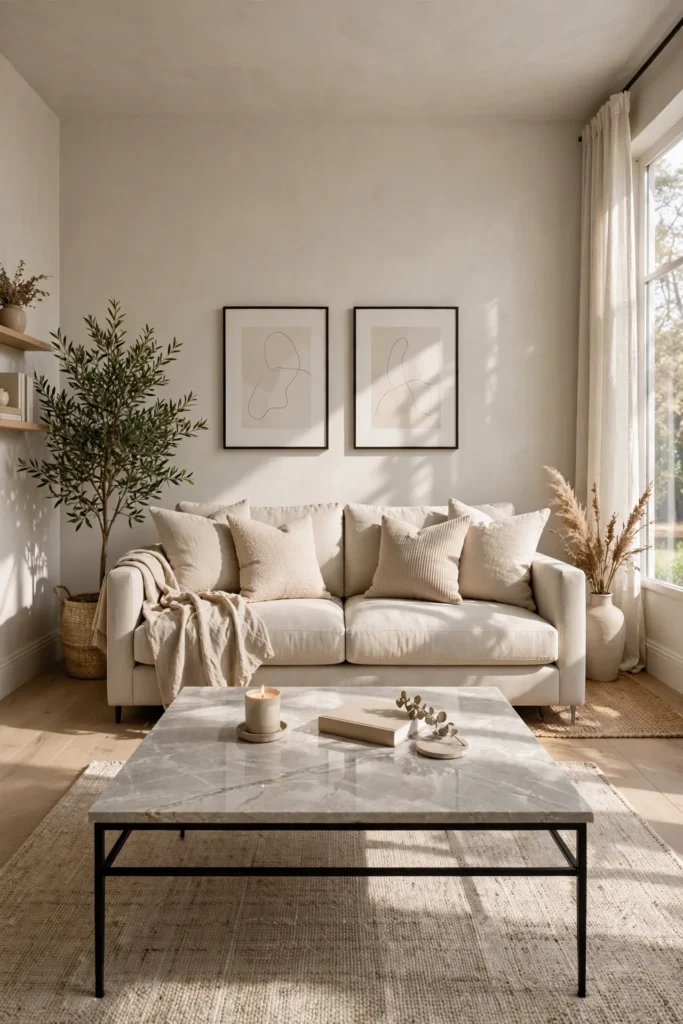
A coffee table with a marble or stone-look surface anchors a seating area the way a real slab would, at a fraction of the cost and weight. Look for laminate, sintered stone alternatives, or resin-topped options with a convincing, subtle vein pattern rather than a high-gloss, obviously synthetic finish. Pairing it with sculptural or metal legs, as covered earlier in this list, compounds the high-end effect without requiring two separate big-ticket purchases.
Related: 21 Afrobohemian Living Room Ideas to Mix Pattern, Texture & Heritage
17. Add One Velvet or Bouclé Accent Chair
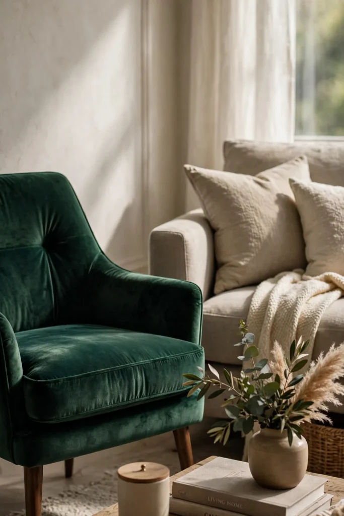
A single chair upholstered in a tactile fabric like velvet or bouclé introduces both color and texture without the commitment of reupholstering an entire sofa. These fabrics catch light in a way flat cotton or linen doesn’t, giving the chair a slightly richer, more dimensional look even from across the room. Placing it at an angle to the main sofa, rather than directly facing it, also supports the more relaxed, conversation-focused layouts favored in current luxury interiors.
18. Arrange Furniture Around a Clear Focal Point
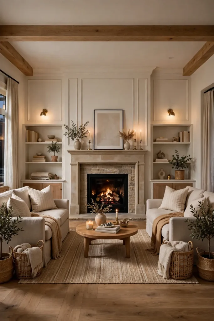
A room without an obvious focal point tends to feel unplanned, even with expensive furniture in it. Anchor the layout around one clear feature — a fireplace, a large window, or the statement art piece from earlier in this list — and arrange the seating to face or frame it. This kind of intentional arrangement is one of the clearest markers of professional design, since it signals the room was planned as a whole rather than furnished piece by piece with no larger structure in mind.
19. Use Dimmable, Warm-Toned Bulbs Throughout
Cool, bright white bulbs are one of the fastest ways to make a room feel clinical instead of inviting. Swapping every bulb in the living room to a warm color temperature, and adding dimmers where possible, gives you control over the mood at different times of day without touching a single piece of furniture. This is a low-cost, high-impact change, and it pairs directly with the layered lighting idea earlier in this list to give the room a genuinely different feel once the sun goes down.
20. Lean a Large Floor Mirror Against a Wall
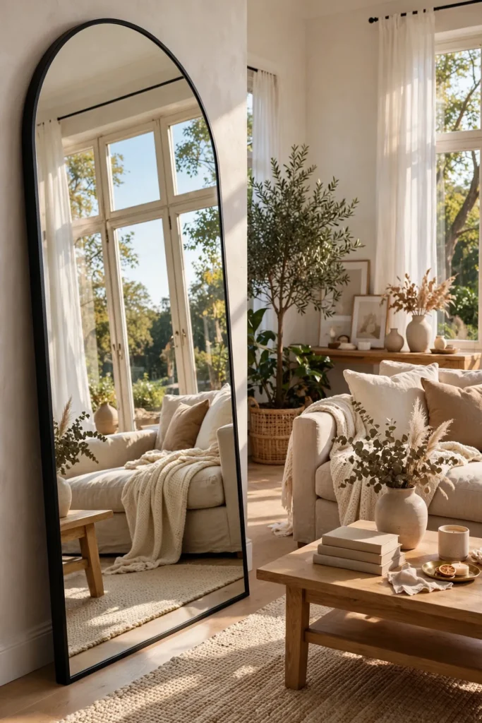
A large leaning floor mirror does double duty: it bounces natural light around the room, making it feel brighter and larger, and it reads as an intentional design object rather than a purely functional one. An arched or gently rounded frame ties into the curved-silhouette trend covered earlier, while a simple, unframed mirror keeps the look more minimal. Positioning it to reflect a window or a piece of art amplifies both the light and the visual interest already in the room.
21. Keep Hardware and Finishes Consistent
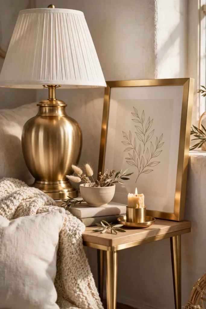
Mismatched hardware finishes across a room — a silver lamp base next to a gold picture frame next to black door handles with no relationship to each other — is a subtle but common reason a space can feel unplanned. Picking one or two finishes and repeating them across lighting, furniture legs, and small hardware ties the whole room together, even if the individual pieces came from very different price points and stores. This kind of consistency is one of the easiest, lowest-cost habits to build into future purchases, since it costs nothing to simply check the finish before buying.
Styling Tips
- Pick a maximum of two metal finishes and two accent colors, then repeat them consistently across the room.
- Buy the rug and the art first — they set the palette and scale for everything else.
- Layer at least three light sources in every seating area instead of relying on one overhead fixture.
- Leave visible negative space on shelves and tabletops; a fully packed surface reads as cluttered, not curated.
- Introduce texture through textiles before reaching for new furniture — it’s the cheaper, faster lever.
Practical Implementation Ideas
- Start with the free changes first: decluttering, rearranging furniture around a focal point, and raising curtain rods.
- Tackle one high-impact swap per weekend — furniture legs one week, lighting the next — instead of trying to do everything at once.
- Photograph the room before starting so you have a clear before-and-after to evaluate progress against.
- Shop secondhand and vintage sources for one or two accent pieces before buying anything new.
- Keep a running list of your chosen finishes and colors so future purchases stay consistent with what’s already in the room.
Common Mistakes to Avoid
- Buying a rug that’s too small and lets furniture float in the middle of the room.
- Relying on a single overhead light instead of layering lamps and ambient lighting.
- Filling every shelf and surface completely instead of leaving intentional negative space.
- Mixing more than two metal finishes without any consistency or repetition.
- Choosing several small pieces of art instead of one confident, oversized piece.
Small-Space Alternatives
- Choose a smaller-scale curved chair instead of a full curved sofa to get the same softened silhouette.
- Use a large mirror instead of a large plant if floor space is limited — it adds the same visual impact without taking up room.
- Stick to one dominant statement piece (art, mirror, or plant) rather than layering several large-scale items in a compact space.
- Keep the color palette lighter and tighter in small rooms, since a restrained palette makes a space feel larger, not smaller.
Budget-Friendly Alternatives
- Use peel-and-stick molding or faux marble contact paper instead of full millwork or real stone installation.
- Thrift one vintage accent piece instead of buying new decor across the board.
- Swap furniture legs instead of replacing the furniture itself.
- Buy a large-format print from an independent artist or print shop instead of an original gallery piece.
- Change bulbs to a warmer color temperature before investing in new light fixtures.
Pro Styling Recommendations
- Choose your rug and your art first, then build the rest of the palette around them.
- Treat lighting as a design layer, not an afterthought — plan for three sources before considering the room finished.
- Let one piece do the talking. A single oversized plant, art piece, or mirror often has more impact than several smaller additions combined.
- Revisit the room every few months and remove one thing rather than only ever adding.
FAQs
Conclusion
A living room doesn’t need a designer’s invoice to look like a designer’s work. It needs a rug sized correctly, light that layers instead of glares, one confident statement piece instead of a dozen small ones, and a palette tight enough to feel considered. Pick a handful of ideas from this list that match your space and your budget, start with the free changes, and let the room build from there.