21 Bedroom Color Schemes That Make Your Room Feel Like a Boutique Hotel
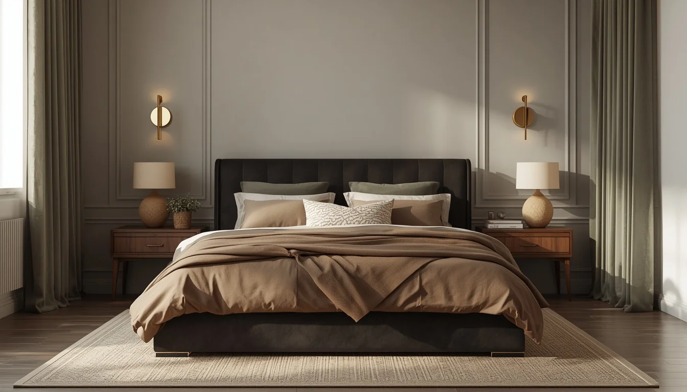
There’s a specific feeling that happens the moment you walk into a beautifully designed hotel room. The lighting is warm. The colors are calm but rich. Nothing competes for your attention, and yet everything feels considered. You set down your bag and exhale.
That feeling has very little to do with thread count or marble bathrooms. It comes down to one thing most homeowners underestimate: color.
Full-room saturation in matte or textured finishes, layered with warm lighting and restrained accents, is what creates that boutique hotel feel — and it’s a formula that translates directly into a bedroom of any size or budget. The right palette does more design work than any amount of furniture shopping ever could.
This guide gathers 21 bedroom color schemes built on that exact principle. Some are moody and enveloping. Some are soft and sun-warmed. All of them are designed to make your bedroom feel less like a room you sleep in and more like a retreat you choose to be in.
Table of Contents
1. Warm Greige & Ivory — The Quiet Luxury Classic
If one palette defines the boutique hotel look more than any other, it’s warm greige paired with layered ivory. This neutral sets the perfect backdrop for layered textures, organic shapes, and a brass feature that becomes the room’s quiet showstopper.
Luxury hotels typically use neutral colour palettes such as warm beige, greige, soft taupe, and muted creams because these tones reflect light gently and make rooms feel calm, spacious, and expensive without being distracting.
The palette: Walls in warm greige (Sherwin-Williams Pewter Green-adjacent neutrals or Benjamin Moore Edgecomb Gray), bedding in ivory and warm white, one brass or wood accent to anchor the room.
Why it reads as expensive: Consistency. Walls, flooring, soft furnishings, and lighting should stay within the same warm color family — sharp contrast is what makes a room feel busy and cheap, not luxurious.
Designer Secret: Avoid sharp whites and cold grays entirely. They make bedrooms feel harsher and less relaxing than warm, gently reflective neutrals.
2. Deep Charcoal & Warm Wood — The Metropolitan Suite
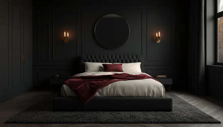
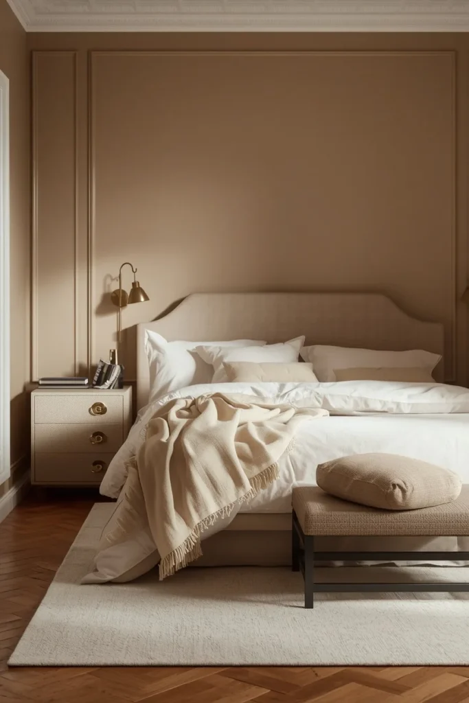
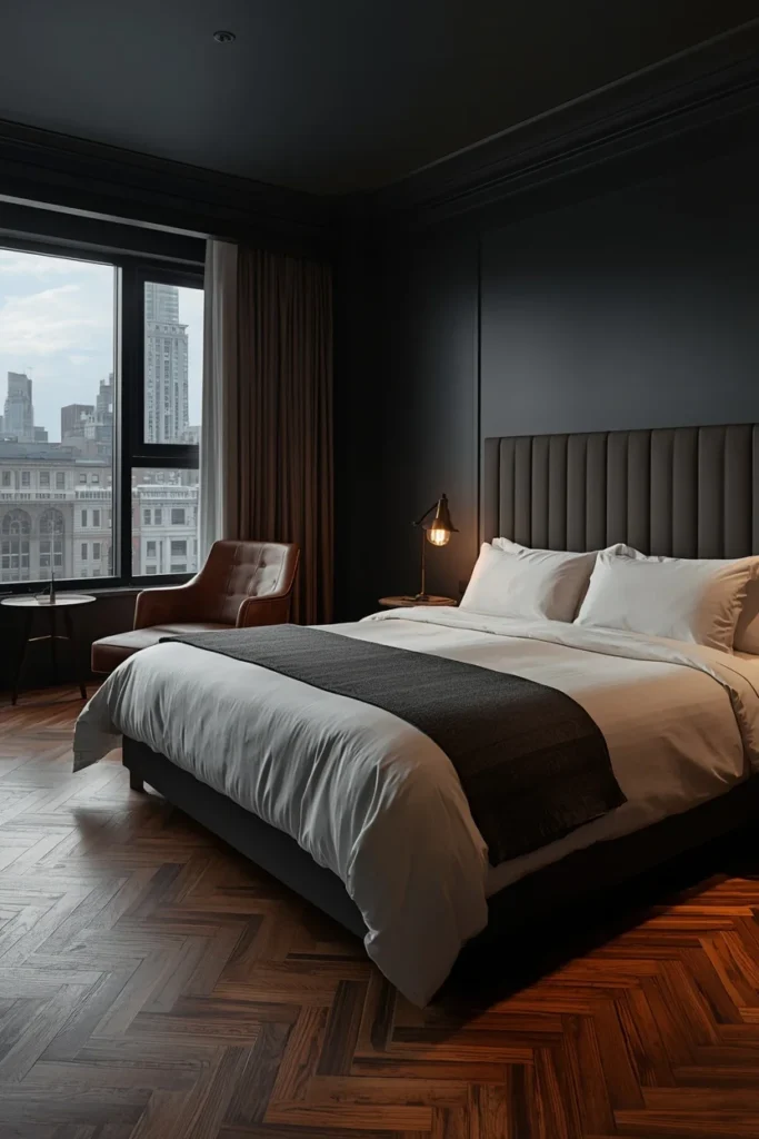
Dark charcoal walls, tailored bedding, and oversized windows create a bold, metropolitan vibe — the kind of room that feels like a boutique hotel tucked high above a city skyline.
The trick with charcoal is balance: when working with a moody palette, always introduce one warm material to balance the coolness and keep the room inviting. A leather chair, warm wood flooring, or brass hardware prevents the charcoal from reading as cold or sterile.
The palette: Deep charcoal walls (matte finish), warm walnut or oak flooring, tailored white or ivory bedding, one leather accent piece.
Lighting matters enormously here: charcoal absorbs light, so layered lamps and warm-toned bulbs are non-negotiable — never rely on a single overhead source.
Who benefits most: Urban bedrooms, primary suites with good natural light during the day (which counteracts the darkness at night), and anyone who wants their bedroom to feel like a private, sophisticated escape from a busy week.
3. Dusty Plum & Cream — Restorative Depth
Instead of pale pastels, homeowners are increasingly choosing saturated yet calming tones such as dusty plum, sage, and deep navy. Full-room saturation in matte or textured finishes creates that elusive boutique hotel feeling.
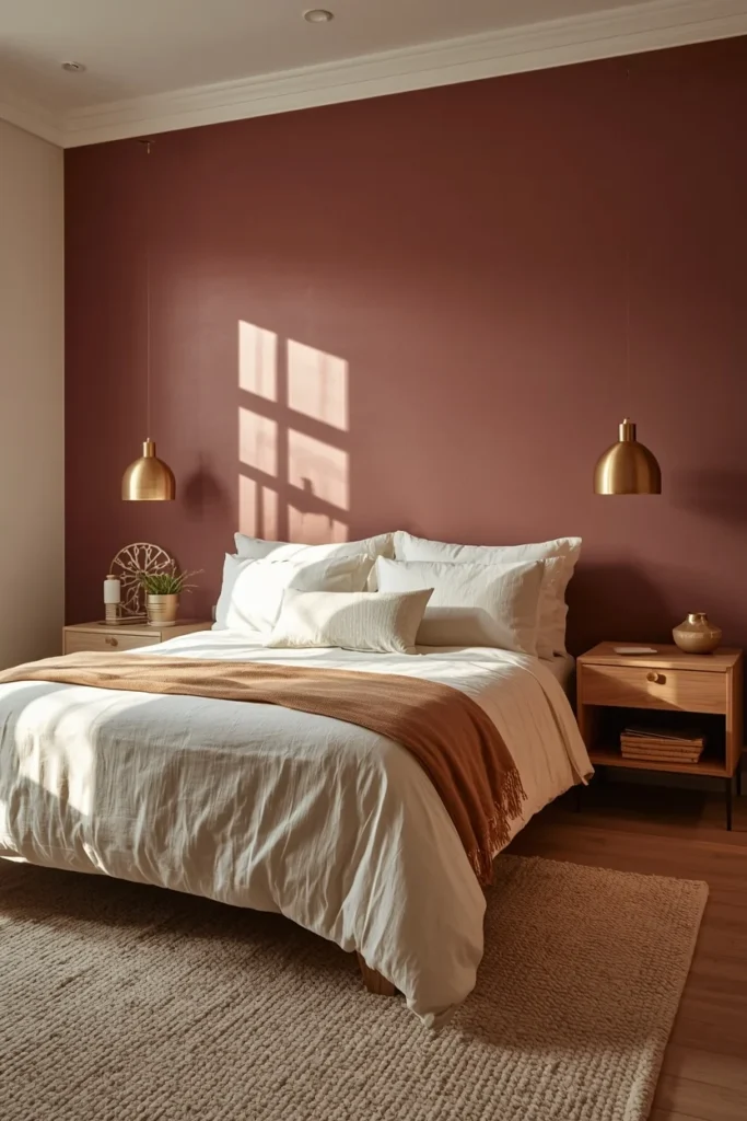
Dusty plum is one of the most underrated bedroom colors available — rich enough to feel grown-up, muted enough to stay soothing. It sits in the sweet spot between a true purple (which can feel dated) and a warm mauve (which can feel flat).
The palette: Dusty plum walls in a matte or eggshell finish, cream and warm ivory bedding, warm brass or aged gold accents, natural wood furniture.
Color Pairing: Dusty plum + warm cream + brass + natural linen = restorative without being precious.
Quick Tip: Plum reads differently in every light condition. Test a large sample swatch on the wall and observe it morning, afternoon, and evening before committing — undertones shift more in this color family than almost any other.
4. Sage Green & Soft White — The Heritage Calm
Green bedroom requests have surged, and sage in particular — green with a touch of gray to calm it — instantly quiets a room. A paneled or solid sage backdrop paired with crisp white bedding creates heritage-home energy, especially with touches of warm brass lighting.
Why this works: Sage occupies a unique psychological space — green is universally associated with calm and nature, while the gray undertone prevents it from reading as too saccharine or cottage-core.
The palette: Sage green walls (Sherwin-Williams Evergreen Fog or Pewter Green family), crisp white bedding, warm brass fixtures, a woven throw or stitched lumbar pillow to break up the white.
The contrast principle: Deep color on the wall, softness on the bed. This is the formula that makes sage feel sophisticated rather than sleepy.
Designer Secret: Add a woven throw or textured lumbar pillow in a contrasting neutral to keep the look layered instead of flat — pure white-on-sage with no texture variation can feel one-dimensional.

5. Terracotta & Warm Peach — Golden Hour, All Day
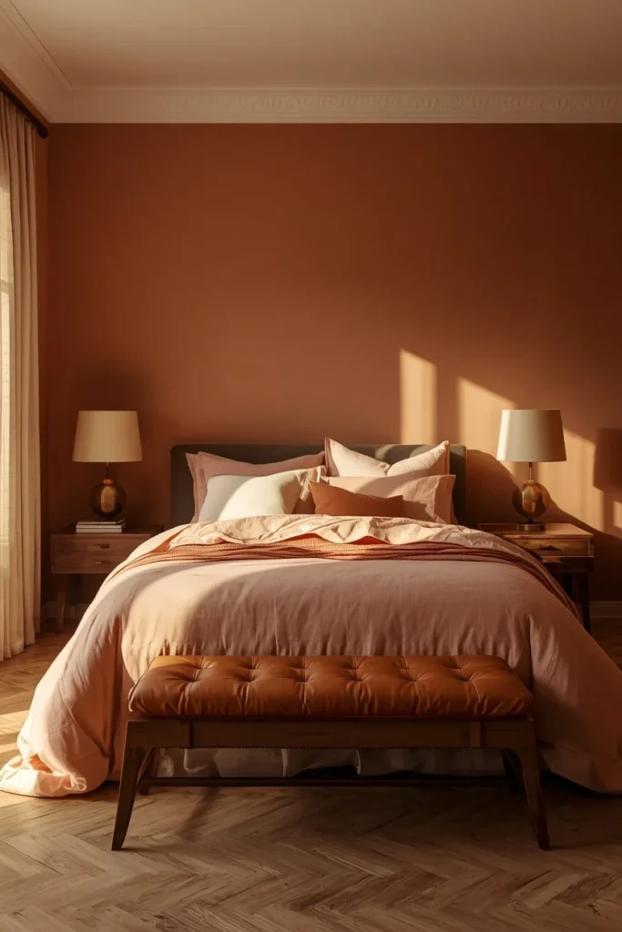
There’s something about a muted rose or terracotta wall that makes a bedroom feel like golden hour all day long. Clay-toned bedding melts into warm paneling, while soft beige curtains and creamy upholstery keep everything grounded.
Earth-inspired colors such as terracotta, sage green, and warm browns enhance biophilic design — a trend that mimics nature to foster a deeper connection to the environment, which is exactly why this palette feels so inherently restful.
The palette: Warm terracotta or clay walls, peach and warm beige bedding, tan leather or brushed brass accents, ivory linen curtains.
The balance rule: When working with pink-leaning or warm earth hues, anchor them with tan leather, brushed brass, or ivory linen so the palette feels curated, not sugary or overly soft.
Small Space Tip: Terracotta has high enough warmth and reflectivity to work beautifully in smaller bedrooms — unlike darker jewel tones, it adds richness without visually shrinking the room.
6. Emerald Green & Ivory — The Jewel Box
Designers consistently return to deep emerald green as a near-universal jewel tone — it plays well with both neutrals and other colors, offering a calming, rest-friendly palette that makes a room feel like a boutique hotel.
There’s a clear misconception that a bold bedroom scheme means bright or vibrant. In reality, the most favored designer approach uses hues with depth — tones that are a bit muddier yet still rich and saturated. Moody, layered color, not loud color.
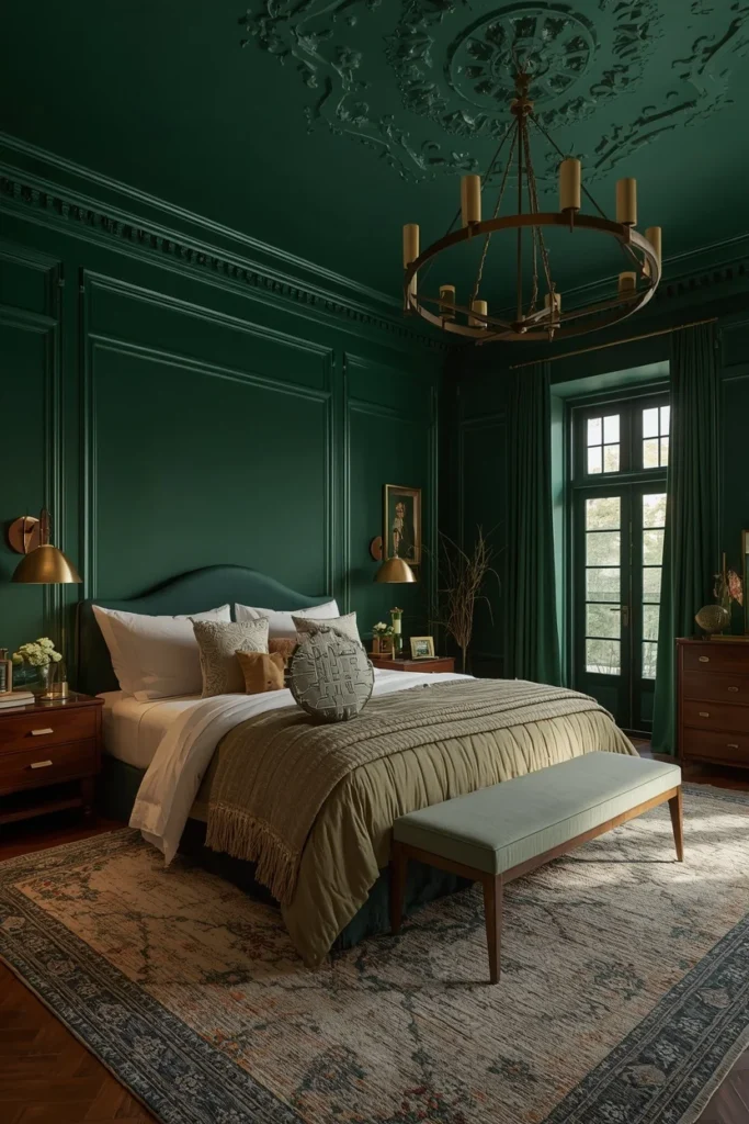
The palette: Deep emerald walls, ivory or warm white bedding, brass or aged gold hardware, dark wood furniture.
The ceiling secret: Painting the ceiling the same emerald shade transforms the room from a simple refresh into a full design statement — it’s the single highest-impact, lowest-cost move in this entire guide.
Color Pairing: Deep emerald + ivory + brass + dark walnut = the definitive jewel box bedroom palette.
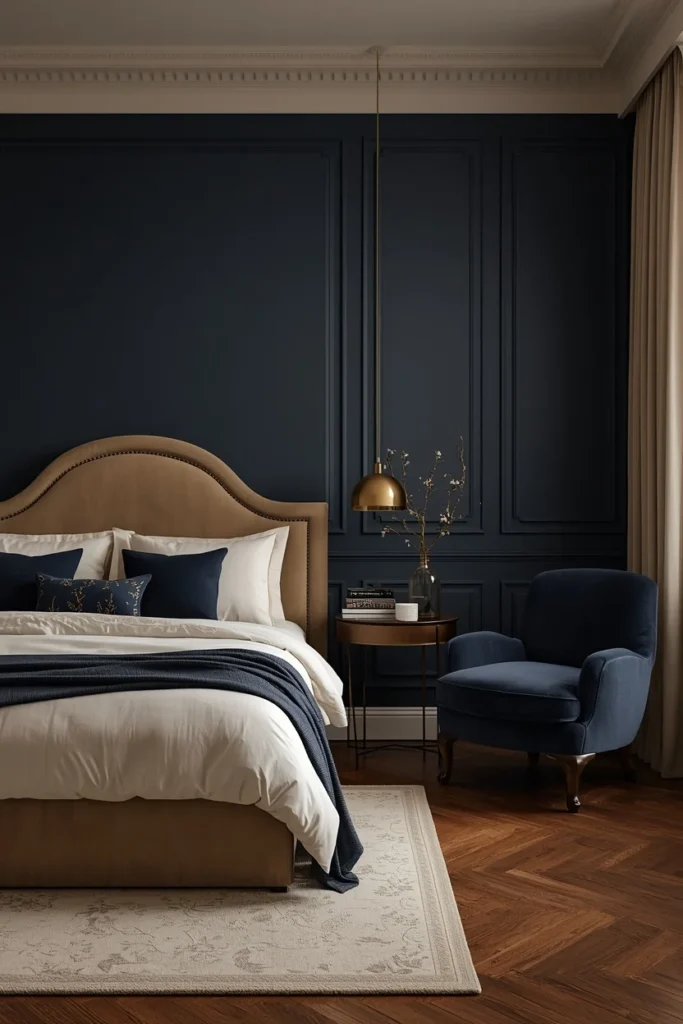
7. Navy & Warm Brass — Timeless Drama
Navy blue is, alongside emerald, one of the most universally loved deep jewel tones for bedrooms — calming, rest-friendly, and endlessly pairable with both neutrals and warm metals.
Deep blues paired with ivory and metallic accents signal comfort and exclusivity, the exact emotional register boutique hotels aim for in their most premium rooms.
The palette: Navy walls (matte finish to soften the depth), warm brass fixtures, ivory or warm white bedding, a single statement chair in a contrasting warm material.
Why navy outperforms black: Black can read as harsh or cold in a bedroom. Navy carries the same dramatic depth with a softer, more enveloping quality — it photographs and lives beautifully under warm lighting.
Common Mistake: Pairing navy with cool-toned silver or chrome hardware. Always choose warm metals — brass, aged gold, or warm bronze — to keep the room feeling inviting rather than corporate.
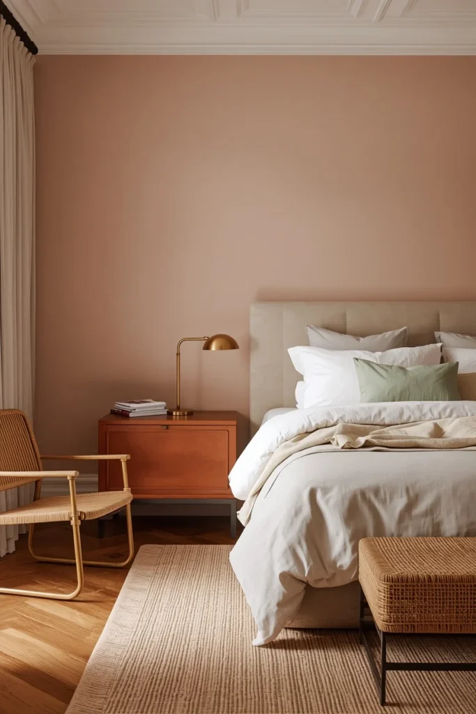
8. Soft Plaster Pink & Tan Leather — Elevated Warmth
A soft, plaster-toned pink that wraps bedroom walls bridges the gap between neutral schemes and colorful ones, bringing warmth and softness without tipping into anything overtly sweet.
This is not the pastel pink of a decade ago. Plaster pink carries warm gray and beige undertones that read as sophisticated rather than youthful — closer to warm clay than bubblegum.
The palette: Soft plaster pink walls (Farrow & Ball Setting Plaster or similar), tan leather accents, brushed brass, ivory linen.
The anchoring rule: Pink-leaning palettes need grounding materials to read as adult and curated — tan leather, dark wood, or aged brass do this work effortlessly.
Quick Tip: This palette pairs beautifully with wicker and rattan furniture, which softens the pink’s warmth and adds an organic textural layer.
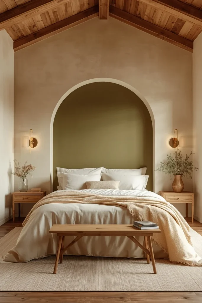
9. Olive & Cream — Architectural Serenity
An arched olive accent wall instantly draws the eye and, paired with creamy bedding, wooden beams, and soft wall sconces, creates a palette that feels architectural and serene at once.
Olive sits between sage and a true forest green — slightly more golden, slightly more grounded. It works particularly well as an architectural feature (an arch, a paneled headboard wall) rather than flat coverage, because the shape itself becomes part of the design statement.
The palette: Olive green as an architectural accent (arch, panel, or alcove), cream and warm white bedding, natural wood beams or trim, soft brass sconces.
The styling rule: When working with an accent feature like an arch or alcove, keep the surrounding walls neutral so the shape and shade feel intentional rather than competing for attention.
Designer Secret: When working with deeper greens like olive, bring light back into the room through textiles and reflective surfaces — ivory throws, pale rugs, and subtle metallics soften what could otherwise feel heavy.
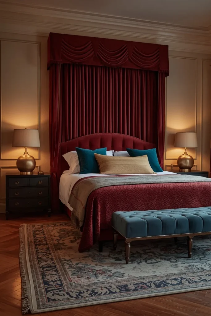
10. Burgundy & Calming Teal — Refined Drama
Burgundy continues its momentum into bedrooms, especially when teamed with calming teal — a combination that adds drama in a genuinely refined way rather than feeling heavy-handed.
This pairing works because the two colors sit in psychological opposition: burgundy is warm, rich, and grounding, while teal introduces a cooling, calming counterbalance. Together, they create the same layered emotional complexity found in the best boutique hotel suites.
The palette: Burgundy as the dominant tone (walls, headboard, or drapery), teal as a secondary accent (pillows, a chair, artwork), warm wood and brass to bridge the two.
Low-commitment option: Decorating with burgundy doesn’t need to mean painting the walls — a velvet headboard or drapery panel achieves the same cocooning effect with far less commitment.
Common Mistake: Using burgundy and teal in equal proportion. One should dominate (typically burgundy, at roughly 70%) while the other plays a supporting accent role — equal weighting reads as visually competitive rather than harmonious.
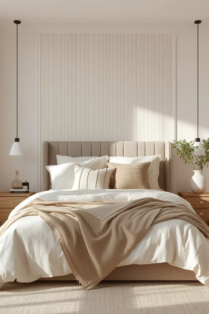
11. Warm Taupe & Greige Stripe — The Whisper Palette
Some of the most beautiful boutique hotel bedrooms whisper instead of shout. Warm whites, soft taupe stripes, and a gentle greige headboard create a space that feels calm the moment you walk in — and the beauty of a neutral scheme like this lives entirely in the layering.
The palette: Warm white walls with a subtle taupe stripe (wallpaper or paint), greige upholstered headboard, layered cream and oatmeal textiles in varied weaves.
Why layering matters more here than in bold palettes: With minimal color contrast, texture becomes the primary source of visual interest. Linen, bouclé, wool, and cotton in slightly different warm tones create the depth that color alone would otherwise provide.
Small Space Tip: This is the single best palette for small bedrooms — the low contrast and light reflectivity make compact rooms feel airy rather than cramped, while the texture layering prevents it from feeling sparse.
12. Mushroom & Sand — The Grounded Neutral
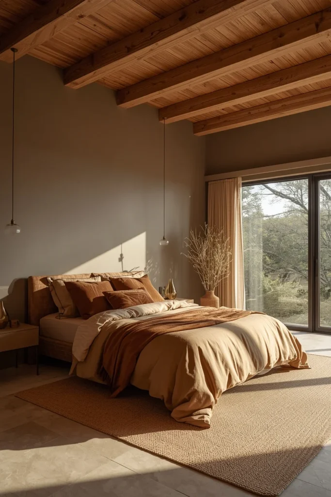
In rooms with soaring ceilings and wall-to-wall windows, the most successful palettes lean into tones that are soft and grounded — mushroom, sand, and taupe — perfect for creating a serene escape that feels expansive rather than stark.
Mushroom is one of the defining neutrals replacing flat beige — a warmer, more complex tone with subtle gray and brown undertones that shifts beautifully throughout the day.
The palette: Mushroom-toned walls, sand and warm taupe bedding layers, natural wood beams or furniture, minimal brass accents.
Why this beats traditional beige: Beige can read as flat and one-dimensional under artificial light. Mushroom carries enough complexity in its undertone to remain interesting and warm across every lighting condition.
Designer Secret: This palette performs exceptionally well in rooms with abundant natural light and architectural features (beams, vaulted ceilings) — let the architecture and color work together rather than over-styling with accessories.
13. Clay & Soft Beige — Spa-Like Warmth
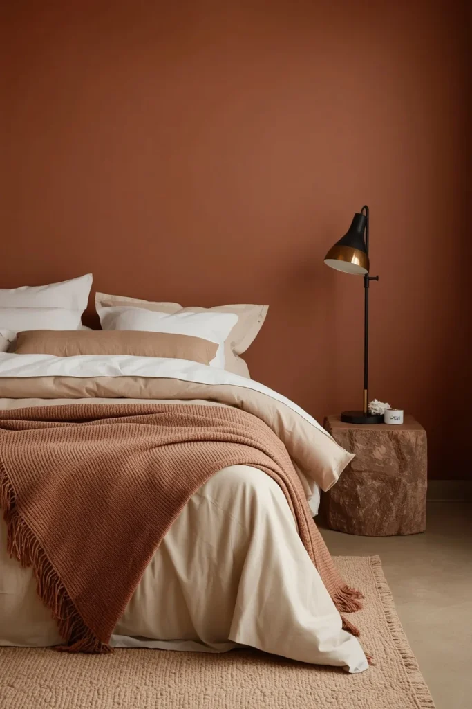
Rich earth tones like clay, terracotta, and muted ochre reflect tradition and craftsmanship, giving bedrooms an inviting, rooted feeling — particularly when paired with textured fabrics and subtle metallic accents.
This palette leans more muted and matte than the brighter terracotta scheme, making it ideal for those who want warmth without strong color saturation.
The palette: Clay-toned walls in a matte finish, soft beige and warm white bedding, woven or textured fabric accents, subtle brass or bronze metallics.
The spa connection: Clay’s muted, earthy quality connects directly to wellness and spa aesthetics — it’s the color equivalent of warm stone and natural materials, making it one of the most universally calming choices in this entire guide.
Quick Tip: Pair this palette with a diffuser or scent element (cedar, sandalwood) to complete the spa-like sensory experience — color alone does about 70% of the work, but scent finishes it.
14. Espresso Brown & Warm Cream —The Comeback Color
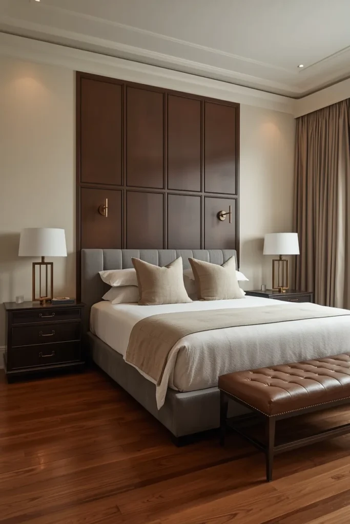
Brown is back. Unlike pastels, this rich, warm neutral is generating serious demand — a shift away from the cooler grays and beiges of the past decade toward something with more depth and personality.
Espresso and chocolate-adjacent browns bring an unexpected sophistication to bedrooms — closer to a tailored, masculine-leaning warmth than the cottage-core connotations brown once carried.
The palette: Espresso brown as a wall color or paneling treatment, warm cream and ivory bedding, brass or warm bronze hardware, leather accents.
Where it works best: As a lower-wall treatment (with wainscoting or paneling) paired with a lighter cream upper wall, or as a single accent wall behind the bed in a room with strong natural light.
Common Mistake: Using cool-toned browns (gray-brown or “greige-brown”) instead of true warm espresso. The cool versions read as muddy rather than rich — always check the undertone on a swatch before committing.
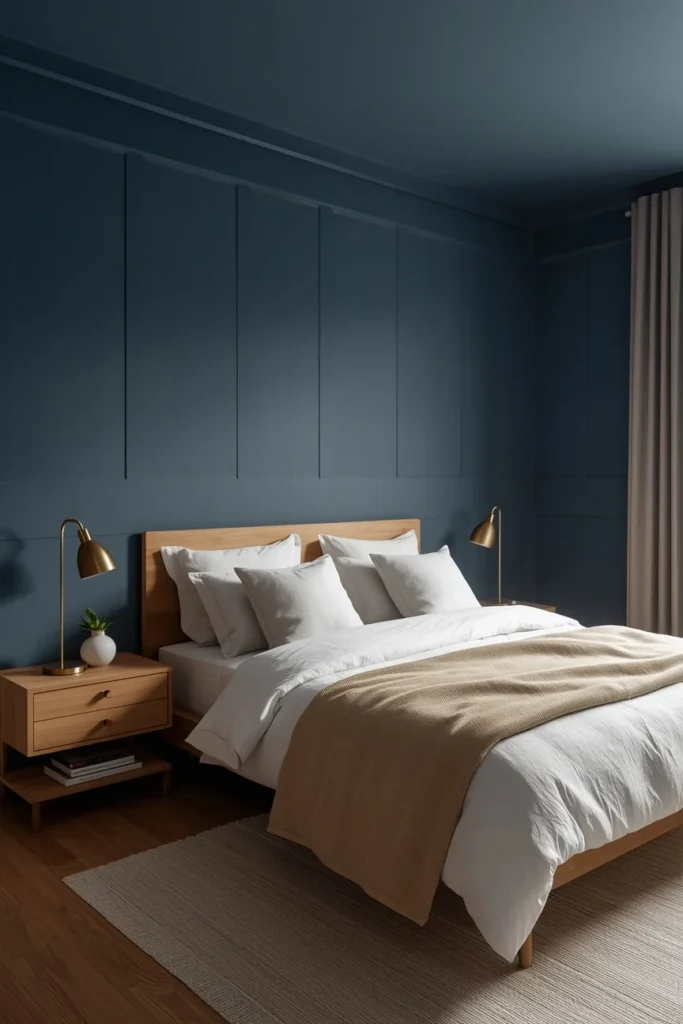
15. Slate Blue & Warm White — Calm With Structure
Light blue paint, with a gray backdrop that slows it down rather than letting it read as baby blue, is showing up increasingly in bedrooms — calming, structured, and quietly sophisticated.
Slate blue occupies an ideal middle ground: cool enough to feel restful, gray enough to avoid any nursery-adjacent associations, and versatile enough to pair with both warm and cool accent colors.
The palette: Slate blue walls, warm white bedding, natural wood furniture, brass or warm pewter accents.
The undertone test: True slate blue should look almost gray in low light and reveal its blue undertone only in brighter, direct light — this complexity is what separates sophisticated slate from flat, one-note baby blue.
Designer Secret: Color capping — light walls, mid-tone trim, and a deeper ceiling, all from the same hue family — draws the eye upward and introduces architectural drama without overpowering the room. This works exceptionally well with slate blue’s range of tonal depth.
16. Black & Gold Art Deco — Cinematic Glamour
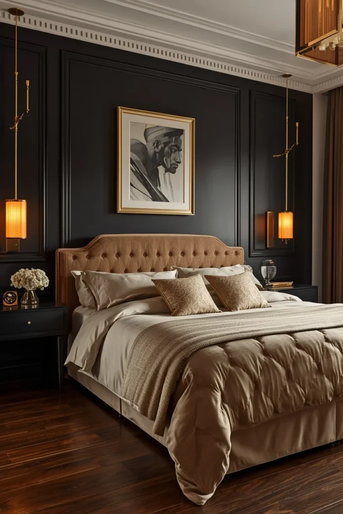
For bedrooms that lean fully into drama, a sleek black-and-gold palette enhanced by warm amber accents creates a striking retreat that blends bold art deco influences with modern sophistication.
This is the boldest palette in this guide — and it requires the most disciplined execution. Black demands warm light, warm metals, and restraint everywhere else to avoid reading as cold or oppressive.
The palette: Matte black walls (or a single feature wall), warm gold and brass hardware, amber-toned lighting, ivory or champagne bedding for contrast.
The execution rule: Layer bold contrasts carefully — dark walls, warm lighting, rich accent colors — and introduce statement art or a single sculptural piece to create character without overwhelming the senses.
Who this is for: Confident decorators with a primary suite that receives good natural light during the day. This palette is not recommended as a first wallpaper or paint experiment — it rewards commitment and careful lighting planning.
17. Warm White & Pale Peach — The Small Room Expander
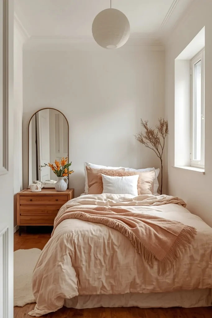
Soft neutrals like off-white and pale peach reflect light beautifully and make compact rooms feel open and airy — a critical consideration for smaller bedrooms or guest rooms where space is at a premium.
Unlike stark white, pale peach carries enough warmth to feel inviting rather than clinical, while still maintaining the light-reflective qualities that make small spaces feel larger.
The palette: Warm white walls, pale peach bedding and soft furnishings, warm wood accents, minimal brass details.
The reflectivity principle: Pearl, eggshell, and champagne whites create the illusion of a larger space — useful for smaller or more cramped bedrooms — while pale peach adds just enough color to prevent the room from feeling sterile.
Small Space Tip: This is the definitive small bedroom palette. Combine it with a large mirror opposite the window to maximize the light-bouncing effect even further.
18. Forest Green Paneling & Crisp White — Heritage Home Energy
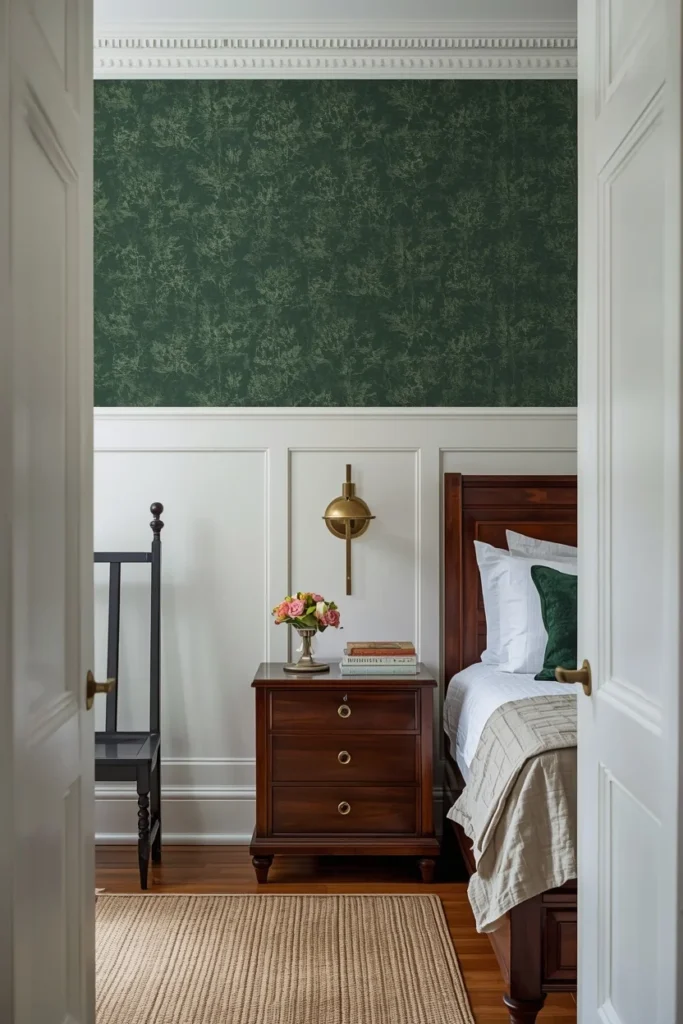
A deeper take on green than sage, forest green paired with crisp white paneling brings heritage-home energy and a sense of permanence that few other palettes can match.
This combination works especially well in older homes or rooms with existing architectural detail (picture rails, paneling, crown molding) — the green deepens the sense of history while the white paneling keeps the room from feeling dark or dated.
The palette: Forest green walls or wallpaper above white paneling, crisp white trim and bedding, brass or aged bronze hardware, dark wood furniture.
Color Pairing: Forest green + crisp white + brass + dark walnut = the definitive heritage bedroom palette.
Quick Tip: Farrow & Ball’s Calke Green is frequently cited by designers as one of the most timeless green paints available — it subtly draws the outside in without feeling too literal or themed.
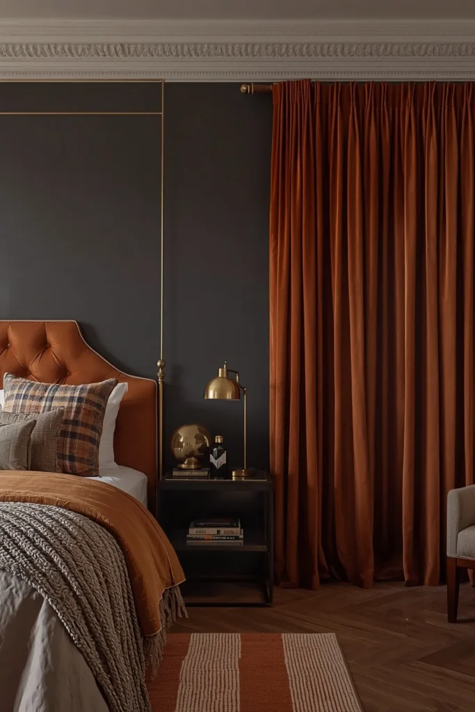
19. Rust & Charcoal — Bold Independent Spirit
Independent and boutique hotels often stand out precisely because they embrace playful, unexpected contrasts — mustard with teal, or in this case, rust with charcoal — adding personality and appeal that more conservative palettes simply can’t achieve.
This combination carries genuine boutique-hotel energy: it’s confident, slightly unconventional, and clearly intentional rather than safe.
The palette: Rust or burnt orange as the dominant accent (headboard, drapery, or single wall), charcoal as the grounding base, warm wood and brass to bridge the two.
The proportion rule: Charcoal should dominate as the base (walls or flooring), with rust appearing in concentrated, confident doses — bedding, a chair, or a single gallery wall — rather than spread thin across many small accents.
Common Mistake: Diluting rust into too many small accessories. The color reads as much more sophisticated in fewer, larger doses (a single substantial headboard or drapery panel) than scattered across a dozen small decorative objects.
20. Sand, Taupe & Mushroom — The Mountain Retreat Palette
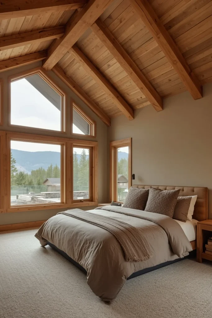
In bedrooms with soaring vaulted ceilings and wall-to-wall windows that open right up to nature and light, the most fitting palette leans entirely into soft, grounded tones — mushroom, sand, and taupe — perfect for a serene mountain or coastal escape.
This palette doesn’t rely on any single bold statement; instead, it builds richness through extremely close tonal layering, all within the warm neutral family.
The palette: Sand-toned walls, taupe and mushroom bedding layers, natural wood beams, warm stone or ceramic accents.
The architectural pairing: This palette performs best alongside natural architectural features — exposed beams, large windows, stone fireplaces — letting the room’s bones do as much work as the color itself.
Designer Secret: Resist the urge to add bold accent colors to this palette. Its entire power comes from restraint — every additional saturated color dilutes the serene, retreat-like quality that makes it work.
21. Monochrome Tonal Layering — One Color, Many Textures
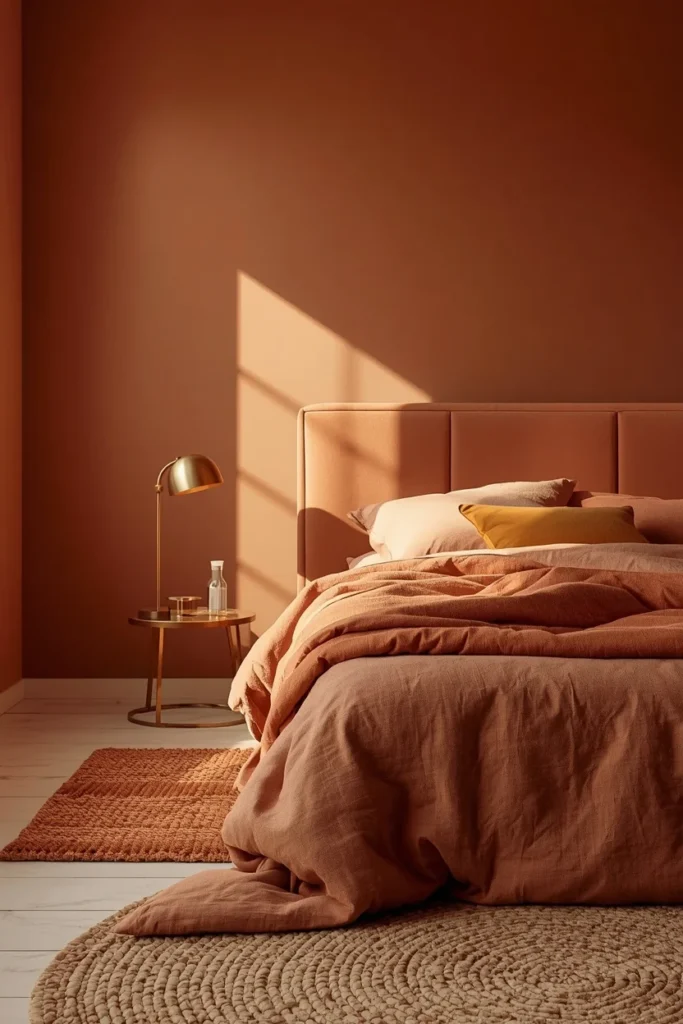
The most sophisticated bedroom color scheme isn’t a combination of colors at all — it’s a single color family, layered entirely through texture and material variation.
Terracotta walls, soft peach bedding, and even a delicate floral mural can create a layered tonal moment that feels artistic yet comforting when they all stay within one color family. Instead of mixing in too many competing shades, this approach leans entirely into a single story — varying texture (linen, velvet, matte paint) to create dimension instead of relying on color contrast.
The technique:
- Choose one color family (warm terracotta, sage, or greige all work beautifully)
- Select three to four tonal variations within that family — lightest for bedding, mid-tone for walls, deepest for one accent piece
- Vary the material and texture at every layer — matte paint, velvet upholstery, linen bedding, a woven rug
- Add exactly one metallic accent (brass or bronze) to prevent the palette from feeling flat
Who benefits most: Anyone nervous about color who still wants a rich, designed feeling. Monochrome tonal layering is the lowest-risk, highest-reward palette strategy in this entire guide — because there’s no contrast to get wrong.
STYLING TIPS
The Color Capping Technique: Layer shades from the same hue — lighter tones on the walls, mid-tones on the trim, and deeper tones on the ceiling. This draws the eye upward and introduces architectural drama without overpowering the room, and it’s one of the easiest ways to make a flat, builder-grade bedroom feel custom-designed.
The Warm Metal Rule: Across nearly every palette in this guide, warm metals — brass, aged gold, warm bronze — consistently outperform cool metals like chrome or silver. Cool metals read as clinical; warm metals read as inviting, which is the entire emotional goal of a boutique hotel bedroom.
The 70-20-10 Layering Formula: Use your dominant wall/bedding color for 70% of the room, a secondary tone for 20% (curtains, a chair, an accent wall), and a single accent color or metallic for the remaining 10%. This formula appears, in slightly varied language, across nearly every successful boutique hotel palette researched for this guide.
BUDGET ALTERNATIVES
| Designer Look | Budget Version | Estimated Saving |
| Full-room emerald or navy paint | Single accent wall in the same color | Save 60–70% on paint cost |
| Custom upholstered headboard | DIY plywood + foam + linen fabric | Save $150–$400 |
| Designer hand-painted wallpaper mural | Peel-and-stick mural in similar palette | Save $300–$1,200 |
| Brass hardware throughout | Brass spray paint on existing fixtures | Save $100–$300 |
| Genuine leather accent chair | Faux leather or vegan leather alternative | Save $300–$800 |
| Color-capped ceiling by a professional | DIY with painter’s tape and a steady hand | Save $200–$500 in labor |
SMALL SPACE ALTERNATIVES
- Want drama but worried about a small room? Use the rust-and-charcoal or burgundy-and-teal palette only on textiles (headboard, drapery) rather than the walls — the boldness reads without the visual weight.
- No budget for full repainting? Color-cap just the ceiling in a deeper tone while keeping the walls warm white — this single move creates an architectural, hotel-like effect for the cost of one gallon of paint.
- Small bedroom, low natural light? Stick to warm white and pale peach, mushroom and sand, or warm greige and ivory — the three palettes in this guide with the highest light reflectance values.
- Renting and can’t paint? Build any of these 21 palettes through bedding, a large area rug, and curtains — color schemes work even when the walls stay neutral.
COMMON MISTAKES
Mistake 1: Choosing cool-toned neutrals over warm ones Cool grays and beiges were the safe choice of the last decade — but they consistently read as sterile and uninviting compared to warm greige, mushroom, or sand. Always check the undertone before committing.
Mistake 2: Pairing dark walls with cool metals Chrome and silver hardware against navy, charcoal, or black walls reads as cold and corporate. Warm brass or bronze is essential for moody palettes to feel inviting rather than harsh.
Mistake 3: Skipping the ceiling The ceiling is the most overlooked surface in bedroom color schemes — and one of the highest-impact. Painting it the same shade as the walls, or one tone deeper, instantly elevates a simple color refresh into a full design statement.
Mistake 4: Going equal-weight on bold color combinations Burgundy and teal, rust and charcoal — these pairings only work when one color dominates (roughly 70%) and the second plays a true supporting role. Equal proportions read as visually competitive rather than intentional.
Mistake 5: Over-accessorizing a bold palette Hotels avoid clutter because every layer needs a clear purpose — too many cushions, throws, or decorative pieces make even a beautifully colored room feel busy rather than luxurious. Fewer, better pieces always win.
Mistake 6: Choosing color without testing it under your actual lighting Every color in this guide shifts under different light conditions. Test large samples in your bedroom under both daylight and your evening artificial lighting before committing to a full room.
FAQs
CONCLUSION
A boutique hotel bedroom isn’t built from expensive furniture or designer labels. It’s built from color — chosen with intention, layered with texture, and lit with warmth.
The 21 schemes in this guide span the full range, from whisper-quiet warm neutrals to confident jewel tones to grounded earthy palettes. None of them require a renovation. Most require a few gallons of paint, a thoughtful lighting plan, and the discipline to keep accessories restrained.
Pick the palette that matches how you actually want to feel walking into your room — calm, cocooned, dramatic, or sun-warmed. Test it. Live with the sample for a few days under your real lighting. Then commit fully, the way every great boutique hotel room does.
Your bedroom should feel like an exhale. Now you have twenty-one ways to make that happen.