25 Colour-Drenched Ceiling Ideas to Make Any Room Feel Like a Hug
There’s a specific kind of room that makes you exhale the second you walk in. Not because it’s big. Not because it’s expensive. It’s because the walls and the ceiling stop arguing with each other.
That’s what colour drenching does. Instead of white up top and color everywhere else, you take one shade — walls, trim, ceiling, sometimes even the door — and let it wrap the whole room in a single, soft envelope. The corners disappear. The hard line where wall meets ceiling just… goes away. What’s left feels less like a decorated box and more like a hug you can walk into.
This list rounds up 25 colour-drenched ceiling ideas, sorted by room, mood, and shade, so you can find the version that fits your space, whether that’s a rented studio apartment or a house with vaulted ceilings and crown molding to spare.
Table of Contents
What Is Colour Drenching, Exactly?
Colour drenching means painting the walls, ceiling, trim, and often the doors or built-ins of a room in one continuous color instead of the usual white ceiling and colored walls combo. It removes the visual break where wall meets ceiling, which is what gives a drenched room that soft, cocoon-like feel instead of a boxed-in one. The technique isn’t new — Georgian and Victorian homes used deep, saturated wall colors long before “colour drenching” was a hashtag — but it’s having a real moment again as homeowners move away from the all-gray, all-white rooms of the last decade.
A close cousin worth knowing about is color capping, where the ceiling gets a slightly darker or lighter shade from the same color family instead of the exact same paint. It’s a softer entry point if full drenching feels like a big leap.
1. Sage Green Cocoon Bedroom
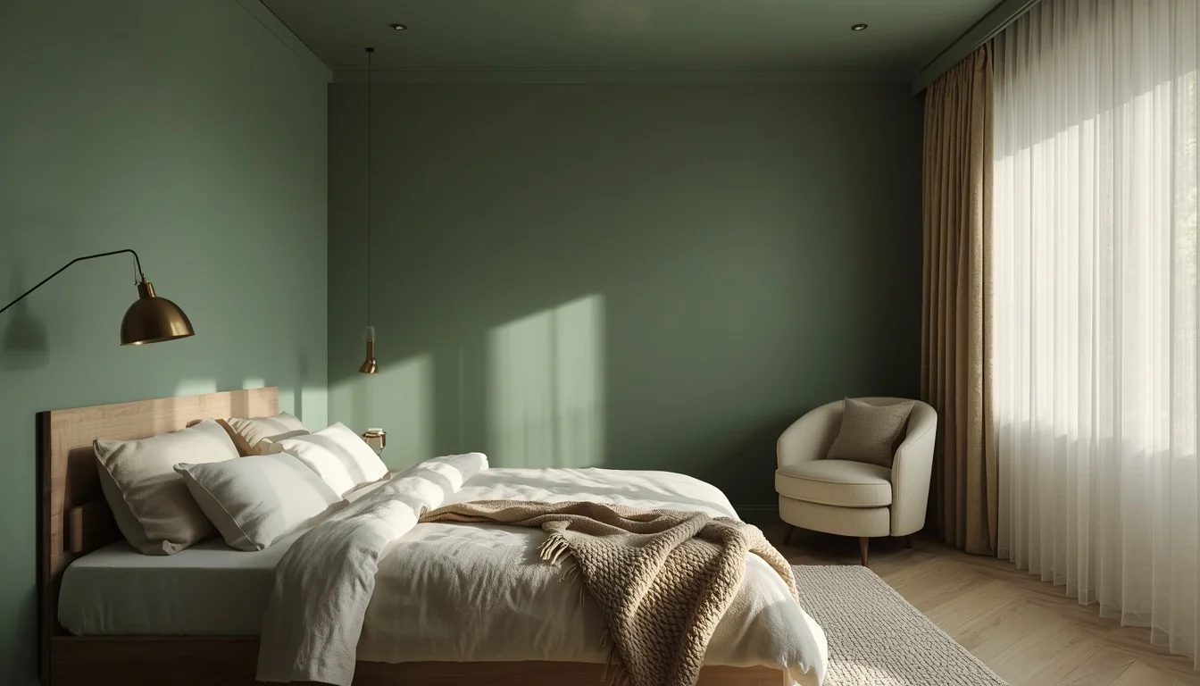
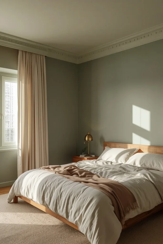
A bedroom drenched top to bottom in muted sage green reads calm, not cold, because sage sits close to gray on the color wheel and picks up warmth from lamp light at night. Keep the trim, closet doors, and even the ceiling in the exact same shade for the full cocooning effect, then let bedding in warm cream or oatmeal linen soften the contrast. A matte or eggshell finish on the walls paired with a flat finish on the ceiling keeps the color from looking plasticky under overhead light. This combination works especially well in bedrooms with lower ceilings, since the continuous color visually stretches the walls upward instead of chopping the room into a colored bottom half and a white top.
2. Deep Navy Powder Room
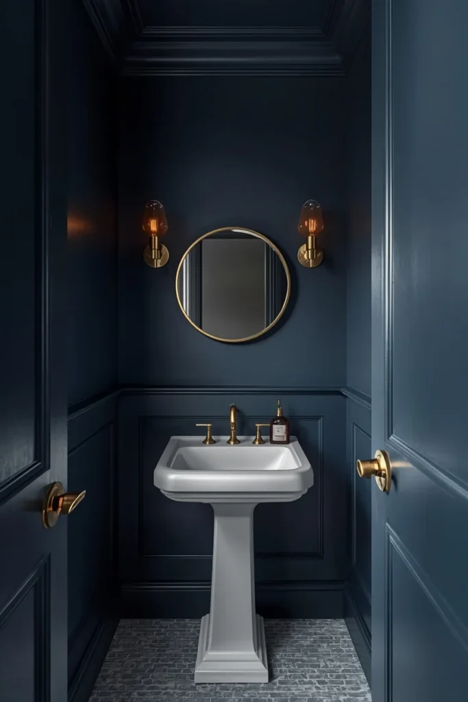
A small powder room is one of the easiest rooms to color drench because there’s less surface area, which means less paint and less commitment. Navy blue on the ceiling and walls, paired with white or brass fixtures, turns a purely functional room into one of the most memorable spots in the house. The darkness of navy actually works in the room’s favor here, since a small windowless space rarely benefits from trying to look bigger than it is — leaning into the coziness instead feels intentional. Add a small brass sconce or a single pendant light so the deep color still has something to reflect off of.
3. Terracotta Reading Nook
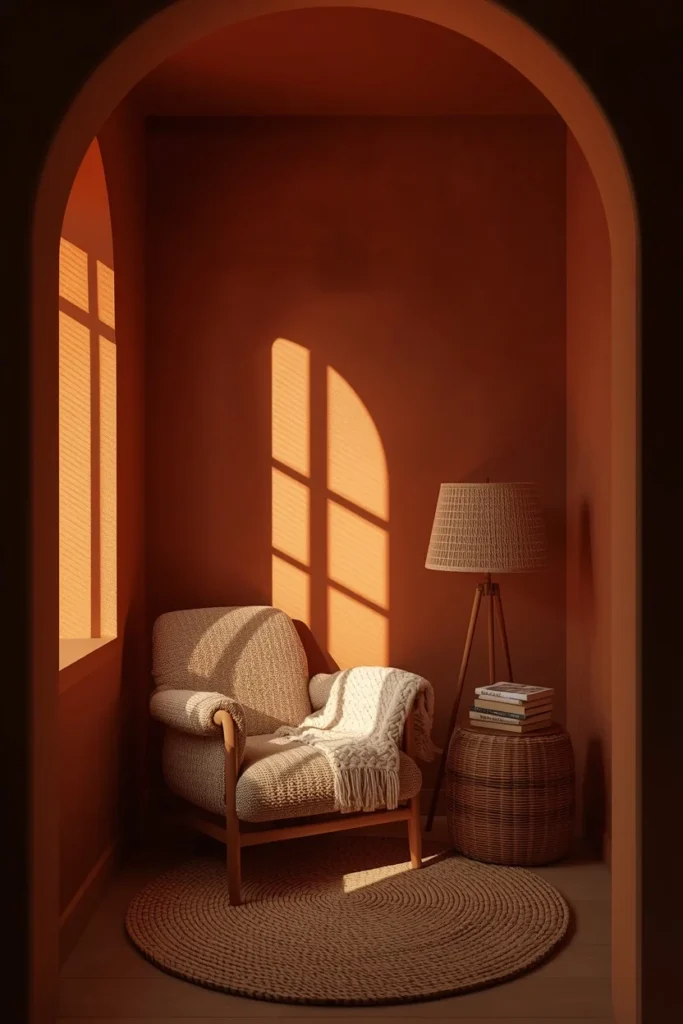
Terracotta on the ceiling gives a reading corner the feel of golden hour even when it’s overcast outside, since the warm orange undertones bounce lamp light around the room. This works best in a nook with a single armchair, a floor lamp, and minimal furniture, so the color has room to be the main event rather than competing with a lot of pattern. Pair it with woven baskets, a jute rug, and unlacquered brass hardware to keep the palette grounded and avoid a costume-y, overly saturated look. Because terracotta reads as earthy rather than bright, it works in both older homes with original molding and newer builds with plain drywall.
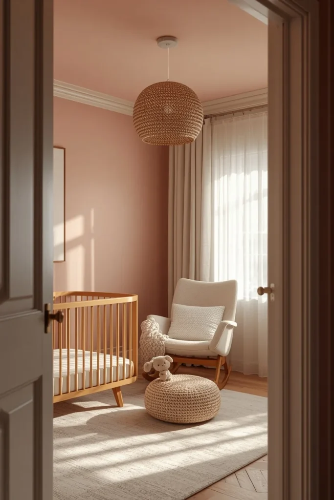
4. Dusty Rose Nursery
A nursery drenched in dusty rose skips the expected pastel-pink-on-white-walls look and instead wraps the whole room in a soft, grown-up version of pink that won’t need repainting once the baby turns into a toddler. Keeping the crib, glider, and curtains in neutral tones like oat, white, or natural wood lets the wall-and-ceiling color stay the focal point without the room tipping into overly sweet. This approach also softens overhead lighting, which matters in a room where a parent might be in and out at all hours. A flat or matte finish keeps the color from looking glossy or nursery-cliché under a ceiling light.
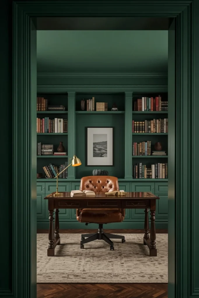
5. Bottle Green Home Office
Bottle green on the ceiling of a home office creates a kind of visual boundary that separates work time from the rest of the house, almost like walking into a different mood the second you sit down. Deep green pairs especially well with a wood desk, leather chair, and brass desk lamp, since those warm materials keep the space from feeling like a corporate conference room. Bookshelves painted the same bottle green as the ceiling, rather than left white, help the whole room read as one cohesive shell instead of a green box with white shelves stuck in it. This is a strong pick for a small or windowless office, since the saturation gives the room a sense of purpose instead of feeling like leftover space.
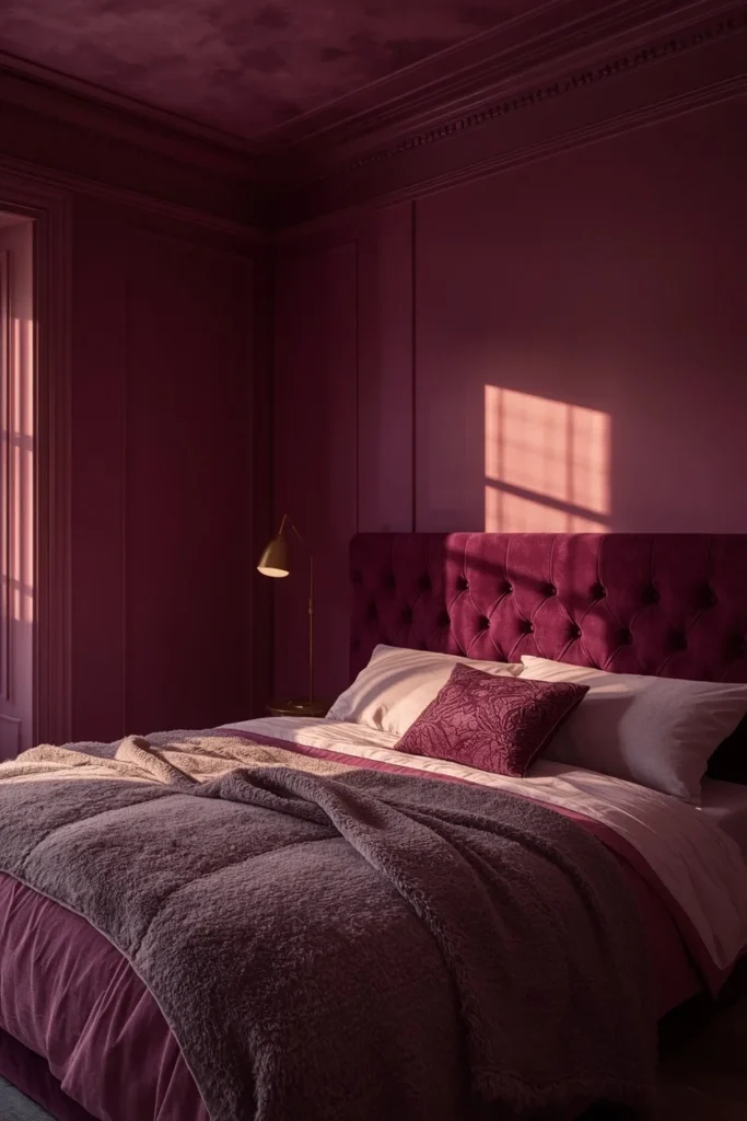
6. Warm Plum Velvet Bedroom
Plum is deep enough to feel dramatic but warm enough to still read as cozy rather than gothic, especially when it’s paired with velvet textures and warm brass lighting. Drenching the ceiling in plum lowers the visual height of a tall bedroom, which can make an oversized room feel more intimate at night. Layer in a velvet headboard, a mohair or wool throw, and a vintage brass floor lamp to keep the materials as rich as the color itself. Because plum reads differently in daylight versus lamp light, it’s worth testing a sample swatch on the actual ceiling, not just the wall, before committing.
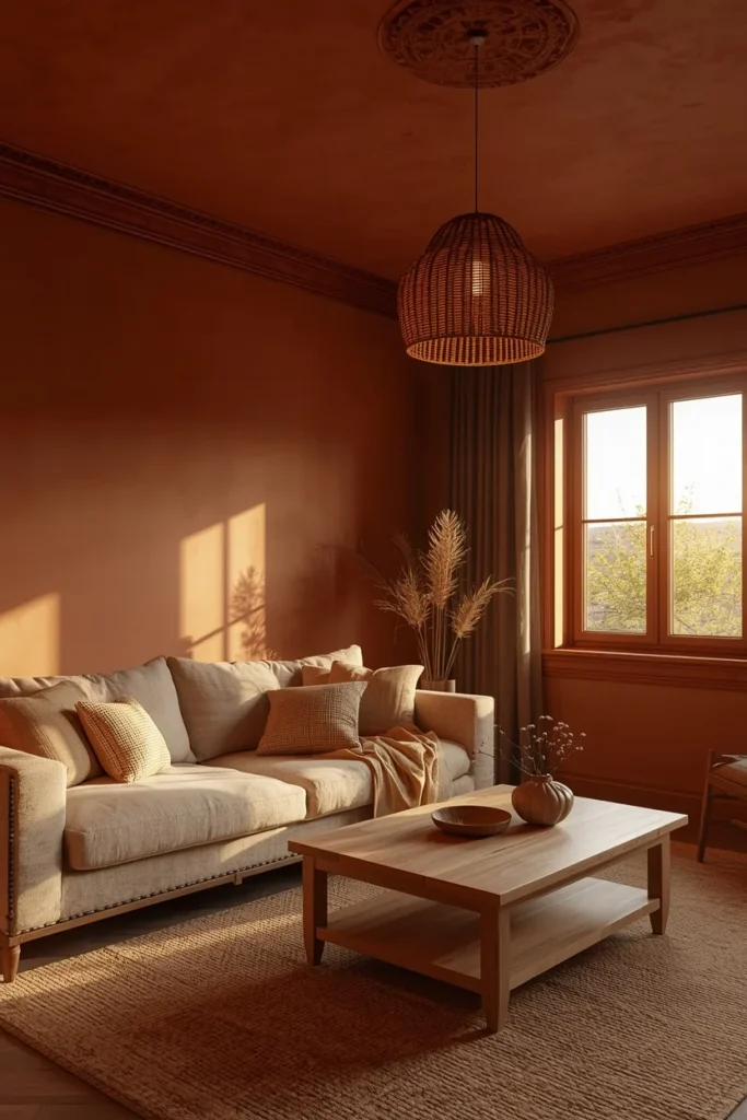
7. Clay-Drenched Living Room
A clay or burnt-sienna living room ceiling gives an open-plan space a defined identity, especially useful when the living room bleeds into a kitchen or hallway without walls to separate them. Because clay sits between orange and brown, it pairs naturally with linen sofas, wood coffee tables, and woven pendant lights without needing a lot of additional color. Keep window trim in the same clay tone rather than white to avoid breaking up the color envelope right where natural light hits hardest. This shade also photographs beautifully at sunset, which is worth knowing if the room faces west.
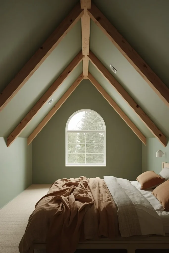
8. Eucalyptus Green Vaulted Ceiling
Vaulted ceilings are one of the best candidates for colour drenching because the extra height means the color has room to breathe without making the space feel closed in. Eucalyptus, a slightly grayer cousin of sage, works especially well on angled ceiling planes since it reads consistently whether the light hits it directly or at a slant. Leave the exposed wood beams, if there are any, in their natural finish so the green has a warm material to play off of. This pairing tends to work in bedrooms and living rooms with big windows, since the height and the light keep a dark color from feeling heavy.
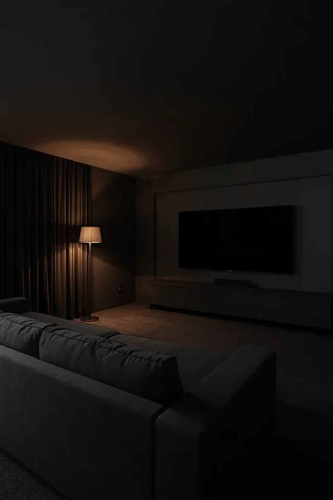
9. Moody Charcoal Media Room
A media or TV room benefits from a dark, drenched ceiling because it reduces glare and screen reflection while making the room feel more like an actual theater. Charcoal or near-black paint on the ceiling and walls also makes a projector screen or TV look sharper by comparison, since there’s less competing light and detail around it. Pair the dark shell with a substantial sectional, floor lamps on dimmers, and blackout curtains to lean fully into the cinematic mood. This is a case where a darker sheen, like matte, matters even more than usual, since a glossy finish on a near-black ceiling can create distracting reflections from screen light.
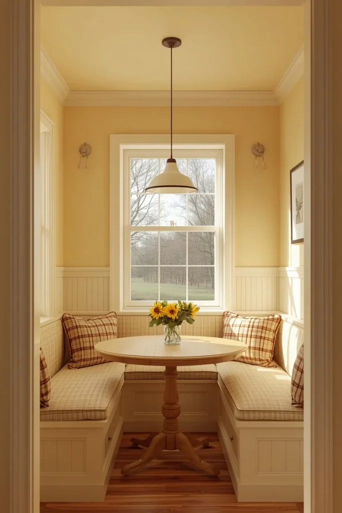
10. Butter Yellow Kitchen Nook
A butter yellow ceiling over a breakfast nook or small kitchen eating area brings warmth into a space that usually leans heavily on white cabinets and stainless steel. Because yellow can tip bright or garish fast, choosing a muted, buttery tone rather than a primary yellow keeps the drenched ceiling from overwhelming the room. This works particularly well in nooks that get strong morning light, since the yellow amplifies that golden-hour feeling at breakfast time. Keep cabinetry and counters neutral so the ceiling color has visual space to stand out rather than competing with patterned tile or colorful counters.
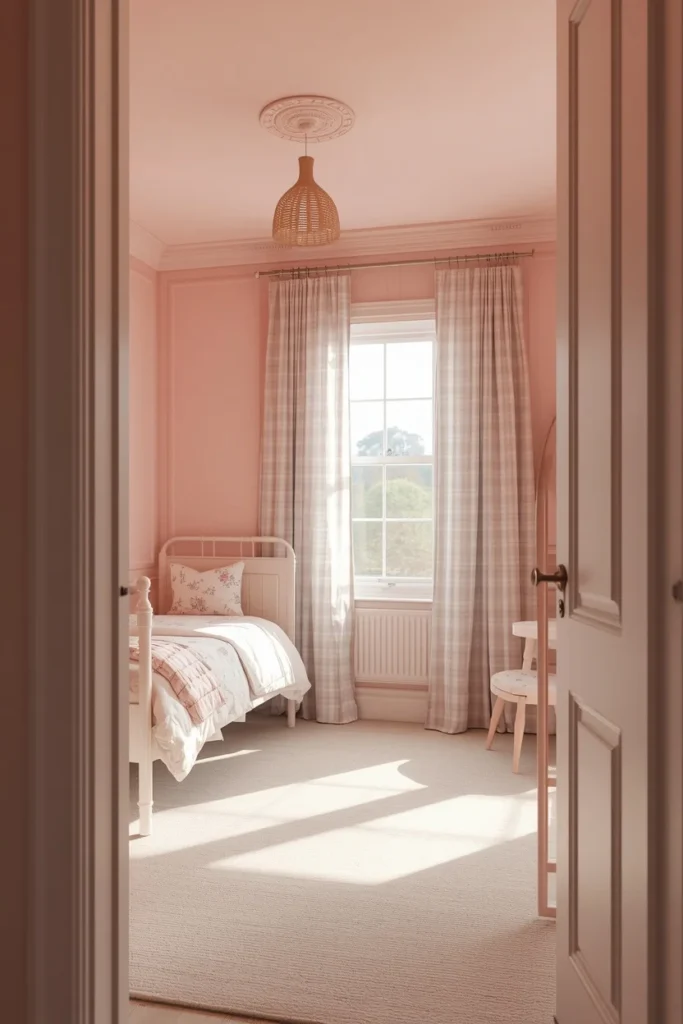
11. Blush Pink Girl’s Bedroom
For a kid’s or teen’s bedroom, blush pink drenched from ceiling to floor trim gives a grown-up alternative to the typical pastel pink accent wall. Painting the ceiling the same shade rather than leaving it white makes even a small bedroom feel intentional and finished, not like a room that’s still waiting to be decorated. Mixing in patterned bedding, like a floral or gingham duvet, against the solid pink shell keeps the room from reading as flat or one-note. Because kids’ taste changes, this is a good candidate for a mid-tone blush rather than a very saturated pink, since it ages more gracefully as the room’s use shifts over the years.
12. Deep Chocolate Brown Dining Room
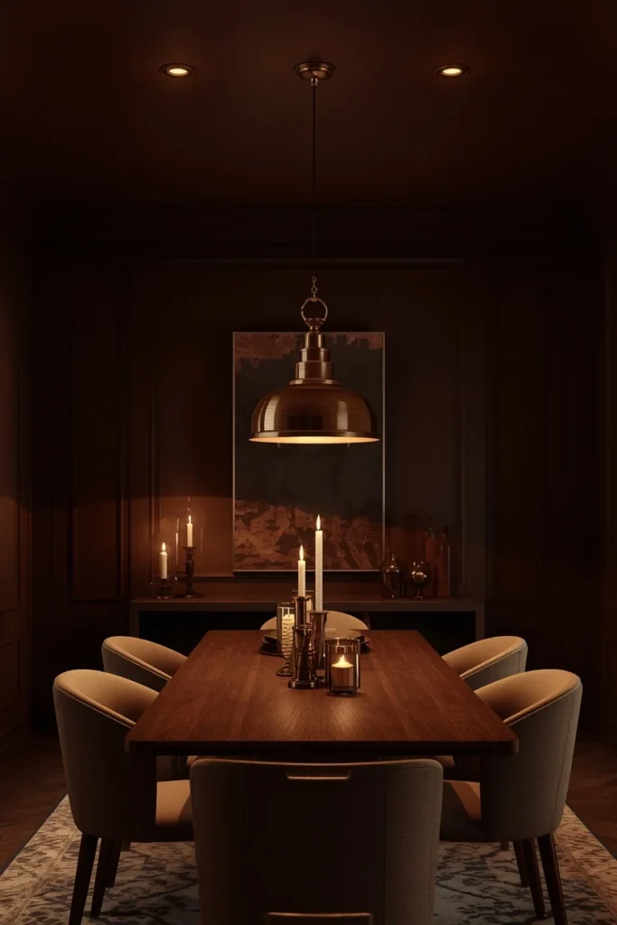
Chocolate brown on a dining room ceiling, paired with the same tone on the walls, creates the kind of restaurant-like intimacy that makes a dinner party feel like an occasion rather than a routine meal. Brass or warm-toned pendant lighting above the table is almost required here, since the dark ceiling needs a strong light source to keep the room from reading as cave-like. Wood furniture in a similar or complementary tone helps the whole space feel intentional instead of like brown paint slapped over a random room. This shade works especially well in dining rooms that are only used in the evening, since candlelight and low pendant light make chocolate brown look rich rather than heavy.
13. Slate Blue Home Library
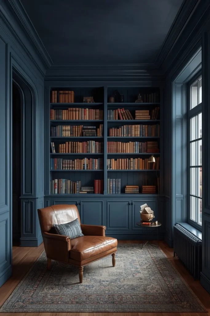
A home library or built-in reading room drenched in slate blue gives bookshelves a backdrop that makes the spines of the books pop rather than blending into white walls. Painting the ceiling the same slate blue as the shelving frame ties the whole wall of books into one cohesive architectural moment instead of a random shelf against a plain ceiling. A leather armchair, a brass reading lamp, and a wool rug round out the materials so the cool-toned blue has some warmth to balance it. This idea works particularly well in rooms with built-in millwork, since the drenched color highlights the trim details rather than hiding them.
14. Olive Green Kitchen Ceiling
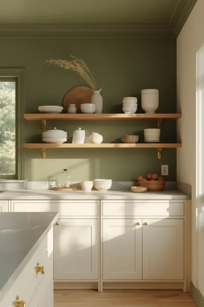
Olive green is having a real moment in kitchens because it pairs naturally with brass hardware, wood cutting boards, and cream cabinetry without needing a lot of extra styling. Drenching just the ceiling and upper walls in olive, while keeping lower cabinets in a lighter tone, gives a kitchen visual depth without the full commitment of an all-olive room. This works especially well in kitchens with exposed beams or a bulkhead, since the change in ceiling height gives a natural stopping point for the color. Open shelving styled with ceramic bowls and simple glassware keeps the room from feeling too dark, since olive can lean heavy without enough negative space around it.
15. Burnt Orange Sunroom
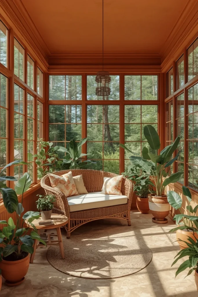
A sunroom or plant-filled reading room drenched in burnt orange leans into the golden, greenhouse-like light these rooms usually already have. Because sunrooms often have a lot of window glass and less wall space, the ceiling ends up doing more visual work than in a typical room, making the color choice matter even more. Filling the space with plants in terracotta pots and a rattan daybed keeps the palette earthy rather than tipping into a costume-like orange. This idea works particularly well in three-season rooms, since the warm color makes the space feel inviting even as the weather starts to cool.
16. Lavender Drenched Guest Room
Lavender on the ceiling of a guest room gives visitors a version of a hotel-like retreat without needing a full renovation. A cooler, grayed-down lavender rather than a bright purple keeps the room feeling restful instead of theme-y, especially when paired with white or cream bedding. Painting the closet doors and trim the same lavender rather than leaving them white keeps the room from looking unfinished, since a guest room often gets less daily attention than the rest of the house. This is a good pick for a guest room that doubles as an occasional office or craft space, since lavender tends to feel calm without being sleepy.

17. Forest Green Hallway and Staircase Ceiling
Hallways and staircases are transitional spaces that rarely get much design attention, which makes them a low-risk place to try a bold, saturated color like forest green. Drenching the ceiling along a stairwell, where the ceiling angle changes as it follows the stairs, adds architectural interest to a space that’s usually just a pass-through. Because these areas often get less natural light, a slightly glossier finish than usual, like satin, helps bounce whatever light is available around the space. Gallery-wall art in warm wood frames against the forest green backdrop gives the eye something to focus on as you move through the space.

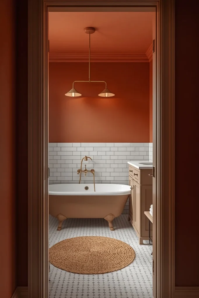
18. Warm Terracotta Bathroom Ceiling
A full bathroom drenched in warm terracotta, ceiling included, turns an often-overlooked room into one of the most photographed spots in the house. Because bathrooms deal with humidity, choosing a paint labeled for bathrooms or high-moisture areas matters more here than in almost any other room on this list. Pairing the terracotta with white tile, brass fixtures, and a woven bath mat keeps the space grounded rather than overwhelming. This approach works especially well in a windowless bathroom, since the warm tone makes up for the lack of natural light in a way a white ceiling never could.
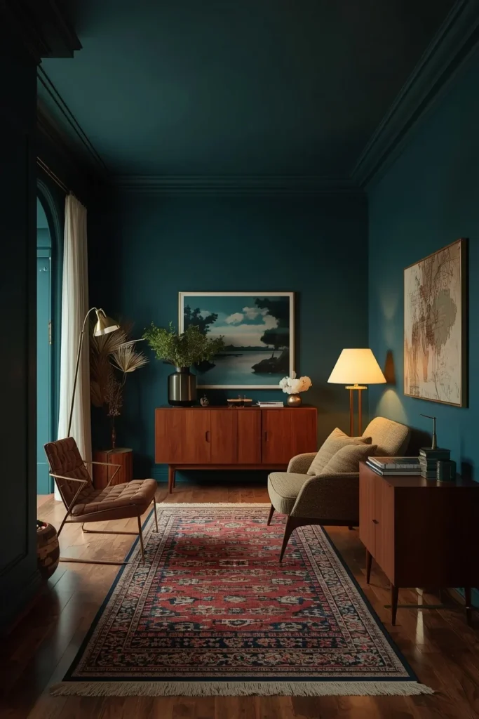
19. Deep Teal Statement Ceiling
Teal sits in an interesting spot between blue and green, which makes a drenched teal ceiling feel a little more unexpected than the now-familiar navy or sage options. It pairs especially well with warm wood tones and brass, since teal on its own can read cold without something to balance it. This shade works well in a formal living room or a den where you want the room to feel a bit more considered than an everyday hangout space. Because teal shifts noticeably between daylight and lamp light, it’s worth living with a large sample board on the actual ceiling for at least a few days before committing to the full room.
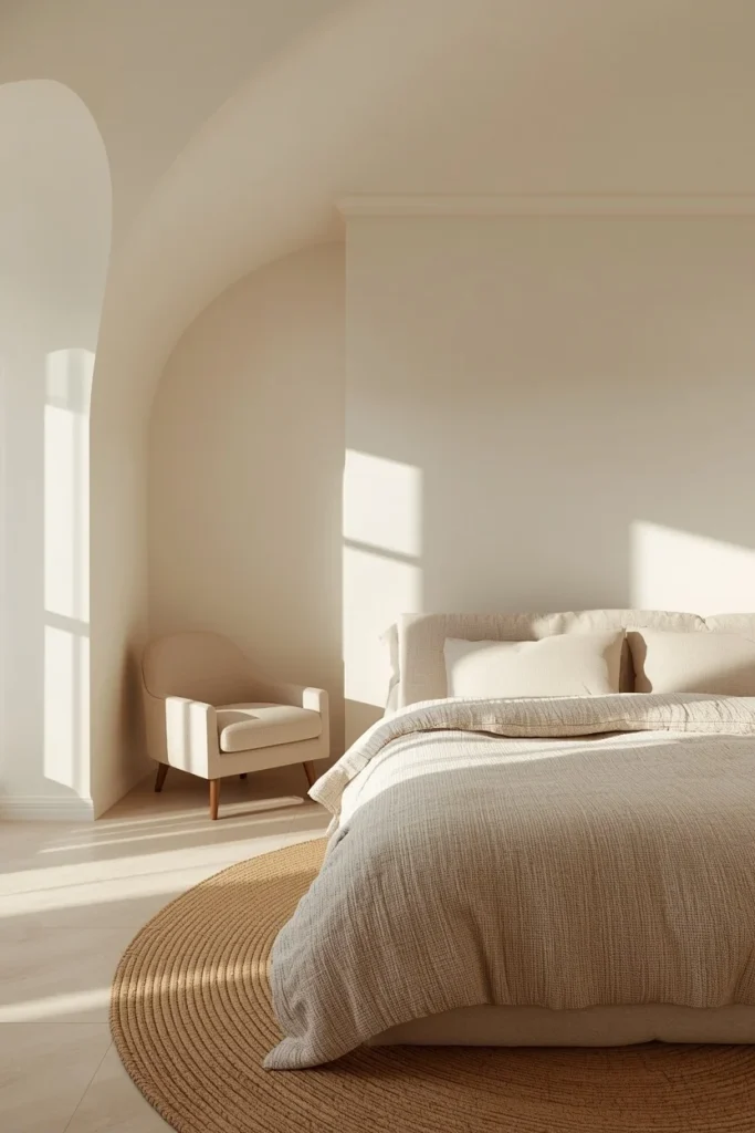
20. Cream and Ivory Tonal Drench
Not every colour-drenched room needs to be dark or saturated — a warm cream or ivory ceiling that matches warm cream walls creates the same enveloping effect with a much softer, quieter result. This tonal approach works well for anyone who wants the cocooning benefit of drenching without a bold color commitment, and it’s especially forgiving in rooms with less natural light, since cream still reflects brightness. Adding texture through a boucle chair, a linen duvet, and a jute rug keeps an all-cream room from feeling flat or sterile. This is often the easiest starting point for someone trying colour drenching for the first time.
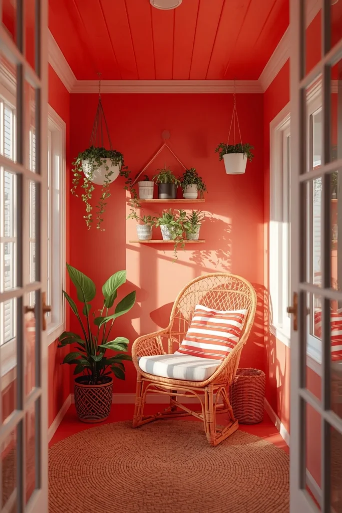
21. Coral Drenched Sunroom Nook
A smaller coral-drenched nook within a sunroom or enclosed porch gives a playful jolt of color without needing to commit an entire house to a bright shade. Coral works particularly well with rattan furniture, striped textiles, and greenery, echoing a resort or coastal feel even in a landlocked home. Keeping the coral contained to one nook, rather than an entire open living space, lets the color stay fun instead of overwhelming. A satin or eggshell finish helps coral catch light in a way that keeps it from looking flat under midday sun.
22. Aubergine Dining Room Ceiling
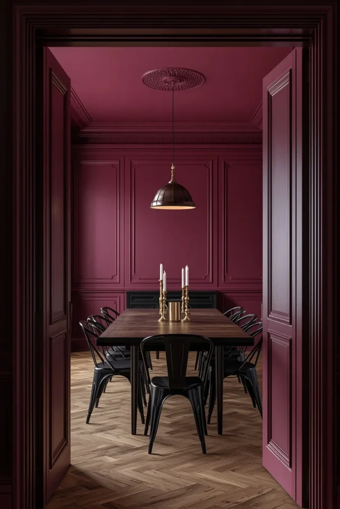
Aubergine, a deep purple-brown, gives a dining room a formal, jewel-box feeling that’s hard to get from any lighter color. It pairs beautifully with black metal chair frames, brass candlesticks, and a dark wood table, since the whole palette leans rich and saturated together. Because aubergine can read almost black in low light, dimmable lighting is worth prioritizing so the room can shift between a bright, usable space and a moody evening one. This shade tends to work best in dining rooms used primarily at night, where the color has a chance to show its full depth under warm artificial light.
23. Color Capping Gradient Ceiling
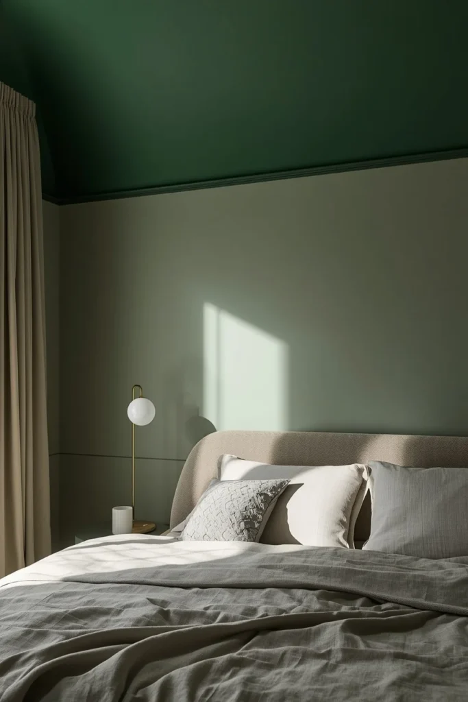
For anyone who wants the drenched effect without painting the ceiling the exact same shade as the walls, color capping offers a softer middle ground by using a slightly darker or lighter tone from the same color family on the ceiling. A room might have walls in a mid-tone sage, for example, with the ceiling capped in a deeper forest green from the same paint family, creating a gradient rather than a flat block of one color. This technique still removes the harsh white break at the ceiling line, but it reads as more intentional and layered than a single flat hue. Color capping is a strong choice for anyone nervous about full drenching, since it delivers a similar cozy effect while feeling closer to a traditional two-tone room.
24. Sloped Attic Ceiling in One Warm Color
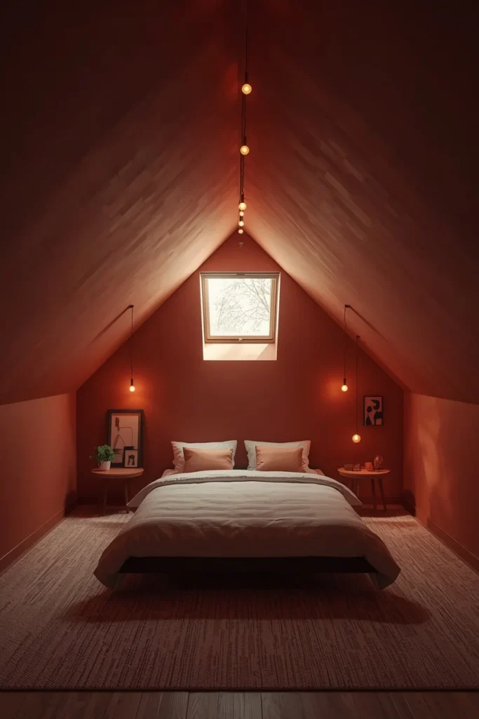
Attic bedrooms and converted lofts often have awkward angled ceilings that are hard to decorate around, and colour drenching solves that problem by painting every angle, nook, and wall in the same warm tone so the odd geometry stops standing out. A warm clay or dusty terracotta works particularly well here, since it makes the low, sloped sections feel cozy rather than cramped. Skylights or small dormer windows benefit from having their trim painted the same color too, so the light source blends into the color story instead of interrupting it. This approach turns what could be an awkward room into one of the coziest spots in the house, since the uniform color makes the unusual shape feel like a design choice rather than a limitation.
25. Beamed Ceiling Uniform Paint (Farmhouse Style)
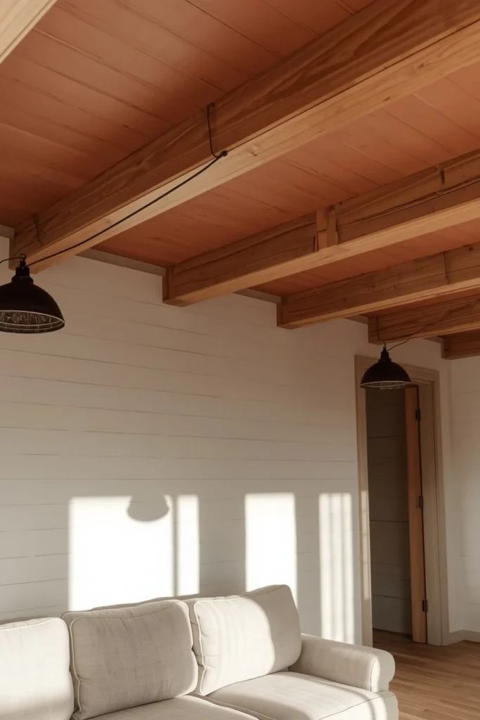
For rooms with exposed wood beams, painting both the ceiling and the beams the same color, rather than leaving beams in natural wood against a painted ceiling, creates a more cohesive farmhouse-meets-modern look. A warm off-white or soft clay tone across both the flat ceiling sections and the beams keeps architectural detail visible through shadow and texture rather than color contrast. This works particularly well in kitchens and living rooms with shiplap walls, since the uniform paint ties the beams, walls, and ceiling into one continuous material story. Leaving light fixtures in black or brass against the painted beams gives the eye a small, deliberate point of contrast within the otherwise unified color scheme.
Styling Tips for a Colour-Drenched Ceiling
- Match the sheen to the room’s function: flat or matte for bedrooms and living rooms, satin for kitchens and bathrooms where moisture and cleaning matter.
- Test paint on the actual ceiling, not just a wall swatch, since light hits horizontal surfaces differently than vertical ones.
- Keep trim, doors, and built-ins in the same color as the walls and ceiling for the full enveloping effect — partial drenching tends to look unfinished rather than intentional.
- Bring in warm materials like brass, wood, and rattan to balance cooler drenched colors like navy, teal, or slate blue.
- Layer at least two light sources (overhead plus a lamp or sconce) in darker drenched rooms so the color doesn’t read as flat or cave-like.
Practical Implementation Ideas
- Start with the smallest room in the house, like a powder room or nursery, to test how a drenched color feels before committing a larger space.
- Paint the ceiling first, then work down the walls, so drips and edges near the ceiling line are easier to clean up.
- Use a paint-and-primer-in-one formula on ceilings to cut down on the number of coats needed for full, even coverage.
- Order a large sample size, not just a tester pot, and paint a full poster-board section to move around the room and view under different light throughout the day.
Common Mistakes to Avoid
- Leaving trim or doors white while drenching the walls and ceiling, which recreates the exact contrast the technique is meant to remove.
- Choosing a color based only on how it looks in a paint app or on a screen, rather than checking it against the room’s actual light.
- Skipping a sample swatch on the ceiling itself, since ceiling paint often reads several shades darker under overhead light than the same color does on a wall.
- Using a glossy sheen on a very dark ceiling color, which can create distracting reflections from overhead lighting or a TV screen.
Small-Space Alternatives
Small rooms are actually some of the best candidates for colour drenching, since the technique removes visual breaks that make a tight space feel choppy. A studio apartment bedroom nook, drenched in one soft tone from ceiling to floor trim, tends to feel more finished than the same space left with white walls and a random accent piece. For renters or anyone hesitant about a full commitment, color capping the ceiling just a shade darker than the walls delivers a similar cozy effect with less paint and less risk. Peel-and-stick wallpaper in a solid, matte tone is also worth considering for a rental ceiling where painting isn’t allowed.
Budget-Friendly Alternatives
A gallon of ceiling paint typically costs less than most other home updates, which makes colour drenching one of the more affordable ways to change how a room feels. Sticking to one paint brand and formula for both walls and ceiling avoids the extra cost of specialty ceiling paint, since a quality flat or matte interior paint often works fine overhead with proper prep. Sampling with a large poster-board swatch, rather than buying and returning multiple gallons, saves money on trial and error. For anyone not ready to paint at all, a single drenched accent nook — like a reading corner or closet interior — offers a taste of the look for the cost of a sample-size pot.
Pro Styling Recommendations
Designers who work with colour drenching often recommend choosing the wall color first, then testing it as the ceiling color before assuming a lighter or darker version is needed — many drenched rooms use the exact same paint code on every surface. Warm neutrals and mid-tone greens tend to be the most forgiving starting shades for a first attempt, since they read as sophisticated rather than trendy and pair easily with existing furniture. Bringing texture into a drenched room, through boucle, linen, rattan, or wood grain, matters more than usual, since a single flat color needs tactile variety to avoid feeling one-dimensional.
FAQs
Final Thoughts
A white ceiling was never a rule — it was just the default nobody questioned. Once you paint it the same color as everything else in the room, the whole space stops feeling like four walls and a lid and starts feeling like one continuous, considered place to be. Whether that’s a full navy powder room or a single sage-drenched reading nook, the effect is the same: the room feels intentional, and it feels warm. Pick one shade from this list, sample it on your actual ceiling first, and give the rest of the room a chance to catch up.