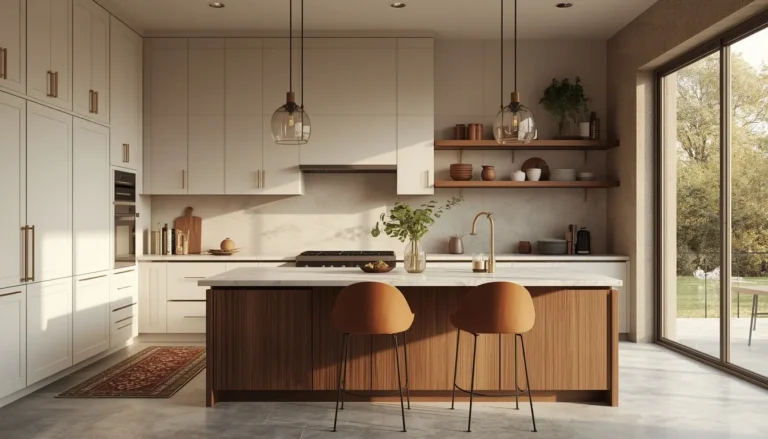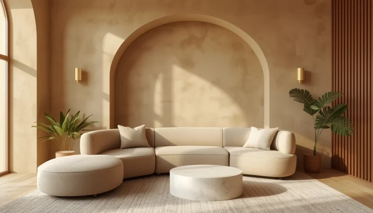
18 Colour-Drenched Kitchen Ideas for a Cabinets-to-Ceiling Monochrome Look
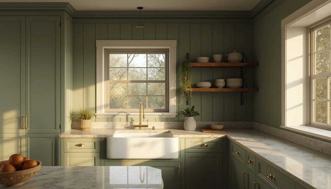
Walk into a kitchen where the walls, cabinets, trim, and ceiling are all the same color, and something shifts. The room stops feeling like a collection of separate parts and starts feeling like one continuous, calming space. That’s the whole idea behind colour drenching — one hue, used everywhere, with texture doing the rest of the work.
It’s not a shortcut and it’s not the easy way out. Done right, it takes more planning than a standard white kitchen, because the color has nowhere to hide. These 18 colour-drenched kitchen ideas break down exactly which shades work, what materials to pair them with, and how to keep a monochrome kitchen from ever feeling flat.
Table of Contents
What Colour Drenching Actually Means?
Colour drenching is the practice of painting every fixed surface in a room — walls, ceiling, trim, cabinets, and sometimes even open shelving — in a single paint color, or very close variations of it. In a kitchen, that usually means the same hue on the cabinetry, the wall behind it, the window trim, and the ceiling, with no white breaks in between. The effect removes visual stopping points, which makes the room feel cohesive rather than segmented into “cabinet color” and “wall color.” Texture, hardware finish, and countertop material become the tools that keep the space from feeling flat, since color alone is no longer doing all the work.
1. Sage Green Tongue-and-Groove Drench
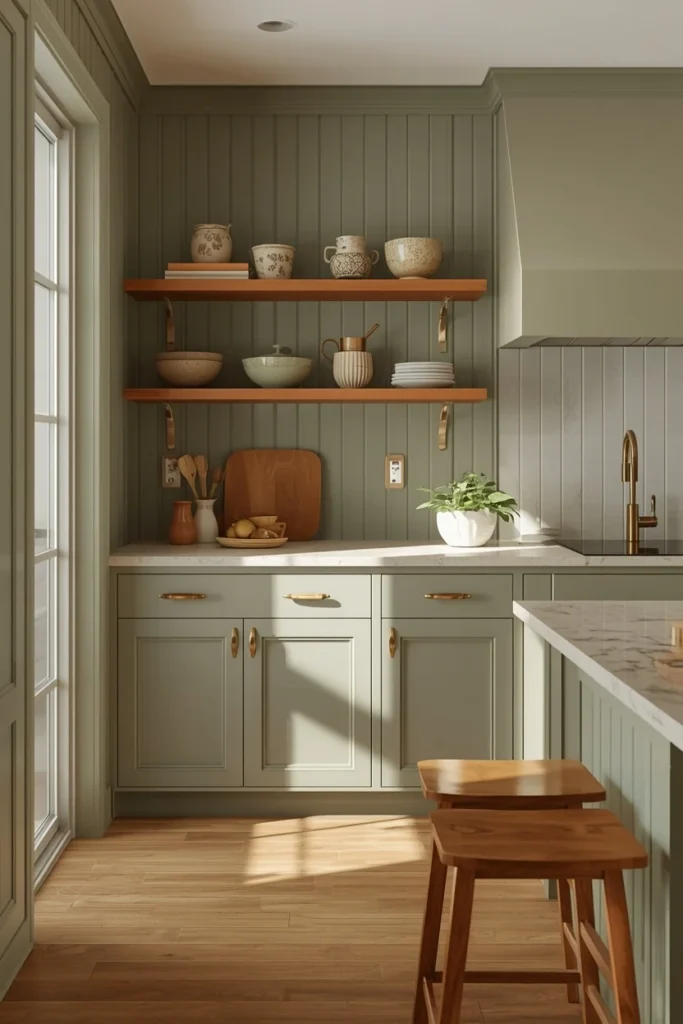
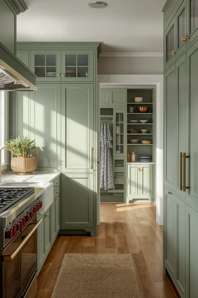
Sage is one of the easiest entry points into colour drenching because it reads as calm rather than dramatic, which makes it forgiving in kitchens with less natural light. Running vertical tongue-and-groove paneling up the lower walls in the same sage as the cabinets adds dimension through shadow lines instead of a second color, so the room still feels layered. Brushed brass pulls and a honed quartz or limestone counter keep the palette warm, while oak counter stools bring in the one material break the eye needs. Open shelving painted to match the walls, rather than left white, keeps the drenched effect unbroken even where storage is on display. This combination photographs particularly well in daylight, since sage shifts subtly from cool to warm depending on the light hitting it.
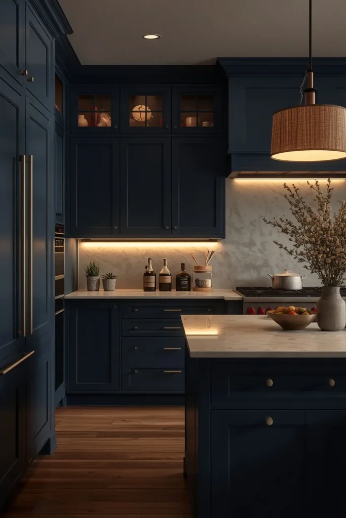
2. Deep Navy High-Gloss Drench
Navy is one of the most dramatic colour-drenching choices because it absorbs light rather than bouncing it, which means the room needs intentional lighting layering to avoid feeling like a cave after dark. Painting cabinets, walls, and trim in a high-gloss or satin navy, rather than flat matte, helps the color catch and reflect whatever light is available, keeping the space from reading as heavy. Warm LED strips under the upper cabinets, a fabric-shaded pendant over the island, and dimmable ceiling lights all work together to stop navy from looking flat once the sun goes down. Creamy quartz countertops and brushed brass pulls lift the palette, while a navy with slightly warm undertones, rather than an icy blue-black, keeps the room from feeling cold in spaces with limited daylight. This is a strong choice for anyone who wants their kitchen to feel like a finished, tailored room rather than a bright, casual one.
3. Terracotta Venetian Plaster Drench
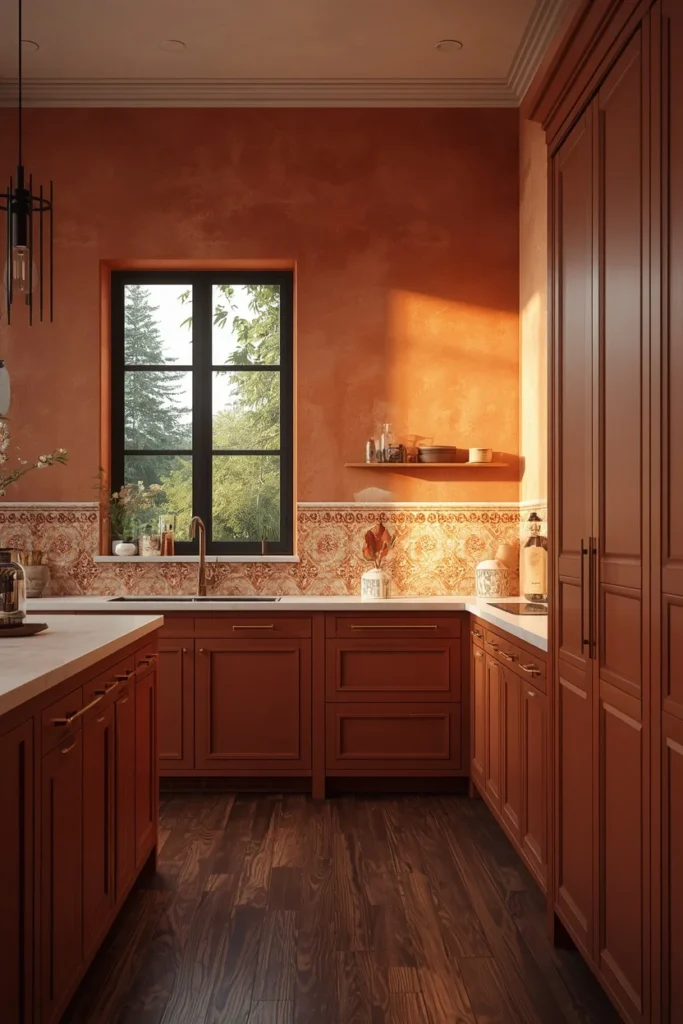
Terracotta color drenching leans into the warm, sun-baked feeling of Mediterranean kitchens, especially when the walls are finished in Venetian plaster instead of flat paint, since the plaster’s subtle texture catches light the same way sunbaked clay does. Carrying the same terracotta across cabinets, walls, and trim, then grounding it with black window frames or dark walnut flooring, keeps the warmth from tipping into an overly saccharine palette. Creamy limestone counters, handmade zellige tile on the backsplash, and woven baskets on open shelves reinforce the Mediterranean feeling without making the kitchen look themed. Matte black or aged brass hardware both work here, but chrome and polished nickel should be avoided entirely, since cooler metals make terracotta read orange instead of warm. This is one of the richer, more layered colour-drenching options, since the plaster texture alone adds a dimension flat paint can’t.
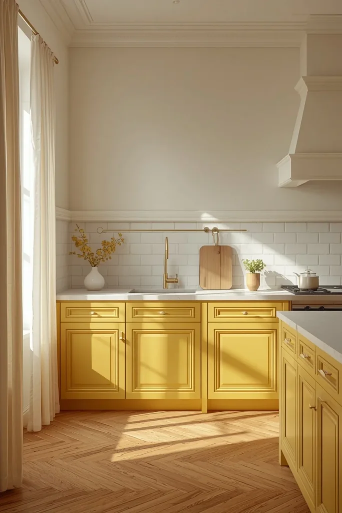
4. Butter Yellow Scandinavian Drench
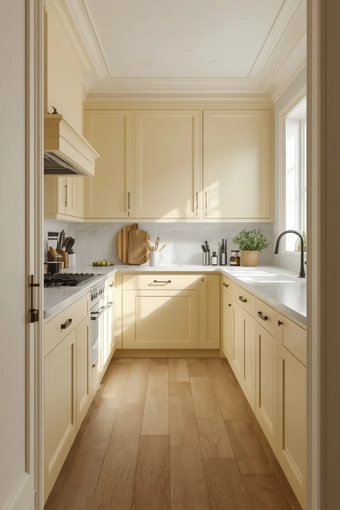
Butter yellow works best as a softer, more restrained colour-drenching choice, especially in a Scandinavian-leaning kitchen where the goal is warmth without visual noise. Rather than a bright, saturated yellow, a muted butter tone keeps the effect feeling sunny and calm instead of overwhelming, particularly when paired with pale oak flooring and simple, streamlined cabinet fronts. Matte black or brushed nickel hardware gives the yellow a clean, modern edge, while a plain white or pale stone counter keeps the overall look from tipping into overly saturated. This palette works especially well in kitchens with limited direct sunlight, since the warm undertone compensates for what natural light can’t provide. Keeping decor minimal — a single wood cutting board, one ceramic vessel — lets the wall-to-cabinet color transition stay the visual focus.
5. Charcoal Moody Drench with Brass Hardware
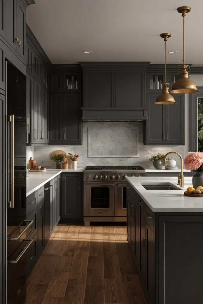
Charcoal gray color drenching creates one of the most dramatic, restaurant-kitchen-inspired looks on this list, and it works particularly well in kitchens with generous natural light that can offset the color’s depth. Painting the ceiling in the same charcoal as the cabinets and walls, rather than leaving it white, is the detail that makes this look feel intentional instead of like an unfinished dark room. Warm pendant lighting becomes essential here, since charcoal needs a golden counterpoint to avoid feeling flat or cold, and brushed or unlacquered brass hardware provides exactly that warmth against the deep gray. Pairing the charcoal with crisp white countertops or a pale marble creates contrast that keeps the kitchen from feeling like one solid block, while still preserving the drenched effect on every architectural surface. This is a strong choice for kitchens that double as entertaining spaces, since charcoal reads as sophisticated under evening lighting.
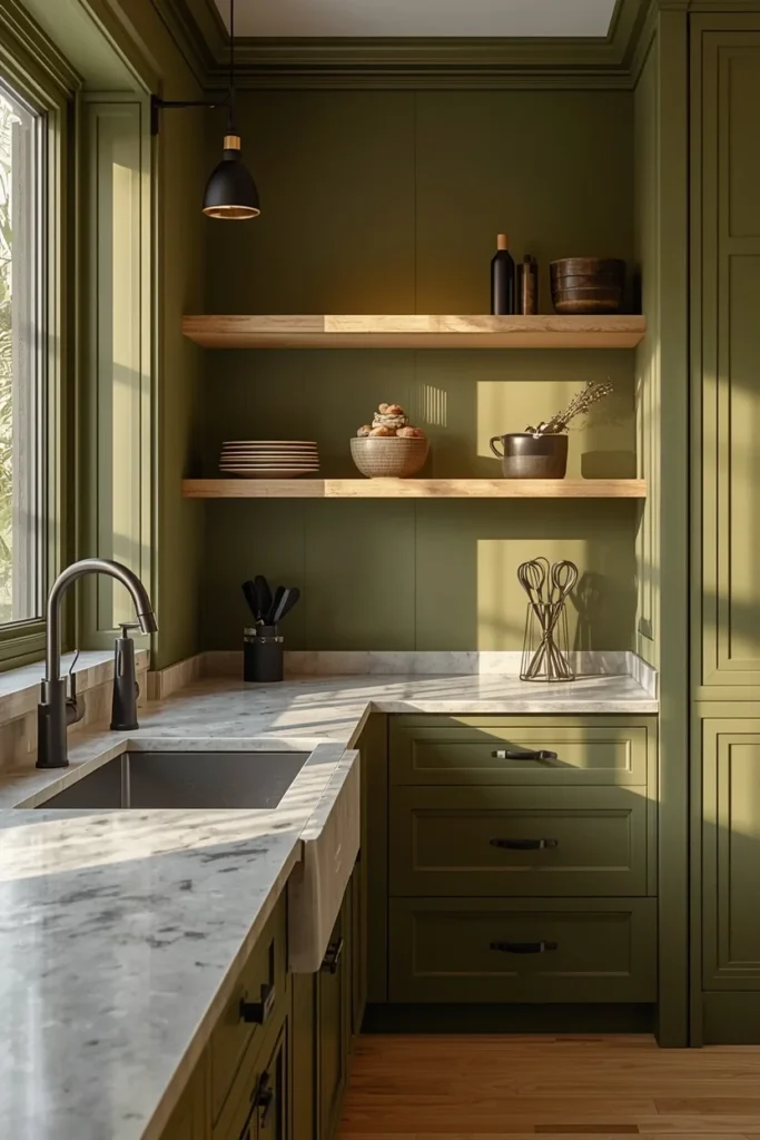
6. Olive Green Drench with Matte Black Fixtures
Olive green sits between sage and forest green on the color spectrum, giving it a slightly more grounded, earthy read that pairs naturally with matte black fixtures and warm wood tones. Carrying the olive across cabinets, trim, and walls, then finishing hardware and faucet fixtures in matte black, creates a quiet, tonal contrast that doesn’t compete with the wall color the way brass sometimes can. Natural oak open shelving, left unpainted against the olive backdrop, becomes the one intentional break in the drenched effect, giving the eye a place to rest. A honed soapstone or concrete-look counter continues the earthy, matte materials story running through the rest of the room. This palette tends to photograph as slightly moodier than sage, making it a good option for kitchens that get strong afternoon light and can handle a deeper tone without feeling dark.
7. Blush Pink Soft Drench
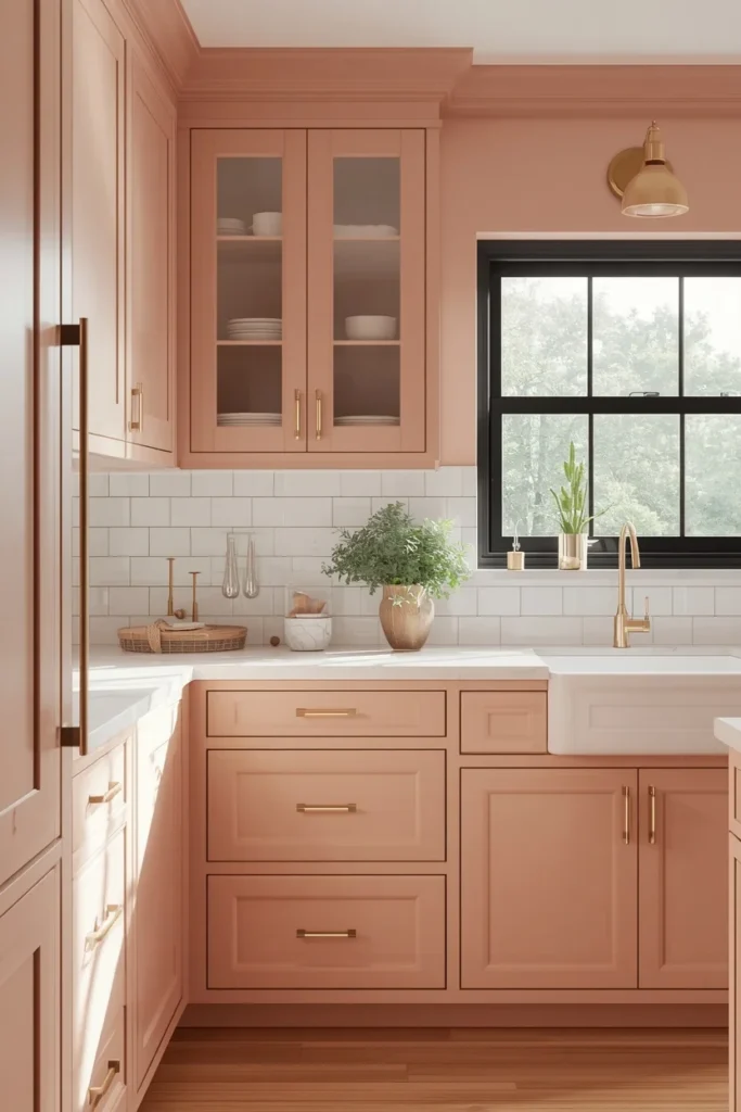
A soft, dusty blush pink color-drenched kitchen reads as fresh and mood-boosting rather than overly sweet, especially when the shade leans muted rather than bright. Painting cabinets, walls, and trim in the same blush, then pairing it with warm neutral finishes like brushed brass or unlacquered brass hardware, keeps the palette feeling elevated instead of playful in a childish way. White or cream quartz countertops add brightness and prevent the pink from feeling too saturated across every surface. Industrial-style window frames or black door hardware provide a grounding contrast that stops the room from feeling one-note. This is a good choice for kitchens attached to open living spaces, since blush tends to read as warm and inviting rather than closing a room in the way deeper drenched colors can.
8. Warm Greige Drench with Bronze Hardware
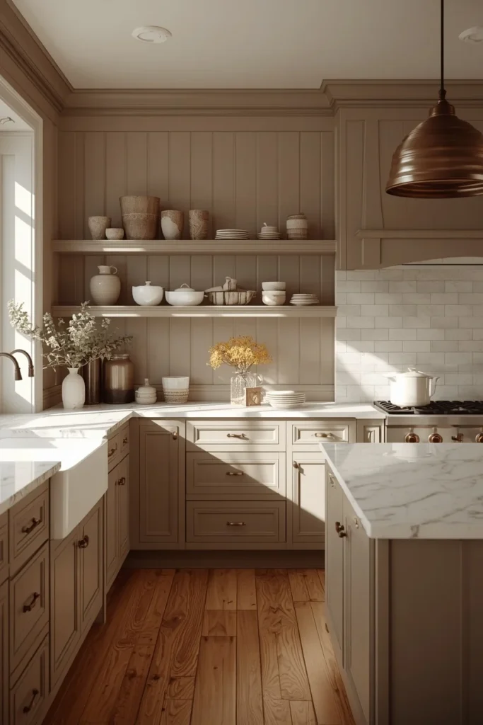
Greige — the warm gray-beige hybrid — has become one of the most popular colour-drenching neutrals because it delivers the cohesive, monochrome effect without committing to a bold statement hue. Choosing a greige with warm rather than cool undertones is critical here, since a cool-toned greige can read as flat or clinical once it covers every surface in the room. Carrying the color across cabinets, walls, and trim, then introducing warmth through natural oak flooring, brushed or antique bronze hardware, and handmade pottery on open shelves, keeps the palette from feeling sterile. Mixing paint finishes — satin on the cabinetry, eggshell on the walls — adds subtle depth even though the color itself never changes. This is one of the most versatile options on this list, since greige pairs easily with almost any countertop material, from white quartz to warm-veined marble.
9. Burnt Sienna Drench
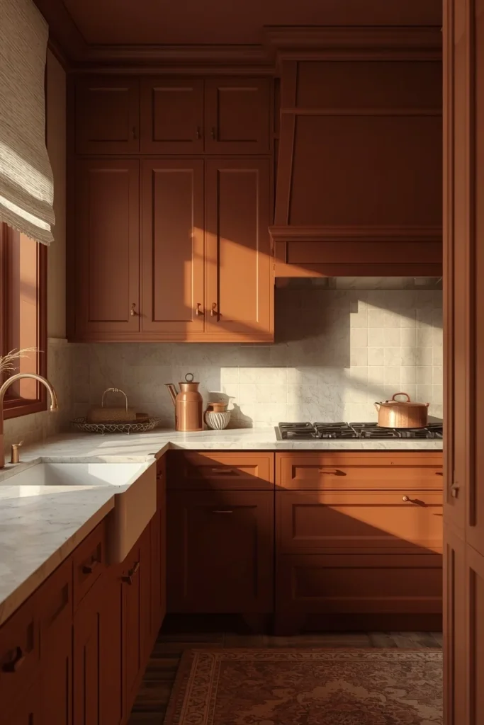
Burnt sienna pushes terracotta into deeper, more saturated territory, giving the kitchen a richer, more autumnal warmth that works especially well in dining-adjacent kitchens meant to feel cozy year-round. The color adds warmth and depth without overwhelming the room when it’s balanced with soft neutrals elsewhere, such as a cream or oatmeal linen café curtain or a pale stone floor. Carrying the sienna up onto the ceiling, rather than stopping at the top of the upper cabinets, is what pushes this from “colorful kitchen” into true colour drenching, since an unbroken ceiling plane makes the room feel enveloping rather than boxed in. Aged brass or copper hardware continues the warm metal story, while a honed granite or soapstone counter keeps the surface matte rather than glossy, which suits the color’s earthy character. This palette tends to look best under warm-temperature bulbs, since cool white lighting can mute sienna’s richness.
10. Citron and Mustard Drench
Citron and mustard tones bring an unexpected hit of cheer into a kitchen, and while they can feel bold at full saturation, keeping the finish flat or matte on the ceiling and eggshell on the walls softens the overall effect. This palette pairs particularly well with olive green, deep navy, or terracotta accents introduced through textiles or a single painted door, which helps ground the citron rather than letting it float alone. Warm woods like oak or walnut, paired with unlacquered brass and cream linen textiles, keep the look feeling European and considered rather than novelty-bright. Because citron is such a high-energy color, many designers recommend drenching only the lower cabinets and trim in this shade while keeping upper walls in a neutral, which offers a gentler entry point before committing to a full ceiling-to-floor treatment. This is a strong pick for kitchens that don’t get much natural light, since the color itself supplies energy the room might otherwise lack.
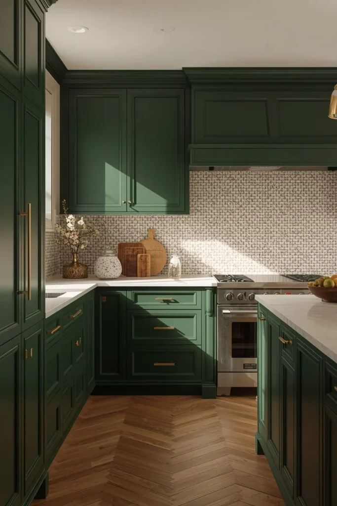
11. Forest Green Drench with Brass
Forest green delivers a deeper, more jewel-toned version of the sage or olive family, and it reads as classic rather than trendy when finished with warm gold-toned hardware and a crisp white handmade tile backsplash. Carrying the forest green across flat-front cabinetry, walls, and trim creates a rich, enveloping backdrop, while the white zellige or subway tile backsplash offers just enough contrast to keep the eye moving instead of settling into one flat plane. Gold or brass hardware pulls warmth out of the green undertone, preventing the color from reading as cold or overly formal. A honed white or cream quartz counter continues that same brightness at working-surface level, which also makes cleanup and daily use easier to see clearly. This combination tends to suit traditional or transitional kitchen layouts especially well, since forest green carries a slightly more classic, less experimental feel than brighter greens.
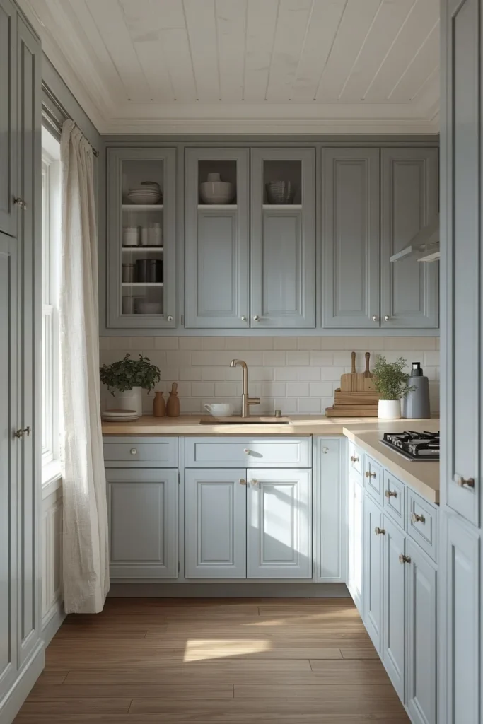
12. Dusty Blue Drench for Small Kitchens
Dusty blue is one of the best colour-drenching choices for anyone who wants a calm, restful kitchen without going as dramatic as navy or charcoal. Wrapping the trim and ceiling in the exact same soft blue as the cabinets and walls, rather than defaulting to white trim for contrast, makes even a small kitchen appear larger, since there are no hard stopping points to shrink the room visually. Texture becomes especially important in this palette, since a single soft color across every surface needs materials like linen, brushed nickel, and natural wood to keep it from feeling flat. A pale wood counter or light stone surface adds brightness without breaking the seamless color story. This is one of the more approachable colour-drenching options for first-timers, since dusty blue is forgiving in both bright and low-light kitchens.
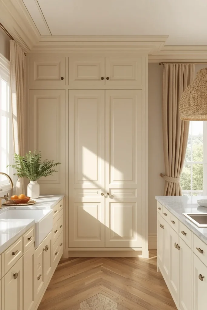
13. Cream and Ivory Tonal Drench
Not every colour-drenched kitchen needs to be bold — a soft, warm cream or ivory drenched across cabinetry, trim, walls, pantry doors, and built-ins creates an incredibly calming, bright kitchen that still embraces the monochromatic effect. The subtle variation between satin cabinets and eggshell walls naturally creates depth even though the color itself never technically changes, which is the trick to keeping an all-neutral drenched kitchen from feeling flat. Linen curtains, woven rattan lighting, fluted cabinet fronts, and marble countertops all add visual interest without introducing a second color into the mix. Cream kitchens also tend to photograph exceptionally well, since natural sunlight highlights every texture throughout the day rather than getting absorbed the way it would in a darker palette. This option suits anyone who wants the cohesive, sophisticated feeling of colour drenching without committing to a statement hue.
14. Aubergine and Plum Drench with Walnut
Aubergine and deep plum are among the boldest colour-drenching choices trending right now, carrying an understated richness that pairs beautifully with walnut, antique brass, and warm honed stone. Because aubergine sits opposite yellow on the color wheel, pairing it with warm wood tones and brass hardware creates a natural, balanced contrast rather than a clash. A vertical walnut slat wall or paneled section breaks up the plum and adds organic texture, while pure white should be avoided nearby since the high contrast can feel jarring against a color this deep. For a brighter overall kitchen, painting the lower cabinets in aubergine and the upper cabinets in cream keeps the drenched effect grounded at the bottom while letting light bounce off the top half of the room. Honed marble with subtle purple veining on the island or backsplash pushes this palette into its most elevated version.
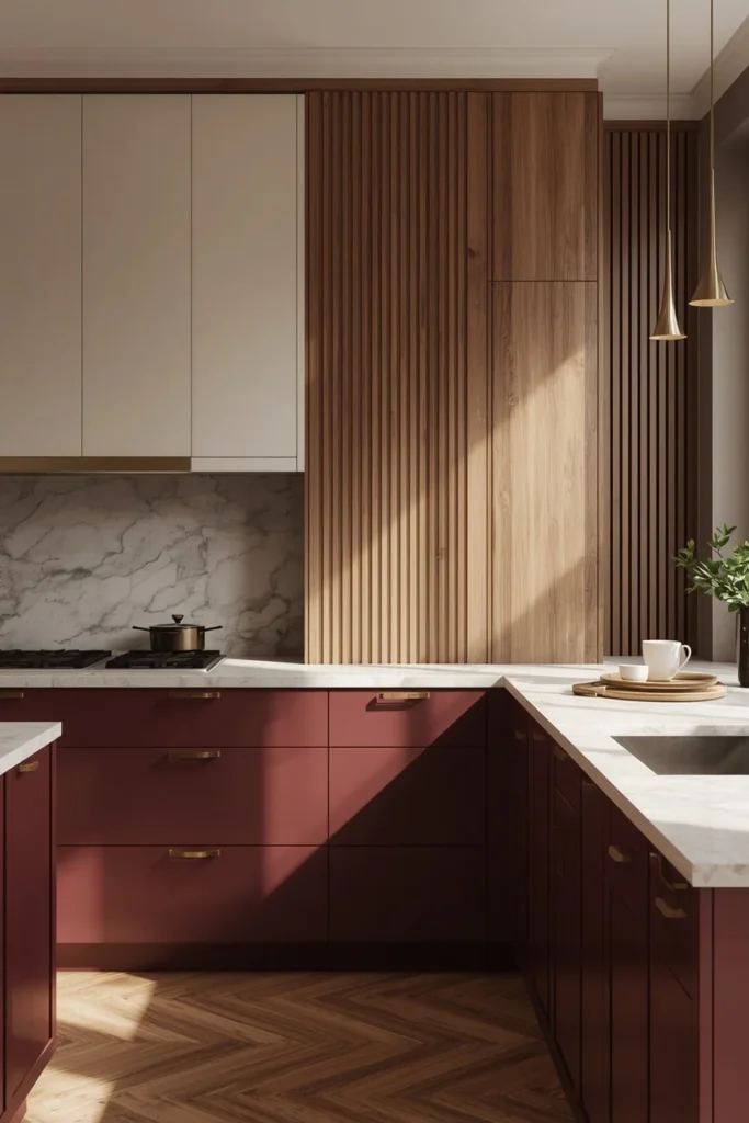
15. Merlot and Wine-Toned Drench with Oak
Merlot and other deep wine tones bring the same jewel-toned richness as aubergine but lean slightly warmer and redder, especially striking in unexpected applications like a tiled range hood or statement millwork. Pairing the deep wine color with mid-tone or lighter oak cabinetry on an adjacent run creates a fresh, grounded contrast between the richness of the color and the warmth of natural wood grain. Rather than drenching the entire kitchen in merlot, many designers apply it to a single wall of cabinetry or the range hood surround, treating it as a concentrated moment of color within an otherwise oak-toned room. Brass or aged brass hardware continues the warm metal thread, while a honed stone counter in a warm white or cream keeps the surface from competing with the wine tone above it. This approach offers a way to experience the drama of colour drenching without covering every surface in the room.
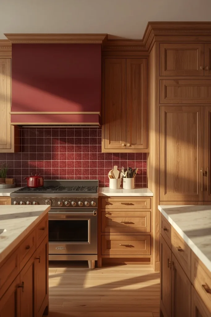
16. Clay and Rose-Brown Earth Tone Drench
Clay and rose-brown tones represent the softer end of the earthy, terracotta-adjacent palette, resonating because they feel calming and architectural while pairing beautifully with natural stone, unlacquered brass, and richly veined marble. Carrying a muted clay tone across cabinets, walls, and trim creates a grounded, almost architectural feeling, especially when paired with a taupe or warm greige wall in an adjoining space rather than a stark white. Bronze or aged brass hardware develops an authentic patina over time, which suits this palette’s understated, lived-in character better than a bright polished finish. A warm veined marble or honed granite counter continues the natural material story, while wood tones should lean warm rather than cool to avoid fighting the clay’s pink-brown undertone. This palette works particularly well for anyone drawn to bold color but wanting something that reads as timeless rather than trend-driven.
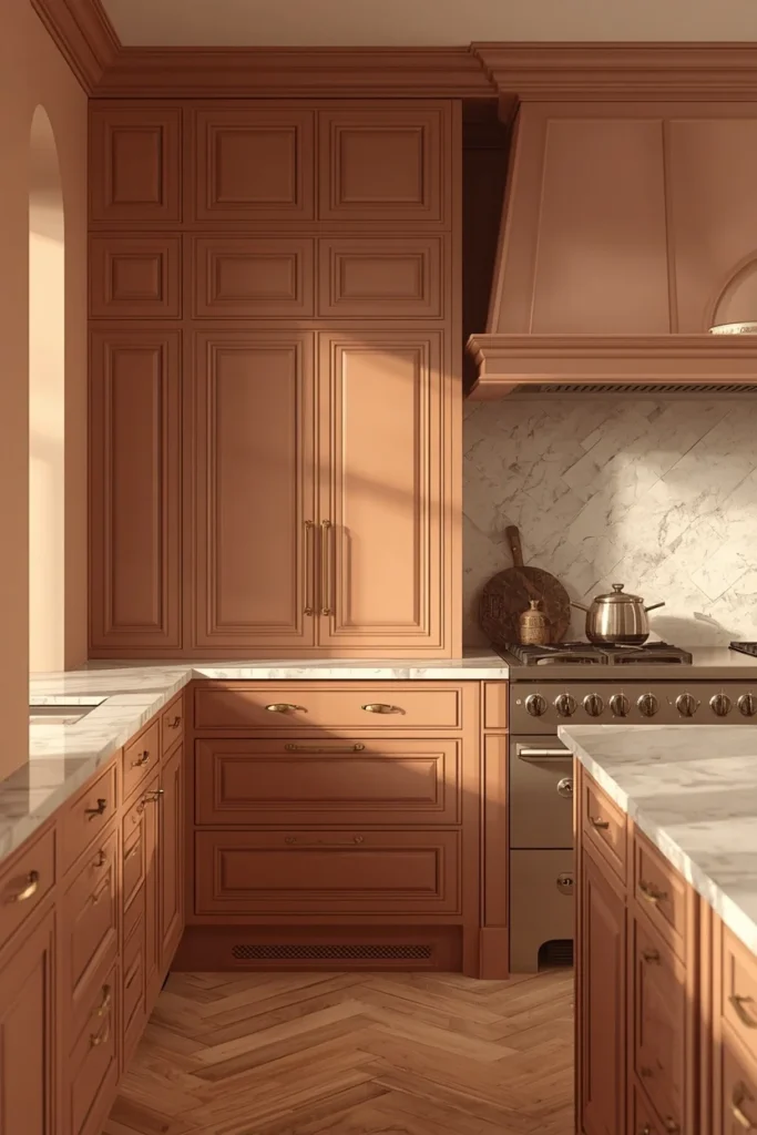
17. Pewter Gray Drench with Stainless Steel
Pewter gray offers a cooler, more silvery alternative to charcoal, and it pairs especially well with stainless steel appliances since the two finishes share the same cool undertone instead of fighting each other. Drenching the cabinetry, walls, and trim in pewter creates a sleek, slightly more modern feeling than warmer earth-tone palettes, making it a strong fit for kitchens with contemporary architecture or an open-plan layout. Stainless steel hardware and appliances continue the cool metal story, while a white or pale gray quartz counter keeps the overall palette from feeling too monochrome-heavy without introducing an actual second color. Layering in warm wood bar stools or a single wood cutting board prevents the kitchen from feeling sterile, since an all-cool palette can otherwise read as clinical. This combination suits kitchens attached to minimalist or industrial-leaning homes better than the warmer, earthier options elsewhere on this list.
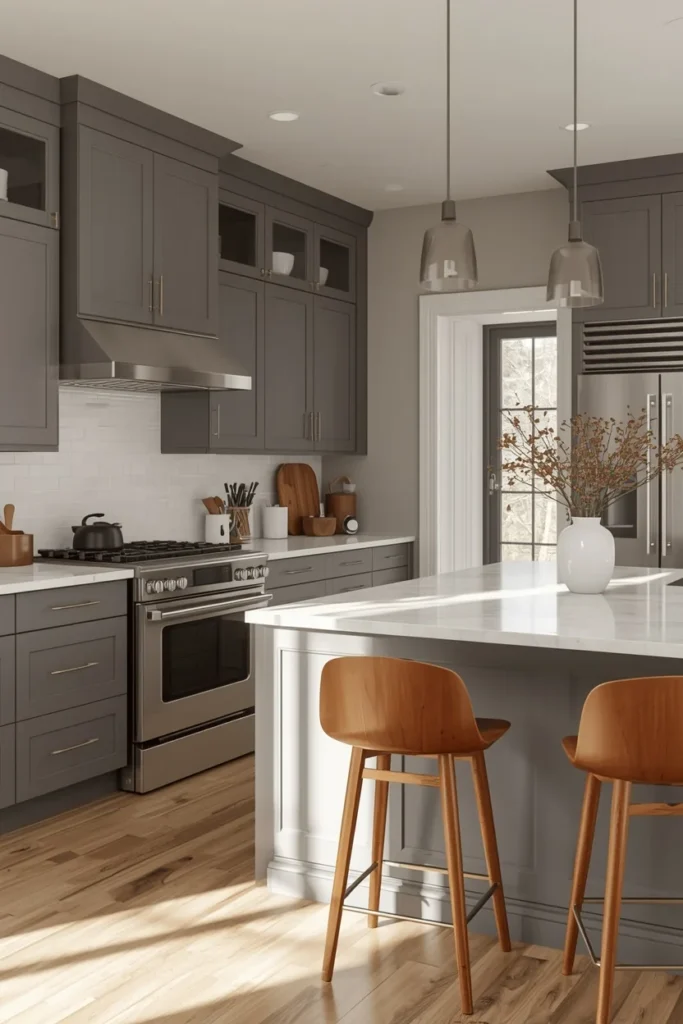
18. Butler’s Pantry Colour-Drenching Extension
One of the most effective colour-drenching techniques isn’t a new color at all — it’s carrying whatever hue you’ve chosen straight through into an adjoining butler’s pantry, breakfast nook, or open shelving alcove, so the drenched effect doesn’t stop at the kitchen’s main walls. This extension technique reinforces the sense of one continuous, intentional space rather than a kitchen with a separate, disconnected pantry tacked on. Painting pantry shelving, cabinetry, and even the interior of glass-front cabinets in the same color as the main kitchen keeps every visible surface part of the same story, down to the dishware displayed inside. It’s also one of the more budget-conscious ways to make a small colour-drenching project feel more expansive, since a pantry or nook typically requires far less paint than a full kitchen renovation. Matching hardware finishes between the two spaces, down to the smallest pull, is what makes this extension read as deliberate rather than incidental.
Styling Tips
- Mix paint finishes within the same color — satin cabinets, eggshell walls, flat ceiling — to create depth without introducing a second hue.
- Choose warm or cool metal hardware based on your paint’s undertone; brass and bronze lift warm colors, while chrome and stainless suit cooler palettes.
- Extend the color onto the ceiling, not just the walls and cabinets, since a white ceiling breaks the drenched effect and makes the room feel capped.
- Bring texture in through materials — linen, rattan, handmade tile, natural stone — rather than additional colors, so the monochrome effect stays intact.
- Test your chosen color in the room at both morning and evening light before committing, since color-drenched rooms shift more dramatically with light than rooms broken up by white trim.
Practical Implementation Ideas
- Start with the lower cabinets and trim only if you’re not ready to commit to a full drench, then expand to walls and ceiling once you’ve lived with the color.
- Repaint open shelving to match the walls rather than leaving it white, which is one of the fastest ways to complete the drenched look without new cabinetry.
- Swap hardware before repainting cabinets to test how a warm or cool metal finish will read against your chosen color.
- Use peel-and-stick tile temporarily on a backsplash to preview a material pairing before committing to permanent zellige or subway tile.
- Sample large boards of your chosen paint color and move them around the kitchen at different times of day before painting any permanent surface.
Common Mistakes to Avoid
- Pairing icy white countertops with a warm color-drenched palette, which creates a jarring, unintentional contrast instead of a cohesive look.
- Using cool blue-toned lighting in a warm-toned drenched kitchen, which mutes the richness of colors like terracotta and sienna.
- Overdecorating open shelving once it’s painted to match the walls, which clutters the clean, continuous effect the color drenching was meant to create.
- Mixing too many different wood tones throughout the room, which fights against the single-color cohesion on every other surface.
- Choosing a trendy color purely because it’s popular rather than testing it against your kitchen’s actual light conditions first.
Small-Space Alternatives
- Choose a soft, mid-tone color like dusty blue or sage rather than a very dark hue, since lighter colour-drenched tones make small kitchens feel larger, not smaller.
- Carry the same color onto the trim and ceiling rather than stopping at the cabinets, which removes visual stopping points that would otherwise shrink the room.
- Keep hardware and lighting fixtures simple and in one consistent finish to avoid adding visual clutter in a compact space.
- Use a single reflective material, like a polished counter or a mirror-backed shelf, to bounce light back into the room.
- Limit patterned textiles or accessories to one small area, letting the color itself carry the visual interest in a tight footprint.
Budget-Friendly Alternatives
- Paint existing cabinets instead of replacing them; this alone achieves most of the visual transformation colour drenching is known for.
- Swap hardware before repainting anything, since new pulls and knobs in brass or matte black instantly modernize the existing cabinet color.
- Choose a single accent element, like a range hood or a pantry door, to drench in a bold color rather than repainting an entire kitchen.
- Use paint instead of tile for a backsplash refresh, carrying the wall color straight up behind the stove for a similar cohesive effect at a fraction of the cost.
- Shop for secondhand or discontinued paint through local swap groups or hardware store clearance sections, since colour drenching typically requires more of one shade than a multi-color kitchen would.
Pro Styling Recommendations
- Ground very deep or bold drenched colors, like aubergine or navy, with at least one warm wood element to keep the room from feeling cold or overly formal.
- Choose a paint with warm undertones for kitchens with limited natural light, and reserve cooler tones like pewter or dusty blue for kitchens that get strong daylight.
- Keep metal finishes consistent throughout the entire kitchen, including light fixtures, faucet, and cabinet hardware, since mixing metals undercuts the cohesive effect colour drenching is built on.
- Extend the chosen color into any adjoining pantry, nook, or open shelving unit so the drenched effect feels intentional throughout the whole space rather than stopping abruptly.
- Sample your final paint choice in a large format, not just a swatch card, and view it under your kitchen’s actual lighting conditions before committing to a full drench.
FAQs
Conclusion
A colour-drenched kitchen isn’t about picking a brave paint color and hoping for the best. It’s about choosing one hue and following it all the way through — onto the trim, the ceiling, even the inside of the pantry — so the whole room reads as one considered decision instead of a series of separate ones. Whichever shade you land on, from a soft cream to a full aubergine drench, the same rule holds: let texture and material do the work that color alone can’t.