16 Colour-Drenched Ceiling Ideas That Prove the 5th Wall Is the Best Wall
Most people paint four walls and call it done. The ceiling gets the same flat white it’s always had, an afterthought nobody really looks at.
But the ceiling isn’t nothing. It’s the fifth wall, and in a lot of rooms, it’s actually the largest single uninterrupted surface you have to work with. Leave it white while everything else gets color and texture, and you create a visual stopping point right where the eye should keep traveling. Bring it into the palette instead, and the whole room suddenly reads as considered, finished, complete in a way four painted walls alone never quite achieve.
This is the idea behind colour drenching: walls, trim, doors, and ceiling all wrapped in the same shade or a closely related one, so there’s nowhere for the eye to stop and nothing that reads as an afterthought. Done well, it makes small rooms feel more enveloping rather than smaller, and it gives every room a kind of quiet, expensive confidence that’s hard to fake any other way.
This guide walks through 16 specific ways to bring color to your ceiling, whether you want a full drench from floor to ceiling or just a bold painted fifth wall on its own. Save the ones that fit your next room.
Table of Contents
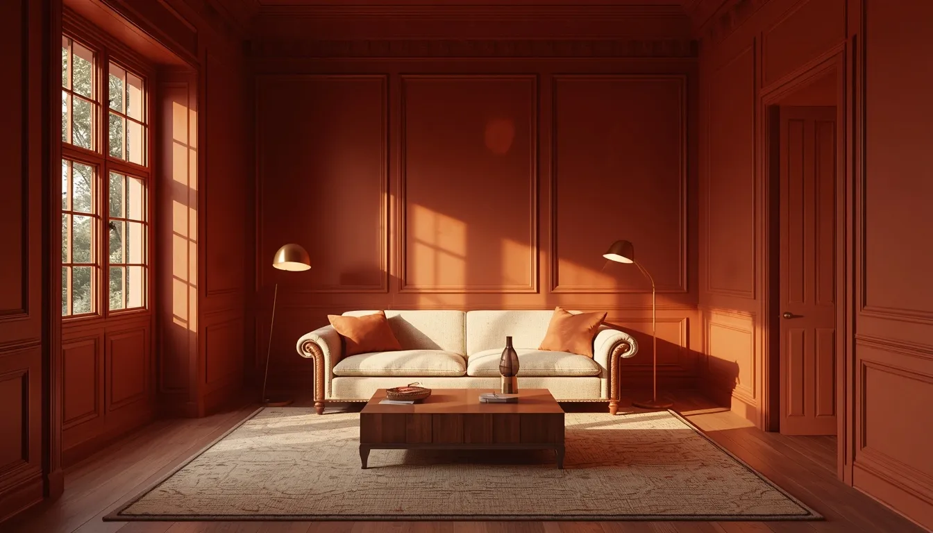
1. Go Full Color Drenching From Wall to Ceiling
The most complete version of this trend wraps walls, trim, doors, and ceiling in a single shade, removing the visual break where wall traditionally meets ceiling and creating one continuous, enveloping surface. This approach works especially well in a room with awkward proportions or busy architectural details, since the single color unifies everything and makes the room feel more like one cohesive shape rather than a collection of separate surfaces. Choose a shade with enough depth and interest to hold attention across every surface, since a flat, uninteresting color can feel monotonous when applied this thoroughly. Keep the sheen level slightly different between surfaces, typically flat for the ceiling and a soft eggshell or satin for the walls and trim, so there’s still subtle definition between planes even within the same color. This is the boldest, most complete expression of colour drenching, and it consistently produces the most dramatic before-and-after transformation on this entire list.
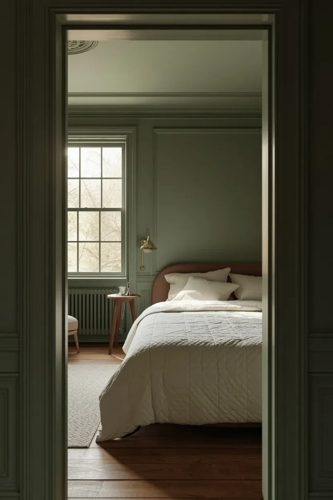
2. Paint the Ceiling a Deep Moody Aubergine
Aubergine brings a rich, wine-toned depth to a ceiling that reads as sophisticated rather than simply dark, especially when the color is allowed to shift subtly under different lighting throughout the day. This shade works particularly well in a bedroom or dining room, spaces where a more intimate, enveloping mood is genuinely welcome rather than working against the room’s function. Pair the aubergine ceiling with warm brass lighting fixtures, since the metal’s golden tone brings out the color’s warmer undertones rather than letting it read as cold or overly somber. Keep the walls a few shades lighter, in a soft blush or warm gray, if you want the ceiling to stand out as a clear focal point rather than fully drenching every surface. This color choice tends to surprise people with how much warmth and richness it adds to a room once it’s actually painted, since aubergine photographs and reads very differently than most people expect from a swatch.
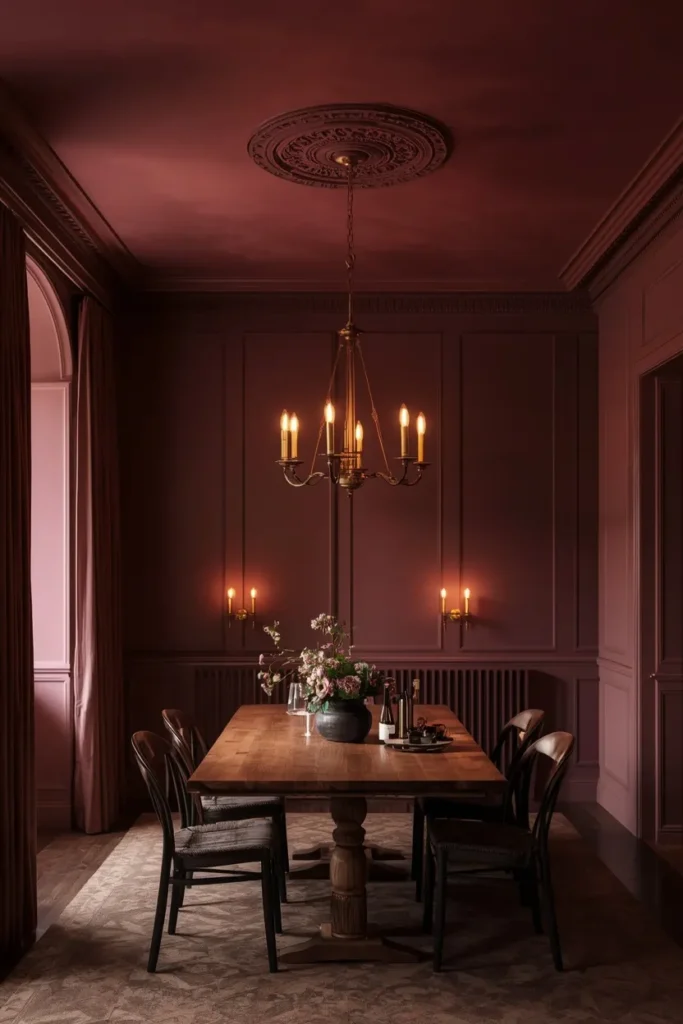
3. Choose a Bold Navy for Instant Drama
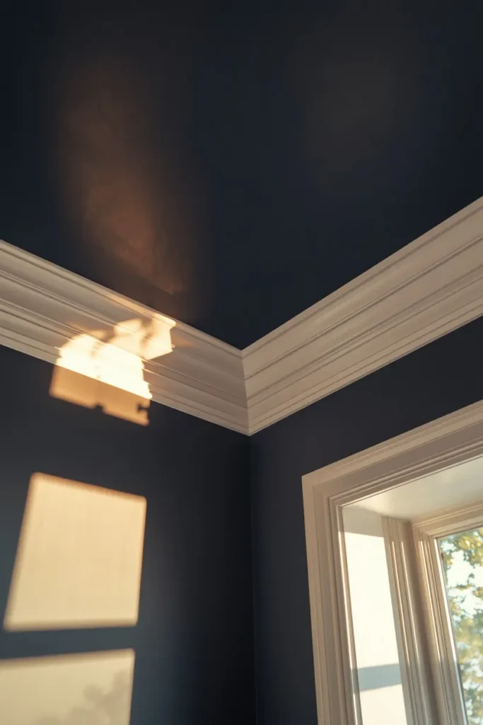
A navy ceiling delivers immediate visual drama while still reading as classic and broadly appealing, making it one of the more approachable entry points into bold ceiling color for anyone hesitant about committing to something more unusual. This shade works especially well paired with lighter walls in white, cream, or pale gray, since the contrast between the dark ceiling and lighter walls creates definition and helps the room feel intentional rather than accidental. Navy also has a documented effect of making a ceiling feel like it’s drawing inward slightly, which can create a genuinely cozy, intimate atmosphere in a living room or den without making the room feel smaller in an unpleasant way. Pair the navy ceiling with warm wood tones and brass or gold accents throughout the room, since these warmer materials keep the overall effect feeling rich rather than cold. This is consistently one of the most popular painted ceiling colors precisely because it delivers strong impact without much risk of looking dated or overly trendy in a few years.
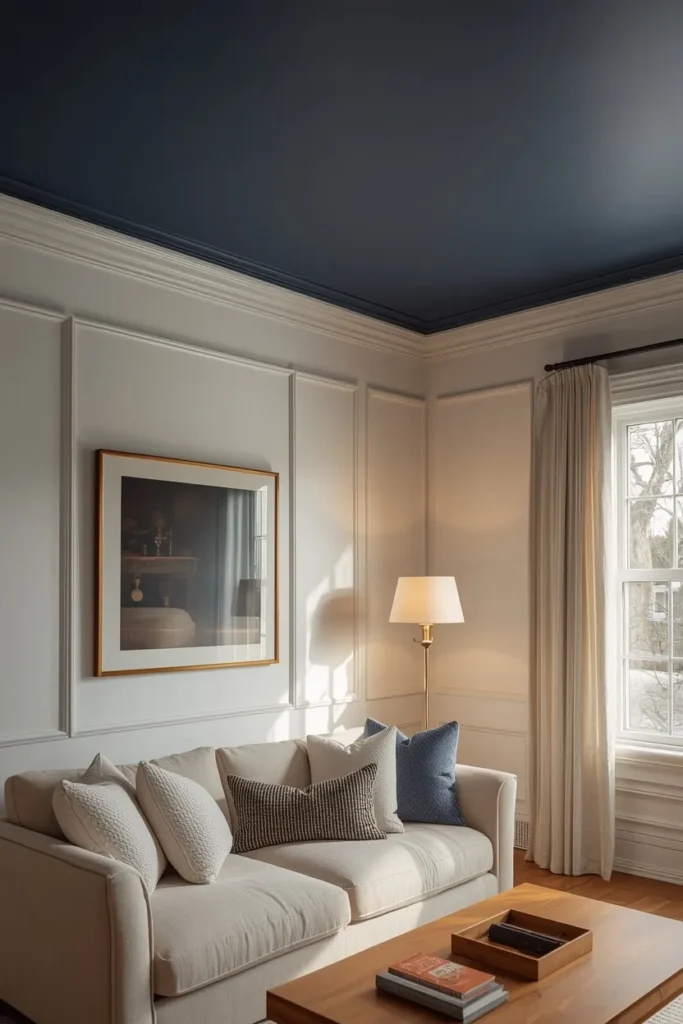
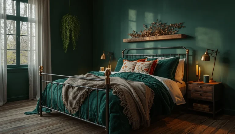
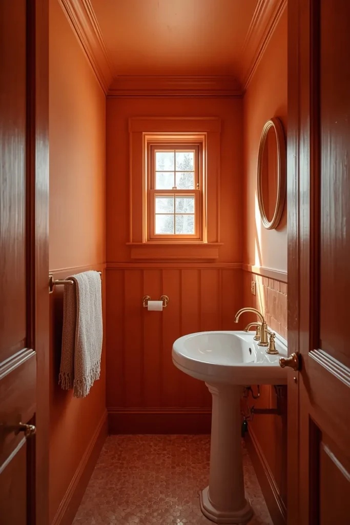
4. Wrap a Small Bathroom in Terracotta Top to Bottom
A small bathroom is one of the best rooms in the house for a full color drench, since its limited square footage means the commitment feels manageable while the payoff, a genuinely transformed, immersive space, is immediate and dramatic. Terracotta brings warmth to what’s often the coldest, most clinical room in the house, and wrapping it across walls, trim, and ceiling removes the visual break that would otherwise make a small bathroom feel even more cramped and segmented. Pair the terracotta with brass fixtures and a simple white or cream sink and tub, letting these fixtures stand out clearly against the warm, saturated backdrop. This approach also tends to make a small bathroom’s low ceiling feel less noticeable, since there’s no white ceiling directly overhead creating a visual lid on the room. Small bathrooms are consistently where colour drenching produces some of its most convincing, photograph-worthy results.
5. Use a Soft Pastel Tint to Lift a Neutral Room
A pale, barely-there pastel, like a soft blush, mint, or powder blue, brings color drenching into a much gentler, more approachable register, adding warmth and personality to a room without the drama of a fully saturated dark shade. This approach works especially well in a nursery, guest room, or any space where a lighter, calmer mood matters more than bold visual statement. Because the color is so pale, painting it across walls, trim, and ceiling doesn’t create the same enclosing, intimate effect a darker drench would, instead reading as a soft wash of color that still reflects plenty of light. Choose a slightly warmer undertone within your chosen pastel family, since cooler pastels can occasionally read as sterile or clinical when applied across every surface. This is one of the most beginner-friendly ways to try colour drenching, since a pale tint carries much less visual risk than a bold, saturated shade while still delivering the trend’s signature cohesive, finished feeling.

6. Try a Two-Tone Ceiling and Wall Pairing
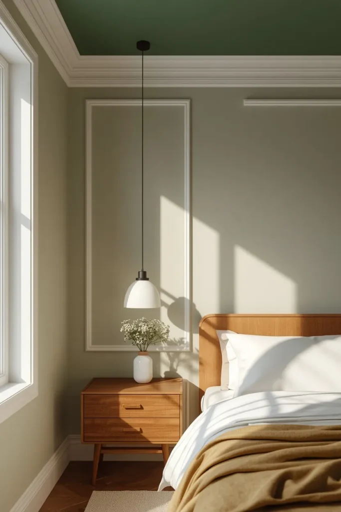
Rather than matching the ceiling exactly to the walls, a two-tone approach pairs two closely related or intentionally contrasting colors, creating definition between the surfaces while still treating the ceiling as an active part of the room’s overall color story. A soft sage wall paired with a slightly deeper forest green ceiling, for example, keeps the room feeling cohesive without the full commitment of an exact color match across every surface. This approach also offers a practical advantage, since two-tone pairings tend to photograph with clearer definition than a full monochrome drench, which matters if the room needs to read clearly in photos as well as in person. Choose colors from the same family rather than wildly different hues, since staying within a related palette is what keeps a two-tone ceiling feeling intentional rather than mismatched. This is a strong middle-ground option for anyone who wants the visual interest of a colored ceiling without going as far as a complete color drench.
7. Highlight Crown Molding With a Contrast Color
In a room with existing crown molding or other ceiling trim detail, painting that architectural feature in a contrasting color, rather than matching it to either the walls or the ceiling, draws attention to craftsmanship that often goes unnoticed under a uniform coat of white. Choose a contrast color with enough tonal difference to read clearly from across the room, like crisp white molding against a deep navy or forest green ceiling. This approach works particularly well in older homes or traditional-style rooms where the molding itself has genuine architectural character worth showcasing rather than obscuring. The defined line this creates between wall, molding, and ceiling also adds a layer of visual structure to the room, which can be a useful counterbalance in a space that’s otherwise fully color drenched. This detail turns a purely functional architectural element into an intentional design feature, adding a level of polish that a uniformly painted ceiling alone doesn’t achieve.
8. Wallpaper the Ceiling Instead of Painting It
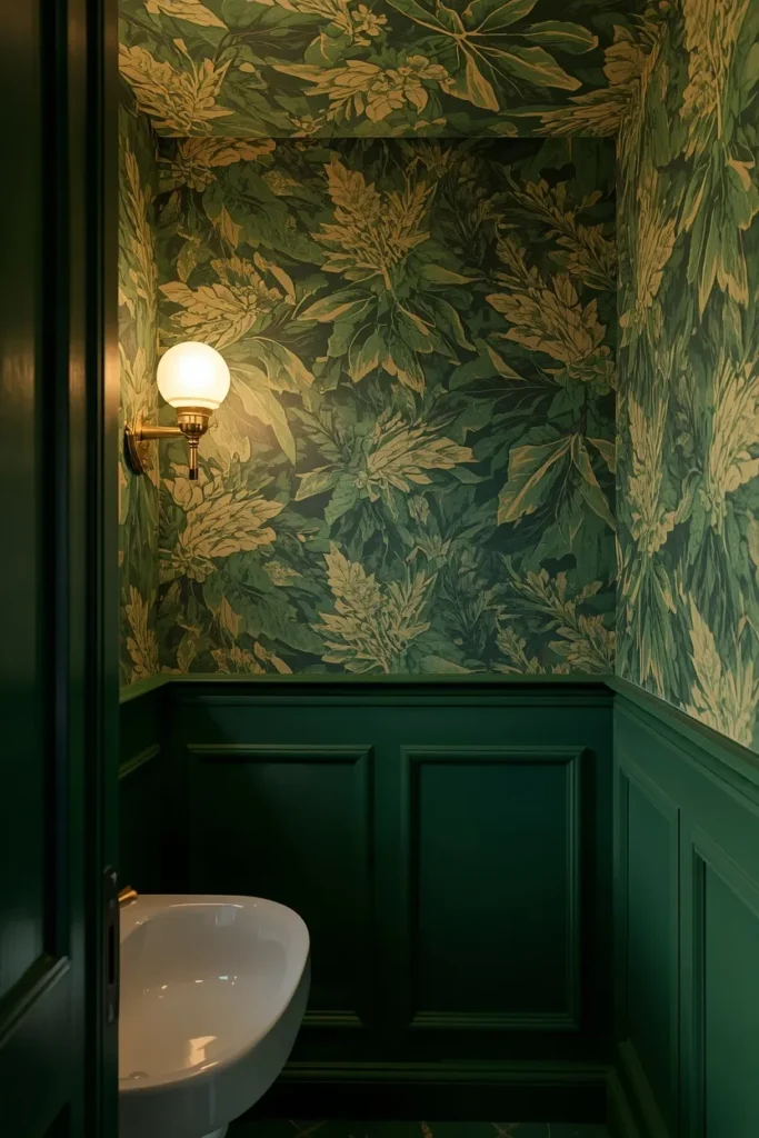
Wallpaper brings pattern and texture to the fifth wall in a way flat paint simply can’t, whether that’s a bold botanical print, a subtle textured grasscloth, or a metallic geometric design. This approach works especially well in a smaller room, like a powder room or reading nook, where the more limited ceiling area makes an intricate pattern feel special rather than overwhelming. Choose a paper with a pattern scale appropriate to the room’s size, since an oversized print can feel disproportionate on a smaller ceiling while a very fine pattern can get lost from typical viewing distance. Coordinate the wallpaper with either a solid wall color pulled from the print or a full wallpapered treatment across both walls and ceiling for an even more immersive effect. A wallpapered ceiling consistently ranks among the most talked-about design choices in any room that features one, since it’s still relatively uncommon and immediately signals a high level of design intention.
9. Go Black for a Dramatic, Intimate Living Room
A black ceiling is the boldest possible choice on this list, delivering maximum drama and an unmistakably intentional, high-design statement, particularly effective in a formal living room, media room, or dining space used mainly in the evening. Contrary to common assumption, a black ceiling doesn’t necessarily make a room feel smaller, especially when paired with lighter walls and plenty of warm ambient lighting, since the contrast actually adds a sense of height and depth rather than closing the room in. This choice works best in a room with strong existing architectural interest or statement furniture, since the black ceiling acts as a dramatic backdrop that makes everything below it read as more considered and gallery-like. Layer in warm brass or gold light fixtures generously, since adequate warm lighting is what keeps a black ceiling feeling luxurious rather than simply dark and heavy. This is a genuinely bold choice best suited to anyone confident in a strong design statement, but it consistently produces some of the most striking, memorable rooms in any painted ceiling roundup.
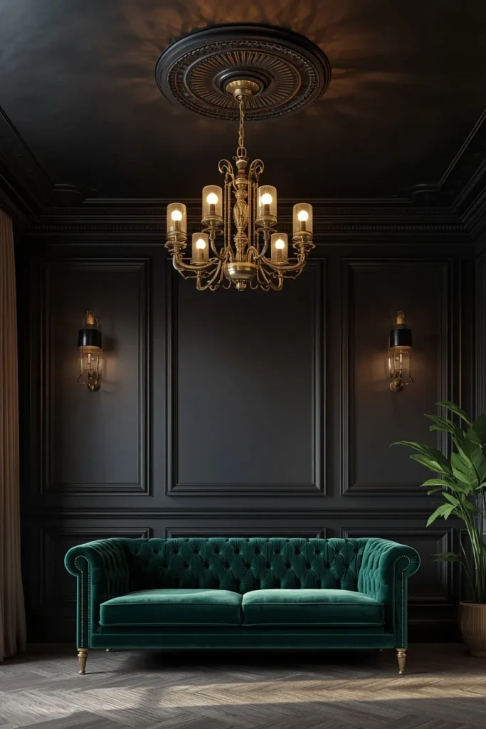
10. Use Color Drenching to Make a Small Room Feel Bigger
Counterintuitively, wrapping a small room’s walls and ceiling in the same color often makes it feel larger and more expansive rather than smaller, since removing the visual line where wall meets ceiling eliminates a hard stopping point that would otherwise define the room’s boundaries clearly. This technique works especially well in awkwardly shaped small rooms, like a narrow hallway or a home office with a low ceiling, where the goal is to blur the room’s actual proportions rather than emphasize them. Choose a mid-tone color rather than an extremely dark or extremely pale shade for this specific effect, since mid-tones tend to create the most convincing sense of expanded, undefined space. This principle runs directly against the common assumption that small rooms need pale colors and high contrast to feel bigger, and it’s backed consistently by designers who specialize in small space transformations. It’s one of the more surprising, counterintuitive benefits of colour drenching, and often the detail that convinces skeptics to try the technique themselves.
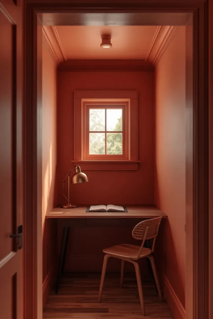
11. Paint a Ceiling Rose or Medallion in a Statement Color
For rooms with an existing decorative ceiling medallion, often installed around a chandelier or pendant light, painting that detail in a standout color rather than matching it to the surrounding ceiling turns a subtle architectural flourish into a genuine focal point. Choose a metallic gold or a rich jewel tone that contrasts clearly against the surrounding ceiling color, letting the medallion’s decorative shape and detail actually register from below rather than blending in unnoticed. This detail works particularly well in more traditional or formal dining rooms, where a ceiling medallion is more commonly found as an existing architectural feature. Pair the painted medallion with a statement chandelier or pendant light directly beneath it, since these two elements are designed to be viewed together as a coordinated overhead focal point. This is a smaller-scale detail compared to a full ceiling drench, but it delivers outsized visual impact relative to the amount of paint and effort actually required.

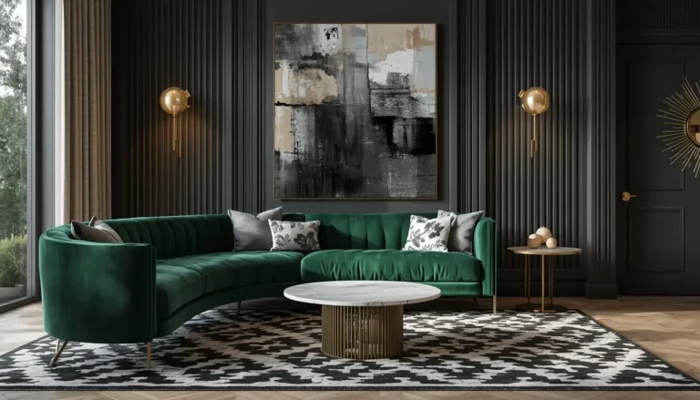
12. Choose Forest Green for a Cozy Library or Den
Forest green brings a rich, grounding depth to a ceiling that pairs naturally with wood tones, leather, and the kind of warm, layered materials commonly found in a home library or den. This shade works especially well in a room already built around dark wood bookshelves or built-in cabinetry, since the ceiling color echoes and extends that existing material palette upward rather than introducing an unrelated tone. Pair the forest green ceiling with warm brass reading lamps and a leather or velvet accent chair, reinforcing the room’s cozy, retreat-like character. This color also has a documented calming, grounding effect, making it a particularly fitting choice for a room specifically meant for reading, working, or quiet time away from the rest of the house. A forest green ceiling consistently ranks among the most requested colors for exactly this type of room, since it captures a sense of established, old-world coziness that feels both current and timeless.
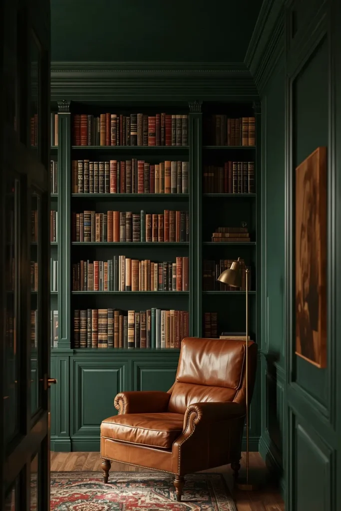
13. Add Stripes or Pattern to a Hallway Ceiling
A narrow hallway ceiling, often one of the most overlooked surfaces in the entire house, becomes a genuine design opportunity when painted with stripes or a simple repeating pattern rather than left blank and white. Choose a striping direction that runs perpendicular to the hallway’s length, since this can visually widen a narrow passage in a way that stripes running the same direction as the hallway wouldn’t achieve. Keep the color palette limited to two or three tones for a clean, graphic effect that doesn’t compete with artwork or lighting fixtures mounted along the hallway walls. This idea works particularly well in a hallway with limited natural light, since a patterned ceiling gives the eye something interesting to focus on in a space that otherwise tends to be purely functional and transitional. It’s a small-footprint project that delivers a surprisingly large amount of personality for the square footage involved.
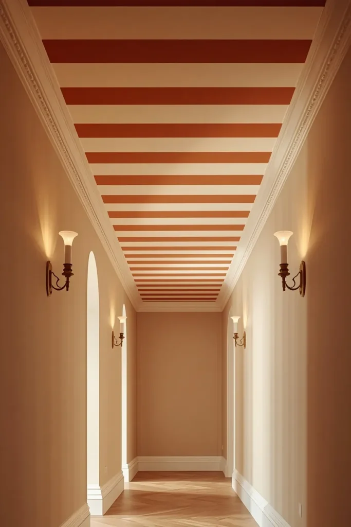
14. Use a Metallic Ceiling Finish for Subtle Shine
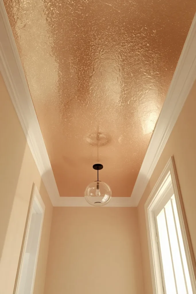
A ceiling painted in a metallic or pearlescent finish, rather than a standard flat or matte color, catches and reflects ambient light in a way that adds a subtle, sophisticated shimmer to the room below without requiring any additional light fixtures. Choose a metallic finish in a champagne, bronze, or soft pewter tone, since these subtler metallics read as elegant rather than overly flashy or costume-like once applied across an entire ceiling surface. This approach works especially well in a dining room or entryway, spaces where guests naturally look up and where a bit of shimmer creates a memorable, luxurious first impression. Pair the metallic ceiling with simple, solid wall colors nearby, letting the ceiling’s texture and shine provide the main visual interest rather than competing with a busy wall treatment. This finish requires slightly more specialized paint and application technique than a standard flat color, but the resulting effect is genuinely difficult to achieve any other way.
15. Match the Ceiling to Window Frames and Trim
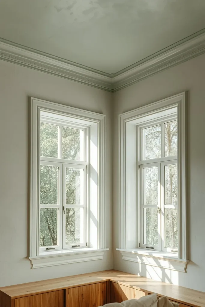
Rather than drenching the entire room, matching just the ceiling to the window frames and trim creates a more subtle, architectural version of colour drenching that ties these often-overlooked details together into one cohesive visual thread. Choose a color already present somewhere else in the room, like a deep sage pulled from an existing rug or a soft blue echoing artwork on the wall, so the ceiling and trim pairing feels connected to the room’s broader palette rather than arbitrary. This approach works particularly well in a room with substantial window trim or paneling, since the shared color treatment emphasizes these architectural details rather than letting them blend unnoticed into plain white surroundings. Keep the main wall color neutral or contrasting, letting the matched ceiling and trim stand out as the room’s defining color choice. This is a more restrained take on the fifth wall trend, ideal for anyone drawn to the idea but not ready to commit to a full room drench.
16. Test Your Color Overhead Before Committing
Before painting any ceiling, hold a large paint sample or poster board swatch directly overhead, parallel to the floor, rather than simply looking at it on a wall or in a paint chip fan, since color reads noticeably differently once it’s viewed from below with light hitting it at a completely different angle. View the sample at multiple times of day, since natural light shifts significantly from morning to evening and a ceiling color that looks perfect at noon can read very differently under evening lamp light. Consider the room’s actual ceiling height and primary use time before finalizing a choice, since a low-ceilinged room used mainly in the evening can generally handle a much deeper, moodier color than a high-ceilinged room used mainly during the day. This testing step feels like an extra hassle in the moment, but it’s consistently the single detail that separates a ceiling color choice that feels perfect once painted from one that requires an expensive, frustrating redo. Any professional painter or color consultant will tell you this step matters more for ceilings than it does for any other surface in the home.

Styling Tips for a Colour-Drenched Room
Choose ceiling sheen carefully. A flat finish on the ceiling minimizes glare and imperfections, while walls and trim can handle a bit more sheen for durability and depth.
Let furniture and lighting provide contrast. A fully drenched room still needs lighter or metallic accent pieces so the space doesn’t read as flat or one-dimensional.
Match undertones across every surface. When drenching walls, trim, and ceiling in one color, use the exact same paint formula rather than three separately mixed near-matches, since subtle undertone differences become obvious once applied.
Consider the room’s primary lighting time. Rooms used mostly in the evening can support deeper, moodier colors than rooms that rely heavily on daytime natural light.
Practical Implementation Ideas
Start by testing your chosen color as a large sample directly on the actual ceiling, viewing it at different times of day before committing to a full application. Paint the ceiling first if you’re drenching the entire room, since this order makes it easier to cut in clean lines where the ceiling meets the walls afterward. Use a flat or matte finish specifically formulated for ceilings, since these are designed to minimize the appearance of application marks and imperfections that show more clearly overhead than on vertical wall surfaces. Budget extra time for ceiling painting compared to walls, since working overhead is physically more demanding and typically requires more careful attention to avoid drips and uneven coverage.
Common Mistakes to Avoid
Skipping the overhead color test. A swatch that looks perfect on a wall can read completely differently once painted across an entire ceiling and viewed from below.
Using a glossy sheen on the ceiling. Higher sheen levels highlight every imperfection and application mark overhead. Stick with flat or matte for ceiling surfaces specifically.
Mismatching undertones between separately purchased paint. When drenching a room, use the identical paint formula across every surface rather than three different products that claim to be the same color.
Forgetting to account for the room’s lighting conditions. A color chosen under bright showroom lighting can look completely different under the room’s actual daylight or lamp conditions.
Small-Space Alternatives
In a smaller room, a full color drench in a mid-tone shade often works better than either a very dark or very pale color, since mid-tones tend to blur the room’s actual boundaries most effectively. If a full drench feels like too large a commitment, start with just the ceiling and trim matched together while keeping the walls a lighter neutral, offering a more restrained entry point into the trend. Powder rooms and small hallways are ideal testing grounds for a bolder ceiling color, since the limited square footage keeps both the cost and the commitment manageable. A patterned or metallic ceiling finish can also add significant visual interest to a small room without requiring the walls to change at all.
Budget-Friendly Alternatives
Painting the ceiling is one of the most affordable major design changes available, typically requiring only a gallon or two of paint depending on room size. Choose a single versatile mid-tone color that you’re confident using across multiple future rooms, reducing the cost of buying and testing several different specialty paint colors over time. If a full color drench feels financially out of reach right now, start with just the ceiling on its own, since this single surface delivers a significant portion of the visual impact at a fraction of the cost and effort of painting an entire room. Sample-size paint pots are inexpensive and allow genuine in-room testing before committing to full gallons, helping avoid an expensive repaint if the chosen color doesn’t work as expected.
Pro Styling Recommendations
Always request the exact same paint formula for walls, trim, and ceiling when attempting a full color drench, rather than assuming three separately purchased products in the same named color will match precisely once dried. Choose a flat or matte finish for the ceiling specifically, saving satin or eggshell sheens for trim and walls where subtle durability matters more than avoiding glare. When selecting a bold or dark ceiling color, increase the room’s warm ambient lighting sources to prevent the space from feeling heavy or dim, since adequate lighting is what keeps dramatic ceiling colors feeling luxurious rather than oppressive. Finally, don’t rush the decision. Live with a large painted sample on the actual ceiling for at least a few days, checking it under different lighting conditions before committing to the full room.
FAQs
Conclusion
The ceiling was never actually a neutral surface. It’s just been treated like one for so long that it’s easy to forget how much visual real estate it actually occupies in every room of the house. Paint it the way you’d paint any wall worth paying attention to, and the whole room shifts, not because you added more furniture or more decor, but because you finally finished the space you already had.