15 Pink Fall Decor Ideas for a Softer Take on Autumn
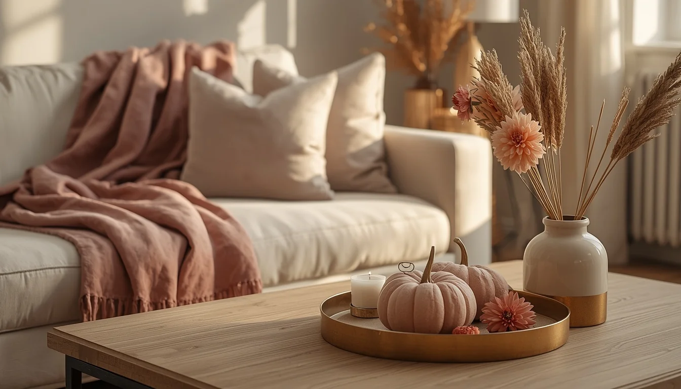
Fall decor tends to default to the same handful of colors every year: burnt orange, deep brown, mustard yellow, maybe a little burgundy if you’re feeling bold. All of that still works, but it can also start to feel like you’re decorating the same room every October whether you mean to or not.
Pink is the twist that quietly changes everything without abandoning what makes fall feel like fall. Dusty rose, blush, and mauve carry the same warmth as traditional autumn colors, but they read as softer and a little more current, especially when paired with copper, brass, cream, and natural textures like dried grasses and velvet. The trick is using pink as one part of the palette rather than the whole thing, so the space still feels unmistakably like fall. These 15 ideas show you how to do exactly that, room by room.
Table of Contents
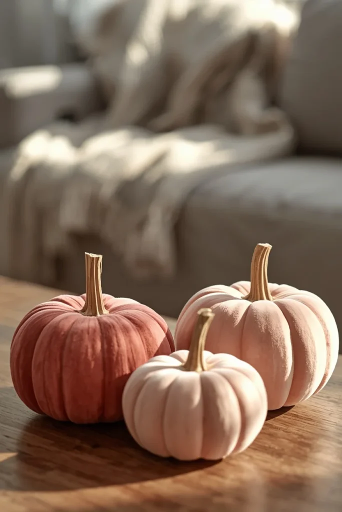
Idea 1: A Blush Pink Velvet Pumpkin Trio
Swapping traditional orange pumpkins for a trio of blush pink velvet ones is one of the simplest ways to introduce the color without touching anything else in the room. Choose pumpkins in slightly different sizes and a couple of tonal variations, like dusty rose and a deeper mauve, so the grouping has depth instead of looking like a single flat shade. Velvet catches light differently than a matte pumpkin would, which gives this small grouping a bit of quiet shine on a coffee table or mantel. Pair the trio with a natural wood stem or stalk detail rather than a bright green one, since a muted stem keeps the whole look feeling cohesive with the softer palette. This idea works in almost any room and takes seconds to set up once you own the pumpkins, making it one of the most repeatable ideas on this list.
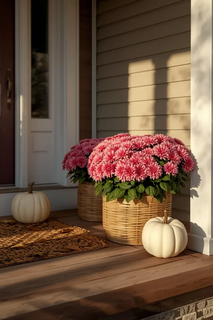
Idea 2: Pink Mums in Rattan Baskets on the Porch
Swapping the classic orange porch mums for pink ones is an easy, high-impact change that costs about the same as the traditional version but reads as noticeably fresher. Place the potted mums in rattan baskets or simple white ceramic containers rather than their plastic nursery pots, since the natural basket texture grounds the bright color and keeps the display from feeling too saccharine. Group two or three pots of slightly different pink shades together near the front steps rather than spacing single pots evenly apart, which creates a fuller, more intentional-looking display. This idea is particularly effective because it’s living decor, meaning it holds up to weather and actual fall temperatures far better than most fabric or paper-based porch decorations. Pairing the mums with a couple of traditional orange or white pumpkins nearby keeps the overall porch from reading as exclusively pink, if you want to ease into the color gradually.
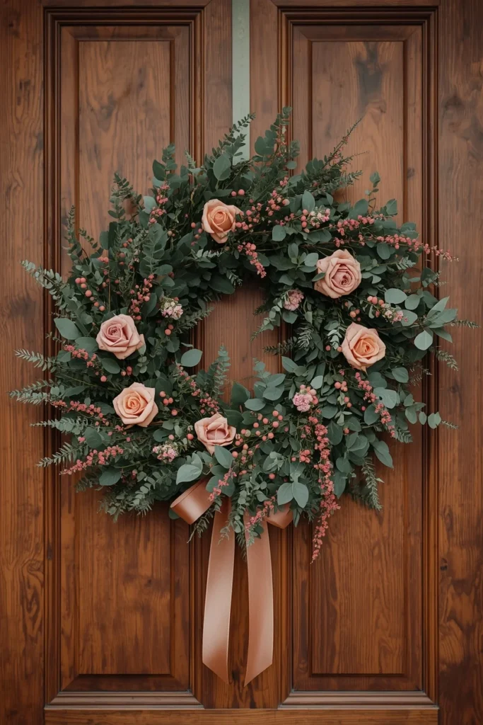
Idea 3: A Dusty Rose Wreath for the Front Door
A wreath built around dusty pink flowers or painted leaves, rather than the typical orange and burgundy fall wreath, softens your entryway while still reading as clearly seasonal. Choose a wreath with a natural greenery or dried grass base, so the pink blooms have something warm and textural to sit against rather than a stark, all-flower design. Hang it with a coordinating ribbon in cream or copper tones, since either color bridges the gap between the wreath’s soft pink and the more traditional fall colors likely present elsewhere on your porch. This idea works beautifully with brick, painted, or natural wood front doors alike, since the muted pink tends to complement rather than clash with most exterior color schemes. It’s often the single decor choice that sets the tone for how guests expect the rest of your home to be styled once they step inside.
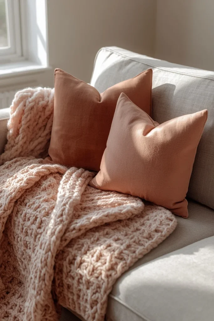
Idea 4: Layered Blush Throws and Velvet Pillows
Layering a chunky knit throw in a soft blush tone over a sofa, paired with one or two velvet pillows in a slightly deeper dusty rose, brings cozy pink texture into the living room without requiring any permanent changes. Mix the pink pieces in with your existing neutral or brown-toned pillows and throws rather than replacing the whole seating area, so the pink reads as an accent layered into the room instead of a full redecoration. Chunky knit and velvet are both texture-forward fabrics that fall decor leans on heavily this season, which means the blush tones fit naturally into the broader seasonal mood rather than standing apart from it. This is one of the lowest-commitment ideas on the list, since throws and pillows are easy to store and swap out once the season changes. It also tends to be the first thing guests physically interact with when they sit down, so the soft texture does as much work as the color itself.
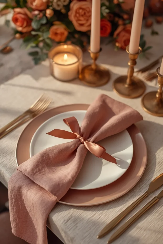
Idea 5: A Pink and Copper Table Setting
Blush pink tableware or napkins, paired with copper or brass flatware and candle holders, elevates a fall table setting with a warmth that traditional orange linens don’t quite achieve on their own. Layer a blush charger under a cream dinner plate, then add a linen napkin in a slightly deeper rose tone, tied with a thin copper ribbon or simple twine, for a setting that feels considered without being fussy. Copper catches candlelight beautifully against pink, which makes this combination especially effective for an evening dinner rather than a bright midday lunch. This palette works particularly well for a smaller, more intimate fall gathering, where the softer color story feels more fitting than a bold, traditional harvest table. Because blush and copper are neutral enough to use again through the winter holidays, this is also one of the more versatile investments on this list.
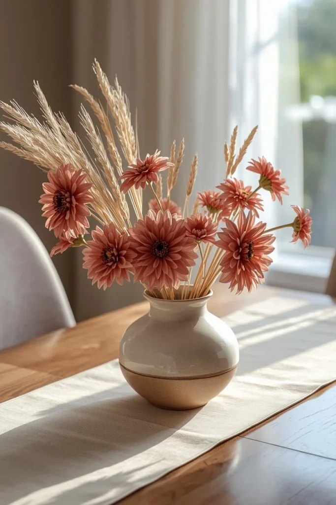
Idea 6: A Dried Pink Dahlia and Grass Centerpiece
Dried pink dahlias, mixed with natural dried grasses and a few stems of wheat, create a centerpiece that brings in fall’s textural, dried-floral trend while keeping the color story soft rather than the usual deep burgundy or rust. Arrange the stems in a low, wide ceramic vase so the centerpiece doesn’t block sightlines across the table, letting the dahlias sit slightly higher than the grasses for contrast. Dried florals like this hold their color and shape for weeks, which makes the centerpiece practical for a season that often includes multiple gatherings without needing a fresh arrangement each time. This idea works particularly well on a table with a neutral linen runner or tablecloth, since the pink dahlias become the clear focal point against a calmer backdrop. It’s a strong middle ground for anyone who loves the look of dried fall florals but wants a softer color palette than the typical rust and mustard combinations.
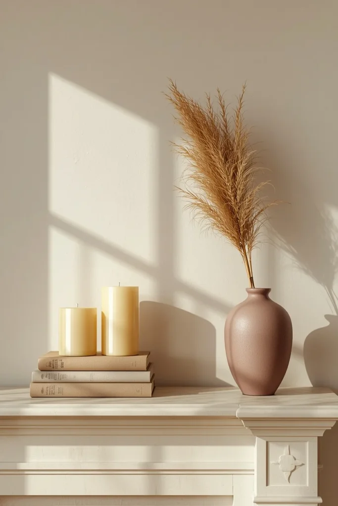
Idea 7: A Mauve and Cream Layered Mantel
Styling the mantel with a mix of mauve, cream, and natural wood elements creates a fall display that feels sophisticated rather than overtly seasonal, which suits a more design-forward living room. Layer a few cream pillar candles of varying heights with a small stack of books in muted tones, then add one mauve-toned object, like a ceramic vase or a small piece of art, as the accent color anchoring the whole arrangement. Keep the greenery minimal, using just one or two dried stems rather than a full garland, so the mantel doesn’t feel overly busy or competing with the color palette itself. This approach works especially well in a modern or transitional living room, where a heavily rustic, orange-toned fall display might feel out of place. Because the palette leans neutral overall, this mantel can also transition easily into a winter look with only minor adjustments.
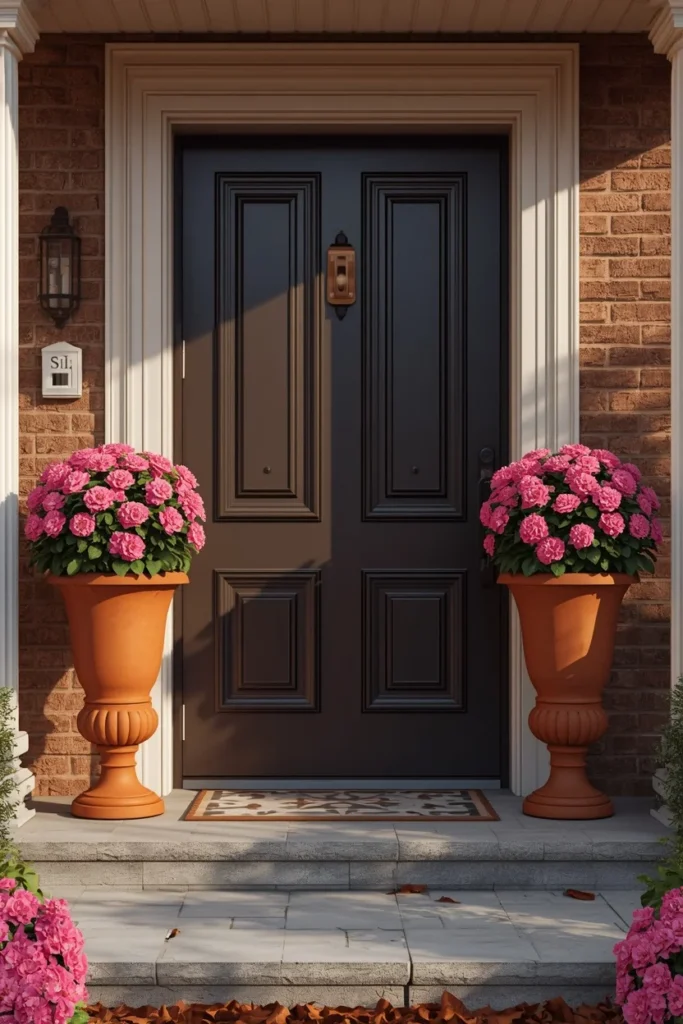
Idea 8: Pink Chrysanthemum Urns Flanking the Entry
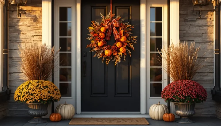
A pair of tall urns filled with pink chrysanthemums, positioned on either side of the front door, gives an entryway a formal, symmetrical presence that a single potted mum can’t achieve on its own. Choose urns in a warm neutral material, like terracotta or aged stone, so the container itself feels seasonal even before the flowers are added. Fill each urn generously, letting the mums fan out naturally rather than trimming them into a tight, uniform dome shape, which keeps the display feeling organic instead of overly manicured. This idea works particularly well for homes with a more traditional or formal architectural style, where symmetry tends to read as more intentional than an asymmetrical grouping. Pairing the pink mums with a coordinating wreath or doormat ties the whole entrance together into one cohesive seasonal statement.
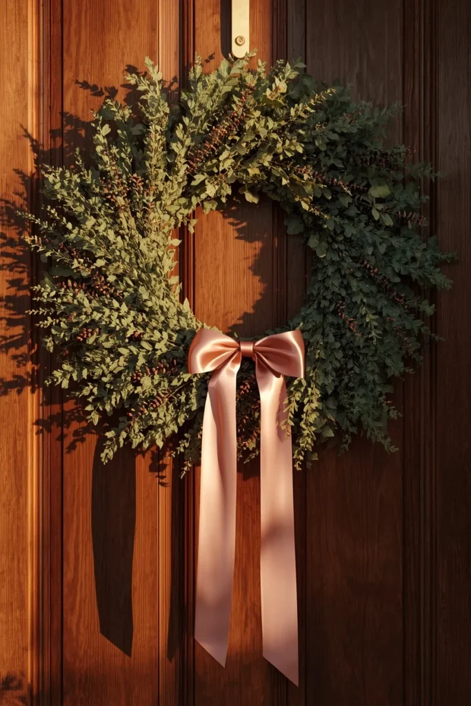
Idea 9: Blush Ribbon Woven Through a Natural Wreath
Rather than building an entirely pink wreath, weaving a wide blush ribbon through a natural, mostly green or brown wreath base introduces the color as an accent rather than the main event. Let the ribbon loop loosely and unevenly through the greenery, with the tails hanging slightly longer at the bottom, so the design feels gathered rather than mechanically placed. This approach is a good entry point for anyone who likes the idea of pink fall decor but isn’t ready to commit to a fully pink wreath, since the natural base still reads as classic autumn styling. The ribbon can also be swapped for a different color easily, meaning the same wreath base can transition into other colors or seasons without needing to be rebuilt from scratch. This is one of the most budget-friendly ways to test out the pink fall trend before investing further.
Idea 10: A Pink and Navy Contrast Palette
Pairing dusty pink accents against a deep navy backdrop, like a navy accent wall, sofa, or throw, creates a bolder, more dramatic take on pink fall decor than the softer blush-and-cream combinations. The contrast between the cool, dark navy and the warm, muted pink gives a room real visual depth, especially once you add in a few brass or gold accents to bridge the two tones. This combination works particularly well in a den, office, or dining room where you want fall styling to feel a bit more sophisticated and less overtly seasonal than a bright, orange-heavy display. Keep the pink elements to two or three key pieces, like pillows, a vase, or a piece of art, so the navy remains the dominant tone and the pink stays an intentional accent rather than competing for attention. This is one of the more design-forward ideas on this list, and it tends to photograph particularly well in evening or lower light.
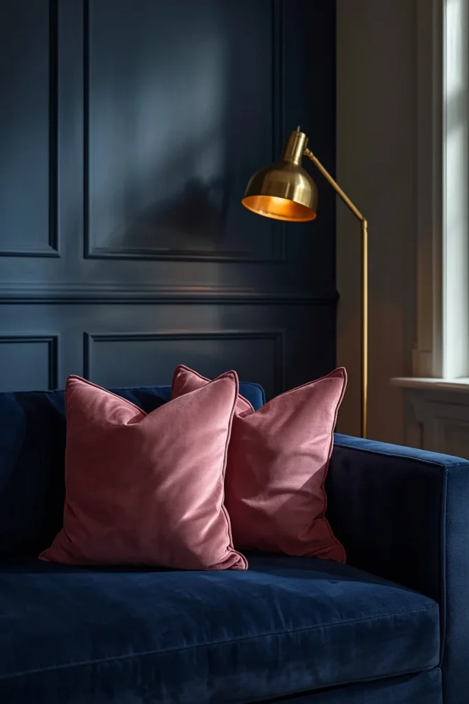
Idea 11: A Dusty Rose Ceramic Pumpkin Duo
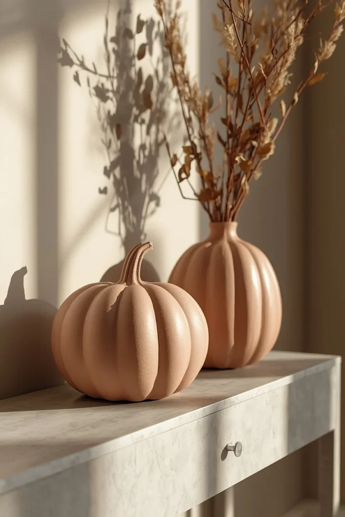
Two oversized ceramic pumpkins in a matte dusty rose glaze can replace an entire grouping of smaller pink accents, since their scale alone gives a room presence without needing much else around them. Choose pumpkins with a slightly textured or ribbed finish rather than perfectly smooth, glossy ones, since the texture reads as more sculptural and less like a mass-produced seasonal item. Place them slightly off-center on a console table or entry bench, letting one sit closer to the edge than the other for a more relaxed, natural arrangement. Ceramic pumpkins in this finish tend to be reusable for years, which makes them a solid long-term investment if pink fall decor is a direction you plan to keep exploring each season. This idea is especially effective in an entryway, where the muted pink offers a soft, welcoming first impression as soon as someone walks in the door.
Idea 12: A Pink Ombré Floral Arrangement
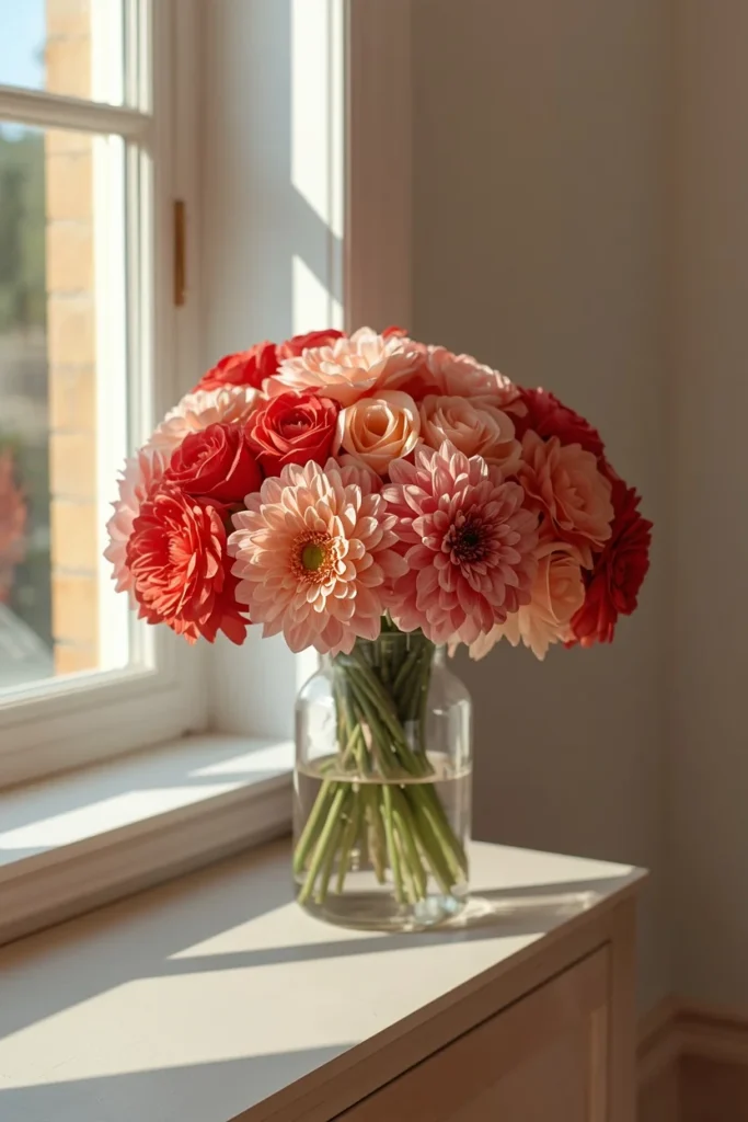
An arrangement built entirely from pink flowers in an ombré gradient, moving from a deep rose at the base to the palest blush at the top, creates a striking single-color centerpiece without needing to mix in traditional fall florals at all. Roses, dahlias, and ranunculus all work well for this effect, since their layered petals show gradient shading clearly even within a single stem. Arrange the flowers in a simple glass or ceramic vase, letting the color transition do all the visual work rather than adding extra greenery or filler that might distract from the gradient. This idea works particularly well as a statement centerpiece for a dining table or entry console, where its single, cohesive color story stands out clearly against more neutral surroundings. It also reads as more of an elevated floral design moment than a typical “fall arrangement,” which makes it a strong choice for a dinner party or special occasion during the season.
Idea 13: A Rose Gold and Blush Bar Cart Vignette
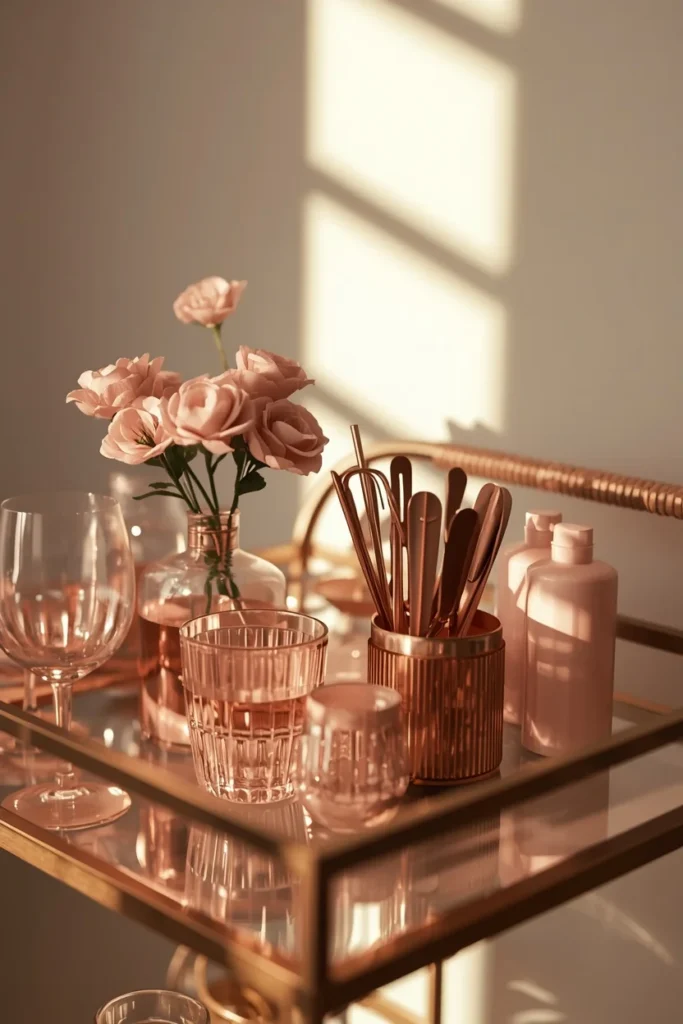
Styling a bar cart with blush glassware, a small vase of dusty pink flowers, and rose gold or brass bar tools brings the seasonal palette into a smaller, more specific corner of the home that often gets overlooked in fall decorating. Layer a small tray at the base of the cart to contain bottles and glassware, then add the floral accent on the top shelf where it’s most visible. This combination works especially well because rose gold and blush are already a popular pairing outside of fall, which means the styling doesn’t feel like a seasonal costume so much as a natural extension of a look you might already have going. Keep the overall arrangement fairly minimal, with two or three key pieces rather than a fully stocked, cluttered cart, so the pink and metallic tones remain the clear visual focus. This idea is a good option for anyone hosting fall gatherings who wants a small, contained styling moment that doesn’t require touching the rest of the room.
Idea 14: A Pink Plaid Throw Blanket Accent
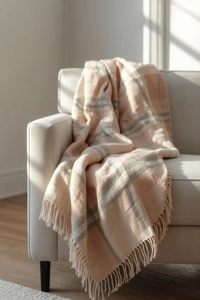
A plaid throw blanket in soft pink, cream, and gray tones brings in fall’s classic plaid pattern while steering away from the more traditional red or orange versions of the print. Drape it over the back of a chair or the arm of a sofa, letting it fall naturally rather than folding it into a perfectly even rectangle, which keeps the styling looking relaxed and lived-in. This idea works well alongside neutral or navy furniture, where the pink plaid becomes a clear but not overwhelming accent against a calmer base. Because plaid already reads as a classic fall pattern regardless of its exact colorway, this throw signals the season clearly even in a palette that skips the usual orange and brown entirely. It’s also one of the easiest pieces to swap in and out, making it a low-commitment way to test the pink fall trend in a room you’re not ready to fully commit to.
Idea 15: Blush Candles in Brass Holders
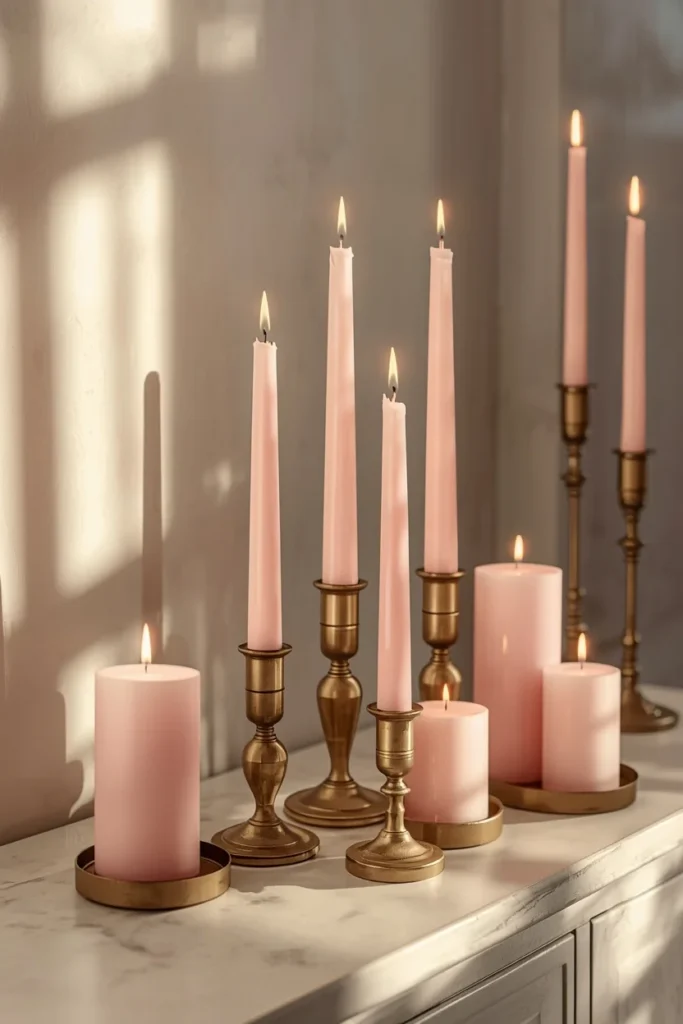
A cluster of blush pink taper or pillar candles, set in brass or aged gold holders, brings warmth and a soft glow to a room while reinforcing the pink and metallic pairing that runs through so much of this palette. Group the candles in varying heights on a tray or directly on a mantel or console, letting the brass holders catch the candlelight and add a bit of shine once they’re lit in the evening. This idea works in almost any room of the house, from a dining table to a bathroom vanity, since candles are one of the simplest and most flexible ways to introduce a new color without committing to larger decor pieces. The soft pink tone of the candles themselves reads as distinctly seasonal without needing to rely on scent or shape to communicate that it’s fall. This is one of the most affordable ideas on this list, and it’s also one of the easiest to find in stores every year around this time.
Styling Tips
- Use pink as an accent, not the whole palette. Pairing it with copper, cream, navy, or natural wood keeps the room feeling like fall rather than like spring.
- Mix textures, not just colors. Velvet, dried grasses, ceramic, and knit all read as seasonal on their own, and pink works best layered across a few of them rather than concentrated in one material.
- Vary your pink tones. Blush, dusty rose, and mauve used together create more depth than a single flat shade repeated throughout a space.
- Keep at least one traditional fall element nearby. A few natural pumpkins, dried leaves, or warm wood tones help ground the softer palette so it still reads clearly as autumn.
- Let metallics do double duty. Brass and copper accents bridge the gap between pink and more classic fall colors, so a room doesn’t feel like two competing color schemes.
Practical Implementation Ideas
- Start with one room or one surface, like a coffee table or mantel, rather than trying to convert your whole home to a pink palette at once.
- Swap in pink versions of decor you already buy every fall, like mums or pumpkins, since it’s a low-risk way to test the trend without new purchases elsewhere.
- Layer pink textiles over existing neutral or brown pieces rather than replacing furniture, since pillows and throws are the easiest and least expensive way to shift a room’s palette.
- Save the more dramatic ideas, like the navy and pink contrast room, for spaces that get less daily traffic, so you can commit to a bolder look without redoing a room you use constantly.
- Buy dried florals and ceramic pieces first, since they’ll last and can be reused each fall, and treat fresh flowers and mums as the seasonal, replaceable layer on top.
Common Mistakes to Avoid
- Using pink alone without any grounding neutral or metallic tone, which can push a space toward looking more like a spring or Valentine’s Day palette than a fall one.
- Choosing a pink that’s too bright or cool-toned. Warmer, dustier pinks like blush and mauve read as more autumnal than a cool, bubblegum pink.
- Overcommitting all at once by replacing every fall decor piece with a pink version, which can feel more like a themed party than a considered seasonal update.
- Skipping texture and relying on color changes alone, which tends to leave a space looking flat even with the right palette.
- Forgetting the room’s existing undertones. Pink can clash with certain warm oranges or yellows already in a space if it’s not chosen and placed carefully.
Small-Space Alternatives
For a smaller room or apartment, choose just one or two ideas from this list rather than layering several pink elements throughout the space. A single throw blanket or a small trio of velvet pumpkins can carry the trend without needing a full palette shift. Candles are also a strong small-space choice, since they add color and warmth without requiring any additional surface space beyond where they’re already sitting.
Budget-Friendly Alternatives
Fresh pink mums typically cost about the same as traditional orange ones, making them one of the most affordable ways to test this trend outdoors. A length of blush ribbon woven through a wreath you already own costs only a few dollars and can be swapped out again easily. Dried pink florals, which hold their color for weeks, tend to be more budget-friendly over time than fresh arrangements that need frequent replacing. Secondhand shops are also a reliable source for ceramic vases, ribbon, and ceramic pumpkins in muted pink tones, often for a fraction of retail pricing.
Pro Styling Recommendations
Professional stylists tend to treat pink as one note in a larger fall chord rather than the melody itself, pairing it consistently with warm metallics and at least one deep, grounding neutral like chocolate brown or navy. It’s also worth stepping back and looking at a styled room from across the space rather than up close, since a few well-placed pink accents can read as too subtle from a distance if they’re all clustered in one small area. Photographing the space in both daylight and evening lighting is a useful final check, since pink tones can shift more noticeably under warm lamp light than most other fall colors do.
FAQs
Conclusion
Pink fall decor works because it doesn’t ask you to abandon what makes autumn feel like autumn — the warmth, the texture, the cozy layering are all still there. It just shifts the color story slightly, trading orange and rust for blush and dusty rose, and pairs that softer palette with copper, cream, and natural materials to keep everything grounded. Start with one small change, whether that’s a throw blanket or a set of pink mums on the porch, and build from there if the look grows on you. A softer fall doesn’t mean a less seasonal one — it just means a slightly different way of getting there.