15 Lilac and Chocolate Brown Fall Decor Ideas for a Moody, Elegant Palette
Every fall color guide says the same thing. Orange, rust, burgundy, repeat. It’s a good palette, but it’s also the one you’ve already seen a thousand times, on every porch and every Pinterest board since September started.
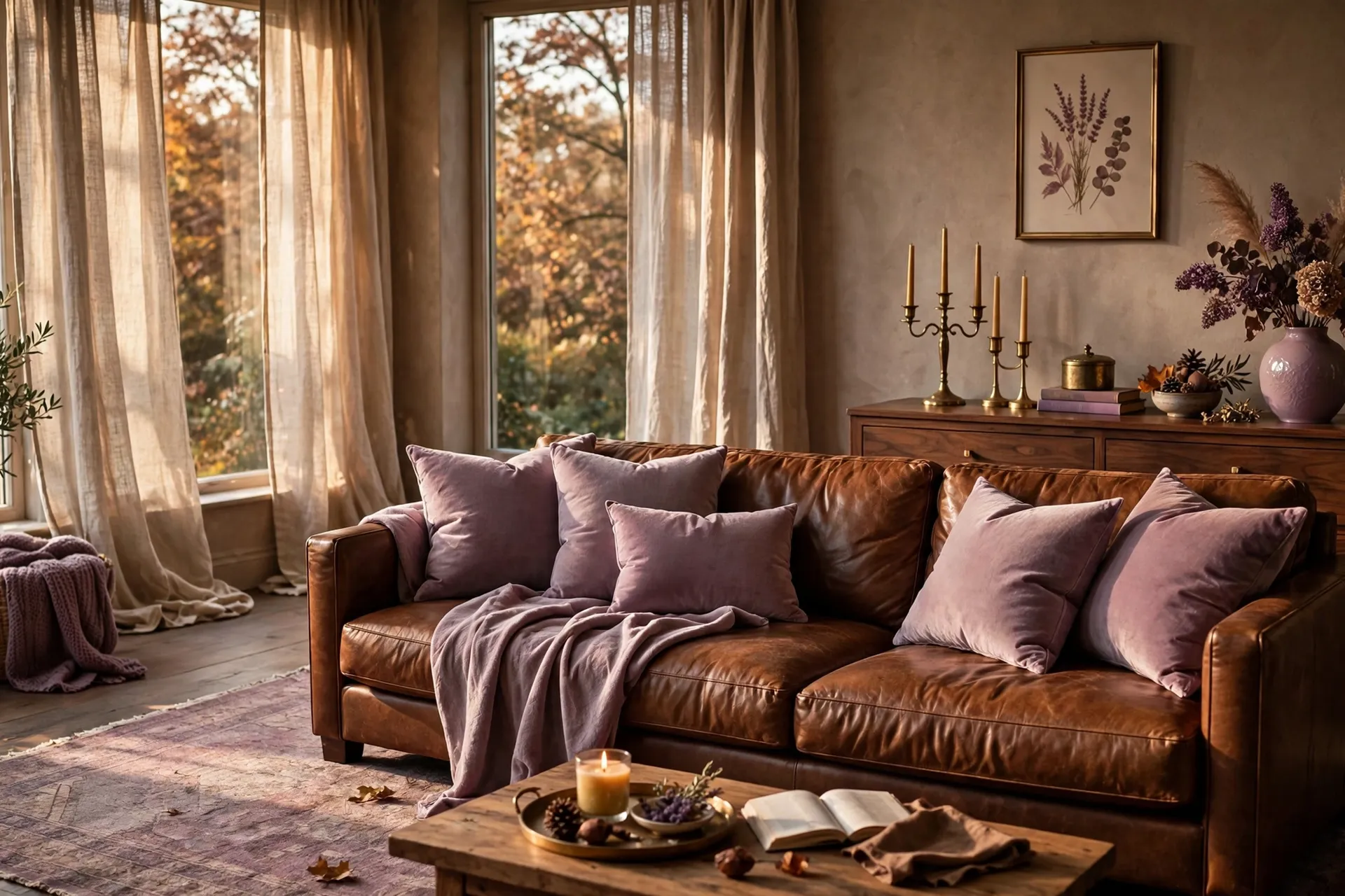
Lilac and chocolate brown is a different conversation entirely. Dusty, muted purple against a rich, warm cocoa brown, it’s a pairing that sounds unlikely on paper and reads as genuinely sophisticated in person. The lilac keeps the palette from feeling heavy the way an all-brown room can. The chocolate brown keeps the lilac from tipping into anything too sweet or pastel. Together they land somewhere moody, a little unexpected, and unmistakably elegant.
This combination works particularly well for anyone who wants their home to feel like fall without looking like every other fall home on the internet. It photographs beautifully in low autumn light, it pairs naturally with brass and walnut, and it has genuine staying power well past the season, since neither color is tied specifically to pumpkins or harvest imagery.
This guide walks through 15 specific ways to bring lilac and chocolate brown into your home this fall. Save the ones that speak to you.
- 15 Lilac and Chocolate Brown Fall Decor Ideas
- Styling Tips for a Lilac and Chocolate Brown Palette
- Practical Implementation Ideas
- Common Mistakes to Avoid
- Small-Space Alternatives
- Budget-Friendly Alternatives
- Pro Styling Recommendations
- FAQs
- Conclusion
15 Lilac and Chocolate Brown Fall Decor Ideas
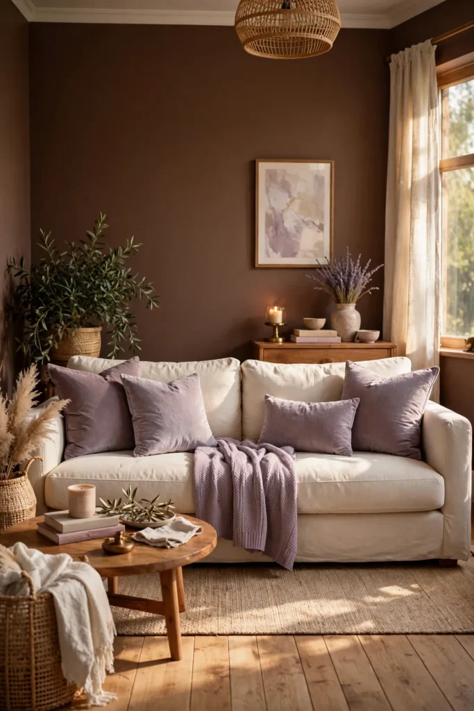
1. Paint Walls in Warm Chocolate Brown, Add Lilac Textiles
A full chocolate brown wall treatment gives the room a rich, enveloping foundation, warm enough to feel genuinely cozy rather than heavy, especially when paired with a warm-toned brown rather than anything leaning gray or cool. Introduce lilac entirely through textiles on top of this base, a few throw pillows, a folded blanket, or curtains, letting the wall color stay the room’s grounding note while the purple provides lift and contrast. Choose a matte or eggshell finish for the walls, since this softer sheen suits the color’s natural warmth better than anything glossy. This combination works especially well in a living room or bedroom, where the brown creates an intimate, cocooning atmosphere that the lilac then keeps from feeling too dark or one-note. Starting with brown walls and layering lilac on top is the most reliable entry point into this palette, since it requires only textile purchases rather than a full room’s worth of new furniture.
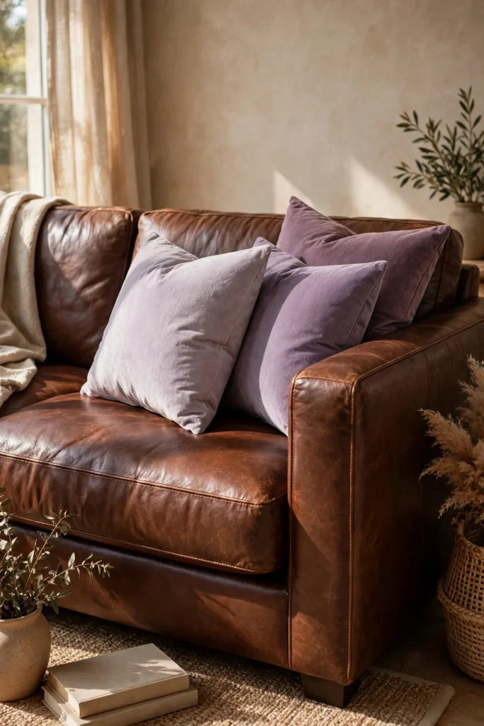
2. Layer Lilac Velvet Pillows on a Chocolate Brown Sofa
A chocolate brown leather or velvet sofa provides an ideal neutral-but-rich base for a scattering of dusty lilac velvet throw pillows, since the pillow’s sheen and soft purple tone stand out clearly against the sofa’s deep, warm brown. Choose two or three pillows in slightly varying shades of lilac, from pale thistle to a deeper amethyst, rather than a single flat tone, adding tonal depth the same way you’d layer neutral bedding. Position the pillows toward the center or one end of the sofa rather than spreading them evenly across the entire length, letting them read as an intentional grouping. This idea is one of the lowest-cost, lowest-commitment ways to try this color pairing, since it requires no wall paint or furniture changes at all if you already own a brown sofa. The contrast between velvet’s soft sheen and leather or a woven brown fabric adds another layer of textural interest on top of the color pairing itself.
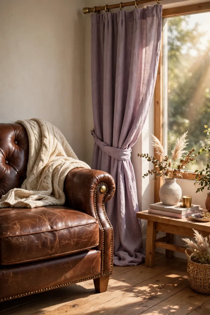
3. Pair Milk Chocolate Leather With Dusty Lilac Linen
Milk chocolate leather, a slightly lighter, warmer brown than a deep espresso tone, pairs particularly well with dusty lilac linen, since both colors share a similar softness and warmth that keeps the combination feeling gentle rather than harshly contrasted. Use the leather in a larger furniture piece, an accent chair or ottoman, then introduce the lilac linen through curtains, a table runner, or a slipcovered cushion nearby. This pairing works especially well in a room with warm natural light, since both materials respond beautifully to golden afternoon sun, the leather deepening slightly while the linen’s purple tone softens even further. Choose a linen with a slightly nubby, relaxed weave rather than a stiff, formal fabric, since the goal is an easy, lived-in elegance rather than anything overly polished. This specific brown-and-purple combination is one of the more subtle, tonal versions of the palette, ideal for anyone wanting a gentler introduction to the pairing.
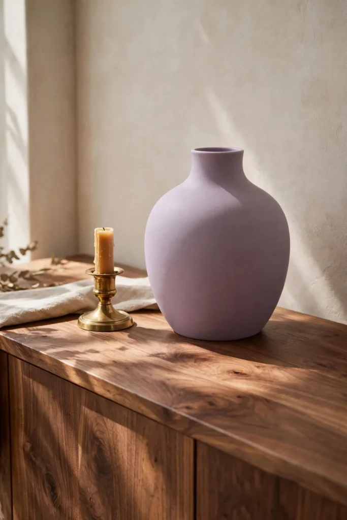
4. Add a Lilac Ceramic Vase on a Walnut Console
A single lilac-glazed ceramic vase, displayed on a warm walnut console table, brings this color pairing into a smaller, more contained styling moment rather than a full room commitment. Choose a vase with a matte or subtly textured glaze, since a flat, glossy finish can read as more purple than lilac, losing some of the dusty, muted quality that makes this shade feel sophisticated rather than sweet. Position it alone or alongside one other neutral object, like a small stack of books or a brass candle holder, giving the vase enough visual space to stand out clearly against the wood’s warm brown grain. This idea is one of the easiest, most affordable ways to test the lilac and chocolate brown pairing before committing to any larger furniture or paint changes. A single well-chosen vase against a walnut surface consistently photographs as one of the most elegant, editorial-feeling styling moments within this entire palette.
Related: 15 Fall Coffee Station Styling Ideas to Cozy Up Your Kitchen
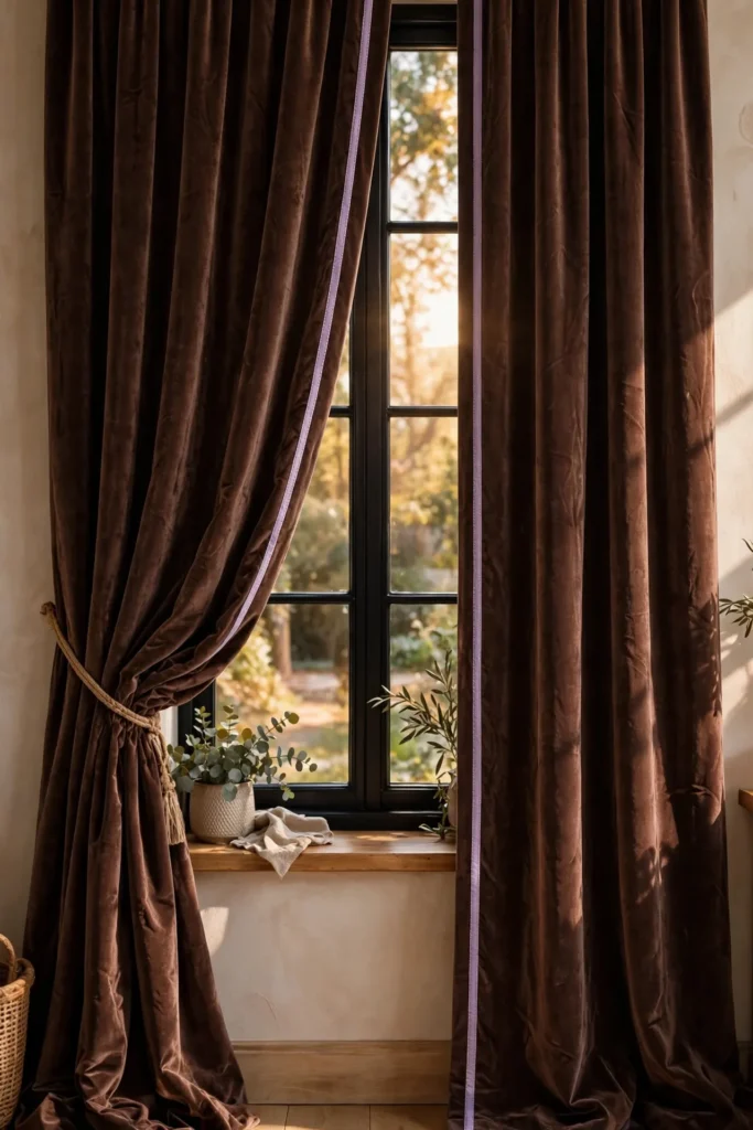
5. Use Chocolate Brown Curtains With Lilac Trim or Piping
Chocolate brown curtains, finished with a thin lilac trim or piping along the leading edge, bring definition and a subtle pop of color to an otherwise deep, solid window treatment. Choose a heavier fabric like velvet or a substantial cotton blend for the brown base, since the curtain’s weight and drape matter as much to the room’s overall mood as its color. Keep the lilac trim narrow and consistent, since a thin line of contrast reads as tailored and intentional, while a wider stripe can tip the look toward something busier and less refined. This detail works particularly well in a room where you want the drama of a dark, saturated curtain without losing all connection to the lighter half of this palette. Custom trim application does require either sewing skill or a professional workroom, but the resulting detail delivers a level of polish that off-the-shelf curtains typically can’t match.
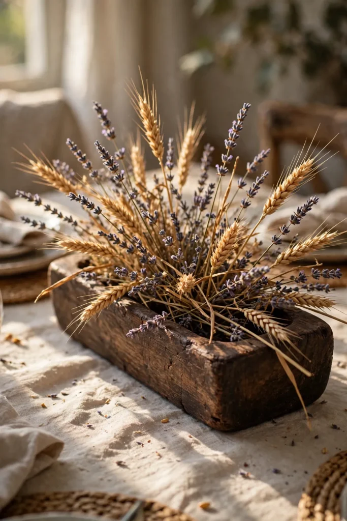
6. Style a Dried Lilac or Lavender and Wheat Centerpiece
A centerpiece combining dried lavender or lilac-toned stems with warm wheat and a few brown seed pods brings both halves of this palette together in one small, organic arrangement, ideal for a dining table or console. Choose a wood or dark ceramic vessel in a warm brown tone to hold the arrangement, letting the vessel’s color ground the softer purple and gold tones of the stems themselves. Keep the arrangement loose and slightly asymmetrical, since an overly tight, formal arrangement loses some of the natural, foraged quality that makes dried botanicals feel authentic rather than purchased purely for display. This idea also has genuine longevity, since dried lavender and wheat both hold their color and shape for the entire season without wilting or requiring replacement. A well-styled dried arrangement is one of the most literal, seasonally appropriate ways to bring this specific color pairing together in a single object.
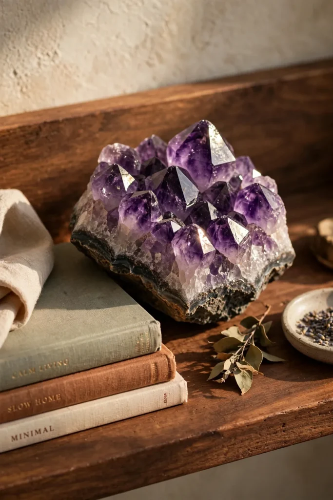
7. Choose Amethyst Crystal Decor Against Brown Wood
A raw or polished amethyst crystal cluster, displayed on a warm wood shelf or side table, brings genuine mineral texture and a deeper, more saturated version of purple into the room, offering a bolder counterpoint to lighter lilac textiles elsewhere. Choose a piece with visible natural variation and faceted texture, since this raw, unfinished quality reads as more interesting and authentic than a smooth, uniform sphere. Position it where it catches some natural or lamp light throughout the day, since amethyst’s color and sparkle depend on light interacting with its crystalline surface. This detail appeals particularly to anyone drawn to a slightly more mystical or eclectic version of this color pairing, connecting the room’s palette to something beyond pure interior styling. Amethyst also naturally deepens the lilac side of the palette without requiring any additional painted or upholstered surfaces, making it a flexible, low-commitment way to add richness to the color story.
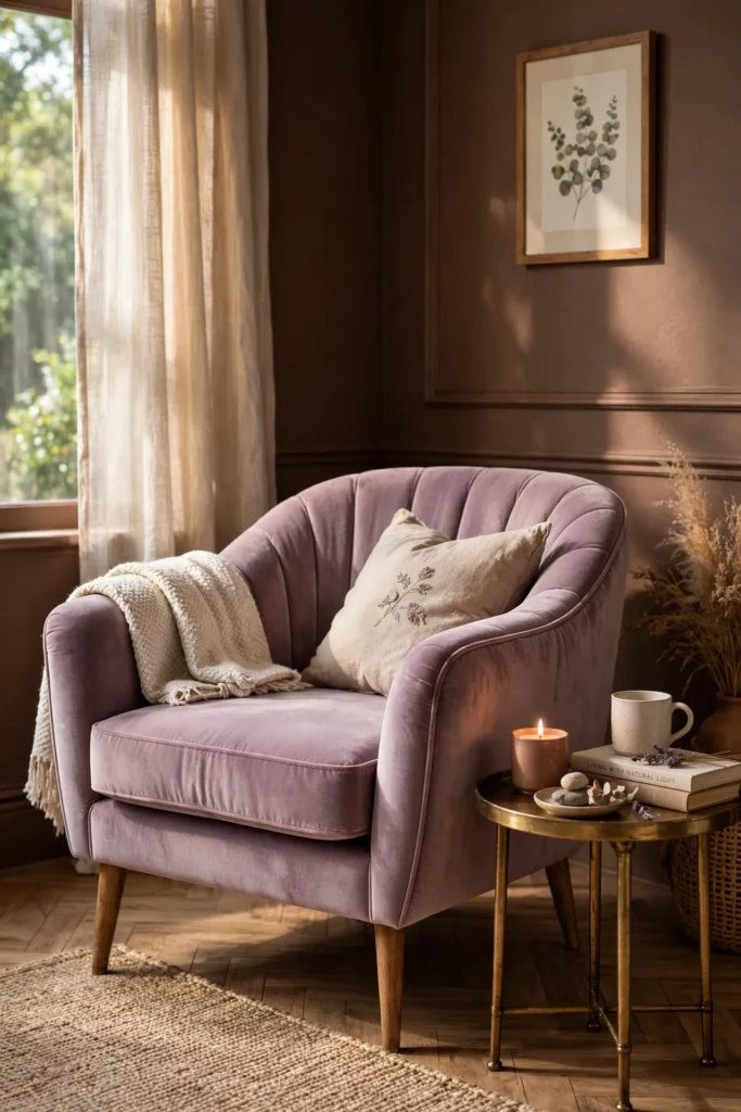
8. Add a Lilac Accent Chair in a Chocolate Brown Room
For a bolder application of this palette, a single upholstered accent chair in dusty lilac velvet or boucle becomes a genuine furniture-level statement within a room otherwise built around warm chocolate brown walls or furniture. Choose a simple, classic chair silhouette, letting the unusual color choice itself carry the visual interest rather than combining it with an overly ornate shape. Position the chair somewhere it has room to stand alone, an empty corner or beside a window, rather than crowding it against other bold furniture pieces. This idea works particularly well for renters or anyone hesitant to commit to paint, since a single chair delivers real personality and color while remaining entirely portable between homes. A lilac chair against a chocolate brown backdrop consistently becomes the piece guests comment on first, since the combination is distinctive enough to stand out without feeling jarring or mismatched.
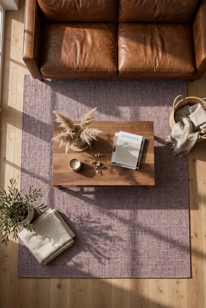
9. Layer a Mauve-Toned Rug With Warm Brown Furniture
A rug in a muted mauve or dusty lilac tone, layered beneath warm brown wood or leather furniture, brings this color pairing down to floor level, grounding the room’s overall palette from the bottom up rather than relying solely on wall color or textiles higher up. Choose a rug with a low pile and subtle texture, like a flat-weave or a soft wool blend, so the color reads clearly without competing against a busy pattern. Position furniture legs directly on the rug, letting the mauve tone peek out around the edges where it can be seen clearly against the room’s warmer brown tones. This detail adds a layer of softness underfoot while reinforcing the room’s color story in a way that’s easy to overlook when focused mainly on walls and upholstery. A well-chosen mauve rug is a particularly effective way to introduce this palette into a room where you’re not ready to commit to purple furniture or paint.
10. Use Brass Accents to Bridge Lilac and Chocolate Brown
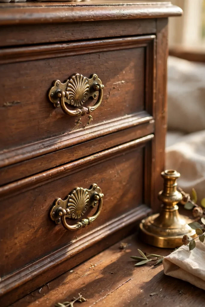
Warm brass hardware, lighting, and small decor objects act as a visual bridge between lilac and chocolate brown, since the metal’s golden warmth relates naturally to the brown while its shine and formality complement the more elevated, jewel-toned quality of the lilac. Choose brass in a slightly aged or antiqued finish rather than bright, polished gold, since the softer patina fits more naturally into this moody, autumnal palette. Apply the finish consistently across drawer pulls, lamp bases, and any picture frames in the room, since this consistency is what ties the two main colors together into one cohesive story rather than two competing ideas. This detail is easy to underestimate while focused on larger color choices, but its role as a unifying element is genuinely significant once you notice how much visual work it’s doing throughout the room. Brass is consistently the recommended metal finish for this specific color pairing, since cooler metals like chrome or silver don’t bridge the warmth of the brown nearly as effectively.
Related: 25 Moody Fall Living Room Decor Ideas for a Cozy Autumn Home
11. Paint an Ombre Wall From Chocolate Brown to Lilac
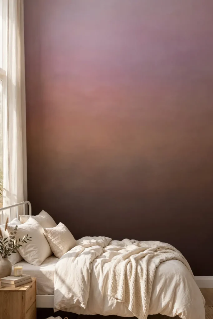
For a genuinely striking, design-forward application of this palette, an ombre wall treatment transitioning gradually from deep chocolate brown at the bottom to soft lilac near the ceiling creates a dramatic gradient effect that showcases both colors within a single continuous surface. Choose three or four intermediate shades to build the transition smoothly, working with a painter experienced in ombre techniques to avoid visible banding between color steps. This treatment works especially well as a single feature wall, like behind a headboard or in an entryway, rather than across an entire room, since the gradient needs enough uninterrupted vertical space to build its full effect gradually. Pair the ombre wall with simple, solid-colored furniture nearby, letting the wall itself remain the room’s clear focal point without competing against other patterns or bold color choices. This is one of the more ambitious ideas on this list, but it delivers a genuinely unique, highly photographable result that few other decorating choices could replicate.
12. Add Lilac Florals or Stems in a Brown Ceramic Vase
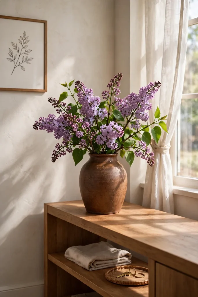
Fresh or dried lilac stems, displayed in a warm brown ceramic vase, bring genuine organic color and softness to the room, using real or high-quality faux botanicals rather than any painted or dyed decor object. Choose a vase with a matte, earthy glaze in a warm chocolate or terracotta-leaning brown, letting the material itself echo the room’s broader color palette even before the flowers are added. Position the arrangement somewhere it catches natural light, a windowsill, dining table, or entryway console, since lilac’s soft color depends on good light to read clearly rather than muddy or flat. This idea works particularly well seasonally, since lilac itself is more commonly associated with spring, making a fall arrangement in this specific color feel intentionally unexpected rather than simply following the calendar. A vase of lilac stems against brown ceramic is one of the most literal, genuinely beautiful expressions of this entire color pairing.
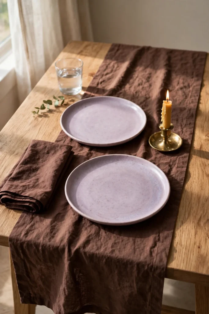
13. Style a Chocolate Brown Table Runner With Lilac Ceramics
A chocolate brown linen table runner, paired with lilac-glazed ceramic dishware or serving pieces, brings this palette into the dining room in a way that feels genuinely suited to entertaining rather than purely decorative display. Choose a runner in a rich, warm brown, layering lilac plates, bowls, or a centerpiece vessel on top, letting the contrast between the two colors define the table’s overall composition. Add brass flatware or candle holders to bridge the pairing, following the same principle used elsewhere in the room. This idea works particularly well for a fall dinner party or holiday gathering, offering a genuinely distinctive tablescape that stands apart from the traditional orange-and-gold harvest table setting seen everywhere else. A well-styled table using this palette consistently draws attention and questions from guests, since the color combination is memorable without feeling costume-like or overly thematic.
Related: 16 Early Fall Porch Decor Ideas for a Subtle Seasonal Transition
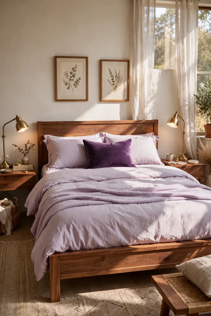
14. Choose Lilac Bedding With Chocolate Brown Furniture
A bedroom built around chocolate brown wood furniture, a warm walnut bed frame, dresser, and nightstands, paired with lilac bedding creates a genuinely soothing, elegant sleep space that avoids both the coldness of an all-neutral room and the intensity of a fully saturated color scheme. Choose lilac in a soft, muted tone for the primary bedding layer, adding a deeper amethyst or plum accent through a single throw pillow or folded blanket for tonal depth. This combination works particularly well because both colors carry naturally calming, restful associations, brown grounding the space while lilac adds a gentle, almost lavender-adjacent softness known for its association with relaxation. Pair the bedding with warm brass reading lamps and simple, unpatterned curtains, letting the wood furniture and bedding colors carry most of the room’s visual interest. This is one of the more livable, everyday applications of this palette, suited to genuine daily use rather than only special occasion styling.
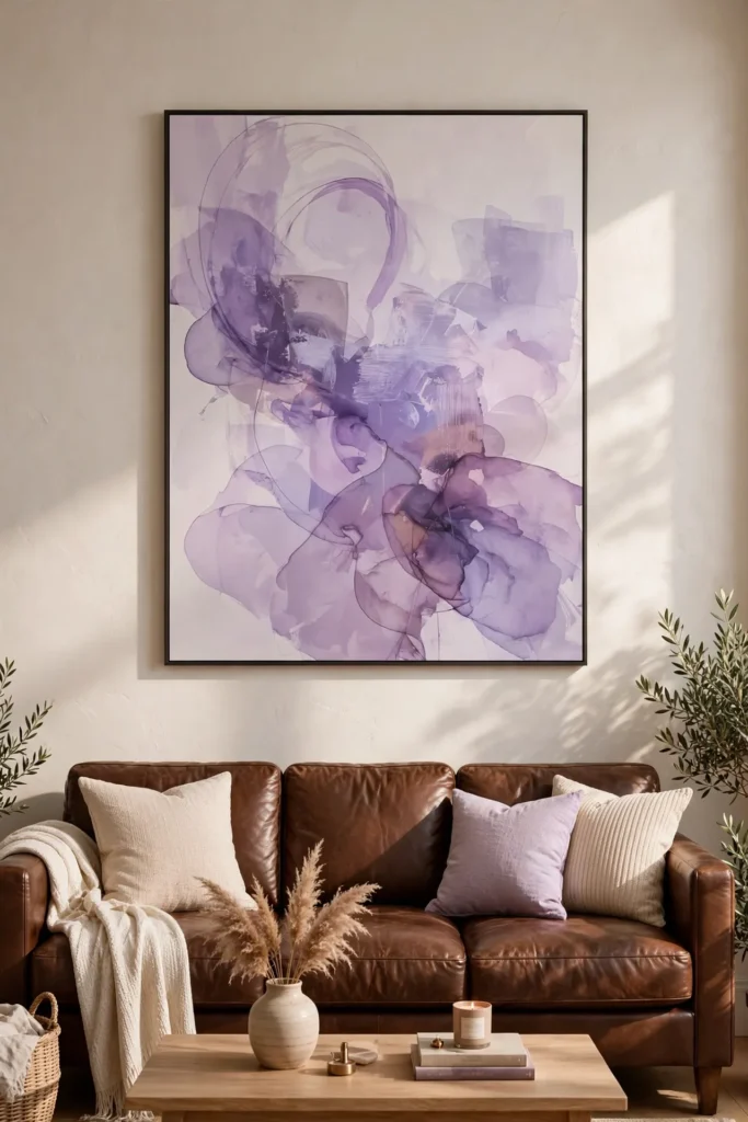
15. Add a Lilac Abstract Art Piece Above a Brown Leather Sofa
A large abstract art piece featuring lilac and purple tones, hung above a chocolate brown leather sofa, turns the wall into a genuine focal point that ties the room’s color palette together through a single, impactful object. Choose artwork with soft, blended color transitions rather than sharp geometric shapes, since a more painterly, abstract quality echoes the same gentle, muted feeling that defines lilac throughout this entire palette. Size the piece generously relative to the sofa, roughly two-thirds its width, so the art reads as a clear, intentional statement rather than an afterthought. Frame it simply in black or a warm wood tone that matches other furniture in the room, keeping the art itself as the primary source of color and visual interest. This is one of the most efficient single purchases for anyone wanting to commit to this color pairing without changing walls, furniture, or extensive textiles, since one well-chosen piece of art can define an entire room’s palette on its own.
Styling Tips for a Lilac and Chocolate Brown Palette
- Let brown be the dominant, grounding tone. This pairing reads best with chocolate brown covering the larger surfaces, walls, furniture, floors, while lilac appears in smaller, more concentrated doses through textiles and accents.
- Choose a dusty, muted lilac over a bright, sweet purple. A grayed-down, softer lilac reads as sophisticated and moody, while a brighter, more saturated purple can tip the palette toward something more playful than elegant.
- Use brass consistently to bridge the two colors. Warm metal accents connect brown’s earthiness to lilac’s cooler undertone more effectively than any other single detail.
- Balance the palette with plenty of warm, natural texture. Walnut, leather, linen, and wool all support this color pairing and keep it feeling grounded rather than overly precious.
Practical Implementation Ideas
Start with your dominant chocolate brown element, whether that’s existing furniture, flooring, or a planned wall color, since this establishes the base the lilac accents will be layered onto. Introduce lilac gradually through a small number of textiles or objects, testing how the color reads in your room’s actual lighting before committing to larger purchases like an accent chair or an ombre wall. Add brass or warm gold accents next, since these unify the two main colors and prevent the pairing from feeling like two separate, competing color schemes. Live with the initial combination for a week or two before adding further elements, checking that the balance between brown and lilac still feels intentional rather than either color overwhelming the other.
Common Mistakes to Avoid
- Using too much lilac relative to chocolate brown. This pairing works best with brown as the dominant tone and lilac as a supporting accent, not the reverse. Too much lilac can tip the room toward pastel rather than moody and elegant.
- Choosing a bright, saturated purple instead of dusty lilac. A cleaner, brighter purple reads as a different, more playful palette entirely. Stick with muted, grayed-down lilac tones for the sophisticated effect this pairing is known for.
- Skipping the bridging metal accent. Without brass or another warm metal tying the two colors together, lilac and chocolate brown can occasionally read as disconnected rather than intentionally paired.
- Ignoring texture in favor of color alone. Leather, velvet, linen, and wool all add necessary depth to this palette. Flat, smooth surfaces in just these two colors can look one-dimensional without enough textural variation.
Small-Space Alternatives
In a smaller room, introduce this palette through a single lilac accent, a throw pillow, a small vase, or a piece of art, rather than committing to a full ombre wall or an accent chair that would take up significant floor space. A mauve-toned rug or runner delivers meaningful color impact underfoot without requiring any furniture changes. Choosing chocolate brown as the wall color in a small room, paired with just one or two lilac accents, can actually make the space feel more enveloping and intentional rather than smaller, similar to how any deep, saturated color functions in a compact footprint. Brass accents in a small space also help bounce available light around the room, which matters more in a smaller footprint with potentially limited natural light.
Budget-Friendly Alternatives
A few lilac throw pillow covers paired with furniture you already own is one of the most affordable ways to test this palette without any larger investment. Thrifted brass candle holders, picture frames, and ceramic vases are widely available and inexpensive, often carrying more character than new pieces. Dried lavender and wheat stems can be sourced affordably from a local farm stand or craft store, delivering genuine seasonal styling for very little cost. If a full ombre wall feels like too large a project, a single gallon of chocolate brown paint applied to one accent wall, paired with a few lilac textiles, delivers much of the same visual impact for a fraction of the cost and effort.
Pro Styling Recommendations
Test both your chosen brown and lilac shades together under your room’s actual lighting before committing to any paint or major upholstery purchase, since both colors can shift noticeably between daylight and warm evening lamp light. Keep the ratio of brown to lilac roughly seventy-thirty in favor of brown for the most balanced, sophisticated result, adjusting slightly based on your own taste once you’ve lived with the initial pairing. Choose one consistent metal finish, ideally brass, across every visible hardware and lighting element in the room to reinforce the connection between the two main colors. Finally, build the palette gradually rather than purchasing everything in a single trip, since this pairing rewards a collected, considered approach far more than an immediate, complete room transformation.
FAQs
Yes, the pairing works particularly well because chocolate brown’s warmth balances lilac’s cooler, softer undertone, while lilac keeps an all-brown room from feeling too heavy or monotone. The combination reads as moody and elegant rather than mismatched when brown is used as the dominant tone.
A dusty, muted lilac, sometimes described as thistle or grayed lavender, pairs more sophisticatedly with chocolate brown than a brighter, more saturated purple. The softer, grayer tone keeps the overall palette feeling elegant rather than overly sweet or playful.
Brass or warm antique gold bridges the two colors more effectively than cooler metals like chrome or silver. The metal’s warmth connects naturally to the brown while its shine complements lilac’s slightly more elevated, jewel-toned quality.
Yes, both colors carry calming, restful associations, making this pairing particularly well suited to a bedroom. Chocolate brown furniture paired with soft lilac bedding creates a genuinely soothing, elegant sleep space.
Most designers recommend keeping chocolate brown as the dominant tone, covering roughly seventy percent of the room’s larger surfaces, with lilac appearing in the remaining thirty percent through textiles, accents, and smaller styling objects. This ratio keeps the palette feeling grounded rather than overwhelmed by either color.
Yes, unlike more literally seasonal palettes built around orange or rust, lilac and chocolate brown aren’t tied to any specific time of year, making this combination a genuinely lasting choice rather than one that needs to be swapped out each season.
Leather, velvet, walnut wood, linen, and wool all support this palette’s overall warmth and texture. These materials add depth and richness that flat paint or smooth fabric alone can’t achieve.
While the specific pairing has become more visible recently as designers move away from traditional pumpkin-orange fall palettes, both lilac and chocolate brown have individually appeared in interior design for decades, suggesting this combination has genuine staying power beyond a single trend cycle.
Conclusion
Lilac and chocolate brown isn’t the fall palette everyone else is reaching for this year, and that’s exactly the point. It takes the season’s usual warmth and gives it something quieter, a little more unexpected, a lot more elegant. Start with one lilac accent against furniture or walls you already have in brown, see how it settles into the room, and let the rest of the palette build slowly from there.