16 Cool Blue Living Room Ideas That Feel Fresh, Not Cold
Blue has a reputation problem in home decor. Get it wrong and a room can feel like a waiting room — flat, sterile, a little too quiet. Get it right, and it’s the calmest, most restorative color in the house.
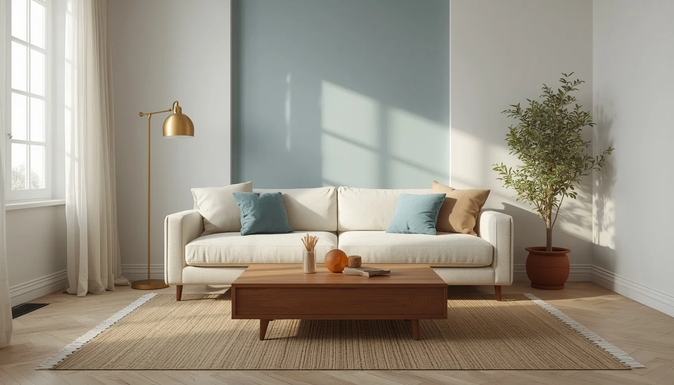
The difference usually comes down to temperature. Cool blue, the pale, glacial shade Pinterest has been calling one of its defining colors, reads as clean and expansive on its own. But paired only with white and chrome, it can tip cold fast. Paired with warm wood, brass, linen, and a little texture, that same blue turns into something else entirely: a room that feels bright, current, and genuinely comfortable to sit in.
That balance is the whole point of this guide. Below are 16 specific elements for building a cool blue living room that leans fresh and airy instead of cold or clinical, with the styling logic behind each one so nothing in the room feels like an afterthought.
Table of Contents
1. Glacial Blue Accent Wall
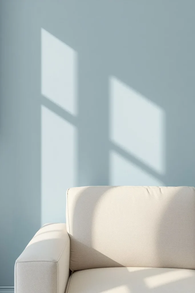
A pale, icy blue wall behind the sofa or fireplace gives the room its cool foundation without tipping into the flatness of an all-blue box. Choosing a shade with a slight gray or white undertone, rather than a saturated sky blue, keeps the color feeling contemporary and mineral rather than nursery-adjacent. Painting only one wall, or color-drenching a single alcove, lets the rest of the room stay in warmer neutrals that balance the temperature out. This wall works best as the backdrop everything else gets layered against, not as the loudest element in the room.
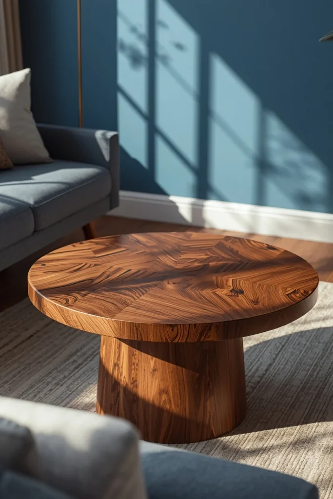
2. Warm Walnut Coffee Table
A coffee table in a rich, warm wood tone like walnut or oak does more to keep a blue room from feeling cold than almost any other single piece. The warm undertones in the wood grain sit in direct, deliberate contrast to the coolness of the walls, and that contrast is what keeps the eye interested instead of settling into one flat temperature. Choosing a table with rounded or organic edges, rather than sharp glass or chrome, adds a softness that pairs naturally with the room’s other textures. This piece often becomes the room’s grounding element, the one warm anchor that everything else gets styled around.
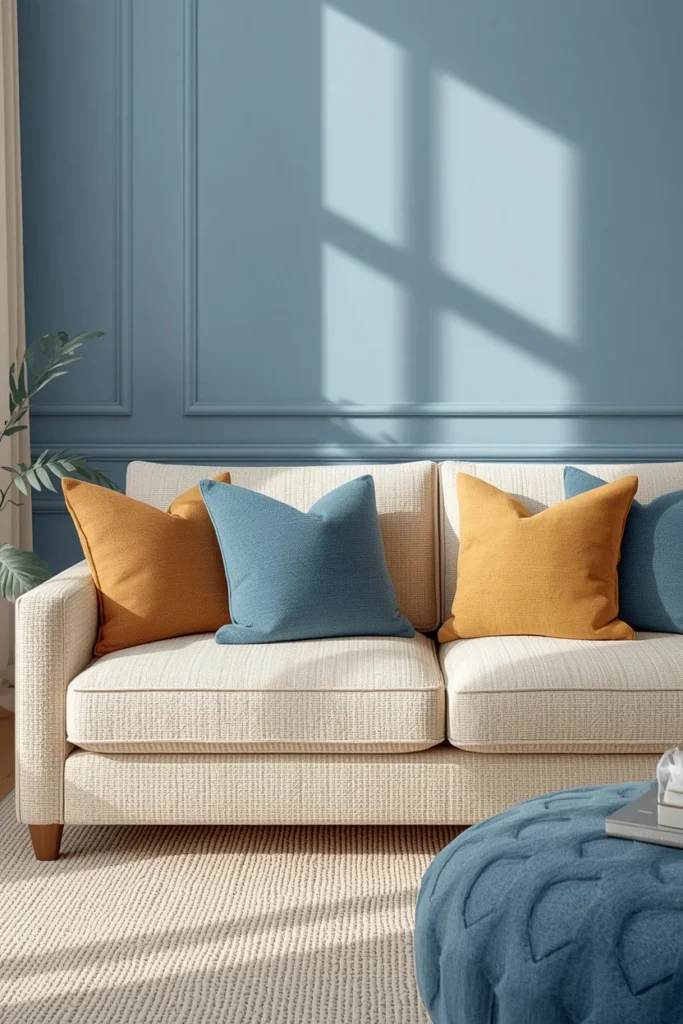
3. Cream or Ivory Boucle Sofa
A sofa in a warm off-white, ivory, or boucle fabric acts as the room’s neutral base, letting the cool blue wall stay the star without another cold surface competing against it. Boucle in particular adds a soft, textural quality that reads as cozy even before anyone sits down, which does a lot to offset the crispness of a glacial blue backdrop. Choosing a warmer white with slight cream or beige undertones, rather than a stark, blue-toned white, keeps the whole palette from drifting too cool. This sofa becomes the room’s largest surface, so its warmth sets the tone for how the rest of the space reads.
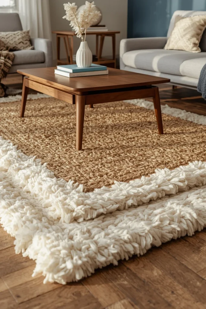
4. Layered Jute and Wool Area Rug
A natural jute rug layered under a soft wool or wool-blend rug adds warmth underfoot in a way a single flat-woven rug can’t. The jute base brings texture and an earthy, sun-bleached tone that softens the room’s overall temperature, while the wool layer on top adds comfort and a slightly plush surface for bare feet. Choosing a wool rug in a warm cream or soft oatmeal tone, rather than another blue or gray, keeps the floor from echoing the wall color too closely. This layering technique also adds visual depth to the room, breaking up what might otherwise be a lot of flat, cool surfaces.
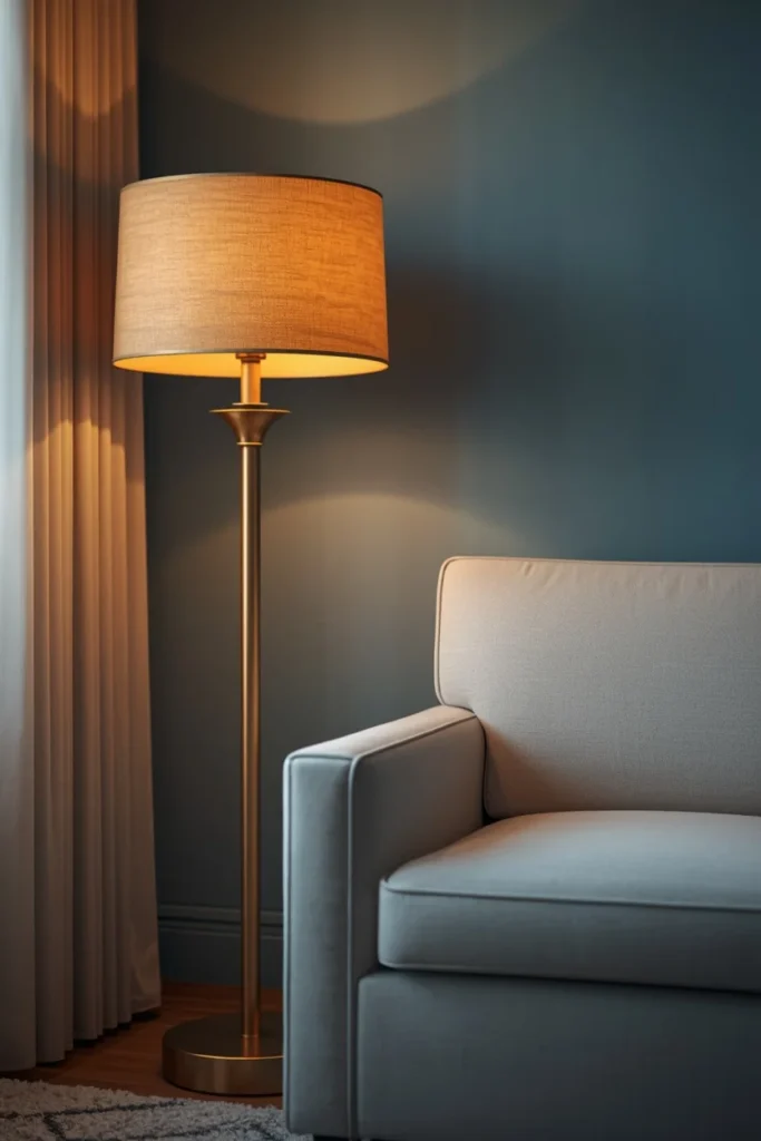
5. Brass or Aged Gold Light Fixtures
Brass floor lamps, sconces, or pendant lights introduce warm metal tones that balance the coolness of blue walls in a way silver or chrome fixtures simply can’t. The warm glow brass reflects under lamp light also adds a golden cast to the room in the evening, which keeps the space feeling inviting rather than sterile once the sun goes down. Choosing fixtures with some age or texture, like a slightly hammered finish or an antique patina, adds character that a flat, shiny finish doesn’t. This is one of the most effective single swaps for warming up a cool-toned room, since lighting affects the mood of a space more than almost any other element.
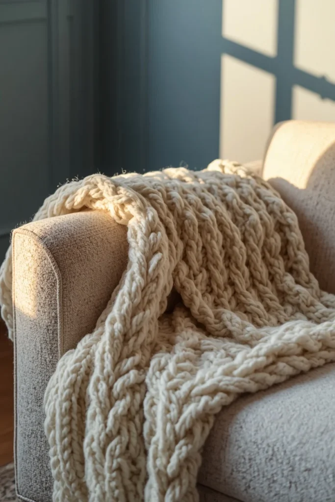
6. Chunky Knit or Wool Throw Blankets
A thick, hand-knit style throw draped over the arm of the sofa or a nearby chair adds immediate tactile warmth to a cool-toned room. Cream, oatmeal, or soft camel tones work best here, since they echo the room’s warm wood and brass accents rather than repeating the blue on the walls. Draping the throw loosely, rather than folding it into a tight square, keeps the styling relaxed and lived-in instead of overly staged. This is one of the least expensive additions on the list, but it does real work in making a cool blue room feel like somewhere you’d actually want to curl up.
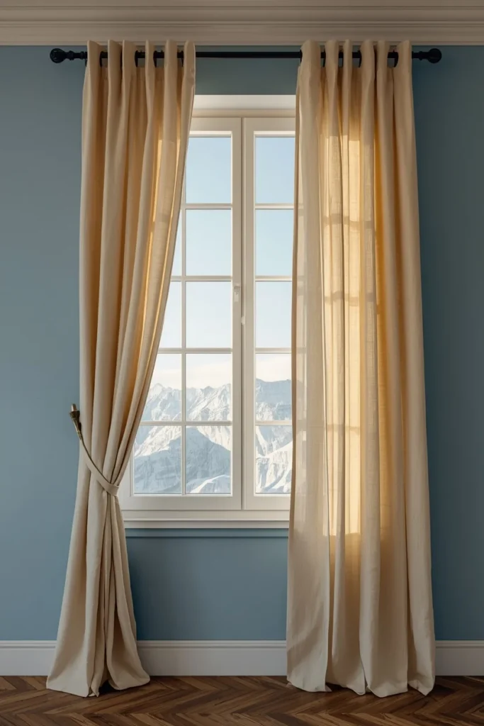
7. Soft Linen Curtains in Warm Cream
Curtains in a warm, undyed linen tone soften the light coming through the window and keep the room’s palette from leaning too far into blue-on-blue territory. Linen’s natural texture and slight wrinkle also add a relaxed, lived-in quality that contrasts nicely with the crispness of a glacial accent wall. Hanging the curtains close to the ceiling, rather than just above the window frame, makes the room feel taller and lets more warm, filtered light spill across the space. This is a simple swap that affects the quality of light in the entire room, not just the window itself.
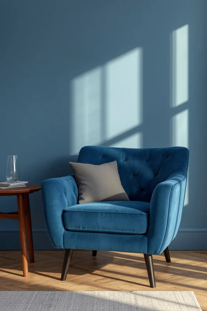
8. Blue Velvet Accent Chair
A single chair in a deeper, richer blue velvet adds tonal depth to the room without introducing a second cool, flat surface. Velvet’s texture catches light differently than a matte or linen fabric, giving even a cool-toned chair a warmer, more dimensional glow under lamp light. Choosing a shade a few tones darker than the wall color creates a tonal gradient across the room rather than a single flat block of blue. This chair also gives the eye a second, smaller blue moment to rest on, which balances the large wall without repeating it exactly.
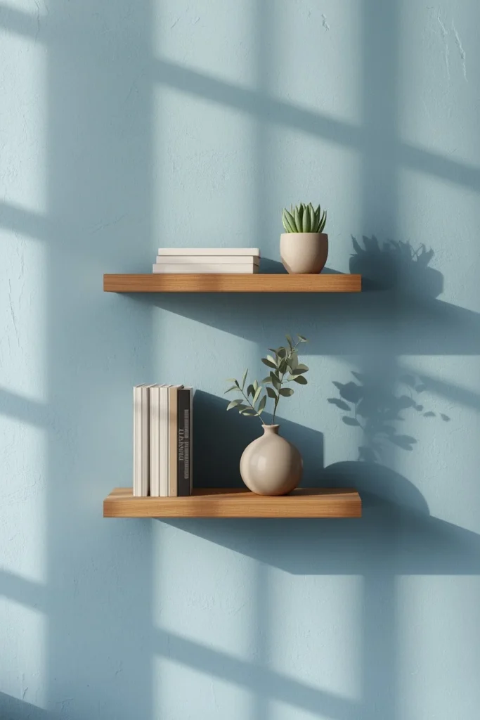
9. Warm Wood Floating Shelves
Simple wood shelves in a warm tone give the room a place to display smaller warm-toned objects — books, pottery, a small plant — that continue balancing out the cool wall color at eye level. Styling them with an intentional mix of heights and a little negative space keeps the display from feeling like a cold, gallery-style arrangement. Choosing a wood tone that matches or complements the coffee table keeps the room’s warm materials feeling connected rather than scattered. These shelves also give you a place to rotate in seasonal warmth, like dried branches in autumn or candles in winter.
10. Rattan or Wicker Accent Pieces
A rattan side table, woven pendant shade, or wicker basket adds natural texture that keeps a cool-toned room from feeling too polished or showroom-like. The open weave pattern of rattan catches and softens light in a way flat surfaces can’t, adding a subtle warmth even in pieces that aren’t a warm color themselves. Placing a rattan piece near the window lets natural light highlight the texture throughout the day, which adds visual interest to an otherwise simple corner. This is also one of the more affordable ways to add warmth, since rattan furniture and accents are widely available across a range of price points.
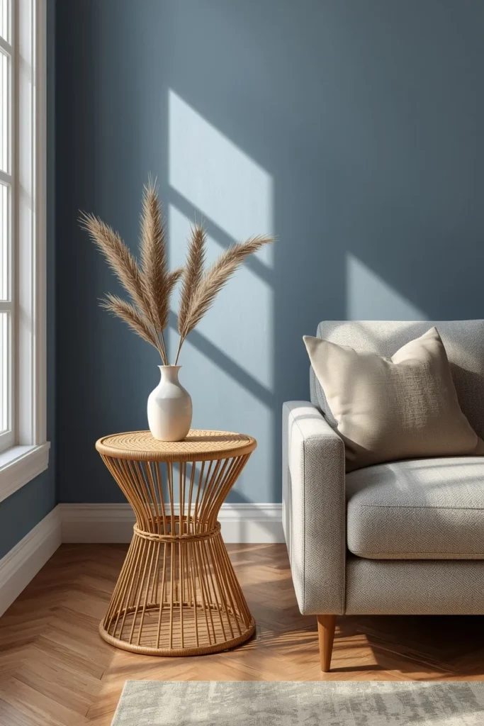
11. Terracotta or Clay Pottery Accents
A small grouping of clay or terracotta vases and bowls adds an earthy, warm-toned counterpoint to a cool blue room, especially when displayed on a shelf or coffee table where the color reads clearly. Choosing pieces with a slightly imperfect, hand-thrown texture adds a handmade quality that contrasts nicely against the cleaner lines of a glacial blue wall. Grouping a few different shapes and sizes together, rather than a single matching set, looks more collected and intentional. This is a small, low-cost addition that does a surprising amount of work in warming up the room’s overall color story.
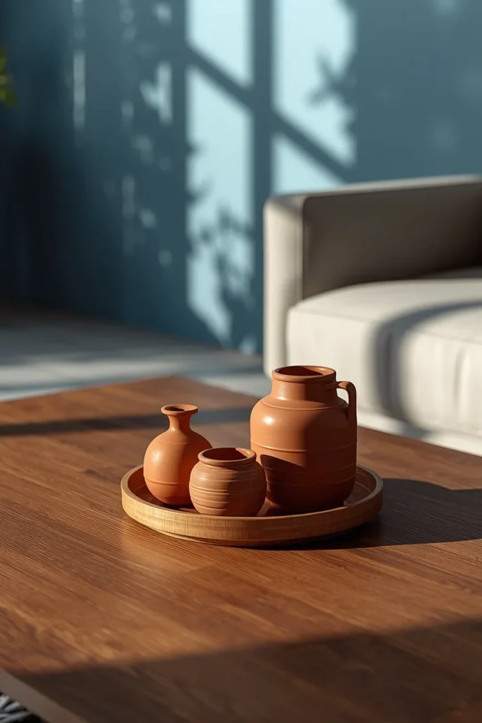
12. Layered Tonal Blue Throw Pillows
Mixing two or three different shades of blue across the sofa’s throw pillows, rather than a single flat tone, adds depth and keeps the color from reading as one large, uniform block. Pairing those blues with one or two warm cream or camel pillows in the mix ties the cushions back into the room’s broader warm-and-cool balance. Varying the pillow textures — a linen weave, a boucle, a smooth cotton — adds tactile interest that a set of matching pillows can’t provide. This layered approach is one of the easiest and most affordable ways to add both color depth and warmth to the room’s largest seating piece.
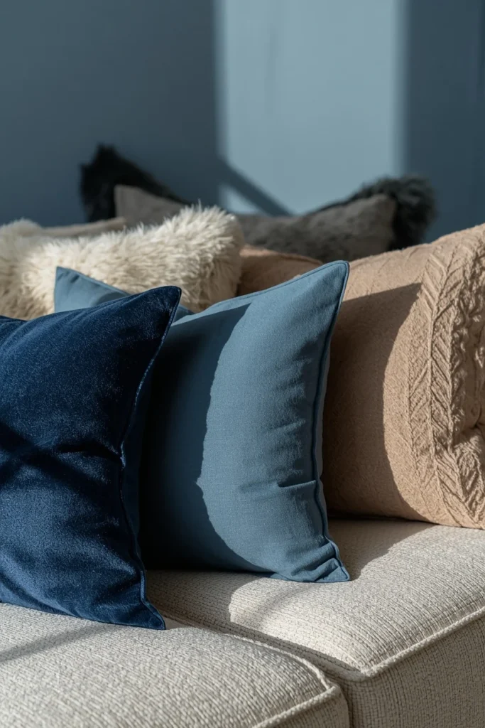
13. Warm Ambient Table Lamp
A table lamp with a warm fabric shade, placed on a side table or shelf, adds a second layer of golden light that keeps the room from relying only on cooler daylight or overhead fixtures. Choosing a lamp base in ceramic, wood, or brass rather than glass or chrome keeps the material palette consistent with the room’s other warm accents. Placing it at a lower height, roughly eye level when seated, creates a cozier pool of light than an overhead fixture alone can provide. Paired with the floor lamp, this gives the room at least two distinct warm light sources, which matters more for the room’s mood than the wall color itself.
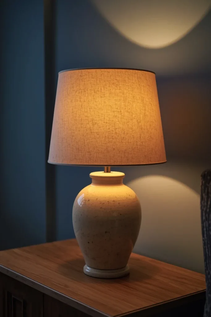
14. Statement Mirror to Bounce Light
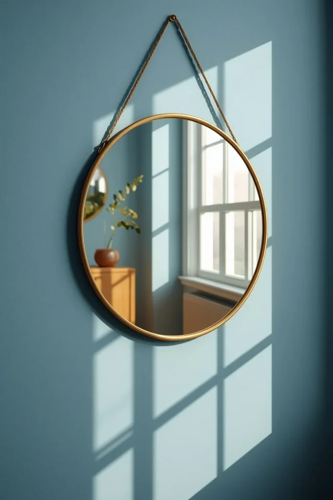
A large mirror with a warm-toned frame, positioned across from a window, bounces natural light back into the room and helps a cool blue wall feel bright rather than dim or flat. Choosing a frame in aged brass, rattan, or warm wood rather than a cold silver or black finish adds another small dose of warmth exactly where the eye lands. Positioning the mirror to reflect a warm element in the room, like the wood coffee table or a cluster of plants, doubles that warmth visually without adding another physical object. This piece does double duty, since it’s both a functional light source and a decorative anchor in its own right.
15. Trailing Indoor Plants
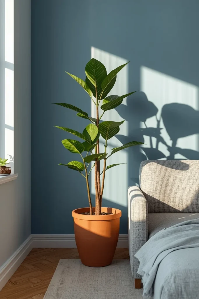
A plant with trailing or broad leaves, like a pothos, fiddle leaf fig, or rubber plant, brings organic warmth and life into a room that could otherwise feel a little too controlled or cool. Placing it in a terracotta or woven planter, rather than a glossy ceramic or metal pot, keeps the warm materials story consistent from floor to shelf. Positioning a taller plant in a corner near the window lets its shadow move across the wall throughout the day, adding a subtle, living layer of movement to an otherwise still room. Greenery is also one of the fastest, least expensive ways to soften any color palette that risks feeling too clean or clinical.
16. Blue and White Ceramic Gallery Art
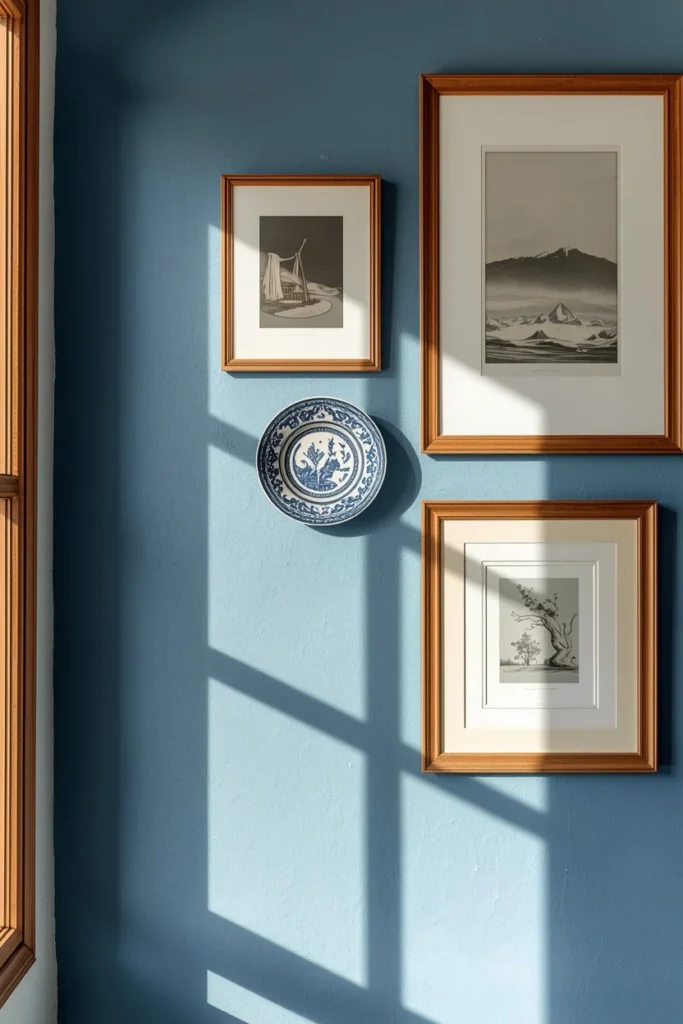
A small collection of framed art or ceramic pieces that echo the room’s blue tones, mixed with a few warm-toned frames or objects, ties the wall decor back into the overall color story without repeating the wall paint exactly. Choosing pieces with some texture, like a ceramic plate or a textured print, rather than flat glossy artwork, keeps the display from feeling too slick against a glacial wall. Grouping a few pieces asymmetrically, rather than a single large print, adds the same collected, personal quality that works well throughout the rest of the room. This is often one of the last elements added, but it’s also one of the most photographed corners once the room comes together.
Styling Tips
Treat cool blue as a background color, not the whole story. The wall does the cooling, and everything else in the room — wood, brass, linen, wool — should be doing the warming. Aim for at least three warm materials in every room (wood, metal, natural fiber) so the space never tips fully cold. Keep pattern and pillow color layered in tones of blue and cream rather than introducing a fourth unrelated color, which keeps the palette feeling calm instead of busy.
Practical Implementation Ideas
Start with the wall color and the sofa, since those two choices set the room’s overall temperature before anything else goes in. Add the coffee table and rug next, since both introduce the warm materials that balance the wall. Layer in lighting, pillows, and smaller warm accents like pottery and plants last, once you can see how much warmth the room already has from the larger pieces.
Common Mistakes to Avoid
Pairing cool blue walls with only white, gray, or chrome accents pushes the room toward sterile fast, since nothing in the space is doing the work of warming it back up. Skipping warm lighting in favor of bright, cool-white bulbs flattens the mood, even if the furniture and color palette are otherwise well balanced. Using too many different blues at competing saturations, rather than a cohesive tonal range, can make the room feel busy instead of calm.
Small-Space Alternatives
In a smaller living room, paint just one wall or a single alcove in cool blue rather than the whole room, and lean on warm textiles and lighting to do the rest of the work. A lighter, glacial shade reflects more light than a deeper blue, which helps a small room feel more open rather than closed in. Mirrors and a single warm wood piece, like a coffee table or shelf, go further in a small space than several smaller warm accents scattered around the room.
Budget-Friendly Alternatives
Paint is the least expensive way to bring in the cool blue trend, so starting with a single accent wall before investing in new furniture lets you test the palette first. Secondhand shops are a strong source for warm wood furniture, brass lighting, and rattan accents that already carry some character. Textiles — pillow covers, throws, and curtains — are an easy, low-cost way to add both the blue tones and the warm balancing elements without a full furniture overhaul.
Pro Styling Recommendations
Layer at least two distinct light sources beyond any overhead fixture, so the room can shift from bright and functional during the day to warm and moody in the evening. Choose one “hero” warm piece, usually the sofa or coffee table, and let smaller accents like pottery and pillows support that warmth rather than compete with the blue wall for attention. Keep roughly a two-to-one ratio of warm to cool elements throughout the room, so the blue reads as a highlight rather than the room’s entire identity.
FAQs
Conclusion
A cool blue living room only feels cold when the blue is left to do all the work on its own. Give it a warm wood table to lean against, a brass lamp to glow beside it, and a few textures that catch the light differently, and the same pale, glacial color turns into something calm and genuinely inviting instead. Start with the wall and the sofa, then build the warmth in around them one piece at a time. The result is a room that feels fresh in every sense of the word, not just visually, but to actually sit in.