24 Kitchen Cabinet Colors That Will Completely Transform Your Space
Nothing changes the entire feeling of a kitchen faster than cabinet color. It’s the decision that gets noticed before the countertop, before the backsplash, before anything else in the room. And after years of the same bright white, cool gray kitchens filling every renovation photo, homeowners are finally reaching for something warmer, richer, and a lot more personal. Whether you’re repainting existing cabinets or planning a full remodel, these 24 colors cover the full range, from quiet neutrals to bold, moody statement shades, so you can pick the one that actually fits how your kitchen lives.
Table of Contents
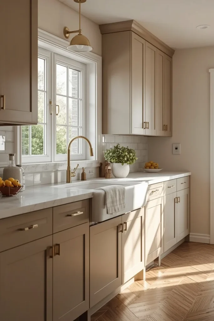
1. Warm Greige
Warm greige sits right between beige and gray, giving cabinets a soft, grounded look that never reads as cold or clinical. Unlike older gray palettes that leaned blue or icy, this newer greige carries warm undertones that play well with both wood floors and warm metal hardware. It works especially well on a full kitchen suite, since the color is neutral enough to avoid feeling dated in five years. Pairing greige cabinets with a warm white quartz countertop and brushed brass pulls keeps the whole room feeling soft and collected. This color also hides daily fingerprints and smudges better than a stark white finish.
2. Mushroom
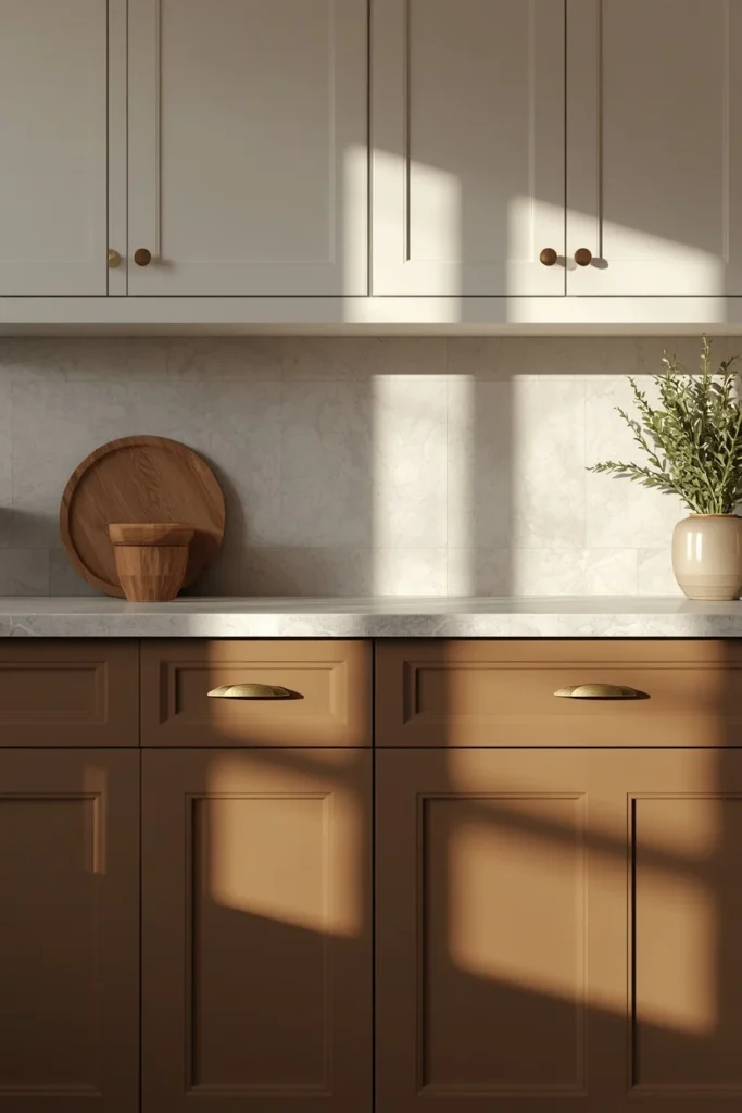
Mushroom is one of the standout neutrals of the past year, a soft brownish-gray that reads as warm rather than flat. It photographs beautifully in natural light, shifting slightly warmer or cooler depending on the time of day, which gives the kitchen a sense of depth that plain white cabinets can’t offer. This color pairs naturally with unlacquered brass hardware and a honed stone counter, letting the cabinet color stay the quiet anchor of the room. Mushroom also works well as a two-tone base, paired with warm white uppers for contrast. It’s a color built for longevity, sitting comfortably outside short-lived trend cycles.
3. Creamy Warm White
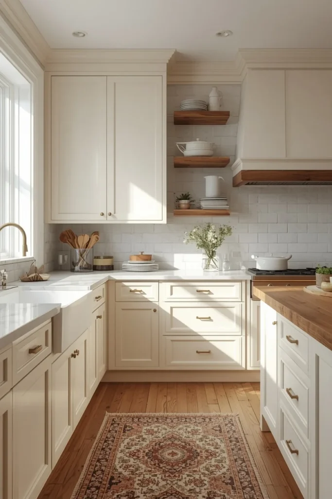
Warm white cabinets replace the stark, cool white of past kitchens with a softer tone that leans slightly toward cream or ivory. This shift matters more than it sounds, since a warm white avoids the sterile, showroom feeling that often comes with bright white cabinetry under artificial light. It pairs beautifully with warm wood open shelving, a butcher block island, or brass hardware, creating a kitchen that feels bright but not clinical. Warm white also remains one of the easiest colors to resell a home with, since it appeals to the widest range of buyers. Choosing a warm white with a hint of yellow or beige undertone, rather than a cool blue-white, is the detail that makes this color feel current instead of dated.
4. Sage Green
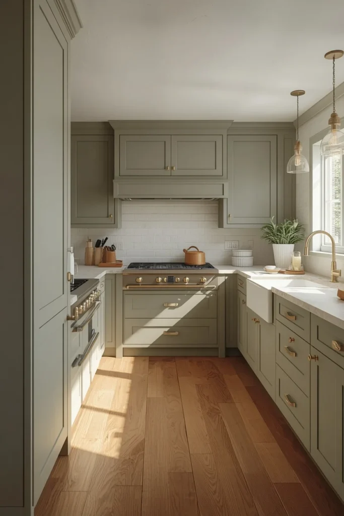
Sage green has become one of the most requested cabinet colors because it acts almost like a neutral while still bringing personality into the room. Its muted, grayish undertone keeps it from reading as a loud or trendy statement color, which makes it easier to live with over the long term. Sage pairs especially well with warm wood floors, brass or matte black hardware, and a light stone countertop, since the softness of the green lets those other materials stand out. This color also works well used only on an island or lower cabinets, with white or wood uppers balancing the look. Sage feels equally at home in a farmhouse kitchen and a more modern, streamlined space.
5. Olive & Moss Green
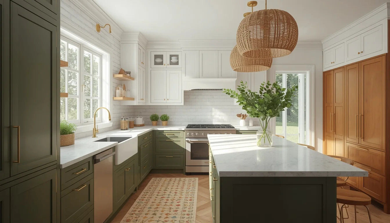
Deeper, earthier greens like olive and moss have taken over from brighter sage and emerald tones, offering a more grounded, nature-inspired look. These shades shift noticeably throughout the day depending on the light, appearing more brown in warm evening light and more green under bright daylight, which adds a layered, dimensional quality to the cabinets. Olive and moss work particularly well with brushed brass or aged bronze hardware and a warm veined stone counter. This palette also pairs beautifully with terracotta tile or wood accents for a fully nature-inspired kitchen. Because these tones are muted rather than saturated, they tend to feel calm rather than overpowering, even across a full kitchen.
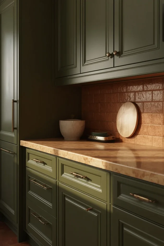
6. Deep Forest Green
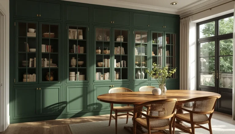
Forest green brings drama and richness to a kitchen without tipping into black or navy territory. This shade works particularly well on lower cabinets or a kitchen island, paired with warm white or Chantilly-style upper cabinets to keep the room from feeling too dark overall. Good task and under-cabinet lighting is essential with a color this saturated, since forest green can read almost black in a dim, poorly lit kitchen. Brass or warm gold hardware brings out the green’s natural warmth, while a light quartz or marble countertop keeps the palette balanced. This color holds up especially well in kitchens with strong natural light, where the green reads as lush rather than heavy.
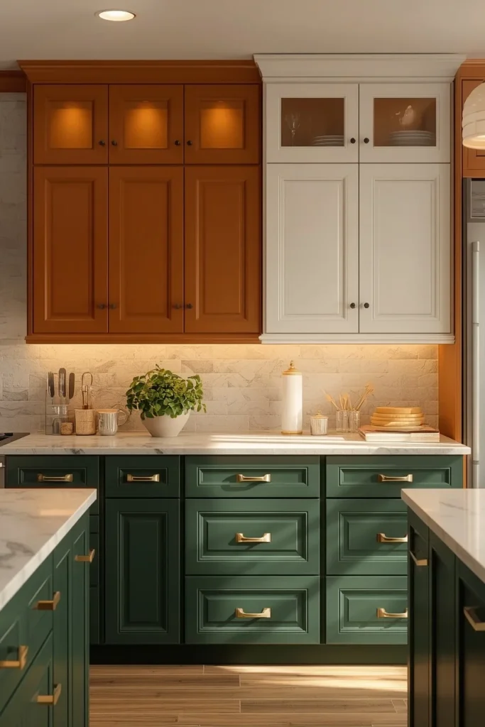
7. Smoky Jade
Smoky jade sits between blue and green, with a soft gray cast that keeps it calm instead of vivid. This in-between quality makes it one of the more versatile statement colors, since it doesn’t compete with either warm or cool-toned materials elsewhere in the kitchen. It works particularly well in period homes or modern traditional kitchens, where a bold primary green might feel out of place. Pairing smoky jade with unlacquered brass and honed marble gives the room a quiet, layered look rather than a bold, graphic one. This color also reads differently across the day, appearing more gray in overcast light and more green under warm bulbs, which keeps the kitchen feeling alive rather than static.
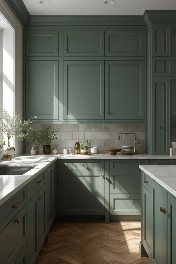
8. Dusty Blue
Dusty blue is a softened, muted take on classic kitchen blue, leaning gray rather than bright or saturated. This makes it easier to live with long term, since it avoids feeling overly beachy or seasonal the way brighter blues sometimes can. It pairs beautifully with polished nickel or unlacquered brass hardware and a white or light gray countertop, keeping the whole look airy. Dusty blue works especially well in kitchens with a lot of natural light, where the color can shift subtly throughout the day. This shade also photographs particularly well, making it a popular choice for kitchens meant to be shared widely online.
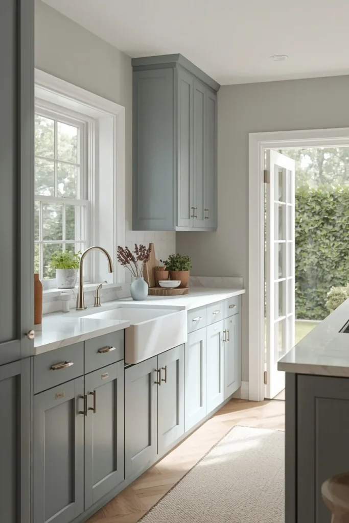
9. Denim Blue
Denim blue brings a slightly deeper, more textured take on blue cabinetry, evoking the soft, worn quality of a favorite pair of jeans rather than a crisp, glossy finish. This color pairs particularly well with warm wood open shelving and brass hardware, softening what could otherwise feel like a cool, one-note palette. Denim blue also works nicely on an island paired with white perimeter cabinets, giving the room a clear focal point without overwhelming the whole space. A matte or satin finish suits this color best, since a high-gloss sheen can make denim blue feel more plastic than intentional. This shade sits comfortably between playful and sophisticated, depending on the hardware and materials paired with it.

10. Smoky Indigo
Smoky indigo is a deep, muted blue with a slight gray undertone, offering drama without the stark contrast of true navy or black. This color works especially well as a high-contrast choice in small kitchens, where a saturated hue on cabinetry paired with a bright white wall makes the whole room feel intentional rather than cramped. Smoky indigo pairs beautifully with brushed nickel or chrome hardware for a sharper, more tailored look, or brass for something warmer. Good lighting is essential here too, since a color this deep can swallow detail in a dim room. This shade tends to photograph as almost black in low light and richly blue under warmer bulbs, giving the kitchen a shifting, layered quality.
11. Muted Navy
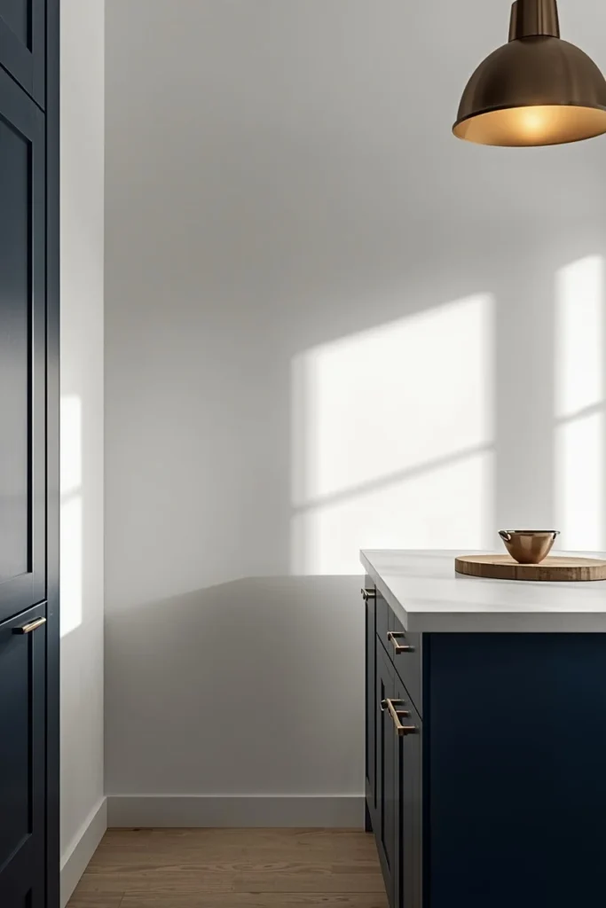
Muted navy softens the classic bold navy kitchen trend into something calmer and easier to live with daily. This shade works well across a full kitchen or reserved for just the island, and it pairs naturally with warm brass hardware and a light quartz counter for contrast. Muted navy also holds up exceptionally well over time, since it sits far enough outside short trend cycles to avoid feeling dated. In kitchens that double as gathering spaces, this color adds personality without asking the room to shout. Pairing muted navy lower cabinets with warm white uppers is one of the most reliable two-tone combinations for kitchens of any size.
12. Charcoal
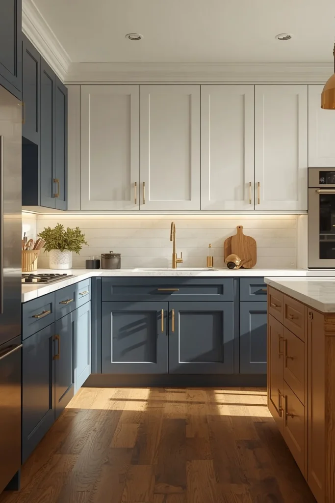
Charcoal sits right between gray and black, warm enough to feel livable but dark enough to make a real impression in the room. This color works particularly well on a kitchen island, paired with lighter perimeter cabinets, since the contrast photographs well and keeps the room from feeling too dark overall. Charcoal is also one of the more timeless choices on this list, aging well because it doesn’t chase a specific color trend the way brighter shades sometimes do. Chrome or brushed nickel hardware brings out a sharper, more modern edge, while stainless steel appliances tie into the same tonal family. This color is especially forgiving with daily fingerprints and smudges compared to lighter cabinet finishes.

13. Soft Black
Soft or matte black cabinets bring drama without the harshness of a true glossy black finish. The matte texture absorbs light rather than reflecting it, which keeps the color from feeling cold or overly industrial, and it also hides fingerprints far better than a shiny finish would. This color works particularly well paired with warm wood open shelving, brass hardware, and a light stone counter, since the contrast keeps the kitchen from feeling like a single dark box. Soft black is often reserved for lower cabinets or an island, with lighter uppers balancing the visual weight. Good lighting, including under-cabinet fixtures, is essential to keep a soft black kitchen feeling intentional rather than dim.
14. Espresso Brown
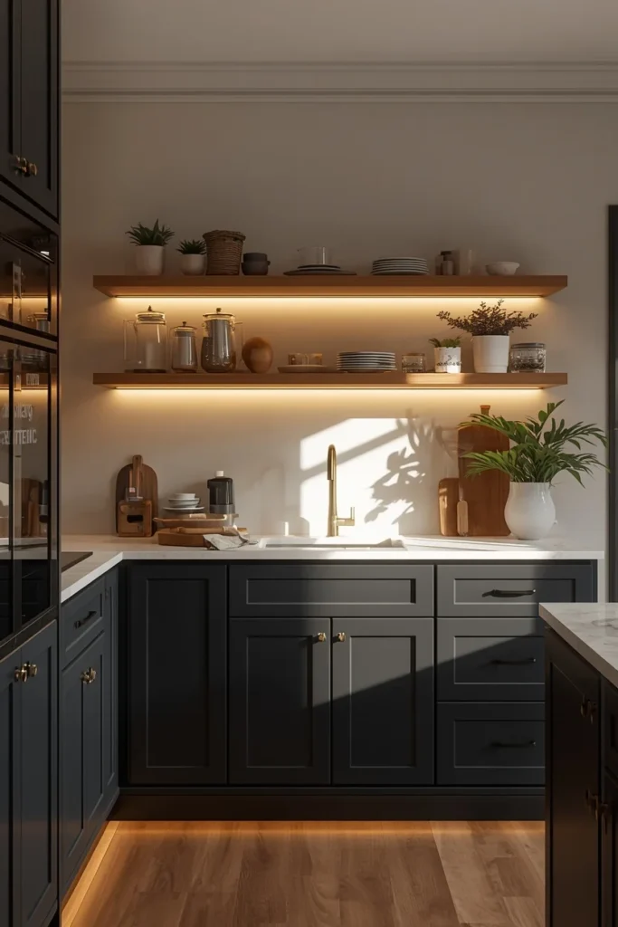
Espresso brown brings warmth and depth without any of the visual coldness that gray or black cabinets can carry in the wrong light. This deep, rich brown pairs naturally with brass or brushed gold hardware and a warm-veined stone countertop, echoing the same coffee-toned warmth that’s become popular across kitchen neutrals more broadly. Espresso works especially well in kitchens with plenty of natural light, where the color reads rich rather than heavy. It’s also a practical choice for busy households, since deep brown tones hide daily wear better than lighter finishes. Pairing espresso lower cabinets with a warm white or cream upper run keeps a kitchen with this much depth from feeling closed in.
15. Chocolate Brown
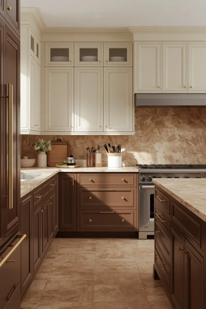
Chocolate brown acts almost like a neutral in its own right, offering depth and richness without the boldness of a true statement color. This shade has become especially popular in smaller kitchens, where it adds warmth and intimacy rather than trying to disappear with an all-white palette. Chocolate brown pairs beautifully with unlacquered brass and a warm veined stone counter, creating a tonal, layered look rather than high contrast. This color also works exceptionally well with matte finishes, which soften the richness of the brown and keep it from feeling too formal. It’s a strong choice for a full kitchen suite in a home leaning toward a collected, lived-in aesthetic.
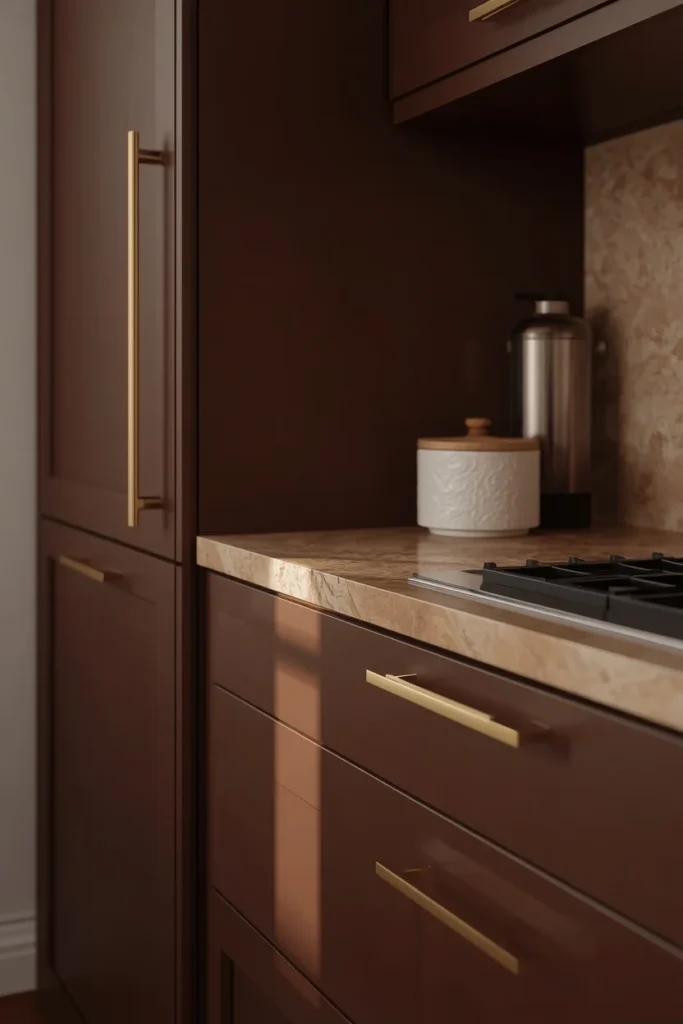
16. Burgundy & Oxblood
Deep red tones like burgundy and oxblood are one of the more unexpected cabinet colors gaining traction, bringing surprising sophistication rather than a bold, primary red statement. These shades work particularly well paired with lighter woods, black or brass fixtures, and layered lighting that lets the red read as rich rather than jarring. Burgundy and oxblood are usually best reserved for an island or a single wall of cabinetry, letting the rest of the kitchen stay neutral. This color pairs beautifully with warm brass hardware, which brings out the red’s natural depth rather than competing with it. It’s a distinctive choice for anyone wanting a kitchen that feels genuinely different from the current wave of green and blue cabinetry.
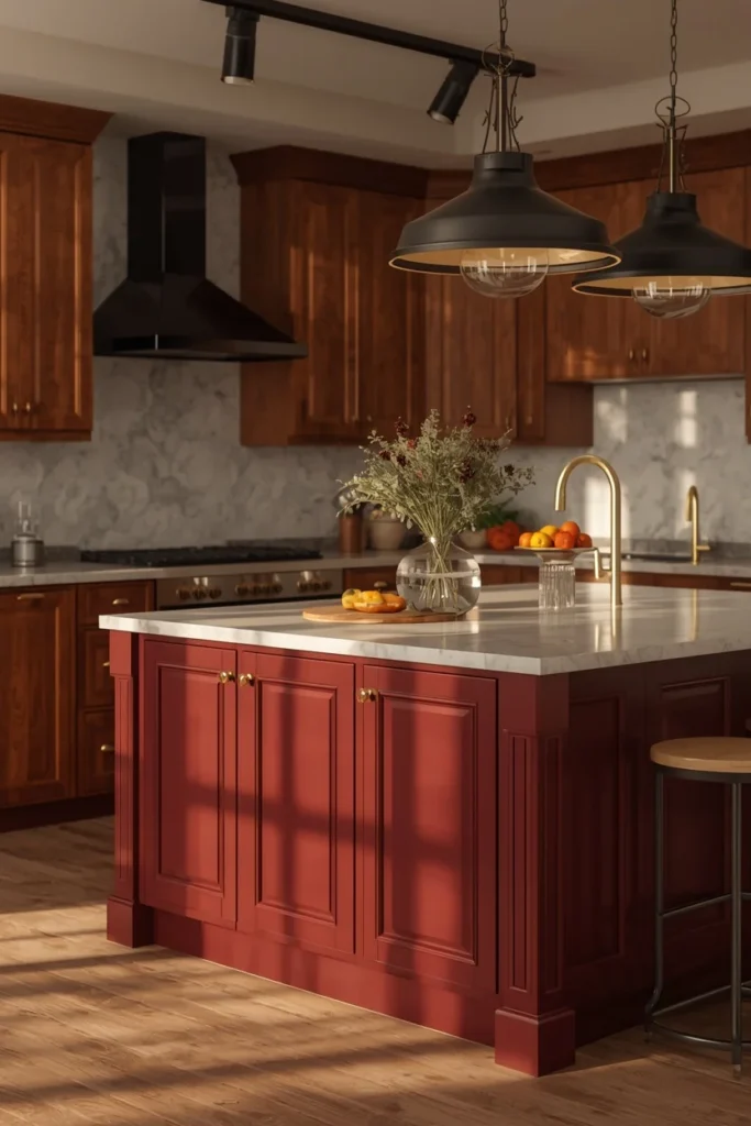
17. Plum
Plum offers a softer, more muted alternative to burgundy, leaning slightly purple rather than red. This color works particularly well in kitchens aiming for a moody, romantic feel without going fully into black or navy. Plum pairs naturally with brushed brass or aged bronze hardware and a warm stone counter, and it photographs beautifully under warm, dimmable lighting. This shade is best used with intention, typically on an island or a single accent wall of cabinetry, letting the rest of the kitchen stay in warm neutrals. Plum ages particularly well in kitchens with strong natural light, where the color can shift from deep purple to a soft mauve depending on the time of day.
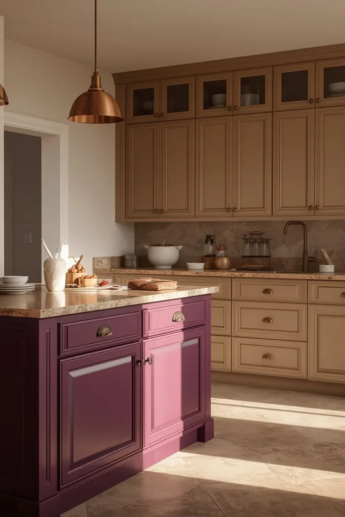
18. Terracotta & Clay
Terracotta and clay tones bring an earthy, sun-warmed quality to kitchen cabinets, especially popular in kitchens leaning toward a nature-inspired or Mediterranean aesthetic. These shades pair beautifully with warm wood open shelving, woven light fixtures, and unlacquered brass hardware, reinforcing the same organic, collected feeling running through the rest of the room. Terracotta works particularly well on lower cabinets, paired with a warm white or cream upper run, so the color reads as grounding rather than overwhelming. This palette also pairs naturally with handmade tile backsplashes, which echo the same warm, textured quality as the cabinet color itself. It’s an especially good fit for kitchens that open onto a garden, patio, or other outdoor living space.
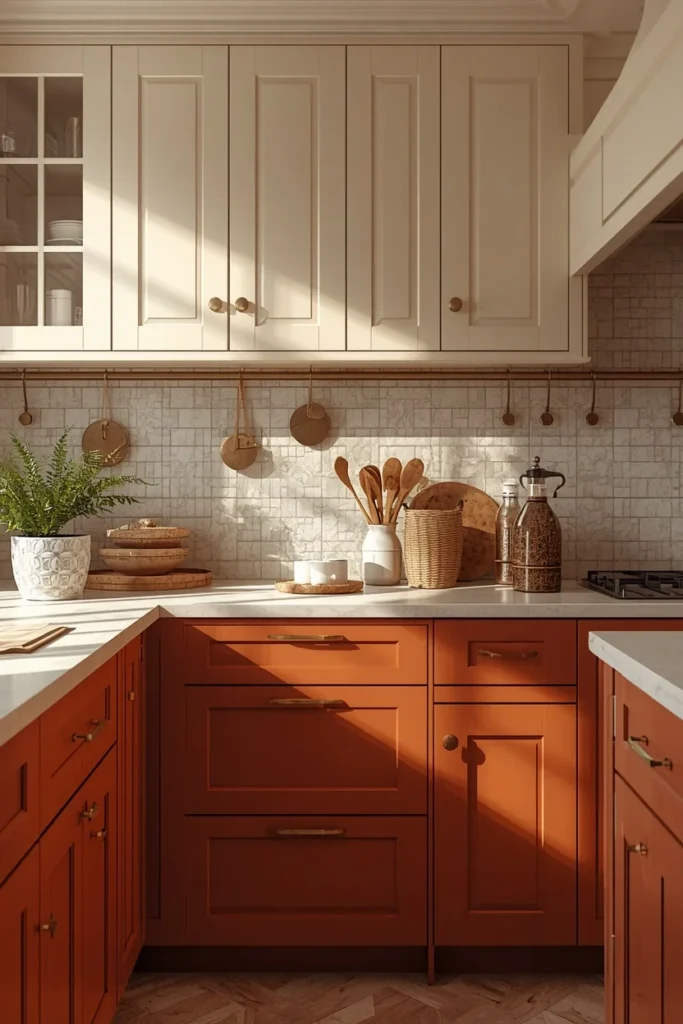
19. Taupe
Taupe remains one of the most dependable neutral cabinet colors, offering warmth without leaning too far into any single color family. It works well across nearly every kitchen style, from farmhouse to modern traditional, since its balanced undertone doesn’t clash with either warm or cool materials elsewhere in the room. Taupe pairs particularly well with warm wood flooring and brass or matte black hardware, letting those materials carry more visual interest. This color also hides daily wear better than a stark white finish, making it a practical choice for busy households. Taupe cabinets tend to photograph as slightly different shades depending on the light, which keeps a kitchen feeling dynamic rather than flat.
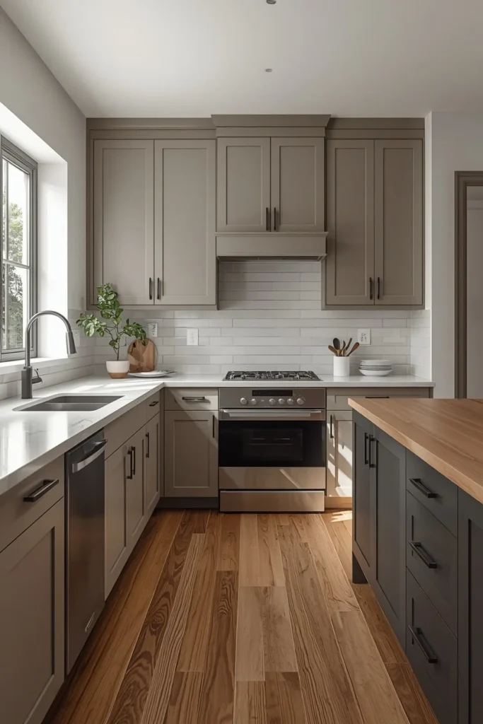
20. Warm Stone & Khaki
Warm stone and khaki tones sit in the middle ground between a bright white kitchen and a deeper statement color, offering a softer, more grounded neutral. These shades pair especially well with light quartz countertops and warm metal hardware, letting other textures in the room, like stone or wood, stand out without competing with the cabinets themselves. Khaki-toned cabinets work particularly well in kitchens with a lot of natural light, where the warmth of the color becomes more apparent throughout the day. This palette is also a safe long-term choice for anyone hesitant to commit to a bolder color, since it reads as intentional rather than plain. Pairing warm stone cabinets with brass hardware and open wood shelving rounds out a calm, cohesive kitchen.
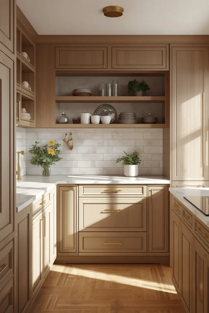
21. Natural Walnut Stain
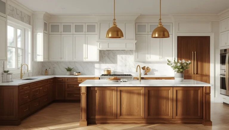
Natural walnut brings back the warmth and character of visible wood grain, moving away from years of painted, matte cabinet fronts. The rich, reddish-brown tone of walnut pairs beautifully with black or brass hardware and a light stone countertop, letting the wood’s natural variation become the room’s main visual interest. This finish works particularly well on a full kitchen suite or as a warm contrast to painted white or sage green uppers. Walnut also ages gracefully, developing a deeper patina over years of use rather than showing wear the way a painted finish might. This choice appeals especially to homeowners wanting a kitchen that feels grounded in natural materials rather than a specific paint trend.
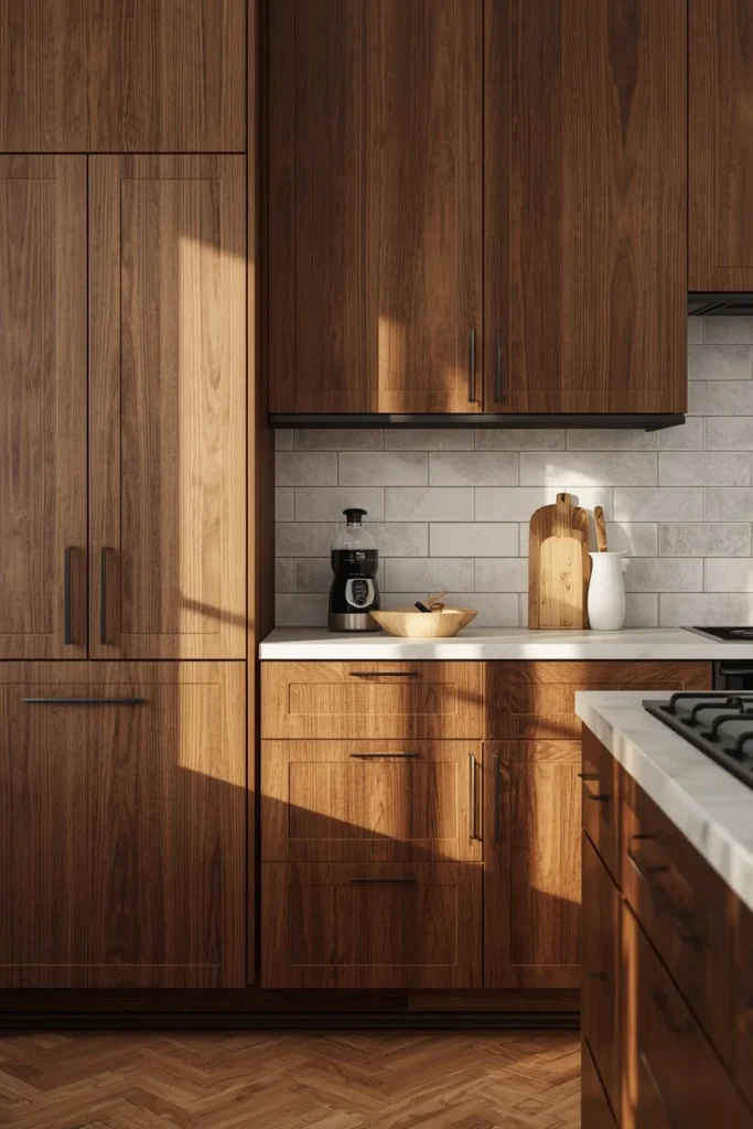
22. White Oak Natural Stain
White oak offers a lighter, more understated take on natural wood cabinetry, with a subtle grain pattern that reads as calm rather than busy. This finish pairs particularly well with warm white walls, brass hardware, and a light stone or quartz counter, creating a soft, Scandinavian-influenced kitchen. White oak also works beautifully as an accent, used on open shelving or a kitchen island while the rest of the cabinetry stays painted in a warm neutral. This wood tone has become especially popular for its versatility, sitting comfortably in both minimalist and more traditional kitchen styles. Its light, natural finish also helps a smaller kitchen feel brighter and more open.
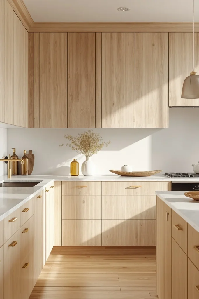
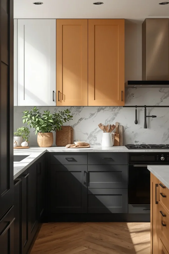
23. Two-Tone Charcoal & Warm White
Two-tone kitchens remain one of the most popular ways to explore cabinet color without committing to a single bold shade throughout the entire room. Pairing charcoal lower cabinets with warm white uppers creates depth and visual interest, grounding the kitchen while still keeping it feeling bright and open. This combination works particularly well with brass or matte black hardware, and it gives a kitchen island a natural focal point without needing additional decor. Two-tone pairings also make it easier to test a bolder color, since the lighter half of the kitchen balances any risk. This approach photographs especially well, since the contrast reads clearly even in smaller kitchen images.
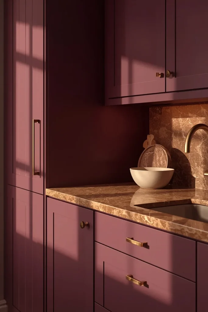
24. Aubergine
Aubergine, a deep, muted eggplant tone, offers one of the most distinctive statement colors on this list, sitting between brown, purple, and black depending on the light. This shade works particularly well in small kitchens, where a saturated, moody color paired with lighter walls creates a sense of intention rather than a cramped feeling. Aubergine pairs beautifully with unlacquered brass and warm veined stone, echoing the same tonal layering trend popular in smaller kitchen spaces. This color is best introduced gradually, often on an island or single wall, letting the rest of the kitchen stay in warm, supporting neutrals. Aubergine ages particularly well, since its muted depth keeps it from reading as trend-driven the way a brighter purple might.
Styling Tips
- Test cabinet paint swatches directly on cabinet doors and view them morning, midday, and evening before committing.
- Pair one saturated color with warm metal hardware to keep the palette from feeling cold or clinical.
- Use a two-tone approach if you’re unsure about a bold color, keeping the bolder shade on lower cabinets or the island only.
- Match cabinet undertones (warm or cool) to your countertop and flooring undertones to avoid a mismatched, patchy look.
Practical Implementation Ideas
- Start with a large sample board painted in your chosen color and prop it against the actual cabinets before ordering paint or new doors.
- Plan lighting upgrades alongside a dark cabinet color, since deep tones need stronger task and under-cabinet lighting to avoid feeling dim.
- If repainting existing cabinets, invest in a proper primer suited for cabinetry to avoid future chipping around handles and edges.
- Order hardware samples in person rather than relying on online photos, since brass and gold tones vary significantly in real light.
Common Mistakes to Avoid
- Choosing a cabinet color based on a screen photo without testing it in your kitchen’s actual lighting.
- Using a bold, saturated color across every surface instead of choosing one hero area, like an island.
- Pairing a dark cabinet color with weak or minimal lighting, which can make a kitchen feel smaller and dimmer.
- Ignoring undertones, which can cause a beautiful cabinet color to clash with an existing countertop or floor.
Small-Kitchen Alternatives
- Use a saturated color against bright white walls for high contrast that reads as intentional rather than cramped.
- Choose matte over glossy finishes, since matte tends to absorb light softly rather than creating harsh reflections in a tight space.
- Reserve bold color for lower cabinets only, keeping upper cabinets or open shelving lighter to maintain a sense of height.
- Add a large mirror or reflective backsplash to bounce light around a small, more colorful kitchen.
Budget-Friendly Alternatives
- Repaint existing cabinet boxes instead of replacing them entirely, saving significantly on a full remodel.
- Update only the island or a lower cabinet run in a bold color, keeping the rest of the kitchen in its current finish.
- Swap hardware before repainting, since new brass or matte black pulls can shift the entire feel of a kitchen on their own.
- Use peel-and-stick or removable wood-look film for a natural wood-tone accent without committing to a full stain job.
Pro Styling Recommendations
- Repeat your cabinet’s warm or cool undertone in at least one other material, like countertop veining or floor tone, for cohesion.
- Choose one hardware finish throughout the kitchen rather than mixing several metals, unless done with clear intention.
- Let a bold cabinet color be the kitchen’s one true statement, keeping backsplash and countertop choices quieter in response.
- When in doubt between two shades, choose the slightly more muted option, since muted tones tend to age better than saturated ones.
FAQs
Conclusion
Cabinet color is one of the few kitchen decisions that changes the entire mood of the room without touching the layout at all. The shift is clear: warmer, richer, more personal colors are replacing the flat, cool palettes that dominated for years. Whether that means a soft greige, a deep forest green island, or a full run of natural walnut, the best choice isn’t necessarily the most trending one. It’s the color that fits your light, your materials, and the way your kitchen actually gets used every day.