25 Moody Fall Living Room Decor Ideas for a Cozy Autumn Home
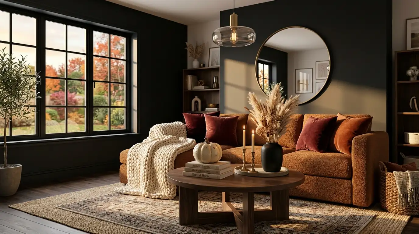
There’s a specific kind of living room that makes you want to put your phone down. The lamp is on instead of the overhead light. The rug has some weight to it. A candle is burning somewhere you can’t quite see. That’s the moody fall look — not orange pumpkins on every surface, but a room that’s gone a shade darker and a lot warmer for the season.
You don’t need a renovation to get there. Most of what changes a living room from “summer neutral” to “moody autumn” is color depth, texture layering, and where the light hits. This roundup walks through 25 specific ways to do that, room zone by room zone, with the reasoning behind each one so you can adapt it to the space you already have.
Table of Contents
1. Deep Charcoal Accent Wall With Warm Wood Tones
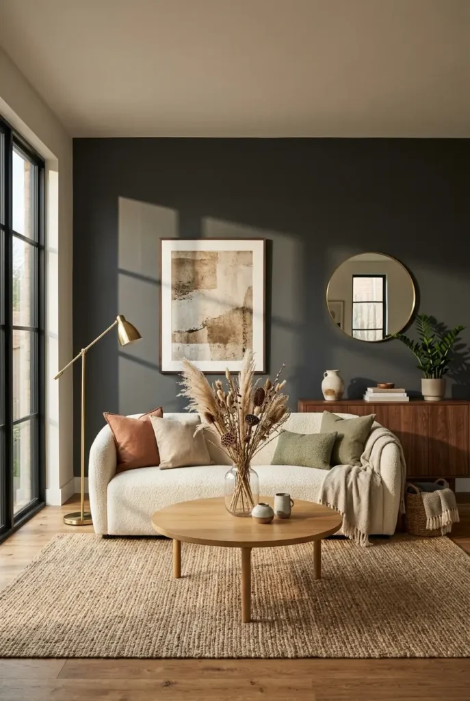
A single charcoal wall behind the sofa does more for a moody fall look than almost any accessory, because it gives the room a backdrop instead of leaving everything to float on white. The trick is pairing it with warm wood — a walnut console, a round oak coffee table, or even wood picture frames — so the space reads as cozy rather than cold or cave-like. Keep the ceiling and trim white or a soft warm white so the room still has a light source to bounce off of. This works especially well on the wall that gets the least direct daylight, since it won’t fight with natural light the way a sunlit wall would. If painting feels permanent, a large piece of dark abstract art or a charcoal fabric panel gives 80% of the effect with none of the commitment.
2. Burgundy and Chocolate Brown Velvet Sofa
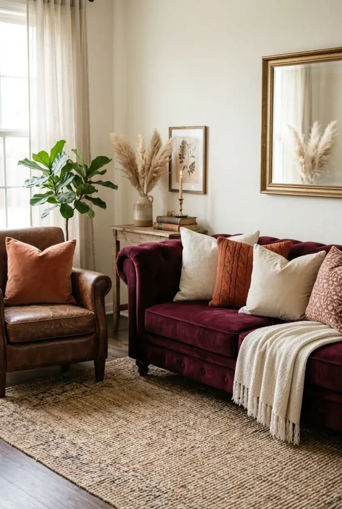
If you’re not ready to repaint, swapping the sofa’s textiles for burgundy or chocolate brown velvet does the same moody work through fabric instead of paint. Velvet specifically matters here because it catches lamp light differently than cotton or linen, giving even a simple sofa a slightly richer, more expensive-looking finish once the sun goes down. Burgundy works especially well against cream, oatmeal, or greige walls, since the contrast keeps the room from feeling too dark during the day. A slipcover or a set of reupholstered cushions can get you this look without buying new furniture. Pair it with a lighter rug underneath so the sofa reads as a deliberate anchor rather than swallowing the whole room in dark tone.
3. Layered Wool and Faux Fur Throw Textures
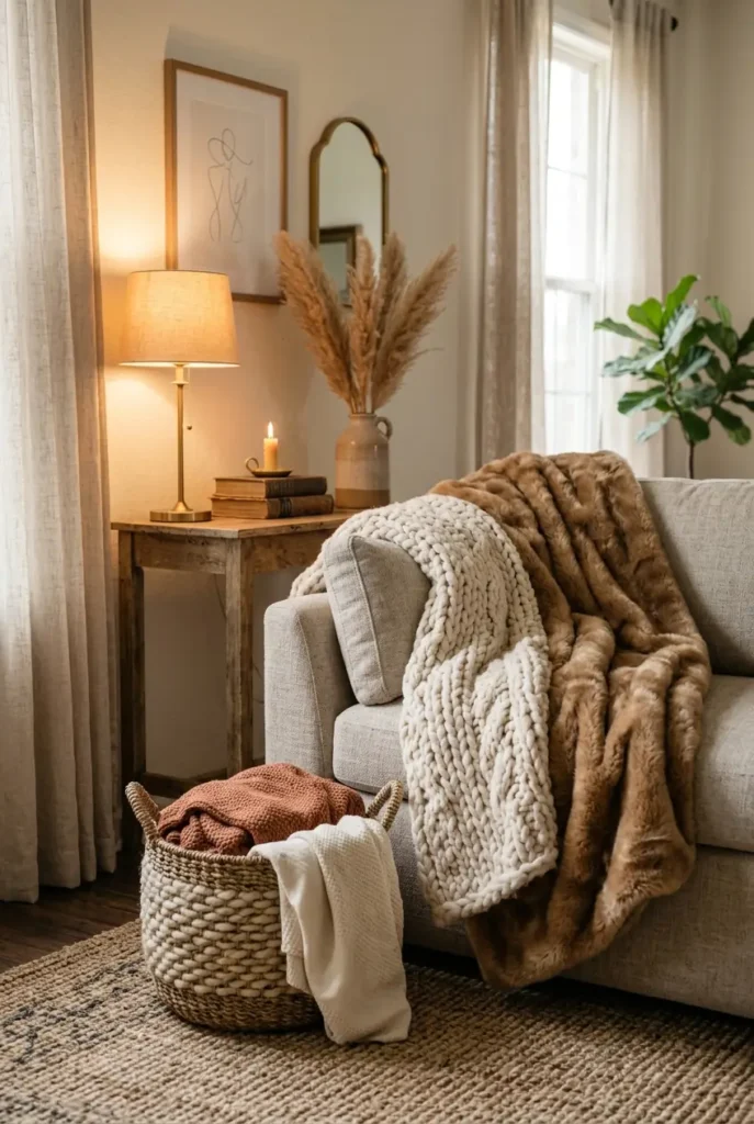
Texture is doing at least as much work as color in a moody fall room, and layering matters more than any single item. Drape a chunky wool knit over the back of the sofa, then add a faux fur throw folded at one end so the two textures contrast rather than compete. The wool reads as structured and a little rustic, while the faux fur adds softness and catches light, which keeps the combination from feeling flat. Stick to two or three textures max in one zone — wool, fur, and maybe a woven basket underneath — since too many competing textures start to look cluttered rather than layered. This idea costs almost nothing if you already own throws in other rooms; it’s really about where you put them, not what you buy.
4. Dark Academia Reading Corner
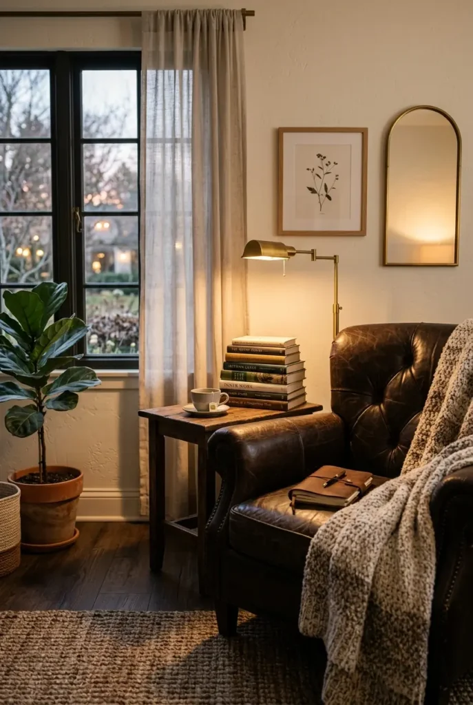
A reading corner leans into the moody fall mood better than almost any other zone because books, leather, and low lamp light are inherently autumnal. Pull an armchair — leather if you have it, otherwise a deep-toned upholstered chair — into a corner near a window, add a small side table, and stack a few hardcover books with a vintage-style lamp on top. A wool throw over the arm and a small brass or glass reading lamp complete the look without needing much square footage. This idea works particularly well in apartments or smaller living rooms, since it only needs one chair and a few feet of wall, not a full furniture rearrangement. The payoff is a corner of the room that photographs beautifully and actually gets used, which is more than most seasonal decor achieves.
5. Terracotta and Sage Color Pairing
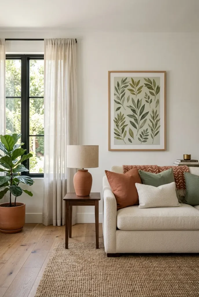
Terracotta and sage green sit opposite each other in a way that feels autumnal without going as dark as charcoal or burgundy, which makes this pairing a good entry point if you want a moody-adjacent look that still feels bright during the day. Use terracotta on pillows, a table lamp base, or a ceramic vase, and bring sage in through a throw blanket or a set of botanical-print art. The two colors share enough warmth that they don’t clash, but they’re different enough in tone to keep the eye moving around the room instead of settling on one flat palette. This combination photographs especially well against cream or warm white walls and works in living rooms that get a lot of natural light, since it doesn’t rely on shadow the way pure charcoal moods do. It’s also an easy pairing to build gradually, pillow by pillow, rather than all at once.
6. Plum and Gold Glam Vignette
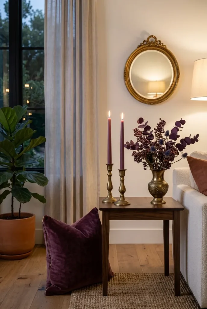
For a more polished, evening-event kind of moody fall look, plum and gold work as a small vignette rather than a whole-room palette — think a single side table, a mirror, and a lamp rather than repainting anything. A deep plum velvet pillow or throw next to a brass or gold-toned mirror and candle holders gives you richness without overwhelming the rest of a neutral room. This idea works especially well if your existing furniture is already neutral, since the plum and gold act as a jewel-toned accent rather than fighting other strong colors. Keep the gold subtle — aged brass rather than shiny gold-tone — so it reads as collected rather than flashy. A single plum stem or dried floral arrangement in a gold vase ties the whole vignette together.
7. Moody Botanical Gallery Wall
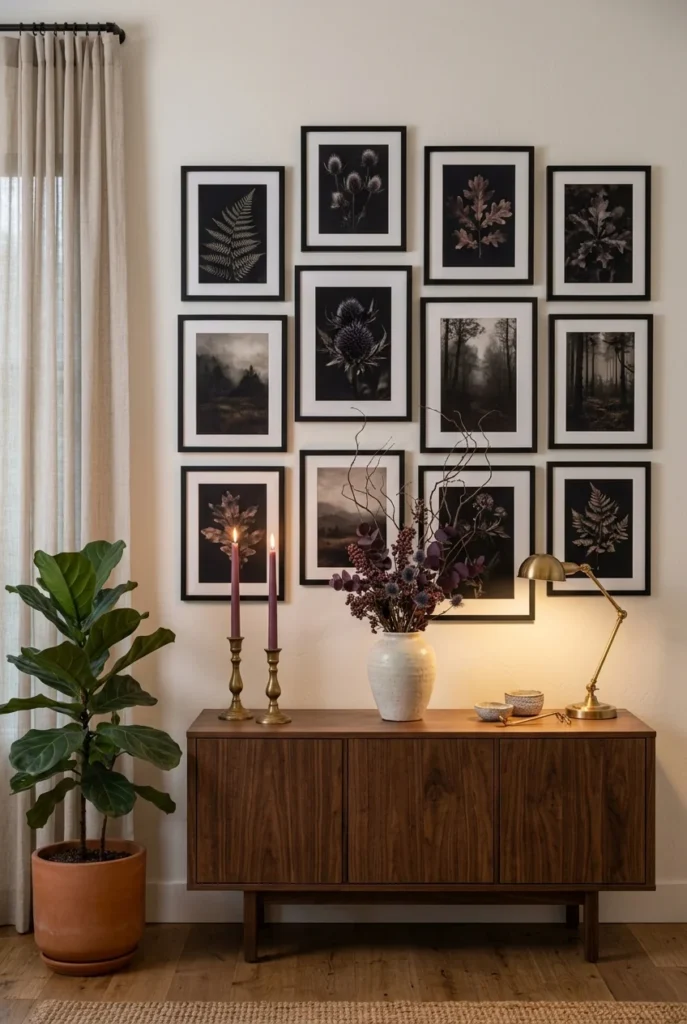
A gallery wall of botanical or landscape prints in dark, moody tones adds depth to a blank wall without requiring paint or big furniture changes. Choose prints with deep greens, browns, or muted golds rather than bright florals, and use matching dark wood or black frames so the collection reads as intentional rather than mismatched. Hang the arrangement above a console table, credenza, or the back of the sofa, keeping consistent spacing between frames so the eye can rest. This idea is one of the most budget-friendly on this list since botanical prints are widely available at low cost or even free through printable downloads, and framing them yourself keeps costs down further. It also works in rentals, since a gallery wall can go up and come down without damaging paint.
8. Patina Blue Ceramic Accents
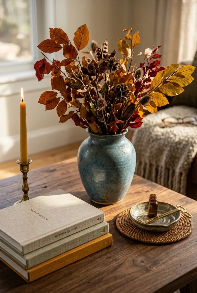
Patina blue — a slightly weathered, dusty blue-green — is one of the season’s quieter trend colors, and it pairs surprisingly well with the browns and rusts of a typical fall palette because it reads as aged rather than cool or wintery. Bring it in through a ceramic vase, a set of candle holders, or a single accent pillow rather than a large piece of furniture, since a little of this tone goes a long way. It looks especially good holding dried branches or dark florals, where the blue-green of the vase contrasts against warm browns and rusts in the arrangement. This idea is a good way to make a fall palette feel current rather than repeating the same rust-and-cream combination every competitor already covers. Keep the rest of the surface simple — one patina piece with a stack of books or a single candle is enough.
9. Woven Baskets and Rattan Trays
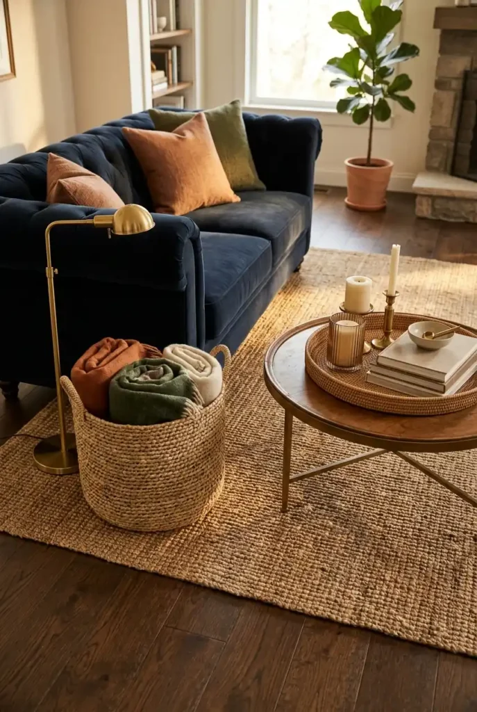
Woven texture keeps a moody, dark-toned room from feeling heavy, which is why baskets and rattan trays show up in nearly every fall living room that actually gets lived in rather than staged. Use a large basket beside the sofa for extra throws, a smaller one under a side table for magazines or remotes, and a rattan tray on the coffee table to corral candles or a stack of coasters. The natural fiber tone contrasts against dark walls or deep-colored textiles, adding warmth without adding more color. This is also one of the most practical ideas on the list, since baskets solve a real storage problem — blankets that would otherwise pile up on the arm of the sofa — while still looking styled. Look for baskets with a lid if you want built-in storage that stays photo-ready.
10. Dried Branches and Pampas Grass Arrangements
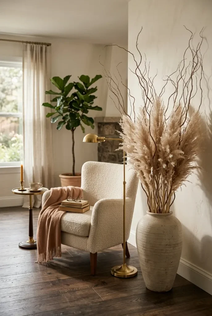
Fresh florals don’t last through an entire season, which is why dried branches and pampas grass have become the go-to fall arrangement — they hold their color for months and actually look better as they dry further. Clip branches from your own yard if you have access to changing leaves, or use faux stems from a craft store, and arrange them tall in a simple ceramic or glass vase rather than a full, packed bouquet. Height matters here: a few tall stems in a narrow-necked vase reads as more sophisticated than a short, bushy arrangement. Place the vase on the floor beside a chair for a dramatic, oversized look, or on the mantel for something more restrained. This idea pairs especially well with the patina blue vase idea above, since the muted vase tone lets the branches be the visual star.
11. Chunky Knit Throw Blankets in Layered Piles
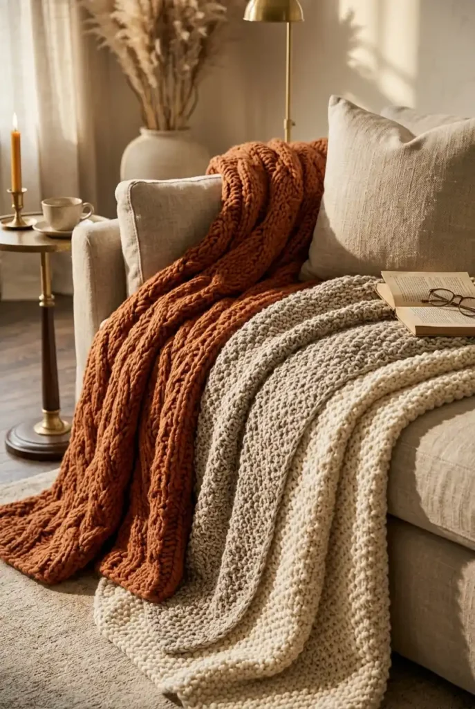
One throw blanket looks intentional; three, layered and slightly rumpled, look collected and lived-in, which is exactly the mood most moody fall rooms are going for. Fold one chunky knit blanket in half over the sofa arm, drape a second more loosely over the back, and leave a third folded in a basket nearby so it reads as ready-to-use rather than purely decorative. Mix textures and weights — a cable knit, a waffle knit, and a faux fur — so the pile has visual interest instead of looking like a stack of identical blankets. Stick to a tight color family, like cream, oatmeal, and rust, so the layering reads as curated rather than mismatched. This is one of the lowest-cost ideas on the list if you already own blankets from other rooms; it’s purely a placement and folding technique.
12. Ambient Candlelight Styling
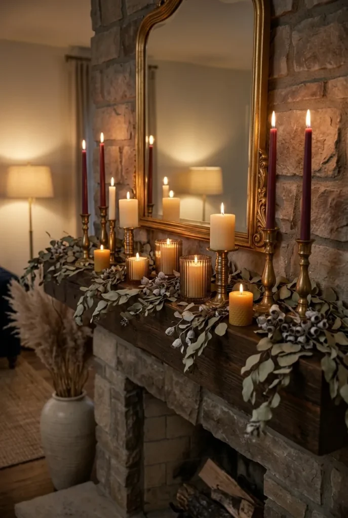
Overhead lighting flattens a room and works against every moody effect you’ve built with color and texture, so candlelight is one of the highest-impact, lowest-cost changes on this entire list. Group three to five taper or pillar candles at varying heights on the mantel or coffee table rather than scattering single candles around the room, since clustering creates a stronger warm glow in one focal spot. Flameless LED candles work just as well for this effect if you have kids, pets, or simply don’t want to worry about open flame, and modern versions flicker convincingly enough that guests often can’t tell the difference. Warm-toned candles — cinnamon, sandalwood, cedar — reinforce the fall mood through scent as well as light. Turn off at least one overhead light source in the evening and let candlelight and lamps do the work instead; the difference in mood is immediate.
13. Warm Table Lamp Layering
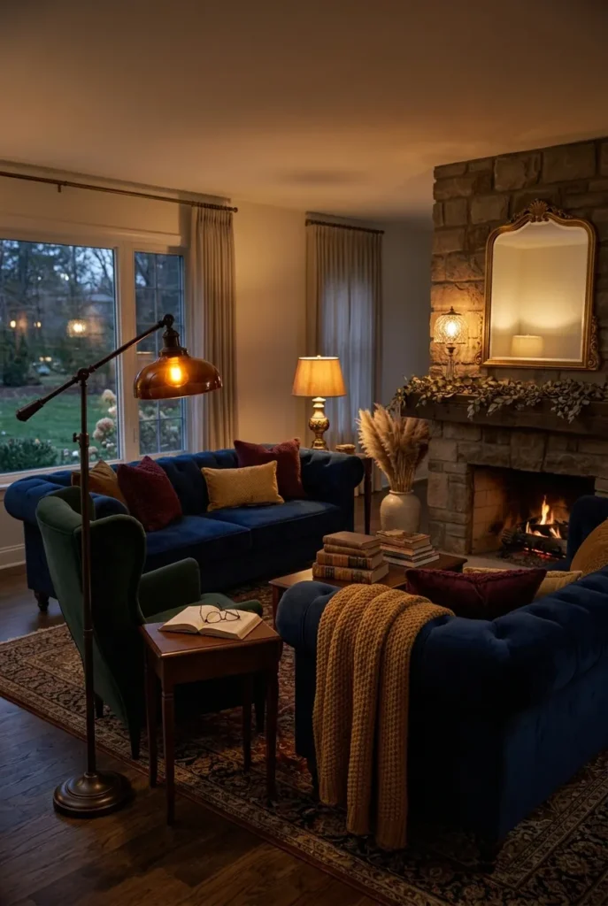
A single overhead light source makes any room feel more like an office than a home, which is why designers layer at least two or three lamps at different heights around a moody fall living room. Put a taller floor lamp near the reading chair, a smaller table lamp on a side table, and if you have a console table, a third lamp there, each with a warm-toned (2700K or lower) bulb rather than a cool white one. The goal is pools of warm light around the room’s perimeter rather than one bright source in the center, which is what makes evening photos and evening living both feel cozier. Lamps with fabric or amber glass shades diffuse light more softly than exposed bulbs, adding to the effect. This is an easy upgrade even if you’re renting, since it requires no wiring changes, only swapping bulbs and adding lamps you can take with you later.
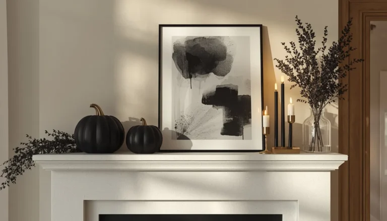
14. Fireplace as the Moody Focal Point
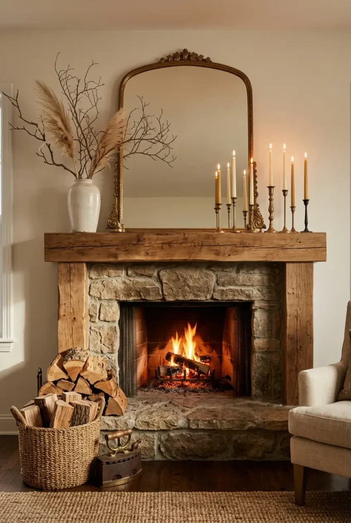
If your living room has a fireplace, it’s already doing half the seasonal work for you, so the goal for fall is to style around it rather than compete with it. Clear the mantel of summer decor and replace it with a mix of heights — a large piece of art or mirror leaning behind, a cluster of candles at varying levels, and one or two natural elements like dried branches or a small pumpkin. Keep the hearth itself simple; a stack of firewood in a woven basket or a single lantern is more effective than crowding the floor space with objects. If your fireplace doesn’t function or isn’t in use for the season, a few flameless candles inside the firebox recreate the same warm glow without the upkeep. The fireplace wall is usually the room’s natural photo backdrop, so this is worth prioritizing over smaller vignettes elsewhere.
15. Layered Window Light With Sheer and Heavy Curtains
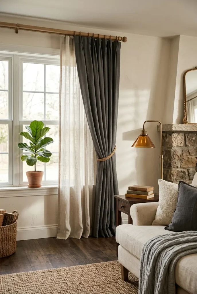
Moody doesn’t mean dark all day, and one of the most overlooked ideas is controlling how much daylight actually enters the room. Pair a sheer curtain closest to the glass with a heavier, textured drape (linen, velvet, or a deep-toned pinch pleat) on the outside, so you can layer light throughout the day — sheer alone for soft daytime brightness, both closed for a moodier evening feel. Charcoal, rust, or deep olive drapes read as intentional rather than dated when paired with warm wood curtain rods instead of plain metal. This idea directly addresses one of the most common competitor gaps: articles mention “moody drapes” but rarely explain the sheer-plus-heavy layering technique that actually makes the look work day and night. It’s a moderate investment but transforms the room’s entire light quality, which no amount of pillow-styling can replicate.
16. Olive Green Accent Chair
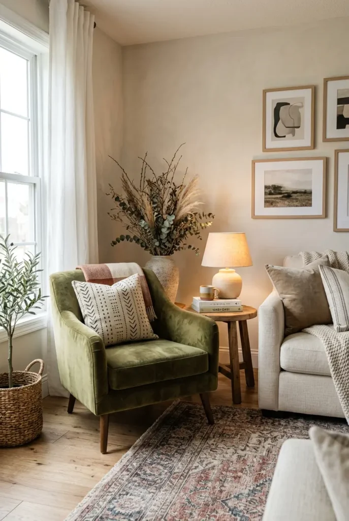
An accent chair is one of the easiest single-piece swaps for adding a moody fall color without repainting or reupholstering the whole room, and olive green is one of the season’s strongest colors because it reads as both earthy and slightly dramatic. Position it at an angle to the sofa rather than directly facing it, so it reads as a conversational addition to the room rather than a mismatched extra seat. Pair it with a small wood side table and a warm-toned lamp so the chair has its own mini vignette rather than sitting alone. Olive works particularly well against warm neutral walls and wood tones, tying together the earthier end of the fall palette without clashing with rust or burgundy accents elsewhere in the room. If buying new furniture isn’t in the budget, a slipcover in olive velvet or boucle achieves a similar effect on a chair you already own.
17. Mushroom and Warm Wood Palette
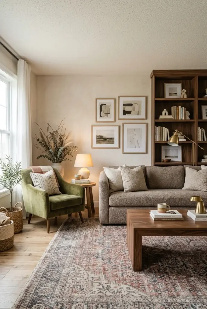
For a quieter, more understated moody fall look, mushroom — a warm, brownish gray — pairs beautifully with wood tones because both sit in the same earthy family without competing for attention. Use mushroom on larger pieces like a sofa or an area rug, then let wood do the accent work through a coffee table, shelving, or picture frames. This combination is especially effective for people who find true moody colors like charcoal or burgundy too dramatic for their space, since mushroom keeps the room feeling calm and grounded rather than heavy. It also photographs well in both bright and low light, unlike some darker palettes that need specific lighting conditions to read well on camera. Add one warm metal accent — brass or aged gold — to keep the palette from feeling flat.
18. Dark Wood Coffee Table Styling
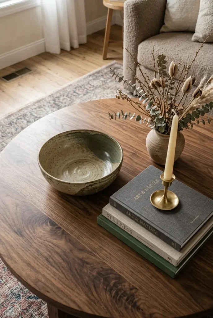
The coffee table is one of the most photographed surfaces in any living room, and a collected, not-crowded styling approach reads far more sophisticated than piling on seasonal tchotchkes. Choose one or two anchor pieces — a substantial ceramic bowl or a sculptural vase — then add a stack of hardcover books, a single candle, and one natural element like a small dried branch or pinecone cluster. Vary height across the arrangement so the eye has somewhere to travel, with the tallest element (usually the vase or branches) toward the back or one side rather than centered. Leave visible empty space on the table itself; a fully covered surface reads as cluttered rather than styled, no matter how nice the individual pieces are. This idea directly counters a common competitor mistake of overloading the coffee table with too many small seasonal objects.
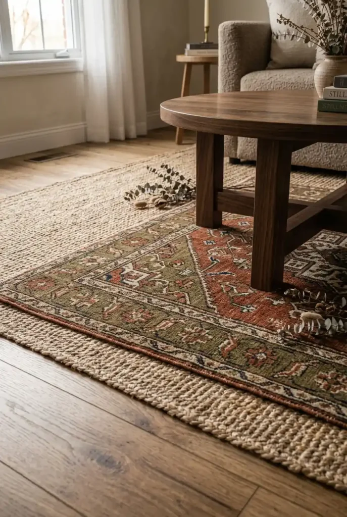
19. Layered Rugs for Depth
Layering a smaller patterned or textured rug over a larger jute or sisal base rug adds visual depth to the floor the same way throw pillows add depth to a sofa, and it’s a technique most competitor articles skip entirely in favor of just recommending “a fall rug.” Choose a natural fiber rug as your base for texture, then layer a smaller wool or vintage-style rug with deeper autumnal tones — rust, olive, or plum — centered under the coffee table. This works especially well in rooms with hardwood or light-toned flooring, since the layered look adds warmth without requiring wall-to-wall carpet. Keep the pattern on the top rug relatively subtle if your pillows and throws already carry bold color, so the room doesn’t compete with itself. This is a slightly bigger investment than most ideas here, but the visual impact rivals a full paint change.
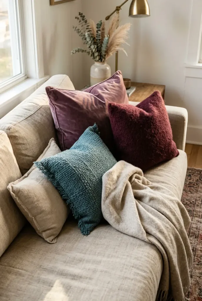
20. Jewel-Toned Throw Pillow Mix
Rather than matching pillows in a single color, a jewel-toned mix — plum, teal, and burgundy together — pulls in the season’s richest colors while still reading as cohesive because all three share the same deep saturation level. Vary texture across the set (one velvet, one wool, one textured weave) so the pillows don’t look like they came from a single matching set, which tends to read as less designer and more big-box. Keep the base sofa neutral so the jewel tones have somewhere calm to land; this combination on an already-colorful sofa tends to look busy rather than rich. An odd number of pillows, usually three or five, tends to look more intentionally arranged than an even, symmetrical set. This is one of the easiest and most affordable ideas on the list to test before committing to any bigger seasonal change.
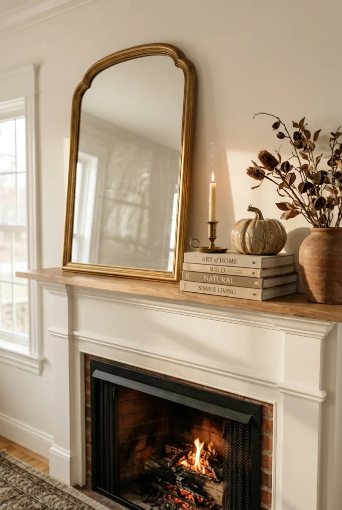
21. Moody Mantel Styling With Asymmetry
A symmetrical mantel — matching candlesticks on either side of a centered mirror — is the default most people reach for, but an asymmetrical arrangement reads as more collected and current for a moody fall look. Lean a large piece of art or a mirror to one side rather than centering it, then build height on the opposite side with a stack of books topped by a small vase or candle. Fill in the remaining space with varying heights — a short pumpkin or gourd, a taller candlestick, a low dried arrangement — so the eye moves across the mantel rather than landing in the middle. This technique works on mantels of any size and costs nothing beyond rearranging what you likely already own. It’s a small styling shift that separates a “just okay” fall mantel from one that actually gets saved and repinned.
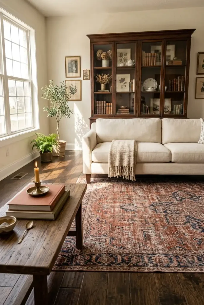
22. Dark Floors With Antique or Vintage Rugs
If your living room already has dark hardwood or stained flooring, lean into it with a worn-in, antique-style rug rather than fighting the darkness with an all-light, all-bright palette. Vintage-inspired rugs in faded rust, navy, and cream patterns give a room a collected, lived-in feeling that pairs naturally with the moody fall mood, since they photograph as though they have history rather than looking freshly unboxed. This works particularly well in older homes or apartments where the floor tone is fixed and can’t easily be changed. Pair the rug with a lighter sofa so the room still has visual balance between dark and light elements. A slightly worn or distressed-look rug, whether genuinely vintage or a modern reproduction, reads as more sophisticated than a flat, uniformly colored new one.
23. Coffee Table Book Stacks as a Design Element
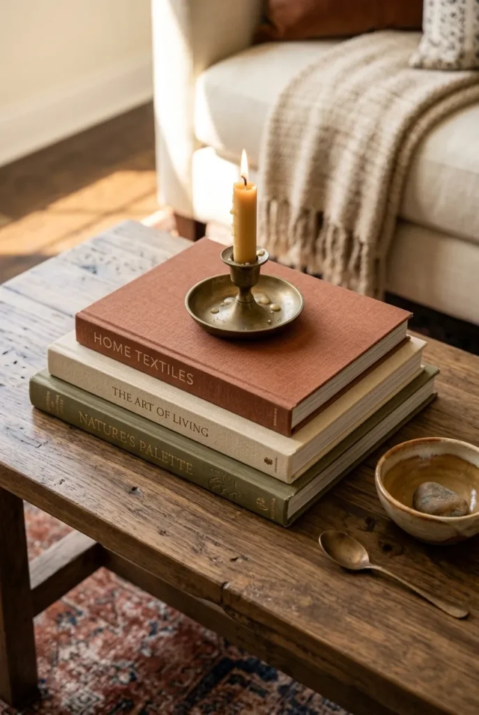
A stack of two or three hardcover books does more design work than most people give it credit for, acting as both a height-builder for other objects and a seasonal color note if you choose covers in warm, earthy tones. Stack books largest to smallest, then place a candle, a small vase, or a decorative object on top so the stack functions as a mini pedestal rather than just reading material left out. Choose spines in tones that complement your existing palette — cream, rust, olive, or deep brown — turning what’s often an afterthought into an intentional color layer. This idea is essentially free if you already own books, and it’s one of the easiest ways to add height variation to a coffee table or console that otherwise reads flat. Rotate the top object seasonally so the same book stack works year-round with a different accent piece.
24. Rust and Cream Color Pairing for a Softer Moody Look
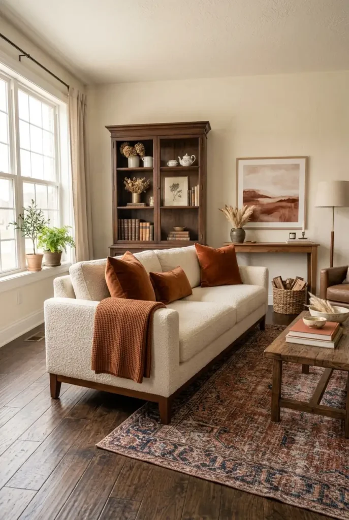
Not every moody fall room needs to go full charcoal or burgundy — rust and cream is a softer, more forgiving pairing that still reads distinctly autumnal without darkening the whole space. Use cream as your base on the sofa and walls, then bring in rust through pillows, a throw, or a single accent chair, keeping the ratio roughly 80/20 so the room stays bright and airy rather than heavy. This pairing is particularly well suited to smaller or lower-light living rooms, where deeper palettes like charcoal can start to feel closed-in rather than cozy. It also transitions easily past fall into winter, since rust and cream don’t read as strictly seasonal the way orange-and-brown combinations can. This is a good starting point for anyone hesitant about committing to a fully moody room but still wanting the seasonal warmth.
25. Cozy Window Seat Nook
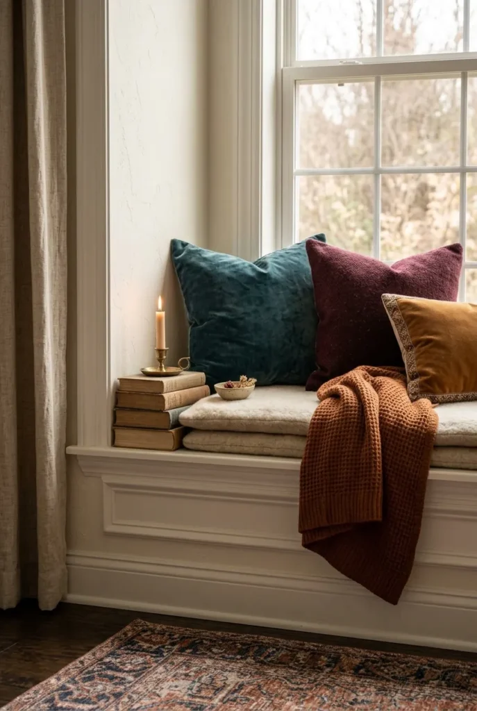
If your living room has a window seat or bay window, it’s one of the most naturally moody-fall-friendly spots in the house, since it already combines natural light with a defined, intimate space. Layer a wool or knit cushion with two or three smaller pillows in jewel or earth tones, then add a folded throw within reach for chillier evenings. A small stack of books and a candle on the windowsill finish the look without crowding the seat itself. This nook works particularly well as a transitional reading or morning-coffee spot, since the natural light makes it usable during the day while the layered textiles keep it feeling warm once the sun goes down. It’s also one of the more photogenic corners on this list, since the window frame naturally composes the shot for you.
Styling Tips
- Anchor the room in one dominant deep color (charcoal, burgundy, or olive) and treat everything else as an accent, rather than spreading several bold colors evenly across the space.
- Vary texture in every zone — pair something soft (velvet, faux fur) with something structured (wood, ceramic, woven fiber) so no single surface feels one-note.
- Build height in vignettes using odd numbers of objects at different levels rather than lining items up at the same height.
- Turn off at least one overhead light source in the evening and let lamps and candles carry the room instead.
- Leave visible negative space on surfaces like the coffee table and mantel; a fully covered surface reads as cluttered rather than styled.
Practical Implementation Ideas
- Start with textiles (pillows, throws, a rug) before committing to paint or new furniture — they’re reversible and let you test a palette first.
- Shop your own home before buying anything new; a chair, vase, or rug from another room may already fit the moody fall palette.
- Group new purchases by function first (lighting, textiles, decor objects) so you don’t accidentally buy five vases and no lamps.
- Style one zone completely (like the coffee table or mantel) before moving to the next, rather than spreading a little effort across the whole room at once.
Common Mistakes to Avoid
- Going too dark all at once — a single deep-colored wall or sofa is usually enough; combining several dark elements without a light anchor can make a room feel closed-in rather than cozy.
- Overloading every surface with seasonal objects (pumpkins on the coffee table, the mantel, and the console all at once) instead of picking one or two focal zones.
- Using only overhead lighting, which flattens color and texture and undercuts the entire moody effect.
- Matching every pillow and throw in one exact color, which tends to look flat rather than rich; slightly varied, jewel-toned shades layer better than a single matched set.
- Skipping texture entirely and relying on color alone — a monochrome dark room without varied texture can feel more stark than cozy.
Small-Space Alternatives
- Instead of a full accent wall, use a large piece of dark art or a fabric panel to get the same color-depth effect without repainting.
- Swap a full accent chair for a single floor cushion or a slipcover on an existing chair if floor space is tight.
- Choose a smaller layered rug setup (a runner-sized top rug) rather than a full room-sized layer, which can overwhelm a compact room.
- Use wall-mounted sconces instead of floor or table lamps to add warm lighting without taking up surface space.
- Limit vignettes to one true focal point (the coffee table or a single shelf) rather than trying to style multiple zones in a small room.
Budget-Friendly Alternatives
- Clip real branches or dried florals from your yard instead of buying faux stems.
- Use flameless LED candles, which are reusable across seasons and avoid ongoing candle costs.
- Thrift or borrow hardcover books for coffee table stacks rather than buying new decor-specific titles.
- Print botanical or landscape images at home or through an affordable print shop instead of buying framed art.
- Rearrange existing throws, pillows, and rugs from other rooms before purchasing anything new for the living room specifically.
Pro Styling Recommendations
- Choose a single “trend color” for the season (like patina blue or olive) and use it sparingly as a highlight rather than a dominant tone, so the room feels current without looking overdone.
- Photograph vignettes in natural daylight and again in lamp light before finalizing a layout — some arrangements that look great in daylight go flat under warm bulbs, and vice versa.
- Keep one element of the room (a piece of furniture, a rug, or a wall) fixed and neutral as a base, then rotate the moody fall accents around it each season so future updates are easier and cheaper.
- Edit down before adding more; remove one object from a vignette before adding a new one, since most styling mistakes come from too much rather than too little.
FAQs
Conclusion
A moody fall living room isn’t about matching every pillow to a pumpkin-spice color chart — it’s about depth: one strong color choice, a mix of real textures, and light that comes from lamps and candles instead of a flat overhead bulb. Pick two or three ideas from this list that fit the room you already have, build them out fully before moving to the next zone, and let the space earn its coziness through use rather than through how many seasonal objects are sitting on the coffee table.