16 Striped Ceiling Ideas to Add Instant Personality Overhead
Every wall in a room gets decorated. Art gets hung, paint gets chosen, furniture gets arranged in front of it. The ceiling just sits there, usually flat white, doing nothing.
Which is exactly why it’s the best opportunity left in most homes. Nothing blocks it. No furniture, no rug, no gallery wall competing for attention. A striped ceiling uses that wide-open surface to do something a wall alone can’t: change how tall a room feels, which direction it draws the eye, and whether it reads as cozy or dramatic or playful, all without touching a single piece of furniture.
This list covers 16 striped ceiling ideas, from subtle tone-on-tone texture to a fully committed haint blue porch, along with the width, direction, and color decisions that actually determine whether a striped ceiling looks intentional or like a taping mistake. There’s a version here for a rental, a nursery, a vaulted great room, and everything in between.
Table of Contents
Why the Ceiling Is the Most Underused Surface in a Home?
A striped ceiling works because it’s one of the only design choices in a room that nothing else interrupts, no furniture in front of it, no rug layering over it, no pillows softening its edges. That makes it one of the highest-impact, lowest-competition surfaces available for adding real visual interest to a space. The direction of the stripes changes what the ceiling does functionally: horizontal stripes across a narrow room stretch it visually, stripes running the length of a bedroom draw the eye up and out for a taller, more expansive feeling, and a single stripe along a vaulted ridge highlights height that’s already there. Color contrast level matters just as much as direction, since a bold two-tone ceiling makes a genuine style statement that the rest of the room needs to support, while a tone-on-tone approach adds quiet texture that only reveals itself as light moves across the surface throughout the day.
1. Bold Two-Tone Contrast for a Room That Commits
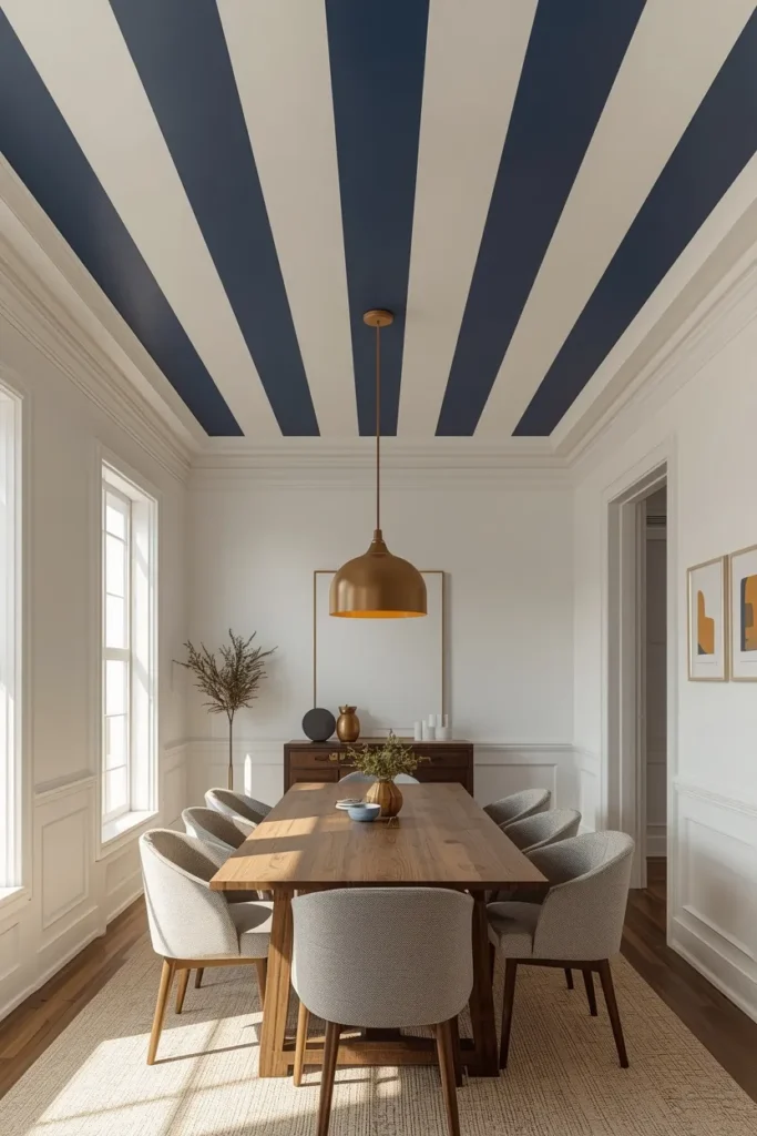
A ceiling striped in deep navy and warm white, or charcoal and cream, or terracotta and linen, doesn’t hedge, it sets the color temperature for the whole room and asks the furniture and textiles below to respond to it rather than compete with it. This treatment reads best against simple, near-white or lightly colored walls, since a heavily patterned or saturated wall will fight the ceiling for attention instead of letting it stand as the room’s clear statement. A dining room with plain white walls and a navy-and-white striped ceiling is one of the most classic executions of this idea, since the ceiling does essentially all the decorative work while everything below stays intentionally quiet. This is the highest-commitment option on the list, but it also delivers the most dramatic, unmistakable result.
2. Tone-on-Tone Stripes for Subtle Architectural Texture
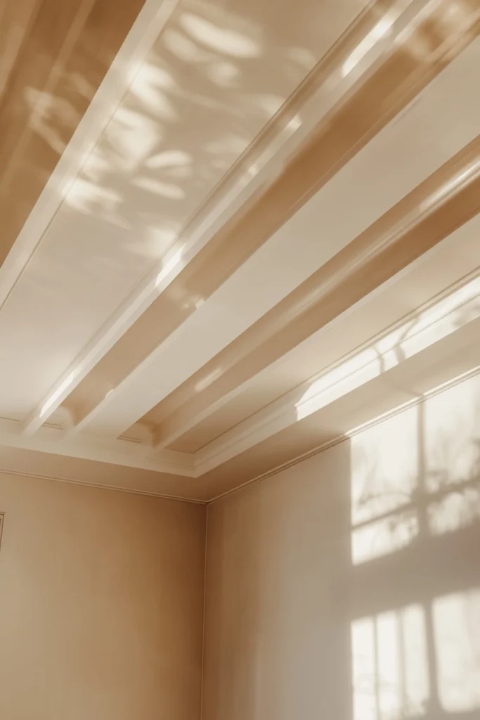
For anyone unsure about full contrast, painting two stripes in the exact same color but different finishes, a flat paint for one and an eggshell or satin for the other, creates a pattern that only reveals itself as light rakes across the ceiling at an angle. This approach reads as sophisticated architectural texture rather than a bold graphic pattern, since the color itself never actually changes. Keeping the stripes fairly wide, in the twelve to eighteen inch range, gives the sheen shift room to register, since narrow stripes in matching tones tend to disappear entirely in low light. This is the lowest-risk entry point into ceiling stripes, since the worst-case outcome is simply a plain-colored ceiling with a bit of extra depth.
3. Wide Horizontal Stripes to Stretch a Narrow Room
In a narrow hallway or a small bedroom with a lower ceiling, two or three wide stripes running the full length of the space create a visual tracking effect that pulls the eye outward, making the room read as longer and the ceiling as less oppressive than it actually is. Keeping the stripe count low matters here, since two or three wide bands read as intentional architecture, while seven or eight narrower ones start to look more like wallpaper than a deliberate ceiling treatment. A soft, low-contrast pairing, like white alternating with a pale sage or dusty rose, gives the stripe enough definition to register from below without overwhelming a genuinely small space. This idea also works well applied to a single sloped ceiling section, where the horizontal lines counteract the downward pitch.
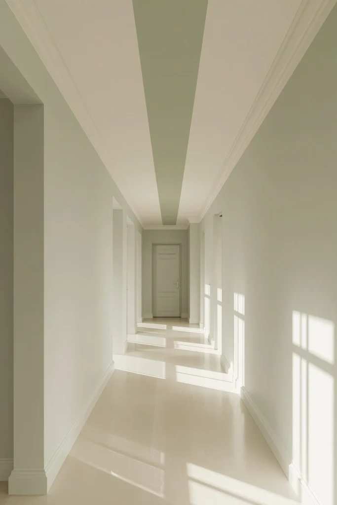
4. Vertical Stripes Along a Bedroom’s Length for a Cathedral Effect
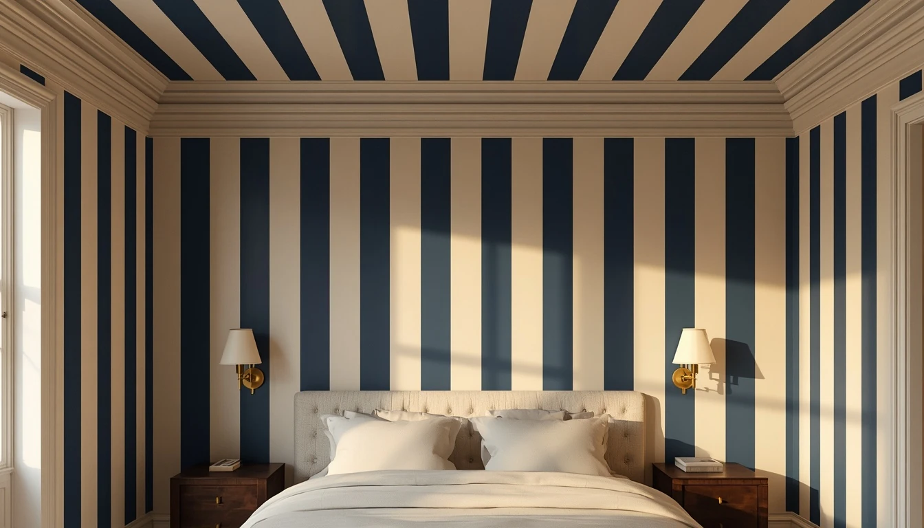
Running stripes from the head wall to the foot wall of a bedroom, the direction that reads as “vertical” when lying in bed looking up, draws the eye toward the far end of the ceiling and gives a low-ceilinged room a sense of height it wouldn’t otherwise have. This orientation works especially well in bedrooms specifically, since that’s the room where people spend the most time actually looking straight up at the ceiling. Keeping the stripes moderately narrow, around eight to twelve inches, maximizes the sense of depth, since very wide stripes running this direction can start to feel like the ceiling is closing in rather than stretching out. Pairing this look with wall sconces rather than a central ceiling fixture avoids interrupting the visual rhythm of the lines with a pendant or flush mount sitting in the middle of the pattern.
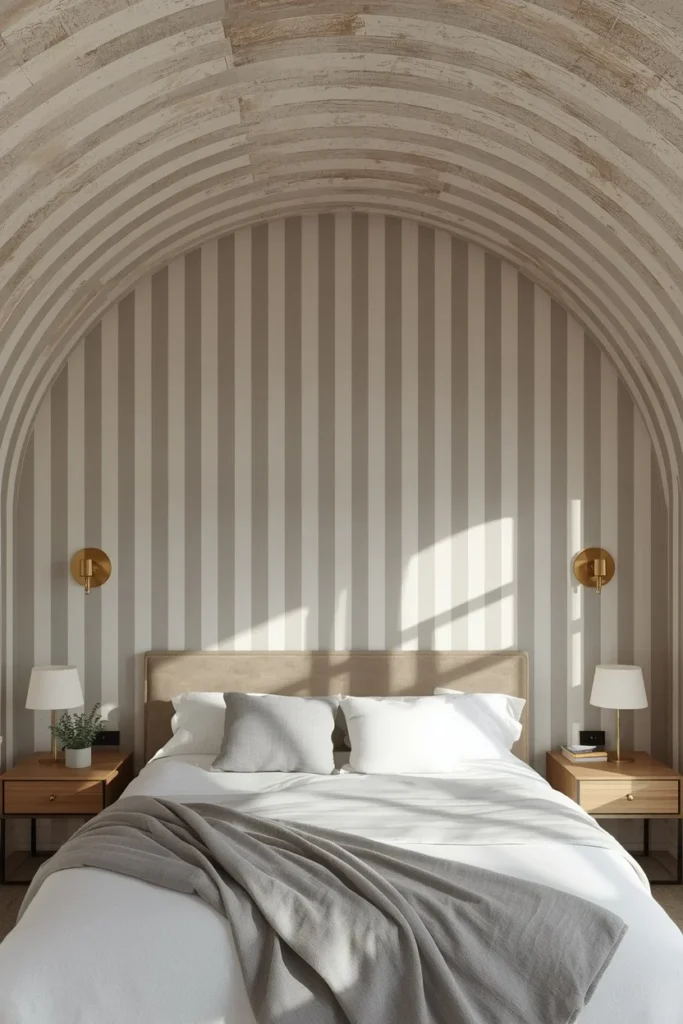
5. Diagonal Stripes for Movement in a Compact Bathroom
Diagonal stripes introduce a kind of visual movement that neither horizontal nor vertical stripes can achieve, since the angle carries the eye outward toward the corners of the room rather than straight across it. In a small bathroom or powder room, this reads as dynamic and expansive rather than making the already-tight space feel smaller. The execution takes more careful measuring than a horizontal stripe, since the pattern works against the room’s natural grid, so starting from the center of the ceiling and working outward keeps everything balanced. Moderate, low-contrast color pairings, like dusty rose and off-white or sage and cream, tend to work better here than high contrast, since a bold diagonal can read as very graphic and become the only thing anyone notices in the room.
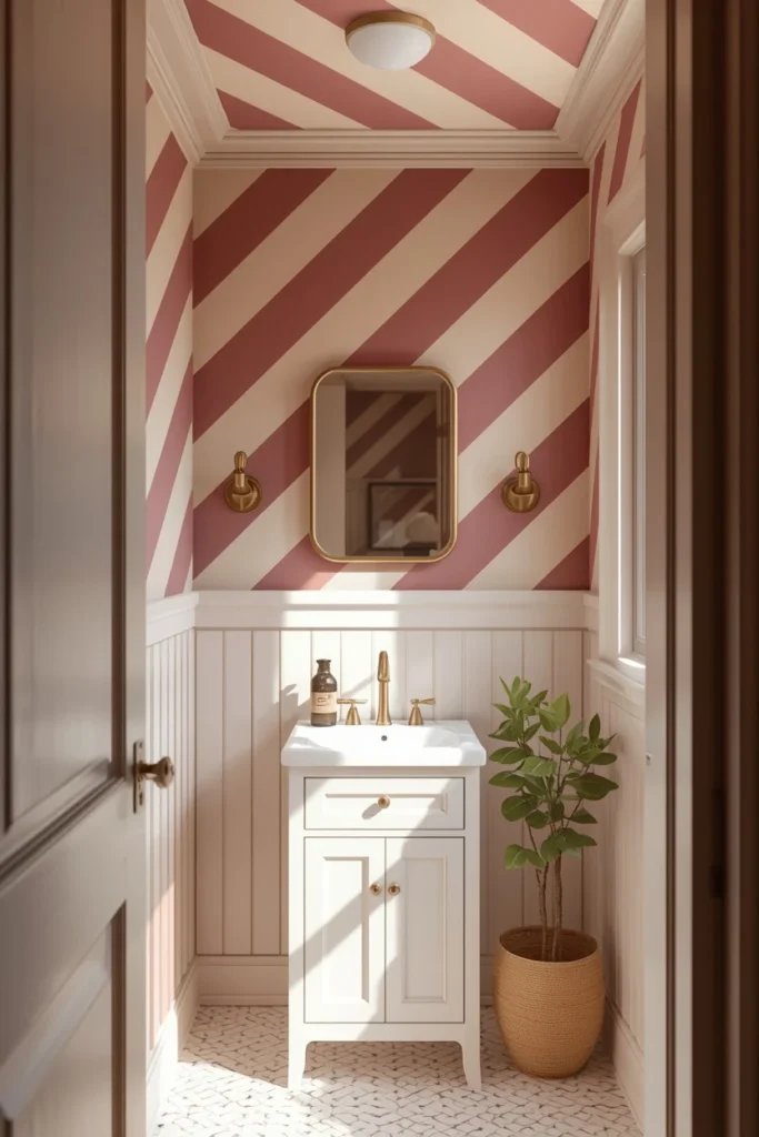
6. A Single Accent Stripe Along a Vaulted Ceiling Ridge
A vaulted ceiling doesn’t need to be fully striped to make an impact, a single bold stripe painted along the peak ridge draws the eye straight to the highest point in the room, making the height feel even more dramatic than it already is. This is the lowest-effort, highest-payoff idea on the entire list, since it requires committing to just one color decision instead of a full striped palette. A deep plum stripe along a white vaulted peak, or a warm terracotta line along a cream ridge, reads as a genuinely architectural choice rather than a decorative afterthought. This idea works particularly well in an open-plan great room, where the single stripe helps define the living area from above without needing a rug or partition to do the same job at floor level.
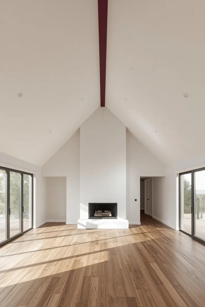
7. Stripes That Wrap Down the Wall for a Canopy Effect
Letting a ceiling stripe continue eighteen to twenty-four inches down the adjacent walls before transitioning to a plain wall color below creates an enveloping, canopy-like effect that makes a bedroom or dining room feel deliberately designed rather than simply decorated. The trick is that the stripe merges the ceiling and wall planes together, softening the hard visual break between them, which in a lower-ceilinged room actually makes the whole space read as taller and more continuous. This technique shows up often in boutique hotel rooms, and it translates just as well to a residential bedroom. Soft, low-contrast tones work best for a bedroom application, like dusty rose and warm white or sage and cream, while bolder contrast suits a dining room or living space meant to feel more energizing than soothing.
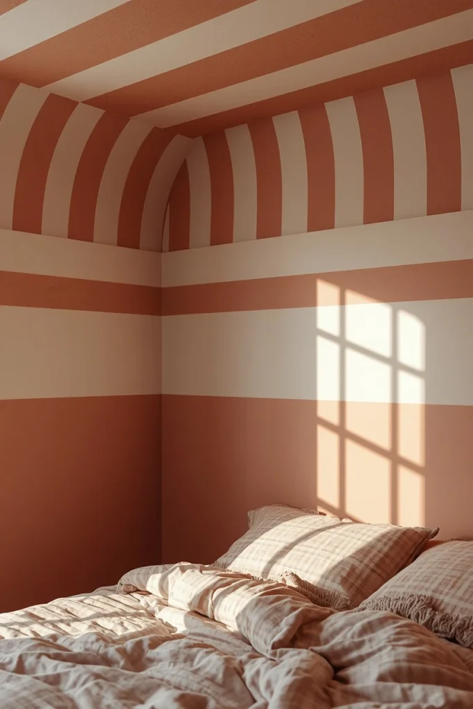
8. Warm Terracotta and Linen Stripes for a Grounded, Livable Palette
Terracotta and linen is one of the most livable striped ceiling pairings available, since both tones are warm and earthy rather than crisp or graphic, which makes the whole treatment feel like a considered design decision instead of a bold renovation statement. This palette suits living rooms, dining rooms, and boho-leaning bedrooms, where the overall direction already favors warmth and a collected feel over something sleek and modern. On a room with white or near-white walls, this combination brings the only real color into the space from above, which is an unusual and genuinely grounding way to introduce warmth without committing to a saturated wall color. Pairing the ceiling with a woven rug and natural wood furniture below ties the whole palette together into one cohesive story.
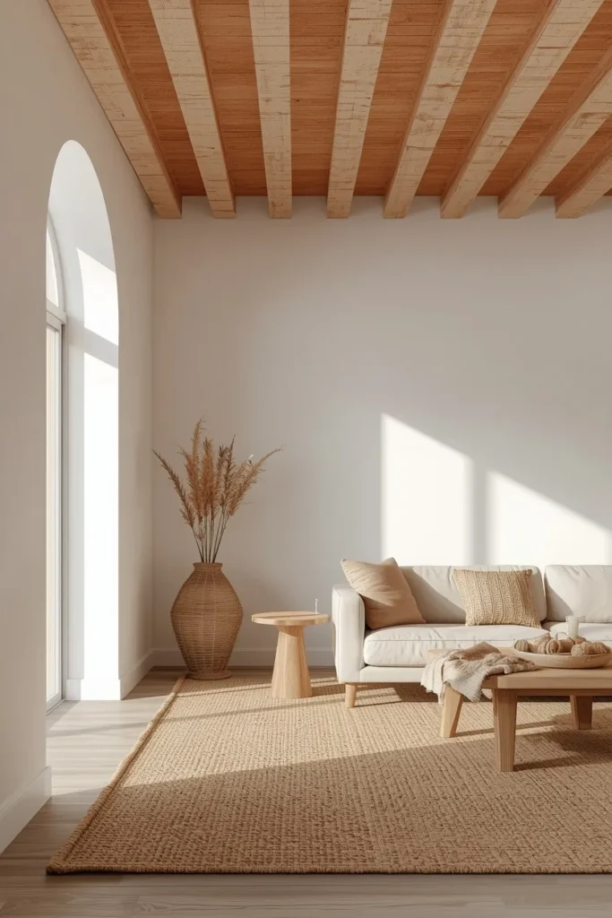
9. Soft Candy Stripes for a Nursery or Kid’s Room
In a nursery or child’s bedroom, a striped ceiling is one of the most enduring choices available, since it adds real visual excitement without the permanence of wallpaper and can be repainted easily as a child’s taste changes over the years. Because the room itself and the ceiling height are usually smaller in scale, the stripe colors can lean a bit more saturated than they would in an adult room without ever feeling overwhelming. A soft dusty rose paired with pale sage green works well regardless of a child’s age or gender, reading as warm and playful rather than overly themed. Alternating stripe widths, one wide band followed by one narrow one, rather than a perfectly even repeat, adds rhythm and gives the ceiling a more custom, less mass-produced feeling.
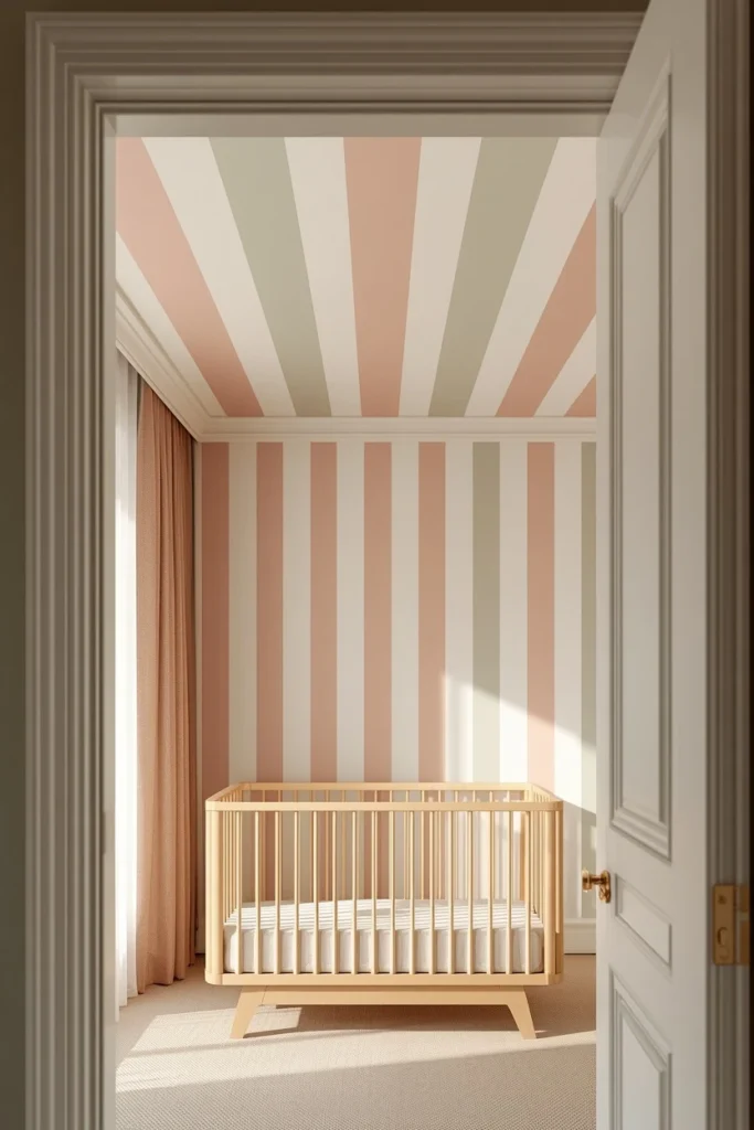
10. Narrow Maximalist Pinstripes in a Jewel Tone
Shrinking the stripe width down to the two-to-four-inch range shifts a ceiling from architectural accent to a full pattern statement, essentially maximalism applied to the one surface most rooms leave blank. In the right space, a moody dining room, a maximalist bedroom, a small powder room, this treatment creates a textile-like effect overhead that reads more like fabric than paint, especially with a rich, deliberate color pairing like deep plum and warm white. The contrast needs to stay high enough that the narrow repeat registers clearly from below without requiring anyone to stand directly underneath it to notice the pattern. This is one of the more labor-intensive ideas on the list, since narrow stripes demand precise, consistent measuring rather than eyeballing, but the payoff is a ceiling that looks genuinely custom-designed.
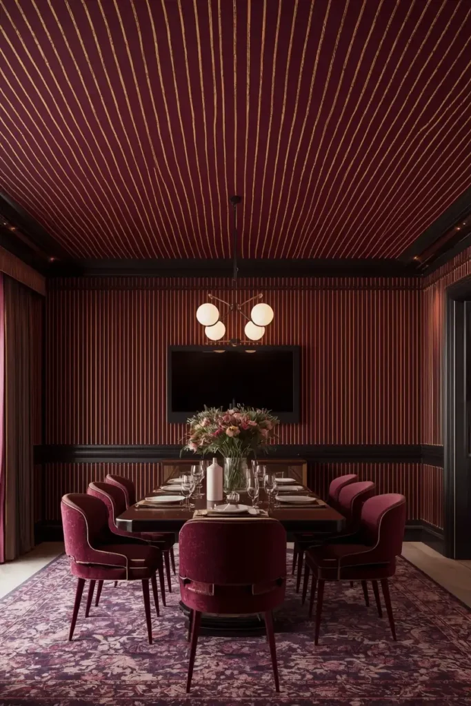
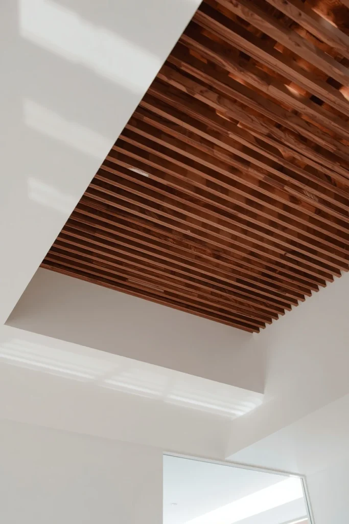
11. Dimensional “Shadow Stripes” Using Wood Slats
Rather than paint, mounting thin wood slats across the ceiling at even intervals creates a genuinely dimensional striped effect, where the stripe comes from real shadow and texture instead of color contrast. This technique reads as more architectural and higher-end than a painted stripe, since the slats cast subtle shifting shadows throughout the day as natural light moves across the room. Staining the slats in a warm walnut tone against a white or cream ceiling background gives the pattern strong definition without needing any paint on the ceiling itself. This idea works particularly well in a modern or Scandinavian-leaning room, and it also has the practical benefit of concealing minor ceiling imperfections that a flat painted surface would show more clearly.
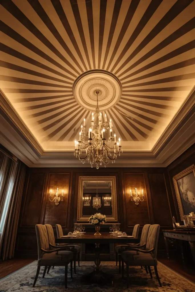
12. Radial Stripes Fanning Out From a Central Light Fixture
Instead of running in parallel lines, stripes that radiate outward from a central point, typically a chandelier, pendant, or ceiling medallion, create a sunburst-like pattern that turns the light fixture into the deliberate anchor of the entire ceiling design. This approach works especially well in a formal dining room or entryway with a statement fixture already in place, since the radiating stripes visually elevate the fixture rather than competing with it the way parallel stripes centered elsewhere on the ceiling might. The execution is more advanced than a standard parallel stripe, since each band needs to taper correctly as it moves outward from the center, and is best planned with chalk lines measured from the fixture’s exact center point. This idea rewards a room that already has genuine architectural presence at its center, giving the ceiling a reason to visually orbit around it.
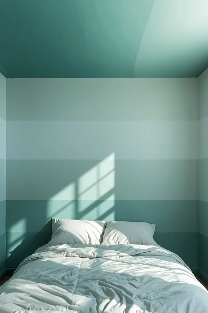
13. Ombre Gradient Stripes That Fade From Dark to Light
Rather than a hard-edged repeat, painting a series of stripes that gradually shift from a deep saturated color at one end of the ceiling to a soft, pale version of the same hue at the other creates an ombre effect that feels more like a painting than a traditional striped pattern. This gradient approach works particularly well running the length of a bedroom or a long hallway, since the fade gives the eye a clear visual direction to follow across the space. Choosing colors within the same family, like deep teal fading to the palest seafoam, rather than two unrelated hues, keeps the transition feeling smooth and intentional rather than jarring. This idea is one of the more painting-intensive options on the list, since blending between bands requires careful color mixing, but it delivers a result that reads as genuinely artistic rather than a straightforward paint job.
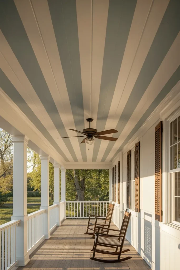
14. Classic Haint Blue Striped Porch Ceiling
Extending the striped ceiling idea outdoors, alternating stripes of the traditional pale haint blue with crisp white along a covered porch ceiling brings a genuinely Southern, time-honored design detail into an exterior space that most homes leave a plain, flat white. The pale blue-green haint blue color was originally used to mimic water and sky in the belief it would ward off insects and spirits, and while the folklore has faded, the color’s cooling, sky-like effect on a porch ceiling remains just as beautiful today. Keeping the stripe width fairly wide and the contrast gentle, rather than bold and graphic, suits the relaxed, unhurried feeling a porch is meant to evoke. This idea also has a practical advantage over most others on this list, since exterior paint formulated for porch ceilings holds up to humidity and temperature swings far better than standard interior ceiling paint.
15. Rental-Friendly Removable Wallpaper Stripes
For renters who can’t commit to paint, applying wide strips of removable, peel-and-stick wallpaper in alternating bands across the ceiling, with equal-width gaps left in the ceiling’s original white, creates a genuine stripe effect that comes down cleanly at move-out. Choosing a wallpaper strip with a subtle texture, like a soft linen weave or a barely-there geometric print, rather than a flat solid color, makes any slight imprecision in the strip edges far less noticeable than it would be with a bold solid stripe. This approach also tends to read as warmer and more layered than paint alone, since the paper’s texture adds a tactile quality a flat painted stripe can’t replicate. Testing a small section first with the specific wallpaper product matters here, since not every peel-and-stick material removes cleanly from every ceiling surface or paint finish.
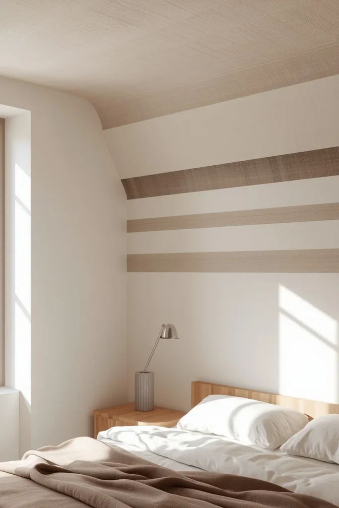
16. A Surprise Striped Ceiling Inside a Closet or Reading Nook
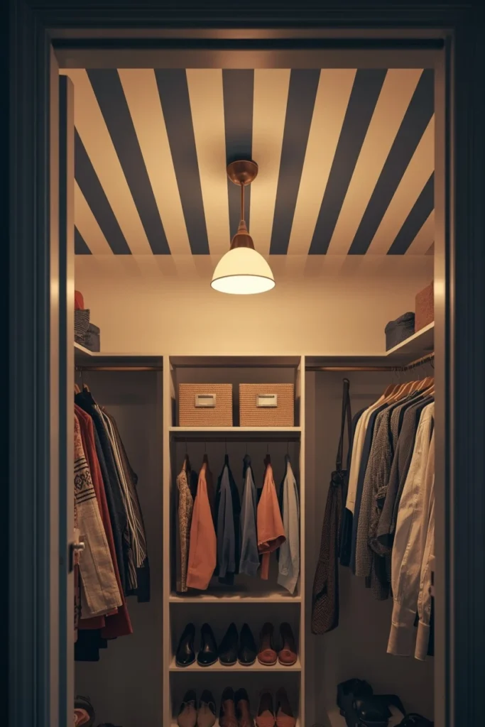
Reserving a bold, high-contrast stripe for a small, semi-hidden space, like the inside of a walk-in closet, a built-in reading nook, or a window seat alcove, gives a home a genuine “wow” detail discovered only by whoever steps inside. Because the space is small and enclosed, a bolder color pairing or narrower stripe width that might feel overwhelming across an entire bedroom ceiling reads as delightful and contained within a nook’s limited footprint. This idea is particularly popular for a closet, since it turns a purely functional space into a small personal design moment without affecting the resale-neutral color scheme of the rest of the home. Pairing the striped ceiling with a single pendant light or a small chandelier inside the nook gives the unexpected detail its own dedicated light source to be properly seen.
Styling Tips for a Striped Ceiling
- Calculate stripe width from the room’s actual ceiling dimensions rather than guessing: divide the ceiling’s width in inches by roughly twelve to sixteen to land on a stripe count, then divide the width by that number for the stripe size. A standard ten-foot-wide room using twelve stripes lands around ten inches per stripe, a moderate width that reads as intentional without feeling like busy wallpaper.
- Match one stripe color to the room’s existing trim, door casings, or window moldings so the ceiling reads as part of one cohesive color system rather than an isolated design choice.
- Keep at least one stripe color related to something already present in the room’s decor, since a ceiling stripe with no connection to anything else below can read as “floating” or disconnected from the rest of the space.
- Choose narrower stripes for a bolder, more maximalist, pattern-forward effect, and wider stripes for a calmer, more architectural, restrained result.
Practical Implementation Ideas
- Tape off and paint a single test stripe in the chosen width and colors, then live with it for a full day before committing to the entire ceiling, since scale and color read completely differently across a full ceiling than on a small sample.
- Use a straightedge, like a scrap piece of wood, to draw the initial guideline in pencil before applying tape, since tape alone can shift or stretch and produce a wavy line.
- Run a putty knife or the flat edge of a tool along freshly applied tape to seal the edge fully, which prevents paint from bleeding underneath and ruining a crisp stripe line.
- For a textured or popcorn ceiling, use a thick-nap roller designed for textured surfaces and apply tape gently, since standard tape can pull texture off the ceiling when removed.
Common Mistakes to Avoid
- Choosing a stripe width without measuring the actual ceiling first, resulting in stripes that feel awkwardly narrow or unbalanced once the whole ceiling is finished.
- Pairing a bold, high-contrast striped ceiling with equally bold or patterned walls, which creates visual competition instead of letting the ceiling stand as the room’s clear statement.
- Choosing stripe colors with no relationship to anything else in the room, leaving the finished ceiling feeling disconnected or randomly placed.
- Skipping the test stripe step and taping the entire ceiling at once, only to discover the chosen width or contrast doesn’t work once it’s fully painted.
Small-Space and Rental Alternatives
A single accent stripe, whether along a vaulted ridge or as one narrow band across an otherwise plain ceiling, delivers real visual impact in a small room without the commitment of a full striped ceiling. For renters, removable peel-and-stick wallpaper strips applied in alternating bands, with the ceiling’s existing white left as the gap color, create a genuine stripe effect that removes cleanly at move-out. A closet or nook, being both small and semi-private, is an especially forgiving place to try a bold, high-contrast stripe for the first time, since any imperfection stays contained to a low-visibility space.
Budget-Friendly Alternatives
A tone-on-tone striped ceiling, using two finishes of the same paint color already sitting in the garage, costs nothing beyond a bit of extra painting time and delivers genuine texture without a second paint purchase. Removable wallpaper strips, while requiring some upfront cost, avoid the labor and cleanup of a full paint project and can be reused or resold if the space changes. Choosing a single accent stripe rather than a fully striped ceiling uses far less paint and tape overall while still delivering a strong visual statement. Painting over an existing textured or popcorn ceiling with wide, low-contrast stripes turns an already-present, hard-to-love surface into a design feature rather than requiring a costly resurfacing project first.
Pro Styling Recommendations
Professional painters and designers consistently point to stripe width as the single most overlooked decision in the entire project, since it’s the factor that determines whether a ceiling reads as bold graphic pattern, subtle texture, or restrained architecture, and the right width depends entirely on the specific room’s dimensions rather than a universal rule. Committing to a test stripe before taping the full ceiling is the recommendation given most often, since color and scale behave completely differently on a full ceiling than they do on a paint chip or a single swatch. Tying at least one stripe color back to the room’s existing trim, wall color, or furnishings is what separates a striped ceiling that looks like a cohesive design decision from one that reads as disconnected from everything below it.
FAQs
Final Thoughts
A striped ceiling works because it uses the one part of a room nothing else is fighting for. No furniture blocks it, no rug competes with it, nothing softens its impact, which means even a modest stripe reads as a real, deliberate design decision. Whether that’s a single bold line along a vaulted peak or a fully committed haint blue porch, the same rules hold: measure the width before taping anything, tie at least one color back to the rest of the room, and always test a single stripe before committing to the whole ceiling. Pick one idea from this list that matches the room and the level of commitment feels right, and let the ceiling finally do some of the design work the walls have been handling alone.